


Creating a login screen using style sheets
Next, we will learn how to put all the knowledge we learned in the previous recipe together and create a fake graphical login screen for an imaginary operating system. Style sheets are not the only thing you need to master to design a good UI. You will also need to learn how to arrange the widgets neatly using the layout system in Qt Designer.
How to do it...
Let’s get started by following these steps:
- We need to design the layout of the graphical login screen before we start doing anything. Planning is very important to produce good software. The following is a sample layout design I made to show you how I imagine the login screen will look. Just a simple line drawing like this is sufficient, so long as it conveys the message clearly:
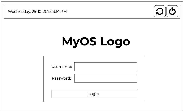
Figure 1.6 – A simple drawing depicting the login screen
- Go back to Qt Designer again.
- We will be placing the widgets at the top panel first, then the logo and the login form beneath it.
- Select the main window and change its width and height from
400and300to800and600, respectively – we’ll need a bigger space in which to place all the widgets. - Click and drag a label under the Display Widgets category from the Widget Box area to the form editor.
- Change the objectName property of the label to
currentDateTimeand change its text property to the current date and time for display purposes – for example,Wednesday, 25-10-20233:14 PM. - Click and drag
PushButtonunder the Buttons category to the form editor. Repeat this process once more because we have two buttons on the top panel. Rename the two buttonsrestartButtonandshutdownButton. - Select the main window and click the small icon button on the form toolbar that says Lay Out Vertically when you mouse over it. You will see that the widgets are automatically arranged on the main window, but that’s not exactly what we want yet.
- Click and drag a Horizontal Layout widget under the Layouts category to the main window.
- Click and drag the two push buttons and the text label into the horizontal layout. You will see the three widgets being arranged in a horizontal row, but vertically, they are located in the middle of the screen. The horizontal arrangement is almost correct, but the vertical position is off.
- Click and drag a Vertical Spacer widget from the Spacers category and place it beneath the Horizontal Layout widget we created in Step 9 (under the red rectangular outline). All the widgets will be pushed to the top by the spacer.
- Place a Horizontal Spacer widget between the text label and the two buttons to keep them apart. This will ensure the text label always sticks to the left and the buttons align to the right.
- Set both the Horizontal Policy and Vertical Policy properties of the two buttons to Fixed and set the minimumSize property to
55 x 55. Set the text property of the buttons to empty, as we will be using icons instead of text. We will learn how to place an icon in the button widgets in the Using resources in style sheets recipe. - Your UI should look similar to this:
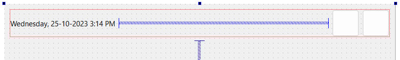
Figure 1.7 – Pushing apart the text and buttons using a horizontal spacer
Next, we will be adding the logo. Follow these steps:
- Add a Horizontal Layout widget between the top panel and a Vertical Spacer widget to serve as a container for the logo.
- After adding the Horizontal Layout widget, you will find that the layout is way too thin in height (almost zero height) for you to add any widgets to it. This is because the layout is empty and it’s being pushed by the vertical spacer under it into zero height. To solve this problem, we can set its vertical margin (either layoutTopMargin or layoutBottomMargin) to be temporarily bigger until a widget is added to the layout.
- Add a Label value to the Horizontal Layout widget that you just created and rename it
logo. We will learn more about how to insert an image into the label to use it as a logo in the Using resources in style sheets recipe. For now, just empty out the text property and set both its Horizontal Policy and Vertical Policy properties to Fixed. Set the minimumSize property to150x 150. - Set the vertical margin of the layout back to zero if you haven’t already done so.
- The logo will now appear to be invisible, so we will just place a temporary style sheet to make it visible until we add an image to it in the Using resources in style sheets recipe. The style sheet is really simple:
border: 1px solid;
Your UI should look similar to this:
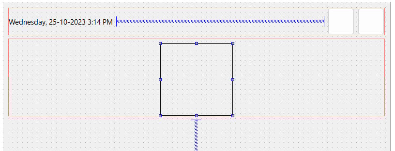
Figure 1.8 – Putting the placeholder logo in the middle
Now, let’s create the login form:
- Add a Horizontal Layout widget between the logo’s layout and the Vertical Spacer widget. Set the layoutTopMargin property to a large number (that is,
100) so that you can add a widget to it more easily. - Add a Vertical Layout widget inside the Horizontal Layout widget you just created. This layout will be used as a container for the login form. Set its layoutTopMargin property to a number lower than that of the horizontal layout (that is,
20) so that we can place widgets in it. - Right-click the Vertical Layout widget you just created and choose Morph into | QWidget. Here, Vertical Layout is converted into an empty widget. This step is essential because we will be adjusting the width and height of the container for the login form. A layout widget does not contain any properties for width and height, only margins, since a layout will expand toward the space surrounding it. This makes sense considering that it does not have any size properties. Once you have converted the layout into a
QWidgetobject, it will automatically inherit all the properties from the widget class, which means we can now adjust its size to suit our needs. - Rename the
QWidgetobject, which we just converted from the layout,loginFormand change both its Horizontal Policy and Vertical Policy properties to Fixed. Set the minimumSize parameter to350x 200. - Since we already placed the
loginFormwidget inside Horizontal Layout, we can set its layoutTopMargin property back to zero. - Add the same style sheet that you did for the logo to the
loginFormwidget to make it visible temporarily. However, this time, we need to add an ID selector in front so that it will only apply the style tologinFormand not its children widgets:#loginForm { border: 1px solid; }Your UI should look something like this:
Figure 1.9 – Constructing the frame for the login form
We are not done with the login form yet. Now that we have created the container for the login form, it’s time to put more widgets into the form:
- Place two horizontal layouts in the login form container. We need two layouts: one for the username field and another for the password field.
- Add Label and Line Edit properties to each of the layouts you just added. Change the text property of the upper label to
Username:and the one beneath toPassword:. Rename the two line edits tousernameandpassword, respectively. - Add a push button beneath the password layout and change its text property to
Login. Rename itloginButton. - You can add a Vertical Spacer widget between the password layout and the
Loginbutton to distance them slightly. After the Vertical Spacer widget has been placed, change its sizeType property to Fixed and change its Height property to5. - Select the
loginFormcontainer and set all its margins to35. This is to make the login form look better by adding some space to all its sides. - Set the Height property of the
Username,Password, andloginButtonwidgets to25so that they don’t look so cramped.Your UI should look something like this:
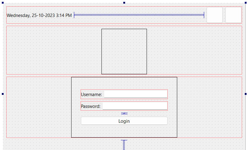
Figure 1.10 – Adding widgets to the login form
Note
Alternatively, you can use a grid layout for the Username and Password fields to keep their sizes uniform.
We’re not done yet! As you can see, the login form and the logo are both sticking to the top of the main window due to the Vertical Spacer widget beneath them. The logo and the login form should be placed at the center of the main window instead of the top. To fix this problem, follow these steps:
- Add another Vertical Spacer widget between the top panel and the logo’s layout. This will counter the spacer at the bottom to balance out the alignment.
- If you think that the logo is sticking too close to the login form, you can add a Vertical Spacer widget between the logo’s layout and the login form’s layout. Set its sizeType property to Fixed and its Height property to
10. - Right-click the top panel’s layout and choose Morph into | QWidget. Rename it
topPanel. The layout must be converted into QWidget because we cannot apply style sheets to a layout. This is because a layout doesn’t have any properties other than margins. - There is a little bit of a margin around the edges of the main window – we don’t want that. To remove the margins, select the centralWidget object from the Object Inspector window, which is right under the MainWindow panel, and set all the margin values to zero.
- Run the project by clicking the Run button (with the green arrow icon) to see what your program looks like. If everything goes well, you should see something like this:
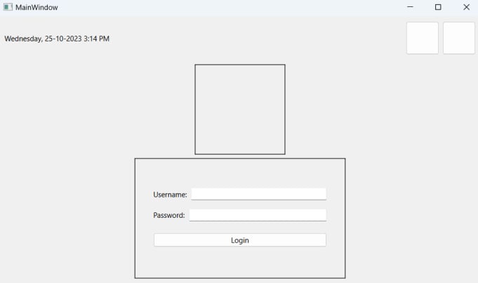
Figure 1.11 – We’re done with the layout – for now
- Now, let’s decorate the UI using style sheets! Since all the important widgets have been given object names, it’s easier for us to apply the style sheets to them from the main window since we will only write the style sheets to the main window and let them inherit down the hierarchy tree.
- Right-click on MainWindow from the Object Inspector area and choose Change styleSheet....
- Add the following code to the style sheet:
#centralWidget { background: rgba(32, 80, 96, 100); } - The background of the main window will change color. We will learn how to use an image for the background in the Using resources in style sheets recipe. So, the color is just temporary.
- In Qt, if you want to apply styles to the main window itself, you must apply them to its centralWidget widget instead of the main window since the window is just a container.
- Add a nice gradient color to the top panel:
#topPanel { background-color: qlineargradient(spread:reflect, x1:0.5, y1:0, x2:0, y2:0, stop:0 rgba(91, 204, 233, 100), stop:1 rgba(32, 80, 96, 100)); } - Apply the black color to the login form and make it look semi-transparent. We will also make the corners of the login form container slightly rounded by setting the
border-radiusproperty:#loginForm { background: rgba(0, 0, 0, 80); border-radius: 8px; } - Apply styles to the general types of widgets:
QLabel { color: white; } QLineEdit { border-radius: 3px; } - The preceding style sheets will change all the labels’ texts to a white color; this includes the text on the widgets as well because, internally, Qt uses the same type of label on the widgets that have text on them. Also, we made the corners of the line edit widgets slightly rounded.
- Apply style sheets to all the push buttons on our UI:
QPushButton { color: white; background-color: #27a9e3; border-width: 0px; border-radius: 3px; } - The preceding style sheet changes the text of all the buttons to a white color, then sets its background color to blue, and makes its corners slightly rounded.
- To push things even further, we will make it so that the color of the push buttons changes when we mouse over it by using the
hoverkeyword:QPushButton:hover { background-color: #66c011; } - The preceding style sheet will change the background color of the push buttons to green when we mouse over them. We will talk more about this in the Customizing properties and sub-controls recipe.
- You can further adjust the size and margins of the widgets to make them look even better. Remember to remove the border line of the login form by removing the style sheet that we applied directly to it in step 6.
- Your login screen should look something like this:
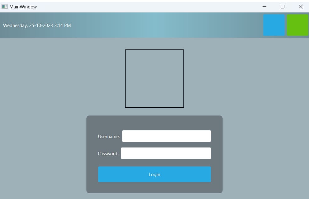
Figure 1.12 – Applying colors and styles to the widgets
How it works…
This example focused more on the layout system of Qt. Qt’s layout system allows our application GUI to automatically arrange itself within the given space by arranging the children objects of each widget. The spacer items that we used in this recipe help push the widgets contained in a layout outward to create spacing along the width of the spacer item.
To locate a widget in the middle of the layout, we must put two spacer items into the layout: one on the left-hand side of the widget and one on the right-hand side of the widget. The widget will then be pushed to the middle of the layout by the two spacers.