In this example, we will learn how to change the look and feel of our program and make it look more professional by using style sheets and resources. Qt allows you to decorate your graphical user interfaces (GUIs) using a style sheet language called Qt Style Sheets, which is very similar to Cascading Style Sheets (CSS), something that’s used by web designers to decorate their websites.
How to do it...
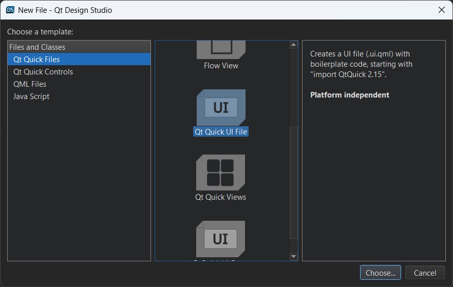
Let’s get started by learning how to create a new project and get ourselves familiar with Qt Designer:
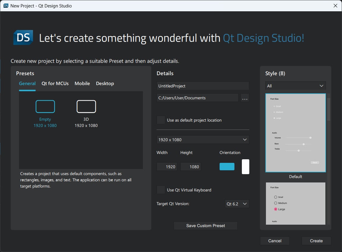
- Open up Qt Creator and create a new project. If this is the first time you have used Qt Creator, you can either click the big button, which reads Create Project…, or simply go to File | New Project….
- Select Application (Qt) from the Projects window and select Qt Widgets Application.
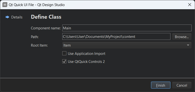
- Click the Choose... button at the bottom. A window will pop out and ask you to insert the project’s name and its location.
- Click Next several times, then click the Finish button to create the project. We will stick with the default settings for now. Once the project has been created, the first thing you will see is a panel with tons of big icons on the left-hand side of the window, which is called the mode selector panel; we will discuss this in more detail in the Dissecting Qt Designer recipe.
- You will see all your source files listed on the sidebar panel, which is located next to the mode selector panel. This is where you can select which file you want to edit. In this case, this is
mainwindow.ui, because we are about to start designing the program’s UI.
- Double-click the
mainwindow.ui file; you will see an entirely different interface appear out of nowhere. Qt Creator helped you switch from the script editor to the UI editor (Qt Designer) because it detected the .ui extension on the file you’re trying to open.
- You will also notice that the highlighted button on the mode selector panel has changed from Edit to Design. You can switch back to the script editor or change to any other tools by clicking one of the buttons located in the upper half of the mode selector panel.
- Let’s go back to Qt Designer and look at the
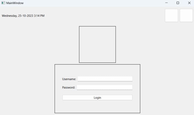
mainwindow.ui file. This is the main window of our program (as the filename implies) and it’s empty by default, without any widget on it. You can try to compile and run the program by pressing the Run button (the green arrow button) at the bottom of the mode selector panel; you will see an empty window pop up once the compilation is complete.
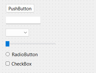
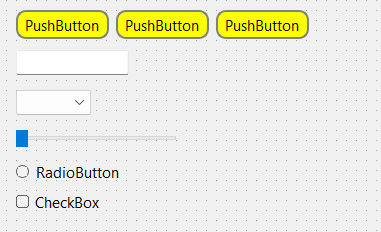
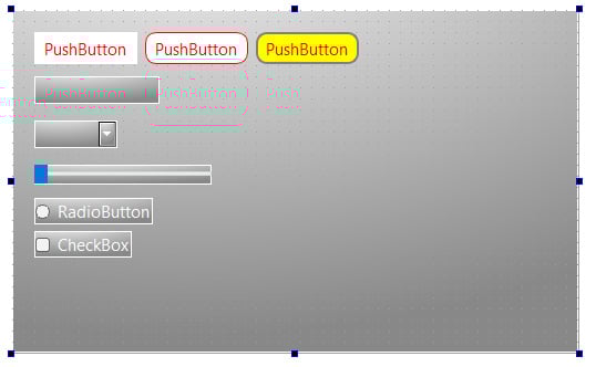
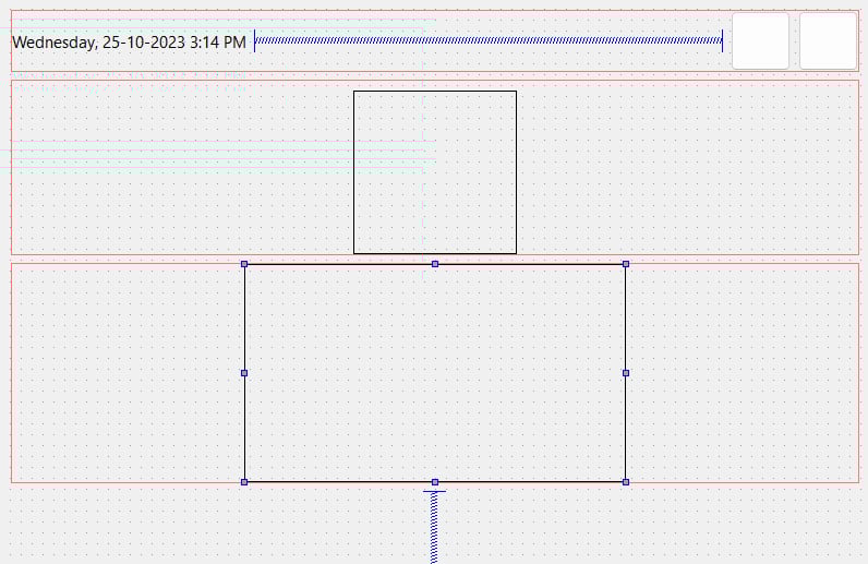
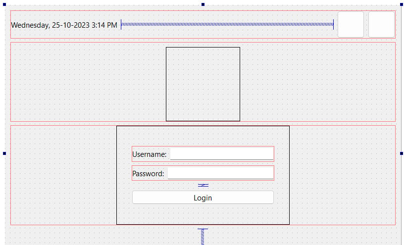
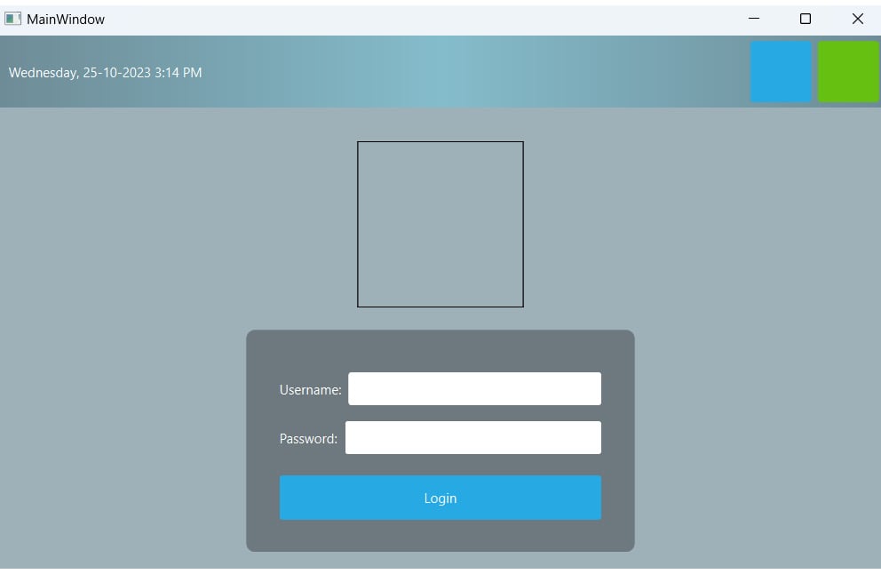
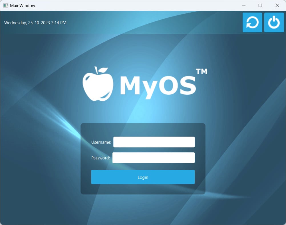
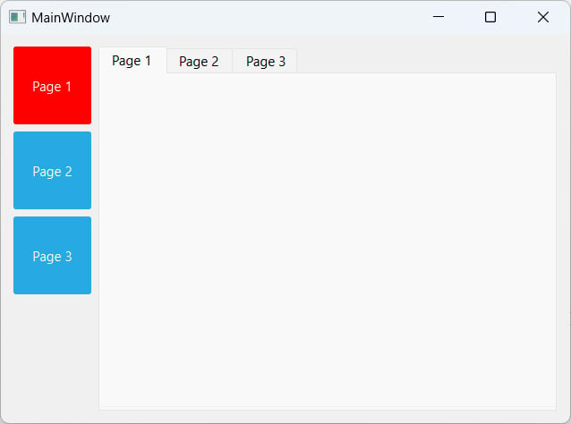
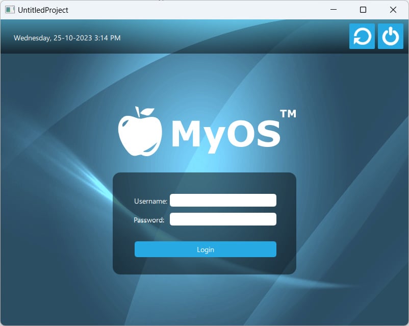
- Let’s add a push button to our program’s UI by clicking on the Push Button item in the Widget Box area (under the Buttons category) and dragging it to our main window in the form editor. Keep the push button selected; you will see all the properties of this button inside the Property Editor area on the right-hand side of your window. Scroll down to the middle and look for a property called styleSheet. This is where you will apply styles to your widget, which may or may not be inherited from its children or grandchildren recursively, depending on how you set your style sheet. Alternatively, you can right-click on any widget in your UI at the form editor and select Change styleSheet... from the pop-up menu.
- You can click on the input field of the styleSheet property to directly write the style sheet code, or click on the … button beside the input field to open up the Edit Style Sheet window, which has a bigger space for writing longer code for style sheets. At the top of the window, you can find several buttons, such as Add Resource, Add Gradient, Add Color, and Add Font, that can help you kickstart your coding if you can’t remember the properties’ names. Let’s try to do some simple styling with the Edit Style Sheet window.
- Click Add Color and choose a color.
- Pick a random color from the color picker window – let’s say, a pure red color. Then, click OK.
- A line of code has been added to the text field in the Edit Style Sheet window, which in my case is as follows:
color: rgb(255, 0, 0);
- Click the OK button; the text on your push button should change to red.
How it works...
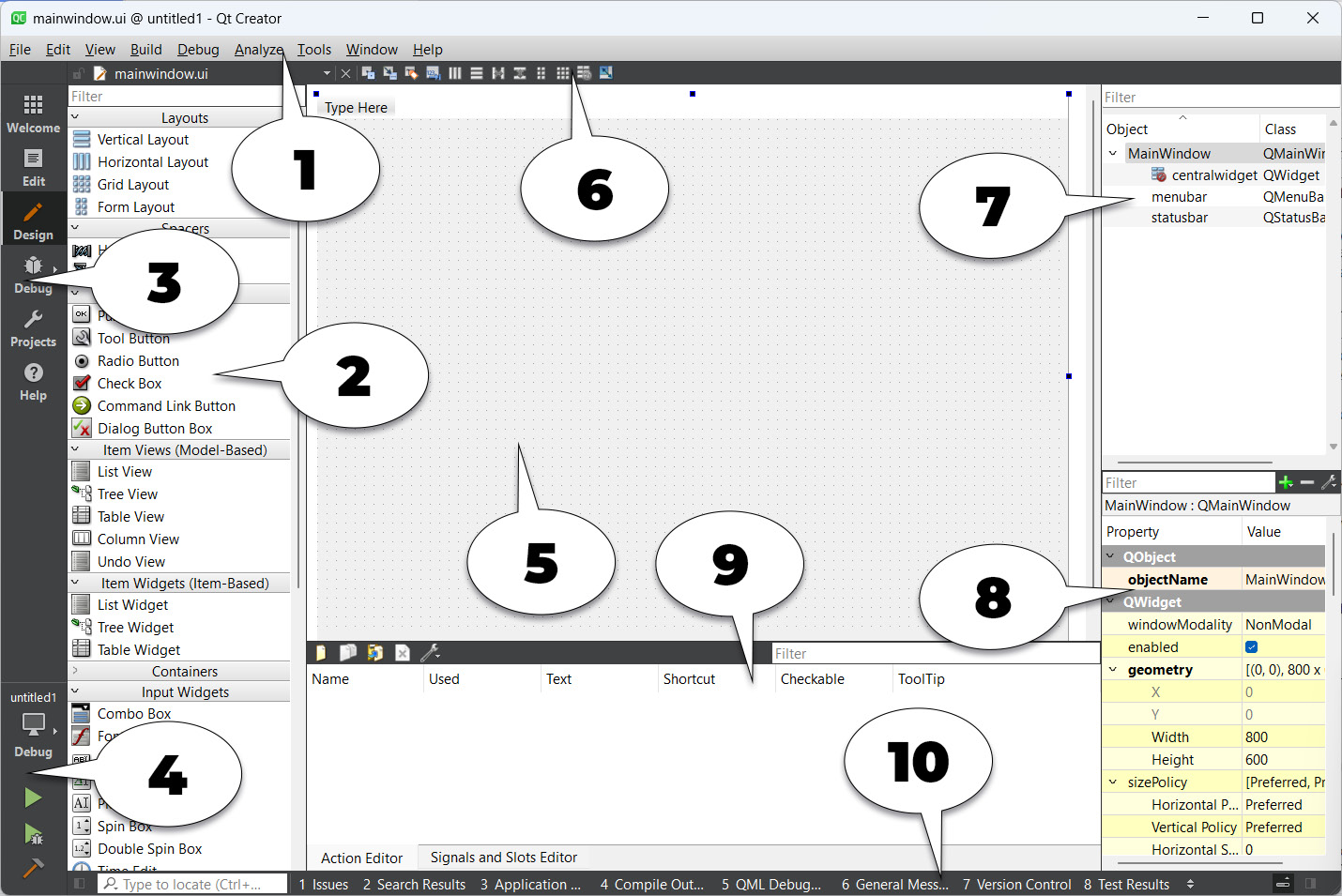
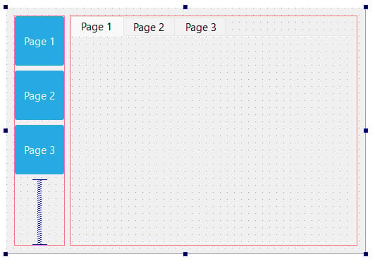
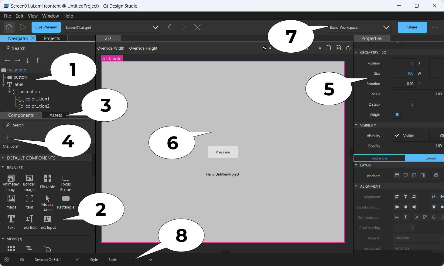
Let’s take a bit of time to get familiar with Qt Designer’s interface before we start learning how to design our own UI:
Figure 1.1 – Overview of Qt Designer’s interface
The explanation for the preceding screenshot is as follows:
- Menu bar: The menu bar houses application-specific menus that provide easy access to essential functions, such as creating new projects, saving files, undoing, redoing, copying, and pasting. It also allows you to access development tools that come with Qt Creator, such as the compiler, debugger, and profiler.
- Widget Box: This is where you can find all the different types of widgets provided by Qt Designer. You can add a widget to your program’s UI by clicking one of the widgets from the Widget Box area and dragging it to the form editor.
- Mode selector: The mode selector is a side panel that places shortcut buttons for easy access to different tools. You can quickly switch between the script editor and form editor by clicking the Edit or Design button on the mode selector panel, which is very useful for multitasking. You can also easily navigate to the debugger and profiler tools at the same speed and manner.
- Build shortcuts: The build shortcuts are located at the bottom of the mode selector panel. You can build, run, and debug your project easily by pressing the shortcut buttons here.
- Form editor: The form editor is where you edit your program’s UI. You can add different widgets to your program by selecting a widget from the Widget Box area and dragging it to the form editor.
- Form toolbar: From here, you can quickly select a different form to edit. Click the drop-down box located at the top of the Widget Box area and select the file you want to open with Qt Designer. Beside the drop-down box are buttons to switch between the different modes of the form editor, and also buttons to change the layout of your UI.
- Object Inspector: The Object Inspector area lists all the widgets within your current
.ui file. All the widgets are arranged according to their parent-child relationship in the hierarchy. You can select a widget from the Object Inspector area to display its properties in the Property Editor area.
- Property Editor: The Property Editor area will display all the properties of the widget you selected from either the Object Inspector area or the form editor window.
- Action Editor and Signals & Slots Editor: This window contains two editors: Action Editor and Signals & Slots Editor. Both can be accessed from the tabs beneath the window. Action Editor is where you create actions that can be added to a menu bar or toolbar in your program’s UI.
- Output panes: Output panes consist of several different windows that display information and output messages related to script compilation and debugging. You can switch between different output panes by pressing the buttons that carry a number before them, such as 1 Issues, 2 Search Results, or 3 Application Output.
There’s more...
In this recipe, we discussed how to apply style sheets to Qt widgets through C++ coding. Although that method works well, most of the time, the person who is in charge of designing the program’s UI is not the programmer, but rather a UI designer who specializes in designing user-friendly UI. In this case, it’s better to let the UI designer design the program’s layout and style sheet with a different tool and not mess around with the code. Qt provides an all-in-one editor called Qt Creator.
Qt Creator consists of several different tools, such as a script editor, compiler, debugger, profiler, and UI editor. The UI editor, which is also called Qt Designer, is the perfect tool for designers to design their program’s UI without writing any code. This is because Qt Designer adopted the what you see is what you get approach by providing an accurate visual representation of the final result, which means whatever you design with Qt Designer will turn out the same visually when the program is compiled and run.
The similarities between Qt Style Sheets and CSS are as follows:
As you can see, both of them contain a selector and a declaration block. Each declaration contains a property and a value, separated by a colon. In Qt, a style sheet can be applied to a single widget by calling the QObject::setStyleSheet() function in C++ code.
Consider the following, for example:
myPushButton->setStyleSheet("color : blue"); The preceding code will turn the text of a button with the myPushButton variable name to blue. You can achieve the same result by writing the declaration in the style sheet property field in Qt Designer. We will discuss Qt Designer more in the Customizing basic style sheets recipe.
Qt Style Sheets also supports all the different types of selectors defined in the CSS2 standard, including the universal selector, type selector, class selector, and ID selector, which allows us to apply styling to a very specific individual widget or group of widgets. For instance, if we want to change the background color of a specific line-edit widget with the usernameEdit object name, we can do this by using an ID selector to refer to it:
QLineEdit#usernameEdit { background-color: blue }
Note
To learn about all the selectors available in CSS2 (which are also supported by Qt Style Sheets), please refer to this document: http://www.w3.org/TR/REC-CSS2/selector.html.
 Argentina
 Australia
 Austria
 Belgium
 Brazil
 Bulgaria
 Canada
 Chile
Chile
 Colombia
 Cyprus
 Czechia
 Denmark
 Ecuador
 Egypt
Egypt
 Estonia
 Finland
 France
 Germany
 Great Britain
 Greece
 Hungary
 India
India
 Indonesia
 Ireland
 Italy
Italy
 Japan
Japan
 Latvia
 Lithuania
 Luxembourg
 Malaysia
 Malta
Malta
 Mexico
 Netherlands
 New Zealand
 Norway
 Philippines
 Poland
 Portugal
 Romania
 Russia
 Singapore
 Slovakia
 Slovenia
 South Africa
 South Korea
 Spain
Spain
 Sweden
 Switzerland
 Taiwan
 Thailand
 Turkey
 Ukraine
 United States


 Filter