Reader small image

You're reading from  Building Interactive Dashboards in Microsoft 365 Excel

Product typeBook
Published inFeb 2024
PublisherPackt
ISBN-139781803237299
Edition1st Edition
Tools
Right arrow
Author (1)
Michael Olafusi
Michael Olafusi
author image
Michael Olafusi

Michael Olafusi is a 9x Microsoft Most Valuable Professional (MVP) and a business intelligence consultant. He is the lead consultant and founder of MHS Analytics Inc. in Canada and UrBizEdge Limited. He has been consulting for clients across North America, Europe, and Africa on data analysis, business intelligence, and financial modeling for the past 10 years. Outside of his consulting business, he is a member of Rotary and the Southern Cruisers Riding Club (SCRC) Chapter 373. He is a proud member of the Canadian Red Cross friendly calls volunteer team. He is also a faculty member at WorldQuant University, USA.
Read more about Michael Olafusi

Right arrow

Perfecting the Dashboard

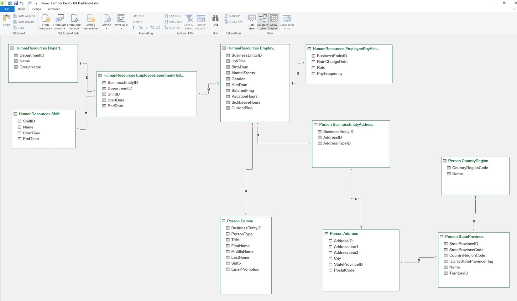
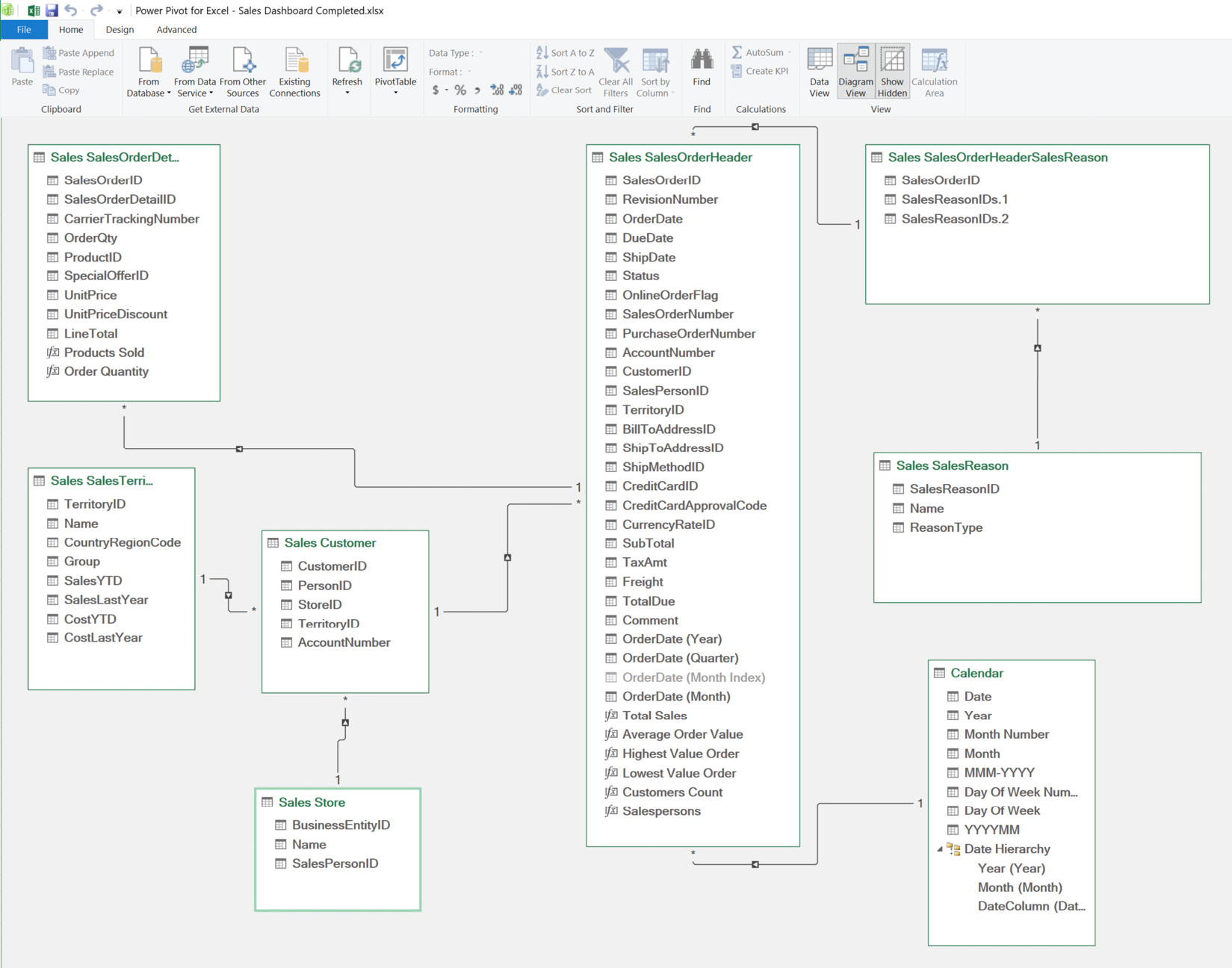
Great job on the progress you have made so far. In the previous chapter, we were introduced to Adventure Works Cycle Limited (AWCL) and explored the company’s dataset across human resources, sales, production, and procurement. We built a data model and put into practice our Power Query knowledge in ingesting and transforming data.

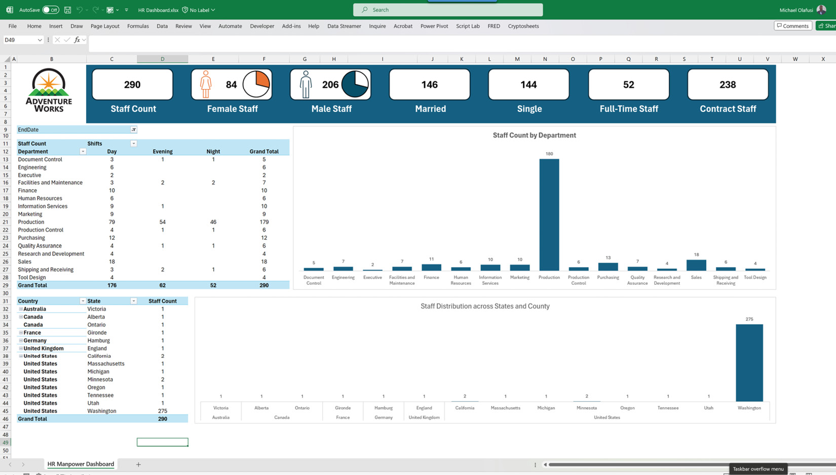
In this chapter, we will build on that progress and build three dashboards, putting to use our knowledge of data visualization tools, such as charts, slicers, and shapes, to create interactive and visually engaging dashboards.

Here’s a breakdown of what we will cover in this chapter:

  • Building the human resources (HR) manpower dashboard
  • Building the sales performance dashboard
  • Building the supply chain inventory dashboard

This is going to be a very exciting chapter as we put together all we have learned from the previous chapters to achieve beautiful and neatly developed dashboards. We will...

Building the HR manpower dashboard

We will pick up from where we left off in the previous chapter when we built the data model, like the one in the following screenshot:

Figure 11.1 – An overview of the HR dashboard data model

Figure 11.1 – An overview of the HR dashboard data model

We are going to build an HR manpower dashboard that will look like the one in the following screenshot:

Figure 11.2 – An overview of a snapshot of the dashboard to be built

Figure 11.2 – An overview of a snapshot of the dashboard to be built

To build this dashboard, we will use the following components in Excel:

  • A PivotTable to generate the interactive tables
  • A PivotChart to create two column charts in the dashboard
  • Insert a picture to add the company logo
  • Shapes and icons to create single-value cards at the top of the dashboard

By the time we have finished building the dashboard, you will get to experience the power that having a proper data model puts in your hands, building beautiful interactive dashboards without using complex...

Building the sales performance dashboard

We will build on the data model we created in the previous chapter for the sales dashboard, and you can see what it looks like in the following screenshot:

Figure 11.14 – An overview of the sales dashboard data model

Figure 11.14 – An overview of the sales dashboard data model

We will take the steps we followed in creating the HR dashboard – inserting PivotTables, inserting PivotCharts, and inserting illustrations (pictures and shapes). However, in addition to those steps, we will insert slicers, insert a timeline, and create calculation measures. So, this will involve more steps than the HR dashboard, and you will enjoy taking these new steps, as they will empower you with the knowledge to create very robust dashboards that meet business decision makers’ needs.

We will start by creating the calculation measures.

Creating measures

Measures are formulas you create within a table in Power Pivot to output one result for the entire table. They are...

Building the supply chain inventory dashboard

We will reuse the steps and what we learned from building the other two dashboards, so I won’t do an elaborate repetition of what I already explained in previous paragraphs. The data model for the supply chain dashboard we built in the previous chapter is shown in the following screenshot:

Figure 11.24 – An overview of the supply chain dashboard data model

Figure 11.24 – An overview of the supply chain dashboard data model

To achieve the dashboard we want, we will start by creating seven measures – six in the Production ProductInventory table and one in the Production Product table. The measures are listed as follows:

  • Products:=DISTINCTCOUNTNOBLANK('Production ProductInventory'[ProductID]) to get the total count of products in the company’s warehouses
  • In Stock:=CALCULATE(DISTINCTCOUNTNOBLANK('Production ProductInventory'[ProductID]),'Production ProductInventory'[Stock Status]="In Stock") to get...

Summary

This has been an exciting and fully hands-on chapter. I hope you practiced the dashboard building by yourself and are now brimming with confidence in your dashboard-building skills.

Together, we have built three different dashboards and used all the common tools (PivotTables, PivotCharts, slicers, shapes, and icons) that you’ll end up using as you build real-world, business-relevant dashboards.

The next chapter is the last one in this book and will cover the best practices to follow in carrying out real-world dashboard-building tasks.

Again, congratulations on making it this far, and see you in the next chapter!

lock icon
The rest of the chapter is locked
You have been reading a chapter from
Building Interactive Dashboards in Microsoft 365 Excel
Published in: Feb 2024Publisher: PacktISBN-13: 9781803237299
Register for a free Packt account to unlock a world of extra content!
A free Packt account unlocks extra newsletters, articles, discounted offers, and much more. Start advancing your knowledge today.
undefined
Unlock this book and the full library FREE for 7 days
Get unlimited access to 7000+ expert-authored eBooks and videos courses covering every tech area you can think of
Renews at $15.99/month. Cancel anytime

Author (1)

author image
Michael Olafusi

Michael Olafusi is a 9x Microsoft Most Valuable Professional (MVP) and a business intelligence consultant. He is the lead consultant and founder of MHS Analytics Inc. in Canada and UrBizEdge Limited. He has been consulting for clients across North America, Europe, and Africa on data analysis, business intelligence, and financial modeling for the past 10 years. Outside of his consulting business, he is a member of Rotary and the Southern Cruisers Riding Club (SCRC) Chapter 373. He is a proud member of the Canadian Red Cross friendly calls volunteer team. He is also a faculty member at WorldQuant University, USA.
Read more about Michael Olafusi