Search icon
Arrow left icon
All Products
Best Sellers
New Releases
Books
Videos
Audiobooks
Learning Hub
Newsletters
Free Learning
Arrow right icon
Building Interactive Dashboards in Microsoft 365 Excel

You're reading from  Building Interactive Dashboards in Microsoft 365 Excel

Product type Book
Published in Feb 2024
Publisher Packt
ISBN-13 9781803237299
Pages 420 pages
Edition 1st Edition
Languages
Author (1):
Michael Olafusi Michael Olafusi
Profile icon Michael Olafusi

Table of Contents (18) Chapters

Preface Part 1 – Dashboards and Reports in Modern Excel
Chapter 1: Dashboards, Reports, and M365 Excel Chapter 2: Common Dashboards in Lsarge Companies Part 2 – Keeping Your Eyes on Automation
Chapter 3: The Importance of Connecting Directly to the Primary Data Sources Chapter 4: Power Query: the Ultimate Data Transformation Tool Chapter 5: PivotTable and Power Pivot Chapter 6: Must-Know Legacy Excel Functions Chapter 7: Dynamic Array Functions and Lambda Functions Part 3 – Getting the Visualization Right
Chapter 8: Getting Comfortable with the 19 Excel Charts Chapter 9: Non-Chart Visuals Chapter 10: Setting Up the Dashboard's Data Model Chapter 11: Perfecting the Dashboard Chapter 12: Best Practices for Real-World Dashboard Building Index Other Books You May Enjoy

Non-Chart Visuals

Most people think only of charts when it comes to visualizations in Excel. Charts are not the only tool for creating visualizations in Excel, as there are over six other tools that help you visualize data in Excel.

In this chapter, we will explore these non-chart visuals. Some can be dynamically linked to values in Excel sheets. A few are multi-functional and are not primarily seen as visualization tools. We will do an exploration of these tools and get you comfortable with creatively using them in your reports and dashboards.

The main broad categories we will explore in this chapter are as follows:

  • Conditional Formatting
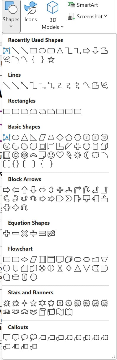
  • Shapes
  • SmartArt
  • Sparkline
  • Images
  • Symbols

More importantly, we will need to draw on some creativity. Even boring text can be used to create visuals as evidenced by the following text terminal image of the first Power BI logo:

Figure 9.1 – Text used to draw the old Power BI logo

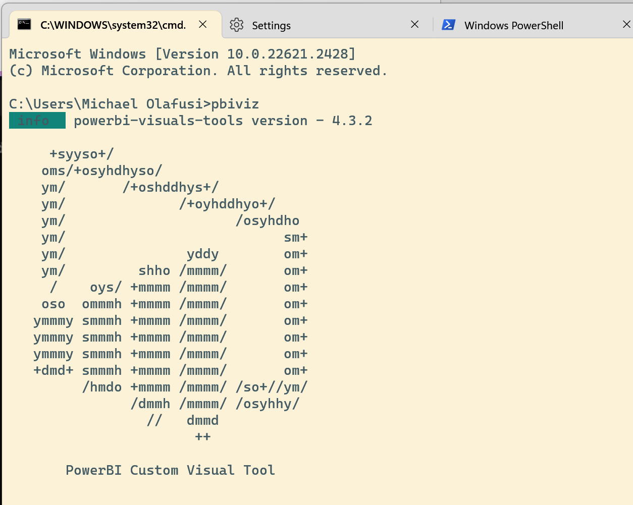
Figure 9.1 – Text used to draw the old Power BI...

Conditional formatting

Conditional formatting is the use of logical rules to set the format for a cell or range of cells in Excel. With conditional formatting, you can set the cell value display format, font settings, border settings, and fill settings.

The following screenshot shows the format settings pane for the cell value. Notice that you can set the display for number, date, and text values:

Figure 9.2 – Value display format pane

Figure 9.2 – Value display format pane

From the Font settings pane, you can set the Font type, Font style, Size, Color, Underline, Strikethrough, Superscript, and Subscript. See the following screenshot for the Font settings pane:

Figure 9.3 – Font settings pane

Figure 9.3 – Font settings pane

There are also border settings that make it possible to create dynamically expanding or contracting borders, and different border types based on cell values. The following screenshot shows the Border settings pane:

Figure 9.4 – Border settings pane

Figure 9.4 &...

Shapes

Shapes can be found under the Insert menu in Excel. They are another interesting way to visually present insights in Excel. Shapes have been in Excel for decades and are currently broadly categorized as lines, rectangles, basic shapes, block arrows, equation shapes, flowcharts, stars and banners, and callouts. The following screenshot shows the categories:

Figure 9.24 – Shape categories in Excel

Figure 9.24 – Shape categories in Excel

There are two general ways of using shapes for visualization in Excel. The first is to have the shape linked to a cell, and the second is to use the shape to organize other objects to achieve a visually engaging outlook.

We will demonstrate how to link a shape to a cell so that the shape reflects the value in that cell. We start by inserting a rectangle, changing the default fill color and outline to a more visually pleasing one, and positioning it where we want. Then we click on the shape, click inside the formula bar, hit = on the keyboard, and...

Summary

In this chapter, you have learned how to use conditional formatting, shapes, SmartArt, sparklines, images, and symbols as visualization tools. They are all important tools in a competent dashboard builder’s toolbox, and you will see your reports look more professional as you put them to use.

This chapter on non-chart visuals brings us closer to the end of this book on Building Interactive Dashboards in M365 Excel & Excel 2021. We have covered all the technical pieces that go into a dashboard in Excel. In the next and last three chapters, we will combine all we have learned so far to set up a dashboard layout, perfect the data model behind the dashboard, and complete a company-wide dashboard for a retail company. Exciting, right?

In the next chapter, we will begin the end of our journey by going through how to set up a dashboard layout. See you in the next chapter!

lock icon The rest of the chapter is locked
You have been reading a chapter from
Building Interactive Dashboards in Microsoft 365 Excel
Published in: Feb 2024 Publisher: Packt ISBN-13: 9781803237299
Register for a free Packt account to unlock a world of extra content!
A free Packt account unlocks extra newsletters, articles, discounted offers, and much more. Start advancing your knowledge today.
Unlock this book and the full library FREE for 7 days
Get unlimited access to 7000+ expert-authored eBooks and videos courses covering every tech area you can think of
Renews at $15.99/month. Cancel anytime}