


Line chart
A line chart shows trends – how a metric performs over a date/time range. It is, perhaps, the second most used chart after the column chart. It’s the same process you’re already familiar with for creating column and bar charts. It also has the clustered, stacked, and 100% stacked options. Figure 8.16 shows an example of a line chart to visualize yearly sales for a company:
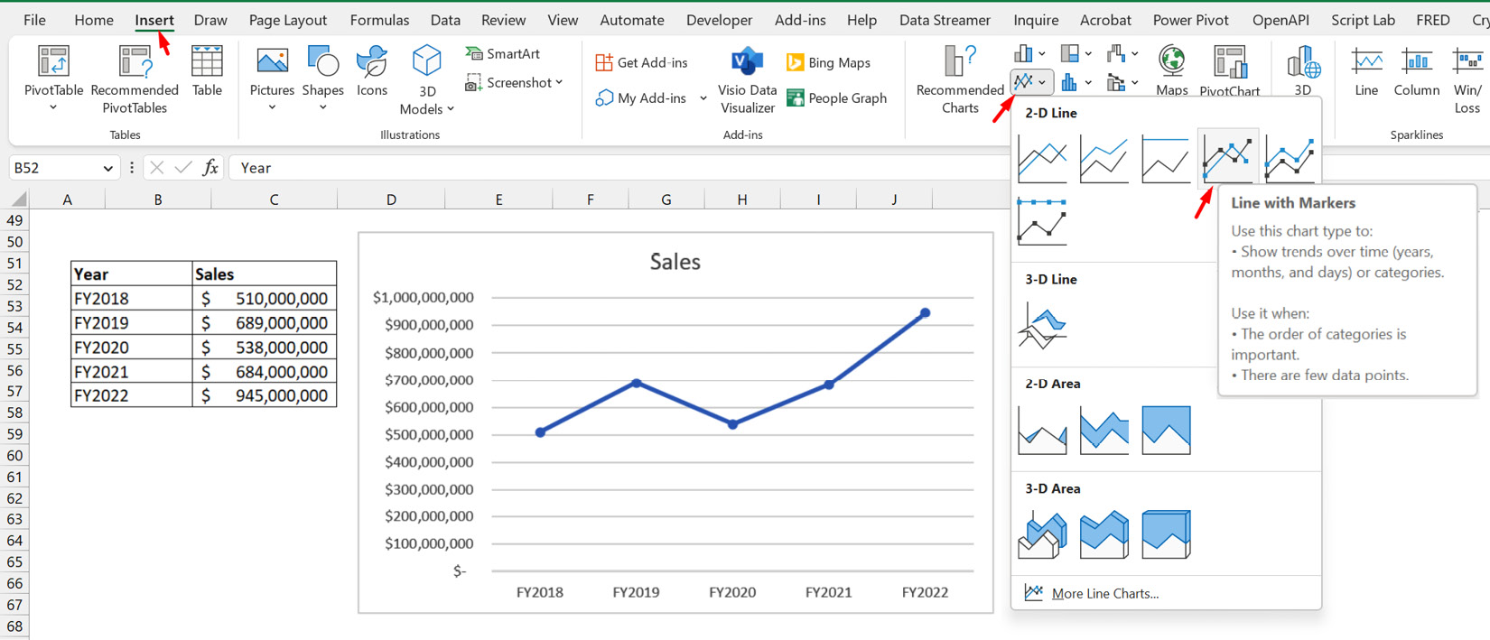
Figure 8.16 – Line chart of yearly sales
You will notice that, in addition to a plain line chart option, there’s a Line with Markers option. We have selected the clustered line with markers option for the chart in Figure 8.16.
Something to note about the line chart is that the trendline chart element display option it has can be more relevant than in the column and bar charts. Trendlines are meaningful for seeing the general trend of performance over time, so it is naturally relevant for line charts that already show the performance of...


