


Choosing the appropriate visual
As I mentioned in previous chapters, one of the skills every analyst should master is the ability to communicate through data. Within Power BI, we have a myriad of visual objects and charts that can help make storytelling much more effective. However, the success of effective communication will depend on the type of visual object you choose to display the results.
Firstly, Power BI provides a default list of visual objects that you can use in your report. However, you can also add elements from the Get more visuals option located in the highlighted area of Figure 8.10:
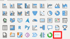
Figure 8.10: Power BI default visuals
A solid understanding of each chart and its usage is crucial for a data analyst. Many companies take this matter seriously, and questions about this topic may arise during the interview process. So, keep this in mind and be well-prepared.
Bar charts
Bar charts are the most effective way to visually represent comparisons...