Reader small image

You're reading from  The Complete Power BI Interview Guide

Product typeBook
Published inApr 2024
Reading LevelIntermediate
PublisherPackt
ISBN-139781805120674
Edition1st Edition
Languages
Right arrow
Authors (3):
Sandielly Ortega Polanco
author image
Sandielly Ortega Polanco

Sandielly Ortega is a data enthusiast and Business Intelligence advocate, he combines programming expertise with Power BI proficiency to drive data-driven decision-making. With over 8 years of experience, he empowers businesses in various sectors, including hospitality and supply chain. Sandielly is also a content creator on YouTube, a speaker, and resides in Puerto Plata, Dominican Republic, with his family.
Read more about Sandielly Ortega Polanco

Gogula Aryalingam
Gogula Aryalingam
author image
Gogula Aryalingam

Gogula Aryalingam has 18+ years of global experience in data analytics and business intelligence, Gogula is a data & AI architect at Fortude. He holds multiple Microsoft MVP awards and certifications, contributing significantly to the development of database and analytics certifications for Microsoft. Gogula is also an author and technical writer for various publications.
Read more about Gogula Aryalingam

Abu Bakar Nisar Alvi
author image
Abu Bakar Nisar Alvi

Abu Bakar N. Alvi is a seasoned Product Manager and Project Management Professional with 23+ years of industry experience, Abu Bakar excels in leading cross-functional teams. Holding degrees in Computer Engineering and Satellite Communications, he's a Senior Digital Consultant and Microsoft Certified Trainer. Abu Bakar has earned global certifications, including recognition from the Government of Pakistan.
Read more about Abu Bakar Nisar Alvi

View More author details
Right arrow

Expert Report Building

Now that you have the fundamentals of data analysis expressions (DAX), it’s time for you to start translating the language of data into actionable information through charts or visual objects, as they are commonly referred to in Power BI. Mastering the creation of reports and their interaction with users is a fundamental skill for today’s data analyst. Remember that among all the phases of data analysis, this is the only one the end user interacts with. Moreover, many job postings commonly include requirements such as designing Power BI dashboards/reports or data analysis and reporting skills, so having this skill on your list only adds value and increases your chances of acing the job interview.

This chapter will teach you the fundamental aspects to consider when creating a Power BI report or dashboard. These are the topics that we will cover in this chapter:

  • Best practices before adding your first visual
  • Choosing the appropriate...

Technical requirements

Best practices before adding your first visual

Just as painters prepare their tools before making their first brushstroke, you must also prepare your report before adding your first visual object. In this section, I will show you some things to consider before creating your report in Power BI.

In Power BI, when we talk about visuals, we are referring to any graphical component inside the report that helps us visualize the data. These can be bar charts, cards, or simple text with information. These visuals try to translate our findings and analytics into useful information for the user; however, before adding your first visual, it’s good to consider some essential settings for your report.

Note

Remember that visual objects in Power BI refer to the charts in which we will display the information.

Once you have downloaded the sample .pbix file and installed Power BI Desktop on your computer, it should appear as follows when you open the document:

Figure 8.1: Power BI Desktop version May 2023 ...

Choosing the appropriate visual

As I mentioned in previous chapters, one of the skills every analyst should master is the ability to communicate through data. Within Power BI, we have a myriad of visual objects and charts that can help make storytelling much more effective. However, the success of effective communication will depend on the type of visual object you choose to display the results.

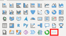
Firstly, Power BI provides a default list of visual objects that you can use in your report. However, you can also add elements from the Get more visuals option located in the highlighted area of Figure 8.10:

Figure 8.10: Power BI default visuals

Figure 8.10: Power BI default visuals

A solid understanding of each chart and its usage is crucial for a data analyst. Many companies take this matter seriously, and questions about this topic may arise during the interview process. So, keep this in mind and be well-prepared.

Bar charts

Bar charts are the most effective way to visually represent comparisons...

AI-powered visuals

In addition to the conventional charts you saw earlier, certain charts leverage artificial intelligence (AI) to display the data you want. Let’s take a look at these one by one.

Key influencers

The key influencers chart is a visual object that allows you to identify variables that significantly impact a specific measure within your data. This chart also leverages machine learning techniques to determine which variables are correlated with the measure you want to evaluate.

Figure 8.24 illustrates a key influencers chart:

Figure 8.24: Power BI key influencers visual

Figure 8.24: Power BI key influencers visual

Here’s a list of components of key influencers charts, in the order of numbers placed on the preceding figure:

  1. Tabs: Use the tabs to switch between different views. The Key influencers tab shows you the main factors that contribute to a specific metric. The Top segments tab shows you the important groups that affect the metric. A segment is a...

Conditional formatting

In Power BI, you can apply formatting to each visual object, which can be conditioned by a measure, a rule, or a field value that you pass to it. The formatting options will depend on the type of visual object you are using.

For example, consider the table shown in Figure 8.29. It displays a list of average ratings given by users to Airbnb apartments in different neighborhoods of New York City. You can apply conditional formatting to this table to highlight neighborhoods whose rating exceeds 4.6.

Figure 8.29: Power BI table with average ratings by neighborhood

Figure 8.29: Power BI table with average ratings by neighborhood

To apply such formatting, you need to select the visual object and click on the Format visual pane located in the Visualizations section. Then, expand the Cell elements menu. Here, you will find a menu divided into two groups. The first group allows you to choose the indicators added in the columns to which you want to apply the formatting. Then, you have different conditional...

Slicing and filtering

Having solid knowledge about the way Power BI slices and dices data points will raise your technical level, give you more weapons to master any interview, and enrich your professional profile as an analyst. This has relevance because, in many cases, the reports are simply a surface where users slice and dice the data until they get what they ask in the report.

One feature that has brought Power BI to its current level is the ability to dynamically apply filters and see the resulting cross-filtered information. In Power BI, you can apply filters in two ways: from the Filter pane or a slicer.

Power BI slicers

The slicer is one of the visual objects that Power BI includes by default. With it, you can apply filters to your report’s visual objects. It can appear in various forms depending on the type of data it contains. For example, if you add a Date field, you can access a list of filtering styles, as shown on the right in Figure 8.33.

Each of...

Configuring visual tooltips

When space is limited in your report, a useful add-on is tooltips. Tooltips allow you to display additional information when you hover over a specific part of the visual object, as seen in Figure 8.39.

Figure 8.39: Power BI default tooltip

Figure 8.39: Power BI default tooltip

There are three types of tooltips available in Power BI:

  • Default tooltip: When you add a visual object such as a bar chart, as shown in Figure 8.39, and hover over one of the bars, you will see a tooltip displaying information about that specific dimension.
  • Modern tooltip: This is an enhanced version of the default tooltip. In this tooltip, you have more formatting options and access to Drill-down and Drill-through buttons.
  • Page tooltip: This type of tooltip is versatile. With it, you can configure an entire page to be used as a tooltip for a visual object, as shown in the following figure:
Figure 8.40: Power BI page tooltip

Figure 8.40: Power BI page tooltip

Although tooltips...

Adding bookmarks

Esthetics is a crucial aspect that you always take care of in Power BI. A good combination of colors will make your report stand out. However, as data analysts, you aim to make your reports resemble and provide a similar experience to a web application. One of the elements that help us achieve this goal is bookmarks.

Bookmarks in Power BI store your page’s state and its visual elements. This allows you to switch between these states using bookmarks. In other words, you can dynamically show or hide any element within your report, or even save the state of multiple filters and access them when needed.

To create a bookmark, you first need to have the Bookmarks pane visible. You can enable it from the View menu by selecting Bookmarks. Then, you can click on Add and automatically create a bookmark with the current status of the visual elements.

Note

Make sure you have the status of your charts as you want them before creating the bookmark.

Once you...

Using Drill-through

Usually, the information displayed in Power BI reports is aggregated and summarized, often to show more information and provide a global context of what is being presented. However, some users may require a deeper level of detail within the report that allows them to delve further into the data.

To achieve that higher level of detail, you can use Drill through to get to another page where more detailed information is available. To do this, you need to configure the page you want to use. This can be done by going to the Visualizations pane and adding the columns that you want to use for filtering this detail page. When you add a column in the Add drill-through fields here field, you can choose to use the column as a category or as a summarized value.

In the example shown in Figure 8.44, I created a page with a bar chart displaying the average rating of Airbnb apartments by neighborhood in New York City. On the detail page, I have added the neighborhood column...

Q&A

Within the data analysis process, the creation of the report materializes the analysis and provides us with something tangible and visual. For this reason, you should focus your efforts on mastering all the parts involved, basically all what you saw in this chapter. That’s why many recruiters may ask you a series of questions related to this topic during the interview process.

Below, I show you some of those questions that may arise.

Question 1: A user reports that, after creating a bookmark menu (which shows and hides some charts in a report), when selecting one of the bookmarks, the filters that the user had previously selected, such as the date, are modified. What do you think could be happening in this situation?

Answer: Since it involves bookmarks, the situation may be related to the data option of the bookmark. Probably, when the bookmark was created, this option was left enabled, indicating that the bookmark considered the filters that were selected at...

Summary

In this chapter, you learned about the key elements that are relevant to the development of a Power BI report. You started by exploring some tips to consider before adding the first chart to your report. Then, you discovered a list of commonly used charts and their appropriate uses, including those that leverage artificial intelligence.

You also learned about conditional formatting and how to identify whether a report property supports it. We covered different types of filters in Power BI and how tooltips and bookmarks can enhance the user experience. Lastly, you delved into creating detailed pages and the various ways to navigate between pages in your report.

Having knowledge of these topics and understanding their proper usage can instill confidence in your portfolio, which will be conveyed to the interviewer. In the next chapter, you will learn how to complement these technical skills with effective storytelling techniques.

lock icon
The rest of the chapter is locked
You have been reading a chapter from
The Complete Power BI Interview Guide
Published in: Apr 2024Publisher: PacktISBN-13: 9781805120674
Register for a free Packt account to unlock a world of extra content!
A free Packt account unlocks extra newsletters, articles, discounted offers, and much more. Start advancing your knowledge today.
undefined
Unlock this book and the full library FREE for 7 days
Get unlimited access to 7000+ expert-authored eBooks and videos courses covering every tech area you can think of
Renews at $15.99/month. Cancel anytime

Authors (3)

author image
Sandielly Ortega Polanco

Sandielly Ortega is a data enthusiast and Business Intelligence advocate, he combines programming expertise with Power BI proficiency to drive data-driven decision-making. With over 8 years of experience, he empowers businesses in various sectors, including hospitality and supply chain. Sandielly is also a content creator on YouTube, a speaker, and resides in Puerto Plata, Dominican Republic, with his family.
Read more about Sandielly Ortega Polanco

author image
Gogula Aryalingam

Gogula Aryalingam has 18+ years of global experience in data analytics and business intelligence, Gogula is a data & AI architect at Fortude. He holds multiple Microsoft MVP awards and certifications, contributing significantly to the development of database and analytics certifications for Microsoft. Gogula is also an author and technical writer for various publications.
Read more about Gogula Aryalingam

author image
Abu Bakar Nisar Alvi

Abu Bakar N. Alvi is a seasoned Product Manager and Project Management Professional with 23+ years of industry experience, Abu Bakar excels in leading cross-functional teams. Holding degrees in Computer Engineering and Satellite Communications, he's a Senior Digital Consultant and Microsoft Certified Trainer. Abu Bakar has earned global certifications, including recognition from the Government of Pakistan.
Read more about Abu Bakar Nisar Alvi