


Use Consistent Icons Across the Product
What is an icon for anyway? An icon is a visual shorthand—a way for the user to glance at the screen, and in a few milliseconds, understand the purpose of a button. The user will not learn their way around a UI from icons alone, but once learned they can speed up recognition and recall massively.
A UI packed with seemingly random, disparate icons is a UX disaster. I know what happened: you started using an icon set because it looked cool, then you realized it didn’t have an icon for “upload” or “download.” The UI review meeting is later today and you’d better get an icon in there quick! So, you use  and
and  instead. But they look different to the rest of the app and users must spend those extra few seconds working out that, yes, they are actually part of the UI too.
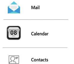
Figure 34.1: Inconsistent icon styles looks unprofessional and is confusing for the user to recognize and recall
Don...
Don’t Use Obsolete Icons
For about 20 years, the “floppy diskette” icon has meant “save” and this connection persists in UIs across desktop and web apps. It was a great visual metaphor for a long time, but things have changed and many users under the age of 20 will have never laid eyes on a floppy disk—if they know it at all, it’ll be from seeing the icon, not the real object.
Other examples include old telephones with handsets, curly cords, and rotary dials; radio microphones from the 1950s; and reel-to-reel tape recorder icons to mean “voicemail.”
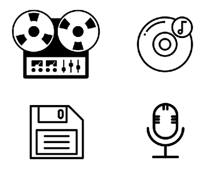
Figure 35.1: Ten years from now, nobody will know what any of these are
Try to think about how the visual metaphors you use will work for different age groups, cultures, and languages. Searching for the right visual metaphor for an icon is often challenging work but rewarding, and your users will benefit from increased familiarity with your product.
Increasingly...
Don’t Try to Depict a New Idea with an Existing Icon
Occasionally, you will need to invent a whole new icon. If the concept you’re trying to describe is novel, then your users will need an icon that doesn’t confuse them by referencing another idea. It needs to be new, yet recognizable, and mappable to a real-world example. If this sounds difficult to you, that’s because it is.
Thankfully, the need to create an entirely new icon is rare because most of the concepts in your app will be better served by existing UX patterns and UI conventions, but there may be a case where you have a new concept.
The middle ground here (using an existing icon to depict a new concept) is the worst of all worlds: it’s confusing for users who have seen the icon before in other products, with a different meaning behind it.
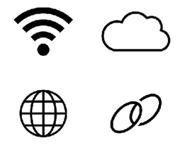
Figure 36.1: Spare a thought for these poor folks...
Some of the most misused icons in this category are:
- The WiFi &...
Never Use Text on Icons
Icons are supposed to be simple pictures that depict a concept. They are a shorthand visual reminder for users that what they’re about to click is the thing they want.
Often, icon designers get frustrated that their pictogram isn’t quite right, as it isn’t quite recognizable or distinct enough. Instead of solving the problems with the picture, they opt to simply add a line of text into the icon design. Note that I’m not talking about text labels for icons—those are essential. I’m referring to the lazy practice of including text within the icon itself.

Figure 37.1: Three icons with text as part of the icon
First off, this is low-effort design, but secondly, and more importantly, it breaks translation and accessibility functionality. Whether your product is a website, which can be translated with an online service like Google Translate, or a self-contained app, which will be internationalized with “...
Always Give Icons a Text Label
Now, I don’t mean text on the icon (see #37, Never Use Text on Icons)—I mean a text label near the icon, not just an icon on a button on its own.
Small, nondescript buttons, with obscure mystery icons on them, are next to useless and consistently perform terribly in user tests.
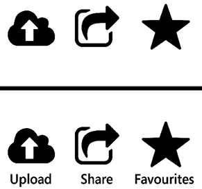
Figure 38.1: Which is easier to understand?
Let’s go back to the original purpose of an icon—to provide a quick visual shorthand by which the user can instantly recognize a control, and to provide a target for the user to click or tap. The icon isn’t meant to describe a button the first time that the user sees it—the user will need a text label for that. However, if the icon is distinct and recognizable, then the user will locate the control and recall its purpose more quickly with it.
Our old favorites, the Nielsen Norman Group, have a great shortcut for this, the “5-second rule”:
If it takes...
 © 2022 Packt Publishing Limited All Rights Reserved
Author (1)