Will Grant is a British UI/UX expert and a digital product designer. He is a web technology entrepreneur with over 25 years' experience, leading teams (and products) at the intersection of technology and usability. After his Computer Science degree, Will trained with Jakob Nielsen and Bruce Tognazzini at the Nielsen Norman Group – the world leaders in usable design. Since then, Will has overseen the user experience and interaction design of several large-scale web sites and apps, reaching over a billion users in the process. Will is a "design purist" and obsessed with building beautiful, compelling, and familiar products that customers intuitively know how to use.
As designers we have an obligation to make sure that the widest possible section of society can use our products. This section aims to ensure you design products that people with disabilities can use easily—not only is it the right thing to do, we’ll also see how it improves usability for everyone.
Contrast Ratios Are Your Friends
Way back in 1999, the World Wide Web Consortium (W3C), the main international standards organization for the internet, published the catchily-titled Web Content Accessibility Guidelines (WCAG). They were revised and updated to “WCAG 2.0” in 2008 (WCAG 3 is currently in “Draft” state), with the guidelines stating that “websites must be perceivable, operable, understandable, and robust.”
The guidelines are extensive and detailed, and go beyond the scope of this book, but some key elements from them are great best-practice guidelines to incorporate into your user interface to improve the UX for everyone—not just for disabled people.
One great guideline is that on contrast:
1.4.3 Contrast (Minimum): The visual presentation of text and images of text has a contrast ratio of at least 4.5:1.
If You Must Use “Flat Design” Then Add Some Visual Affordances to Controls
Minimalism is generally good and reducing clutter and visual distractions can often help a user to find what they need more quickly. Minimalism does not, however, mean making controls so minimal that they are impossible to use.
The flat design aesthetic (refer to #13, Make Interactive Elements Obvious and Discoverable) tends to remove visual affordances, but not to the same extent as the newly-emerging “web brutalism.” Brutalism, inspired by the brutalist architectural style, is an aesthetic in product design that deliberately looks unstyled and raw (Craigslist is a great example):
Figure 65.1: Craigslist: no, it’s not broken—it’s supposed to look like that
Outside of being a joke for designers, this level of minimalism is too imposing and unnecessary and, like flat design, can degrade discoverability by removing all visual affordances.
Let...
Avoid Ambiguous Symbols
This is easier said than done, but there are some symbols and iconography that are often used and misused across products.
This principle aims to encourage you to think about two things; “Am I using symbols that the user will be familiar with?” and “Do these meanings conflict with other parts of their experience?”
Here are just a couple of examples from products on the web and mobile, but there are hundreds more:
@: The “at” symbol is a repeat offender in the context of the control. Does it mean email, a web link, to mention a user, or something else?
: Does this mean “share” or “new window” or “open additional menu options”? I’ve seen it used to represent all of the above, as well as upside down to mean “go back.”
Some things to think about when picking iconography:
Is there a well-used existing icon for this...
Make Links Make Sense Out of Context
Q: What’s the difference between these two ways of offering a web link to a user?
To download our brochure: click here.
You can download our brochure here.
A: The first one is harder for visually impaired people to use.
Screen-reader software often has a mode where the user can skim the page for clickable links, and these links need to make sense out of context. In this case, the first link would be read aloud as “click here,” while the second would be dictated as “download our brochure”—much more usable.
Let’s take another example from an index of blog posts. Compare the following links:
Blog post story 1: Read more
Blog post item 2: Read blog post item 2
In this example, recapping the title in the “read more” link gives additional context and prevents the screen reader from simply reading a list of “read more, read...
Add “Skip to Content” Links Above the Header and Navigation
As previously mentioned, some users with a visual impairment will be using screen-reader technology to read the text elements of your interface aloud.
One problem is that it’s easy for these users to get lost in the mess of links and content on an especially busy page. Users need a way to get to the navigation. For fully sighted users, the location of the navigation is a well-accepted pattern, but partially sighted users may not have the same “mental model” of a web page or web app.
Figure 68.1: Amazon’s homepage is, at the time of writing, almost impossible for visually impaired people to navigate using a keyboard.
Adding a “skip to content” link to the top of your site (it can be hidden with CSS rules and only needs to be visible to assistive technologies like screen reader software) will allow the user to skip past the navigation effortlessly. They...
Never Use Color Alone to Convey Information
This sometimes sounds counterintuitive: making a warning red or a success alert green is second nature to most designers. While color can act as a shorthand for most users, those with color blindness can find themselves at a disadvantage. Certain types of color blindness will mean that users can’t tell the difference between a red status blob and a green one.
The best way to approach this is to use color to convey additional information, and not just use color alone. This makes the site usable for most people, but not at the expense of a few. Therefore I advise making links underlined (and, optionally, a different color), not just a different color, to differentiate them from body copy.
Another example is that a “status normal” label could show a green indicator blob, but should never just be the green blob on its own.
Figure 69.1: Only one of these interfaces is usable for color-blind people
...
If You Turn off Device Zoom with a Meta Tag, You’re Evil
Adding the following meta tag to the head of an HTML page will prevent the user from scaling the page, either using their browser controls or with “pinch-to-zoom” on a touchscreen device:
Although rare, it’s still seen in the wild. Designers typically do this because:
They haven’t made their designs work responsively or don’t know how to
They don’t understand the implications for accessibility
The result is that this prevents users with vision difficulties from scaling the page.
Don’t be these designers. Let your users choose how to view and manipulate your interfaces. Away from web pages, offer these scaling controls in desktop and native mobile software. iOS and Android both have built-in support...
Give Navigation Elements a Logical Tab Order
Try an experiment: head to a website in your browser and once the page has loaded, start pressing the Tab key repeatedly. You should notice the “focus” (usually a colored rectangle or shaded area) move from item to item across the site.
This is one of the ways that users who are partially sighted, or have motion difficulties, use web pages. These users rely on interface designers to use common sense in the tab order that they assign to items. On some websites and web apps, this is unusable, while on some, it’s clearly been well thought through.
Filling in a form is often extra frustrating when tapping the Tab key takes your focus to a strange part of the page. It’s unlikely that you’ll be writing code yourself, but you may wish to tell your frontend developers that they can specify the order that items are selected in using the tabindex attribute:
<inputtype="text"name="...
Write Clear Labels for Controls
Another small change you can make, which will make the world of difference to your users using assistive technologies, is writing clear labels:
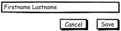
Figure 72.1: An example of bad labelling
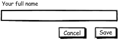
Figure 72.2: An example of good labelling
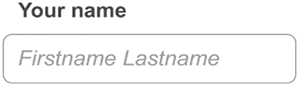
Pre-filling your field with placeholder (or watermark) text may look tidy, but it’s not supported in all browsers and disappears when the focus moves to the input field.
You can, however, include both, which allows the field to be identified and gives some assistance to users as to the kind of information that is needed for that input.
A word about alignment: from a logical “order of the content” point of view, it makes sense to add the label above the field and left align. All other alignments (right align, label to the left, and so on) have various visual and accessibility issues: your default should be above the field, left-aligned.
Figure 72.3: An input with a clear...
Make Tappable Areas Finger-Sized
If you think your design will be used by touch, then your users’ fingers are the tool that they’ll use. Given that obvious statement, it’s surprising to see UI controls in touch interfaces that are clearly way too small for users to poke at easily with their digits.
As a guide, your smartphone screen is (roughly) five fingers wide and 10 fingers high, so—if you introduce padding (the area around each control)—that’s about 40 controls: a hard limit of the controls that can be comfortably used on such a display. If you were to try to fit more than four or five items horizontally across the display, they would be too small to be comfortably used.
You’ll need to experiment to find the right control size, but if you’re using native control elements (see #39, Use Device-Native Input Features Where Possible), that research has been done for you: they’re already the right size (44px or...
The rest of the chapter is locked
Unlock this book and the full library FREE for 7 days
Get unlimited access to 7000+ expert-authored eBooks and videos courses covering every tech area you can think of
Will Grant is a British UI/UX expert and a digital product designer. He is a web technology entrepreneur with over 25 years' experience, leading teams (and products) at the intersection of technology and usability. After his Computer Science degree, Will trained with Jakob Nielsen and Bruce Tognazzini at the Nielsen Norman Group – the world leaders in usable design. Since then, Will has overseen the user experience and interaction design of several large-scale web sites and apps, reaching over a billion users in the process. Will is a "design purist" and obsessed with building beautiful, compelling, and familiar products that customers intuitively know how to use.


 : Does this mean “share” or “new window” or “open additional menu options”? I’ve seen it used to represent all of the above, as well as upside down to mean “go back.”

