


Use Device-Native Input Features Where Possible
If you’re using a smartphone or tablet to dial a telephone number, the device’s built-in “Phone” app will have a large numeric keypad, which won’t force you to use a fiddly QWERTY keyboard for numeric entry.
Sadly, too often, we ask users to use the wrong input features in our products. By leveraging what’s already there, we can turn painful form entry experiences into effortless interactions.
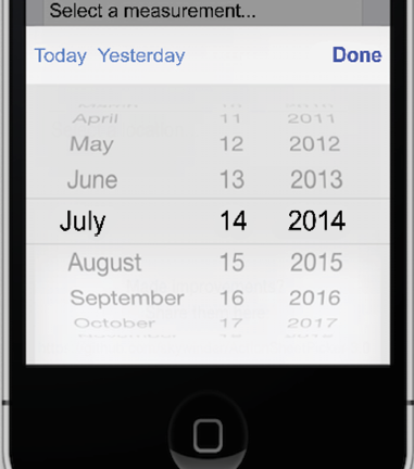
Figure 39.1: The iOS “picker” control replaces fiddly drop-down menus
Dropdowns should let users use the device’s full-width picker control and numeric entry should show a numeric keypad. For example, you can display a numeric keypad in web forms by adding the type=tel attribute to the input field in HTML:
<label for="phone">Your telephone number:</label>
<input type="tel" id="phone" name="phone">
This...
Streamline Creating and Entering Passwords
It still makes sense to obfuscate passwords as they’re being entered, but let’s be real, shoulder-surfing isn’t possible when you’re signing in to an app on your couch.
Providing a “show password” toggle is not only great for usability but also improves security: users can enter longer, more complex pass-phrases and be confident that they can retype them correctly. Default to obfuscating the password, but provide a checkbox or toggle that allows the user to see their password.
Yes, I know we should all be using a password manager (a plugin that generates and stores all your site passwords for you), but the fact remains that most regular users don’t.
Show the password strength rules. Don’t make users try and try again to enter passwords, only to be told later that they need to have a certain obscure combination of letters, numbers, and symbols. Show the user the rules the...
Always Allow the User to Paste into Password Fields
It’s difficult to fathom where this pattern of disabling paste came from or what possible security issue it’s supposed to address. Back in the 1990s, “webmasters” would disable right-click to prevent users from copying images. This worked for about 5 seconds, until people realized that they could just screen capture the image. Using some JavaScript on the page to prevent users from pasting into a password field is insane and potentially harmful for security.
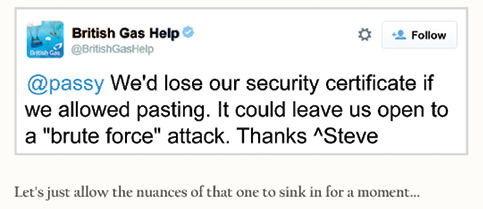
Figure 41.1: Screenshot from security expert Troy Hunt’s blog post, “The ‘Cobra Effect’”: https://www.troyhunt.com/the-cobra-effect-that-is-disabling/
A user with a password manager app will have a long, impossible-to-remember password that has to be pasted into the field (especially on mobile, where it’s more tricky to autofill the field). However, disabling paste in a password field forces users...
Don’t Attempt to Validate Email Addresses
Your user is entering an email address and you’re thinking about writing some code to validate it (check that it’s in a sensible format and they haven’t entered gibberish or mistyped it). Think again.
It used to be so simple to validate email addresses on the client side. A little bit of JavaScript was all it took to check that the domain was in the format:
user@domain.tld
If it didn’t match this pattern, it wasn’t a valid email and the user couldn’t sign up. We used to only have a handful of top-level domains (TLDs). Now, we have over 1,000 TLDs, with more being added all the time:
stealthy+user@example.ninja
stealthy+user@example.ninja
holidays@ .ws
email@www.co
website@email.website
.ws
email@www.co
website@email.website
The above addresses are all valid domains (please don’t email these people, in case they are real!), but the TLD list changes all the time, so good luck writing the JavaScript to...
Respect Users’ Time and Effort in Your Forms
Your long-suffering user has painstakingly entered field after field of data into your form, often on a tiny mobile screen with an on-screen keyboard.
Don’t clear this data unless the user specifically abandons the flow (maybe by hitting cancel). If clicking something is going to reload the page, and this might result in a blank form, then make sure you save the user-entered data first.
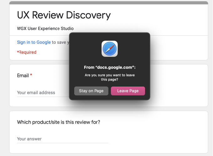
Figure 43.1: Some sites and browser combinations will warn you before leaving or reloading to prevent accidental loss of user-entered data
This is a great example of where technical reality runs against UX goals. On the one hand, if a browser could speak, it would likely argue that reloading a form should clear it, as we’re telling the browser to fetch the empty form again.
However, we are not robots, we are humans, and so much of good UX design is about empathy and respect. This includes respecting the user’...
Pick a Sensible Size for Multiline Input Fields
Forms need to be as frictionless as possible, because they are a huge barrier for users to painstakingly navigate. Conversion rates are generally low, so make forms as easy for the user to complete as possible.
Sometimes, we need to ask users for more than a simple one- or two-word answer (like a name) and a multiline input field (or “text area”) is needed. A common mistake on the web (and in some desktop apps) is to provide a text area that is way too big or way too small.
If the text area is way too big, and the user has to manipulate the viewport to see what they’re typing, then you’re wasting valuable screen space.
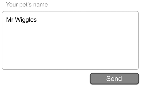
If the text area is way too small, then the user has to scroll around inside the field to see what they’ve written.
Figure 44.2: An impossibly small input field for lots of text
HTML...
Use Animation with Care in User Interfaces
Only a psychopath would deliberately make elements of their UI move while users attempt to interact with it, forcing users to “press and guess” as they try to tap or click controls—that’s more like a video game than a usable digital product.
The prevalence of Flash on the web in the late 1990s and early 2000s led to many designers introducing UI animation just because they could, and it’s almost always a bad idea. Unfortunately, the UI can and does move due to unintentional factors and users are left frustrated.
Do the following scenarios feel familiar?
Have you had a web page load, but the advertising elements (or custom fonts) are served from a different, slower server? As the page loads, the introduction of these ads or fonts “shunts” the page elements around, meaning that you click or tap on the wrong part of the page.
This can be solved by testing, then introducing placeholders...
Use the Same Date Picker Controls Consistently
This problem of fiddly, arbitrary, and unusable date pickers is less pronounced than it used to be, thanks to browsers and mobile device makers producing more consistent date picker UIs. By triggering the device-native date picker, you can give the user an experience they’re familiar with and a UI that has been designed for their device.
There are cases where the native UI won’t cut it, however, as some tools need a more complex or more advanced interface for selecting dates, ranges of dates, or comparison date ranges. When this is the case, always use the same date picker control everywhere in your app.
Showing a different set of controls for the same task in a different part of your product will confuse users and reduce your conversion rates. A common place where this mistake is made is on holiday or hotel booking sites. The home page will often have a big, clear date picker, designed to convert casual visitors...
Pre-Fill the Username in “Forgot Password” Fields
If your user has tried to sign in and failed, it’s a safe bet that their next action will be to click “forgot password.” Don’t make them enter their email again—pre-fill the username field with the entry from their earlier sign-in attempt, so that the user can just tap “reset password” and be on their way.
The forgot password flow of an app is—certainly from metrics I’ve seen—a very well-used feature. In fact, a user who uses a difficult password, forgets it, then resets it every time is probably more secure than a user who just uses a weak password. So, let’s make the forgot password process easy by following these rules:
- If the user gets their password wrong, pre-fill the username field with the last-used username (or email) and show a “forgot password” button
A quick security note on this—ensure...
Make Your Input Systems Case-Insensitive
Lots of systems are case-insensitive by default—that is, they don’t care if characters are UPPERCASE or lowercase—but you don’t notice, because that’s how it should be, and it works well.
For example, emailing Will@WillGrant.org goes to the same place as will@willgrant.org. Visiting www.WikiPedia.ORG takes you to the same site as www.wikipedia.org.
The email system and domain name system are both case-insensitive, which was a good call back in the 1970s. Thousands of years of combined technical support time have been avoided by this decision.
Despite this, you can still find apps and websites where you have to sign in with a case-sensitive username or email address. Not only does this lead to errors—a user who cannot sign in because their username had a capital letter they forgot about—but even if they do remember, switching between lowercase and uppercase letters on a fiddly mobile...
Chatbots Are Usually a Bad Idea
Conversational user interfaces (CUIs) are big right now—right at the top of the “hype cycle”—and you can’t move around the web without seeing the “Chat now” bubble in the corner of everything from banking and insurance apps through to online stores like Amazon and Apple.
CUIs are not in themselves a bad thing—they’re focused, simple, and widely understood by users. The problem is: what’s on the other end? Who is your user talking to?
Some of my best user experiences as a customer have come from using online chat: telling Amazon about a faulty product and getting an instant refund, or telling the electricity people that I need a new smart meter in a matter of minutes.
Do you want to know what some of my worst user experiences have been? Chatbots.
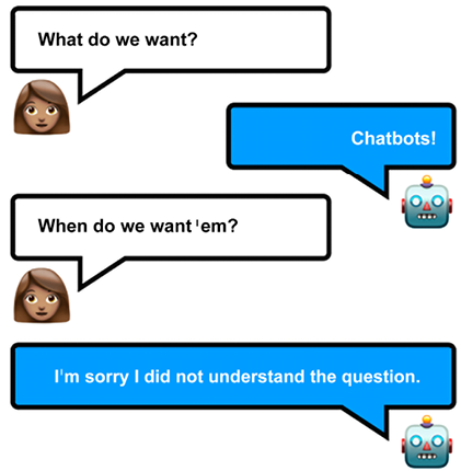
Figure 49.1: Let me know when there’s a good chatbot I can try