


Let Users Turn off Specific Notifications
Notifications, whether on desktop or, more commonly, mobile, are a great way to keep users informed of state changes while the app is closed or in the background.
It’s worth thinking through carefully how users can customize or disable certain types of notifications (or all of them). The events that each user considers important, or notification-worthy, will vary and may even change over time.
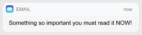
Figure 74.1: A notification
A user probably doesn’t want an audio notification every time someone likes their Instagram selfie. Perhaps they do want a notification of a direct message because they get them less frequently.
The user’s device or browser will allow them to disable notifications entirely for your app, which they will do if what they’re seeing isn’t fine-tuned enough.
It’s extra technical work to allow a user this kind of fine-grained control, but allowing them to set up notifications...
Each Aspect of a User’s Journey Should Have a Beginning and End
The user’s journey can be thought of in a broad or narrow way: it can be their journey through the whole product—for a dating app, that could be from signing up to a first date—or it could be a fine-grained journey, for example, into a particular settings menu to change an option.
As the user goes through their jobs to be done (JTDB; a methodology for discovering user needs and solving them), they make a great many small journeys. In every case, the user should know that they have begun a journey, that this journey will end at some point, and when it has ended.
The classic anti-pattern here is users thinking, “Have I saved these settings or not?” For example, a rare UX mistake from Apple is that on macOS, changing the settings and then closing the window saves the settings. On the other hand, on (older) Windows applications, the user must press Save. In some more obscure...
The User Should Always Know What Stage They Are at in Any Given Journey
Some of the worst experiences in digital products come from not adhering to this principle. For example, a user’s profile page that can’t be saved because there’s another step to complete or the user who abandons their checkout journey because they’re not sure how many more steps there will be.
Most users will approach your product with an incomplete (or non-existent) conceptual model of how it functions—this is normal. You need to expose some of this to the user, so they can understand how to use the product.
Although the user will not consciously “know” what stage they’re at, at all times they should at least have a general sense of it and you can deliver that experience with some simple cues. Much like landmarks in the real world, your product should include visually different areas that serve as landmarks in the product.
The home screen should...
Users Rarely Care About Your Company
There’s a running joke in the HBO series Silicon Valley about how every tech company wants to make the world a better place. The show’s main antagonist, Gavin Belson, goes so far as to say, “I don’t want to live in a world where someone else makes the world a better place better than we do.”
Too many products labor the point: telling their users about their mission or vision, which is about how they’re trying to change the world. Please don’t do this because users simply don’t care. Products are useful for what they let users do. This pattern of too much information is a symptom of a lack of objectivity.
If a user has installed your dating app, for example, the chances are that they have some clear goals in mind: some basic “jobs to be done” that involve setting up a profile and meeting people. They don’t want a multi-screen onboarding wizard that tells them how...
Follow the Standard E-Commerce Pattern
If you’re selling items online—physical goods or digital items—then, like it or not, you’re in the world of e-commerce. The word e-commerce already seems hopelessly outdated, but it’s the best word we’ve got to mean “selling things online through a website or app.”
Now, because e-commerce generates revenue for businesses in a very direct way, it was one of the first areas of online experience to really get deep focus and attention from UX professionals. Even marginal gains could increase revenue by significant volumes, so it was worth putting in the effort of user testing and A/B trials.
The e-commerce pattern we’ve arrived at from the past 25 years of the consumer web is both well-refined and well-understood by users. Getting a customer through a purchase funnel is difficult, with many opportunities for “cart abandonment,” which means that it has to be as frictionless...
Show an Indicator If the User’s Work Is Unsaved
If possible, your app should be “autosaving” the user’s work, but there are, of course, cases where this needs to be a user-initiated action (for example, in an application where saving could be destructive—like writing a really long document or editing a photo).
A great way of showing the user that their work is unsaved is by displaying a visual indicator in the title bar of the app. This could be a bullet or could even explicitly say “not saved,” if space allows.
At a glance, the user can tell if they need to quickly hit Cmd + S (or Ctrl + S) to save where they’re at or if they’re just experimenting, they will know that they haven’t saved.
A big part of this is about respecting the time and effort that the user has put into using your product: entering data, preparing a profile or bio, and so on. They deserve to be shown the state that their...
Let Users Give Feedback, but Don’t Hassle Them
See how annoying that is? Yet apps do it all the time, interrupting the users’ flow to nag them for a review on the relevant app store. App publishers care a lot about reviews because they build trust in a product, and app stores will rank software more highly if it has attracted a lot of great reviews. So it’s easy to understand their relentless drive to ask users to rate every app.
It’s the digital equivalent of wandering around a department store (remember those?) and having an eager salesperson ask “Can I help you?” within 30 seconds of you walking in.
It’s counterproductive because this interruption just annoys users and leads to lower levels of user satisfaction for your product. Much better to just offer a “Give feedback” or “Tell us what you think” control in a help section of your UI.
Some of the best feedback experiences on the...
Don’t Use a Vanity Splash Screen
The splash screen—the full-screen graphic that appears when your user opens your iOS or Android app—is a great place for your company logo, brand messaging, or corporate vision statement, right?
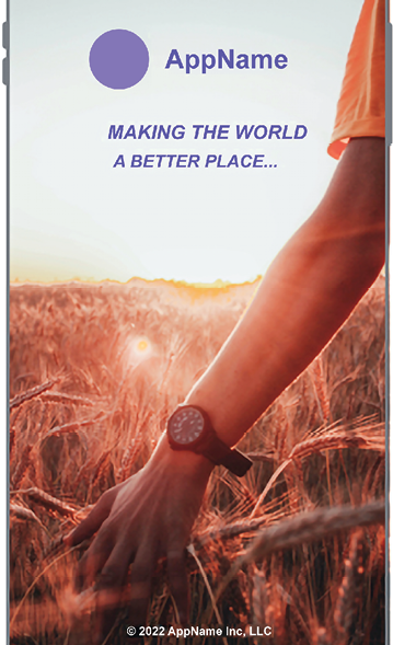
Figure 82.1: Splash screen (Photo by Artem on Unsplash)
No. Do not do this.
Users do not care about how you’re making the world a better place—they just want to open the app to do whatever it is the app does, and you’re just slowing them down by a few seconds every time.
Instead, look at the first screen of your app and offer a splash screen that echoes this layout, but without content. This is called a “skeleton screen” or “content skeleton,” as seen below:
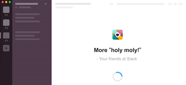
Figure 82.2: Slack makes great use of a content skeleton to get users straight into the product while it loads, rather than showing a vanity splash screen
Users will feel like the app is loading quicker...
Make Your Favicon Distinctive
A favicon, app icon, or apple-touch-icon—whatever you like to call it—is an icon you may well have forgotten to add to your web app. It serves a useful purpose beyond branding, appearing in the browser’s tab UI and in bookmark views across your devices.
Users with lots of tabs open, lots of apps in their start menu, or lots of apps in a folder on their phone, will appreciate being able to find yours quickly.
Figure 83.1: Some favicons
A bright, bold icon or letter is usually sufficient, but test it at 16 pixels in size to see that it’s legible. Use transparency because, unless your icon actually is a white square, nobody wants a white square in their tab bar!
You can cover most browsers out there with just four types of favicon, containing just six favicon files:
- A
favicon.icofor legacy browsers at 32px square - A single SVG icon with a light and dark version for modern browsers
- A...
Add a “Create From Existing” Flow
An often-overlooked flow in many applications is the “create from existing” flow, and the ability to create templates. Whatever your user is dealing with in the app—customers, orders, or really any repetitive task—you should offer a “create from existing” flow if possible.
When given a chance to re-use work that they have meticulously created, this simple flow is a massive time saver and productivity boost for the user.
Selecting “create from existing,” “duplicate and edit,” or even “duplicate,” should make the product behave something like this:
- The system copies the item, giving it a new ID
- The user is presented with the edit view, but with a new name (perhaps with “copy” appended to the original title)
- The fields are pre-filled with the data from the original item
- The user can change as much or as...
Make It Easy for Users to Pay You
The routes by which products are paid for are many and varied, but—even if you’re not selling tangible items—there is often the need for a product to ask a user to upgrade and enter some payment details.
Time and again, these interactions fall short of top-quality user experience. Be they complex credit card forms, asking for too much information on lengthy order forms, or unclear pricing plan details, they represent a massive missed opportunity.
To some extent, this is a solved problem in mobile apps—both iOS and Android include extensive support for in-app purchases and subscriptions, allowing designers to use native input systems rather than clunky custom ones. The user likely has their payment details saved and it’s often a one-tap action to make a purchase.
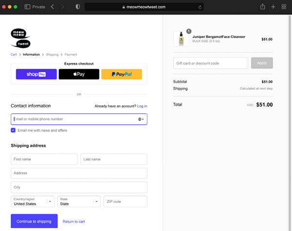
Figure 85.1: The Shopify checkout experience is well-tested and almost perfect
Out on the web, however, it’s a different story...
Give Users the Ability to Filter Search Results
In the early days of web interfaces, most search systems worked like this:
- Enter a search term, such as red shoes
- The system would return 100,000 pairs of red shoes
- The user would try again: red men’s shoes in size 8
- The system would try an
ANDmatch on all the terms - The results page would show no results
- The user would have to work out how to change the query to get the results they want
Some enterprise and business systems still work this way, much to the frustration of their long-suffering users. It’s a symptom of interface design mapped directly onto the engineering requirements: this is how databases are queried, but it’s not how human minds work.
Over the past 10 years, pioneered by e-commerce sites, searching has gotten a lot better—a modern example looks like this:
Your Users Probably Don’t Understand the Filesystem
The filesystem of your computer is the complex tree of many, many thousands of folders and files that make up the operating system—all your apps and their resources, and all your documents, images, and music files. Your users likely don’t understand this—nor should they have to.
I’ve witnessed people use Microsoft Word as the primary way to find and retrieve information from their computer or network. They’ll open Word and use the “open” command as a way to browse around their documents. If they come across an image, they’ll open it in a Word document. This probably sounds insane to most computer-literate people. But this makes perfect sense to users who mostly write and manage Word documents. These people aren’t stupid—they just don’t understand how files are stored on their computers.
One of the reasons why smartphones and tablets became...
Show, Don’t Tell
The expression “show, don’t tell” comes from screenwriting and fiction. Often attributed to playwright Anton Chekhov, the technique is intended to allow the reader to experience the story through action, words, senses, and feelings, rather than through the author’s exposition and description.
Show the viewer (or user) the situation and let them approach it in their own way. It’s also a great mantra to repeat to yourself if you’re working on the experience of onboarding, feature guides, or other tuition—showing users how to use your product is always better than telling them.
The first reason for this is that users don’t read text. Really, they don’t. Time and again, in user test after user test, I’ve witnessed this with my own eyes—users simply don’t read blocks of onscreen copy. You have to show them how to use the product, not write a description using prose.
Onscreen...
 © 2022 Packt Publishing Limited All Rights Reserved
Author (1)