Reader small image

You're reading from  Tableau 10 Business Intelligence Cookbook

Product typeBook
Published inNov 2016
PublisherPackt
ISBN-139781786465634
Edition1st Edition
Tools
Right arrow
Authors (2):
Donabel Santos
Donabel Santos
author image
Donabel Santos

Donabel Santos is a self-confessed data geek. She loves working with data, writing queries, and developing reports on her SQL Server databases, and exploring and visualizing data with Tableau. She is the principal and senior business intelligence architect at QueryWorks Solutions, a Tableau Learning and Alliance partner in Vancouver, BC, Canada, providing consulting and training services. She has spent years in consulting and has developed a variety of solutions for clients in different verticals—finance, manufacturing, healthcare, legal, higher education, and local government. Donabel is a multi-year Microsoft Data Platform MVP (previously known as SQL Server MVP) and has extensive experience in the SQL server in different areas, such as development, administration, data warehouse, reporting (SSRS), tuning, troubleshooting, XML, CLR, and integration with ERPs and CRMs using PowerShell, C#, SSIS, and Power BI. One of Donabel's passions is teaching and sharing her love for data. She is a Tableau Certified Professional and a Tableau accredited trainer, delivering Tableau public and on-site client training. She is also the lead instructor for a number of courses at British Columbia Institute of Technology (BCIT), including Applied Database Administration and Design (ADAD) and Applied Data Analytics (ADA) programs. She teaches SQL server administration, development, integration (SSIS), data warehouse foundations, and visual analytics with Tableau. Donabel has also authored three other books with Packt Publishing: SQL Server 2012 with PowerShell V3 Cookbook, PowerShell for SQL Server Essentials, and SQL Server 2014 with PowerShell V5 Cookbook. She also contributed a chapter to Manning Publications' PowerShell Deep Dives.
Read more about Donabel Santos

Paul Banoub
Paul Banoub
author image
Paul Banoub

Contacted on: 18/12/2015 for Mastering Tableau 10 [video]
Read more about Paul Banoub

View More author details
Right arrow

Creating a line chart


A line chart often represents trend over time, and typically requires numeric values plotted as lines over date-related fields.

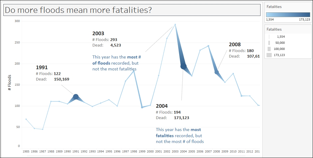
In this recipe, we will create a time series graph (or line chart) that shows the number of floods over time. In addition, we will show the number of fatalities and represent this as the width of the line graph. This will enable us to see more obviously when the most flood-related fatalities occurred.

Getting ready

To follow this recipe, open B05527_01 – STARTER.twbx. Use the worksheet called Line, and connect to the MasterTable (FlooddataMasterListrev) data source.

How to do it...

The following are the steps to create a time series graph in Tableau:

  1. From Dimensions, drag Began to Rows. Tableau will automatically choose the YEAR level for this date field.

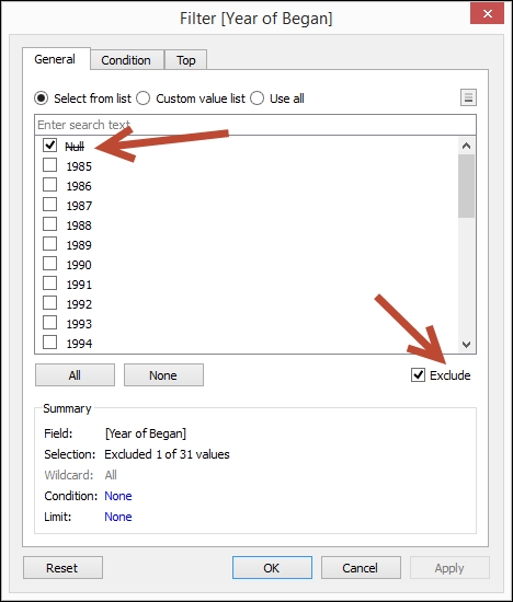
  2. Right-click on the Null column heading in YEAR(Began), and select Exclude.

  3. From Measures, drag Number of Records to Columns.

  4. From Measures, drag Dead to Size in the Marks card.

  5. Click on the top-right drop-down arrow of the size legend and choose Edit title….

  6. Edit the title of the size legend to display Fatalities.

  7. From Measures, drag Dead to Color in the Marks card.

  8. Click on the top-right drop-down arrow of the color legend and choose Edit title….

  9. Edit the title of the color legend to display Fatalities.

  10. Click on Color in the Marks card. Under the Effects section, select the middle marker.

  11. Click on Size in the Marks card. Drag the size control to the right to make the marks in your chart bigger.

  12. Annotate your marks. In this sample, I have chosen to annotate 2003 (the year with the highest number of floods) and 1991, 2004, and 2008 (the years with the highest numbers of fatalities). To annotate the marks, you can right-click on the mark in your chart and select Annotate, and then Mark.

    The annotation for the year 2003 looks like the following:

  13. Hide the Began field label at the top of the chart by right-clicking it, and selecting Hide field label for columns.

  14. Right-click on the Number of Records axis, and change the title to # Floods.

How it works...

By default, Tableau creates a line chart—also called a time series chart—when a Date (or Date & Time) field is placed in either the Rows or Columns shelf. A Date field is presented in the side bar with a small calendar icon, while a Date & Time field will be a small calendar icon with a clock. Line charts are best used when you want to see patterns over time.

In this recipe, when we dragged the Began field onto Rows, the field showed up as YEAR(Began) instead of just the Began field.

Date fields in Tableau have a natural hierarchy—meaning you can roll up to a higher date level like YEAR, or drill down to a lower level like DAY. In this case, we see a blue YEAR(Began) pill, which indicates Tableau presented the years as a series of discrete headers.

Note

Discrete and continuous fields are discussed in more detail in Appendix C, Working with Tableau 10.

When the year field was rendered, the first column value that appeared was Null. A Null means there is no value, that is, this data is missing for some records. One way to remove it is to right-click the column header and select Exclude. Exclude creates a filter, but it is a negation filter. Whatever is checked will be excluded. When you investigate the settings for this filter, you will find that Null is checked, but the bottom checkbox for Exclude is checked.

In this recipe, we also used SUM(Dead) to be presented both in Color and Size. The darker the color and the thicker the line indicates the more fatalities. Adding this visual cue in the line graph allows us to easily identify when the most fatalities occurred, without having to hover over each point in the graph and look at the details.

There's more...

Tableau is a great visualization tool that gives us a lot of flexibility over how we want to display our graphs. However, it can also be a double-edged sword. Nothing stops us from creating all kinds of chart just because we can. However, we shouldn't. Just because we can does not mean we should. We should identify first our data points, and evaluate the best (or most effective) way to represent them.

Take, for example, the following line chart. The line chart has a vertical sales axis. At the bottom of the graph, we can find the discrete categories.

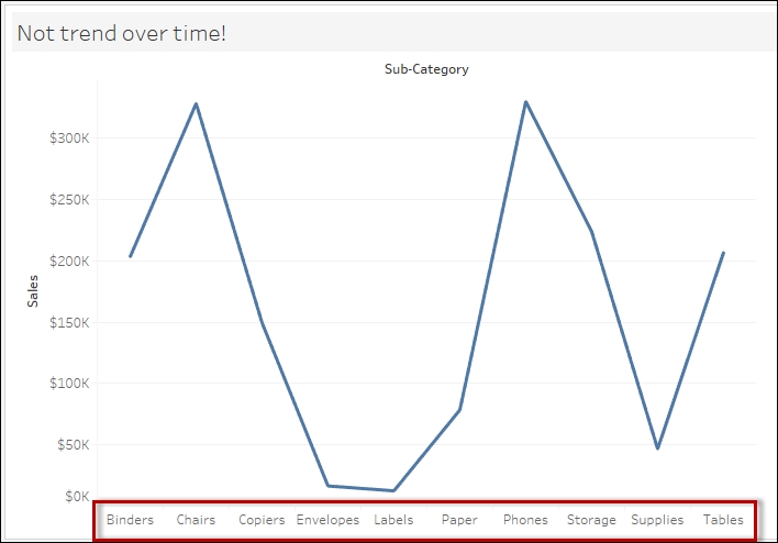
Is the line chart the best way to represent this information? No. In fact, this is incorrect and grossly misleading. When your audience first looks at this graph, the initial perception is that we are showing the fluctuations of sales over time. There is also a notion of relatedness, that is, that the category headers are somehow related. This isn't true. Categories are nominal. There is no inherent order in these classifications. When we move the category labels around, it shouldn't affect the message that is being relayed by the graph. This particular graph can be best represented as a bar chart.

See also

  • Please refer to the Creating a bar chart recipe in this chapter

Previous PageNext Page
You have been reading a chapter from
Tableau 10 Business Intelligence Cookbook
Published in: Nov 2016Publisher: PacktISBN-13: 9781786465634
Register for a free Packt account to unlock a world of extra content!
A free Packt account unlocks extra newsletters, articles, discounted offers, and much more. Start advancing your knowledge today.
undefined
Unlock this book and the full library FREE for 7 days
Get unlimited access to 7000+ expert-authored eBooks and videos courses covering every tech area you can think of
Renews at $15.99/month. Cancel anytime

Authors (2)

author image
Donabel Santos

Donabel Santos is a self-confessed data geek. She loves working with data, writing queries, and developing reports on her SQL Server databases, and exploring and visualizing data with Tableau. She is the principal and senior business intelligence architect at QueryWorks Solutions, a Tableau Learning and Alliance partner in Vancouver, BC, Canada, providing consulting and training services. She has spent years in consulting and has developed a variety of solutions for clients in different verticals—finance, manufacturing, healthcare, legal, higher education, and local government. Donabel is a multi-year Microsoft Data Platform MVP (previously known as SQL Server MVP) and has extensive experience in the SQL server in different areas, such as development, administration, data warehouse, reporting (SSRS), tuning, troubleshooting, XML, CLR, and integration with ERPs and CRMs using PowerShell, C#, SSIS, and Power BI. One of Donabel's passions is teaching and sharing her love for data. She is a Tableau Certified Professional and a Tableau accredited trainer, delivering Tableau public and on-site client training. She is also the lead instructor for a number of courses at British Columbia Institute of Technology (BCIT), including Applied Database Administration and Design (ADAD) and Applied Data Analytics (ADA) programs. She teaches SQL server administration, development, integration (SSIS), data warehouse foundations, and visual analytics with Tableau. Donabel has also authored three other books with Packt Publishing: SQL Server 2012 with PowerShell V3 Cookbook, PowerShell for SQL Server Essentials, and SQL Server 2014 with PowerShell V5 Cookbook. She also contributed a chapter to Manning Publications' PowerShell Deep Dives.
Read more about Donabel Santos

author image
Paul Banoub

Contacted on: 18/12/2015 for Mastering Tableau 10 [video]
Read more about Paul Banoub