Reader small image

You're reading from  Tableau 10 Business Intelligence Cookbook

Product typeBook
Published inNov 2016
PublisherPackt
ISBN-139781786465634
Edition1st Edition
Tools
Right arrow
Authors (2):
Donabel Santos
Donabel Santos
author image
Donabel Santos

Donabel Santos is a self-confessed data geek. She loves working with data, writing queries, and developing reports on her SQL Server databases, and exploring and visualizing data with Tableau. She is the principal and senior business intelligence architect at QueryWorks Solutions, a Tableau Learning and Alliance partner in Vancouver, BC, Canada, providing consulting and training services. She has spent years in consulting and has developed a variety of solutions for clients in different verticals—finance, manufacturing, healthcare, legal, higher education, and local government. Donabel is a multi-year Microsoft Data Platform MVP (previously known as SQL Server MVP) and has extensive experience in the SQL server in different areas, such as development, administration, data warehouse, reporting (SSRS), tuning, troubleshooting, XML, CLR, and integration with ERPs and CRMs using PowerShell, C#, SSIS, and Power BI. One of Donabel's passions is teaching and sharing her love for data. She is a Tableau Certified Professional and a Tableau accredited trainer, delivering Tableau public and on-site client training. She is also the lead instructor for a number of courses at British Columbia Institute of Technology (BCIT), including Applied Database Administration and Design (ADAD) and Applied Data Analytics (ADA) programs. She teaches SQL server administration, development, integration (SSIS), data warehouse foundations, and visual analytics with Tableau. Donabel has also authored three other books with Packt Publishing: SQL Server 2012 with PowerShell V3 Cookbook, PowerShell for SQL Server Essentials, and SQL Server 2014 with PowerShell V5 Cookbook. She also contributed a chapter to Manning Publications' PowerShell Deep Dives.
Read more about Donabel Santos
Paul Banoub
Paul Banoub
author image
Paul Banoub

Contacted on: 18/12/2015 for Mastering Tableau 10 [video]
Read more about Paul Banoub

View More author details
Right arrow

Chapter 2. Advanced Charts

In this chapter, we will cover:

  • Creating a histogram

  • Creating a small multiple chart

  • Creating a shared axis chart

  • Creating a combo chart (dual axis chart)

  • Creating a bullet chart

  • Creating a bar in bar chart

  • Creating a donut chart

  • Creating a unit chart

  • Creating a box and whisker plot

  • Creating a sparkline with indicators

  • Creating a KPI text table

  • Creating a waterfall chart

  • Creating a population pyramid

Introduction


In this chapter, we will explore additional techniques for creating more advanced charts in Tableau. Some of the charts introduced in this chapter are quite effective for specific use cases, for example the waterfall chart for showing cumulative changes to a measure and the population pyramid for showing population over time. However, this should not discourage you from exploring and testing your data set with different charts! Sometimes different types of chart can help uncover insights in ways we don't expect, or they may surprisingly convey information much more clearly than the chart we had originally intended to use.

Some of the charts covered in this chapter may well just be starting points to even more charts you may want to explore and experiment on your own. Be not afraid—explore, explore, explore!

Note

Make sure to check out Appendix A, Calculated Fields Primer, as this chapter starts using more calculated fields.

Creating a histogram


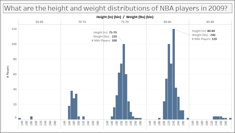
Histograms are graphs that plot frequency distribution of data.

In this recipe, we will create a histogram that will visualize what the most common heights and weights are of NBA players, based on a 2014 NBA player's stats data source.

Getting ready

To follow this recipe, open B05527_02 – STARTER.twbx. Use the worksheet called Histogram, and connect to the Player Stats (NBA Players Regular Season 2009) data source.

How to do it...

The following are the steps to create the histogram in this recipe:

  1. Under Measures, right-click on Height (in) and select Create and then Bins….

  2. Set the bin size to 5, and click OK when done. This will create a new discrete field called Height (in) (bin) under the Dimensions section of the side bar.

  3. Under Dimensions, right-click on Height (in) (bin) and select Aliases....

  4. Change the alias values of the Member items to the following. To edit the alias, simply click on the Value (Alias) field and that field will become editable.

  5. Create another bin for...

Creating a small multiple chart


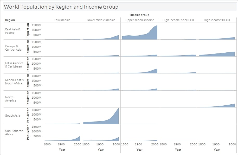
A small multiple is a series of smaller charts that share the same type and scale. This chart is typically used when you want to have multiple values (or categories) to be compared side by side.

In this recipe, we will create a small multiple area chart that shows the world population sliced by region and income group.

Getting ready

To follow this recipe, open B05527_02 – STARTER.twbx. Use the worksheet called Small Multiple, and connect to the Data (Modified Gapminder Population) data source.

How to do it...

The following are the steps to create a small multiple chart:

  1. From Dimensions, drag Year to the Columns shelf.

  2. Right-click on the Year field in the Columns shelf, and select Continuous. You should notice that the pill color changes from blue to green.

  3. From Measures, drag Population to the Rows shelf.

  4. In the Marks card, click on the dropdown to change the mark from Automatic to Area.

  5. From Dimensions, drag Income Group to the Columns shelf.

  6. Right-click on the first...

Creating a shared axis chart


A shared axis chart in Tableau is a chart that shares one axis among multiple measures. This chart can be used when the measures have similarly ranged values, and can be presented using one mark and one scale.

In this recipe, we will compare field goals made vs field goals attempted by Phoenix Suns players in the NBA 2009 season by using a shared axis chart.

Getting ready

To follow this recipe, open B05527_02 – STARTER.twbx. Use the worksheet called Shared Axis, and connect to the Player Stats (NBA Players Regular Season 2009) data source.

How to do it...

The following are the steps to create a shared axis chart:

  1. From Dimensions, drag Team Name to the Filters shelf.

  2. Under the General tab, check Suns.

  3. From Dimensions, drag Year to the Filters shelf.

  4. Under the General tab, choose 2009.

  5. From Dimensions, drag League to the Filters shelf.

  6. Under the General tab, check N for NBA.

  7. If it doesn't exist yet, create a calculated field called Player Name, and provide the following formula...

Creating a combo chart (dual axis chart)


A dual axis chart is a chart that uses two axes for two different measures. This chart is useful when two measures have different types or ranges (for example, monetary value and percentage), or if the two measures need to be displayed differently (for example, one as a bar and one as a line).

In this recipe, we will create a dual axis chart, also often referred to as a combo chart.

Getting ready

To follow this recipe, open B05527_02 – STARTER.twbx. Use the worksheet called Combo Chart Dual Axis, and connect to the Player Stats (NBA Players Regular Season 2009) data source.

How to do it...

The following are the steps to create a combo chart (dual axis chart):

  1. From Dimensions, drag Team Name to the Filters shelf.

  2. Under the General tab, check Suns.

  3. From Dimensions, drag Year to the Filters shelf.

  4. Under the General tab, choose 2009.

  5. From Dimensions, drag League to the Filters shelf.

  6. Under the General tab, check N for NBA.

  7. If it doesn't exist yet, create a calculated...

Creating a bullet chart


A bullet chart allows us to visualize progress in a small, concise graph. This chart borrows from thermometers and progress bars, and is typically used to show goals vs actuals.

In this recipe, we will create a bullet chart that shows the comparison between field goals attempted and field goals made by Phoenix Suns players in the NBA 2009 season.

Getting ready

To follow this recipe, open B05527_02 – STARTER.twbx. Use the worksheet called Bullet Chart, and connect to the Player Stats (NBA Players Regular Season 2009) data source.

How to do it...

The following are the steps to create a bullet chart:

  1. From Dimensions, drag Team Name to the Filters shelf.

  2. Under the General tab, check Suns.

  3. From Dimensions, drag Year to the Filters shelf.

  4. Under the General tab, choose 2009.

  5. From Dimensions, drag League to the Filters shelf.

  6. Under the General tab, check N for NBA.

  7. If it doesn't exist yet, create a calculated field called Player Name, and provide the following formula that concatenates...

Creating a bar in bar chart


A bar in bar chart stacks one bar chart on top of the other. Typically the two bars will have different colors and widths. Bar in bar charts can be effective in showing progress to a goal, or any two measures from the same starting point. In this recipe, we will compare the field goals made and attempted by the Phoenix Suns players in 2009 using a bar in bar chart.

Getting ready

To follow this recipe, open B05527_02 – STARTER.twbx. Use the worksheet called Bar in Bar, and connect to the Player Stats (NBA Players Regular Season 2009) data source.

How to do it...

The following are the steps to create a bar in bar chart:

  1. From Dimensions, drag Team Name to the Filters shelf.

  2. Under the General tab, check Suns.

  3. From Dimensions, drag Year to the Filters shelf.

  4. Under the General tab, choose 2009.

  5. From Dimensions, drag League to the Filters shelf.

  6. Under the General tab, check N for NBA.

  7. If it doesn't exist yet, create a calculated field called Player Name, and provide the following...

Creating a donut chart


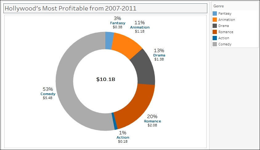
A donut chart, like a pie chart, shows part-to-whole relationships. And like a traditional donut (the sweet, edible kind), it has a hole in the middle.

In this recipe, we will create a donut chart that shows the breakdown of Hollywood's top movies from 2007-2011 by genre.

Getting ready

To follow this recipe, open B05527_02 – STARTER.twbx. Use the worksheet called Donut, and connect to the HollywoodMostProfitableStories data source.

How to do it...

The following are the steps to create a donut chart:

  1. Change the mark type to Pie in the Marks card.

  2. From Measures, drag Worldwide Gross Amount to Angle in the Marks card.

  3. From Dimensions, drag Genre to Color in the Marks card.

  4. To make the pie easier to view, set the chart to show as Entire View from the toolbar.

  5. Right-click on the Genre pill in the Color in the Marks card and select Sort….

  6. Sort the slices by the Sum of the Worldwide Gross Amount in Ascending order.

  7. From Dimensions, drag Genre to Label in the Marks card.

  8. From Measures...

Creating a unit chart


Unit charts, also referred to as pictogram charts, display each unit of measure as a single mark or symbol. While other types of charts may be more effective and less cluttered, unit charts may create more engagement because of the images and visuals used.

In this recipe, we will create a unit chart that shows all the medals that were won by Canada in the Summer Olympics from 1896-2008.

Getting ready

To follow this recipe, open B05527_02 – STARTER.twbx. Use the worksheet called Unit Chart, and connect to the ALL MEDALISTS (Summer_Olympic_medallists_1896-2008) data source.

How to do it...

The following are the steps to create a unit chart:

  1. From Dimensions, drag NOC to the Filters shelf and filter to CAN.

  2. From Dimensions, drag Edition to Rows.

  3. From Dimensions, drag City to Rows, to the right of Edition.

  4. Create a calculated field called # of Medals. This field should be fixed to Edition and NOC so that it is not affected by the data fields (pills) used in the view.

  5. From Dimensions...

Creating a box and whisker chart


Box and whisker plots, also called box plots, are charts that divide their data points into quartiles. Box plots are great at comparing distributions of data for different groups or categories side by side.

In this recipe, we will create a box and whisker plot that shows the spread of points garnered by NBA teams from 2000-2009.

Getting ready

To follow this recipe, open B05527_02 – STARTER.twbx. Use the worksheet called Box and Whisker, and connect to the Player Stats (NBA Players Regular Season 2009) data source.

How to do it...

The following are the steps to create a box and whisker plot:

  1. From Dimensions, drag League to the Filters shelf and filter to N for NBA.

  2. From Dimensions, drag Year to the Filters shelf and choose years 2000-2009.

  3. Ctrl + click Year from Dimensions and Points from Measures to select both data fields from the side bar.

  4. While Year and Points are still selected, expand Show Me.

  5. Select the Box and Whisker plot icon in Show Me, as shown in the following...

Creating a sparkline with indicators


Sparklines are really small, compressed charts that are good for showing a high level volatility or trends in data.

In this recipe, we will create a sparkline with additional indicators at the line end.

Getting ready

To follow this recipe, open B05527_02 – STARTER.twbx. Use the worksheet called Sparkline with Indicators, and connect to the DOHMH New York City Restaurant data source.

How to do it...

The following are the steps to create a sparkline with indicators at the end:

  1. From Dimensions, drag Inspection Date to the Filters shelf.

  2. When prompted on what to filter, choose Years.

  3. In the next window, under the General tab, select all years except 1900.

  4. From Dimensions, drag Cuisine Description to the Filters shelf and under the Top tab, select Top and 15 by Sum of Number of Records.

  5. From Dimensions, drag Cuisine Description to the Rows shelf.

  6. From Dimensions, right-click drag Inspection Date to the Columns shelf, and choose continuous month. This is the fourth field...

Creating a KPI text table


Key performance indicators, or KPIs, are metrics that indicate how well an organization is performing against its objectives. KPIs are typically represented as easily understandable color-coded symbols in a dashboard. For example, a red circle could mean that area is not meeting objectives, while a green circle does.

In this recipe, we will show the top 10 New York restaurant cuisines based on their average inspection scores from 2012-2016 in a text table with KPIs.

Getting ready

To follow this recipe, open B05527_02 – STARTER.twbx. Use the worksheet called KPI Text Table, and connect to the DOHMH New York City Restaurant data source.

How to do it...

The following are the steps to create a KPI table:

  1. From Dimensions, drag Inspection Date to the Filters shelf.

  2. When prompted on what to filter, choose Years.

  3. In the next window, under the General tab, select all years except 1900.

  4. From Dimensions, drag Inspection Date to the Columns shelf.

  5. From Dimensions, drag Cuisine Description...

Creating a waterfall chart


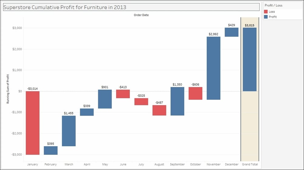
Waterfall charts look like bar charts, but these specifically show the aggregated effect of a series of positive and negative values. The final bar represents the net value of all the preceding values. Waterfall charts can be useful when the history as well as the final net value is important to be shown. This can be applied, for example, to showing beginning and ending inventory numbers, and showing how the ending inventory number came to be.

In this recipe, we will use the waterfall chart to show cumulative changes in profit for Furniture in the Superstore data set.

Getting ready

To follow this recipe, open B05527_02 – STARTER.twbx. Use the worksheet called Waterfall, and connect to the Orders (Sample – Superstore) data source.

How to do it...

The following are the steps to create a waterfall chart:

  1. From Dimensions, drag Category to the Filters shelf.

  2. In the next windows, under the General tab, select Furniture.

  3. From Dimensions, drag Order Date to the Filters shelf.

  4. When...

Creating a population pyramid


A population pyramid is a chart that shows population distribution by age and gender. Age is typically distributed using five-year age groups. The youngest groups are located at the base and the oldest groups at the top. Population pyramids can indicate how slow or fast the population ages, and can also be used to forecast how the population will change in the future.

In this recipe, we will create British Columbia's population pyramid from 1986 to 2041.

Getting ready

To follow this recipe, open B05527_02 – STARTER.twbx. Use the worksheet called Population Pyramid, and connect to the BC Population Projection data source.

How to do it...

The following are the steps to create a population pyramid:

  1. From Dimensions, drag Age Bracket to the Rows shelf.

  2. Hover over the Age Bracket column header until you see a sort icon, and click on the sort icon. Click on the sort icon twice to sort the Age Bracket values descending.

  3. Right-click on Total value for Age Bracket and select...

lock icon
The rest of the chapter is locked
You have been reading a chapter from
Tableau 10 Business Intelligence Cookbook
Published in: Nov 2016Publisher: PacktISBN-13: 9781786465634
Register for a free Packt account to unlock a world of extra content!
A free Packt account unlocks extra newsletters, articles, discounted offers, and much more. Start advancing your knowledge today.
undefined
Unlock this book and the full library FREE for 7 days
Get unlimited access to 7000+ expert-authored eBooks and videos courses covering every tech area you can think of
Renews at $15.99/month. Cancel anytime

Authors (2)

author image
Donabel Santos

Donabel Santos is a self-confessed data geek. She loves working with data, writing queries, and developing reports on her SQL Server databases, and exploring and visualizing data with Tableau. She is the principal and senior business intelligence architect at QueryWorks Solutions, a Tableau Learning and Alliance partner in Vancouver, BC, Canada, providing consulting and training services. She has spent years in consulting and has developed a variety of solutions for clients in different verticals—finance, manufacturing, healthcare, legal, higher education, and local government. Donabel is a multi-year Microsoft Data Platform MVP (previously known as SQL Server MVP) and has extensive experience in the SQL server in different areas, such as development, administration, data warehouse, reporting (SSRS), tuning, troubleshooting, XML, CLR, and integration with ERPs and CRMs using PowerShell, C#, SSIS, and Power BI. One of Donabel's passions is teaching and sharing her love for data. She is a Tableau Certified Professional and a Tableau accredited trainer, delivering Tableau public and on-site client training. She is also the lead instructor for a number of courses at British Columbia Institute of Technology (BCIT), including Applied Database Administration and Design (ADAD) and Applied Data Analytics (ADA) programs. She teaches SQL server administration, development, integration (SSIS), data warehouse foundations, and visual analytics with Tableau. Donabel has also authored three other books with Packt Publishing: SQL Server 2012 with PowerShell V3 Cookbook, PowerShell for SQL Server Essentials, and SQL Server 2014 with PowerShell V5 Cookbook. She also contributed a chapter to Manning Publications' PowerShell Deep Dives.
Read more about Donabel Santos

author image
Paul Banoub

Contacted on: 18/12/2015 for Mastering Tableau 10 [video]
Read more about Paul Banoub