


Creating an area chart
An area chart is very similar to a line chart (time series graph) with the area between the axis and the line shaded. A stacked area chart segregates the area, based on related categories. Area charts may allow trends to be more easily spotted because the eye focuses on a bigger area rather than comparing lines.
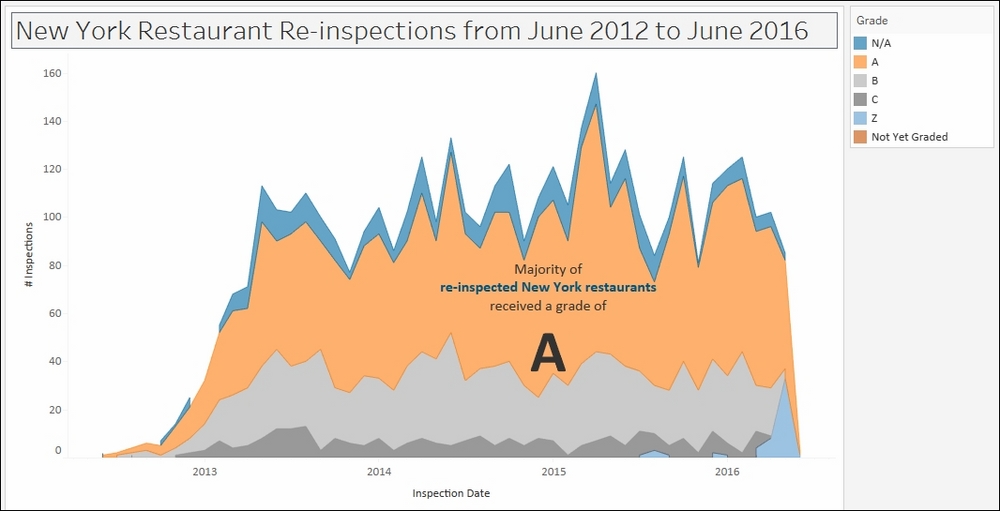
In this recipe, we will create an area chart that will show the results of restaurant re-inspections in New York City from June 2012 to June 2016.
Getting ready
To follow this recipe, open B05527_01 – STARTER.twbx. Use the worksheet called Area, and connect to the DOHMH New York City Restaurant data source.
How to do it...
The following are the steps to create the area chart for re-inspections:
Change the mark type to Area in the Marks card.
From Measures, drag Number of Records to Rows.
From Dimensions, right-click and drag Inspection Date to Columns. This will open a window asking for the specific value to place.
Choose continuous month. This is the MONTH(Inspection Date) option in the fourth section, with a green calendar icon to its left.

From Dimensions, right-click drag Inspection Date to Filter. This will open a window that shows the possible variation of values that can be used.
Choose to filter by discrete year, which is the third option called Years with a blue # beside it, and then click Next >.

Under the General tab, choose all years except for 1900.

Under the Wildcard tab:
Type the keyword Re-inspection in the Match value: text box
Choose Contains in the radio button options
Leave the checkbox to Include all values when empty checked

From Dimensions, right-click and drag Grade to Color in the Marks card.
Click on the drop-down arrow beside the color legend and choose Edit colors….
Choose the Color Blind 10 palette and click on Assign Palette. Click on OK when done.
Right-click on an empty area in your chart and select Annotate, and then Area.
Add the following annotation, and place it on top of the area that represents the A grades.

How it works...
Area charts look like line charts (or time series graphs) that have shaded areas. Area charts are also similar to stacked bar charts, where the areas are cumulative. It is best used when you want to show the cumulative value of the measures you are using. Area charts, however, bear the same risks as the stacked bar chart. Because individual areas are stacked, it is hard to compare the different areas because they don't all start in the same level.
Creating an area chart is similar to creating your line chart and your stacked bar chart. You create a time series graph first. By default, Tableau will create a time series graph (or line graph) first when you put a Date or Date & Time field in either Rows or Columns, and a Measure in the other.
Once you have the time series graph, you can change the mark to Area, and drop a dimension in Color in the Marks card to create the different colored areas.
There's more...
I've often asked students in my training classes when they would usually use area charts, and majority of the time students mention budgeting. With budgeting, they care about what proportion over time goes to which categories, but they also care about the cumulative value of the budget.
See also
Please refer to the Creating a stacked bar chart recipe in this chapter


