Reader small image

You're reading from  Tableau 10 Business Intelligence Cookbook

Product typeBook
Published inNov 2016
PublisherPackt
ISBN-139781786465634
Edition1st Edition
Tools
Right arrow
Authors (2):
Donabel Santos
Donabel Santos
author image
Donabel Santos

Donabel Santos is a self-confessed data geek. She loves working with data, writing queries, and developing reports on her SQL Server databases, and exploring and visualizing data with Tableau. She is the principal and senior business intelligence architect at QueryWorks Solutions, a Tableau Learning and Alliance partner in Vancouver, BC, Canada, providing consulting and training services. She has spent years in consulting and has developed a variety of solutions for clients in different verticals—finance, manufacturing, healthcare, legal, higher education, and local government. Donabel is a multi-year Microsoft Data Platform MVP (previously known as SQL Server MVP) and has extensive experience in the SQL server in different areas, such as development, administration, data warehouse, reporting (SSRS), tuning, troubleshooting, XML, CLR, and integration with ERPs and CRMs using PowerShell, C#, SSIS, and Power BI. One of Donabel's passions is teaching and sharing her love for data. She is a Tableau Certified Professional and a Tableau accredited trainer, delivering Tableau public and on-site client training. She is also the lead instructor for a number of courses at British Columbia Institute of Technology (BCIT), including Applied Database Administration and Design (ADAD) and Applied Data Analytics (ADA) programs. She teaches SQL server administration, development, integration (SSIS), data warehouse foundations, and visual analytics with Tableau. Donabel has also authored three other books with Packt Publishing: SQL Server 2012 with PowerShell V3 Cookbook, PowerShell for SQL Server Essentials, and SQL Server 2014 with PowerShell V5 Cookbook. She also contributed a chapter to Manning Publications' PowerShell Deep Dives.
Read more about Donabel Santos

Paul Banoub
Paul Banoub
author image
Paul Banoub

Contacted on: 18/12/2015 for Mastering Tableau 10 [video]
Read more about Paul Banoub

View More author details
Right arrow

Creating a heat map


Heat maps are graphs that display information using a matrix of colors. Often the density of color in the matrix represents the concentration of information, or the relative magnitude of the values. Heat maps are great for spotting patterns based on the concentration or density of information.

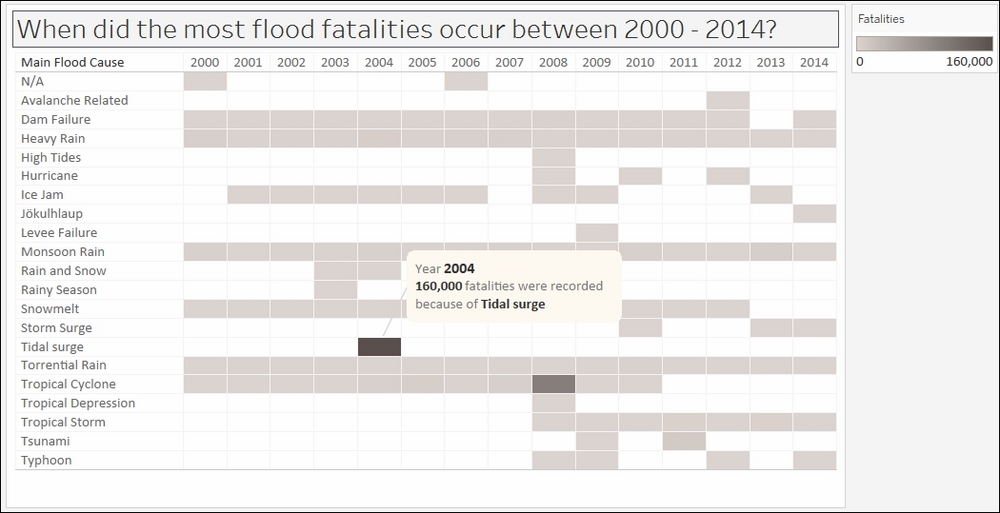
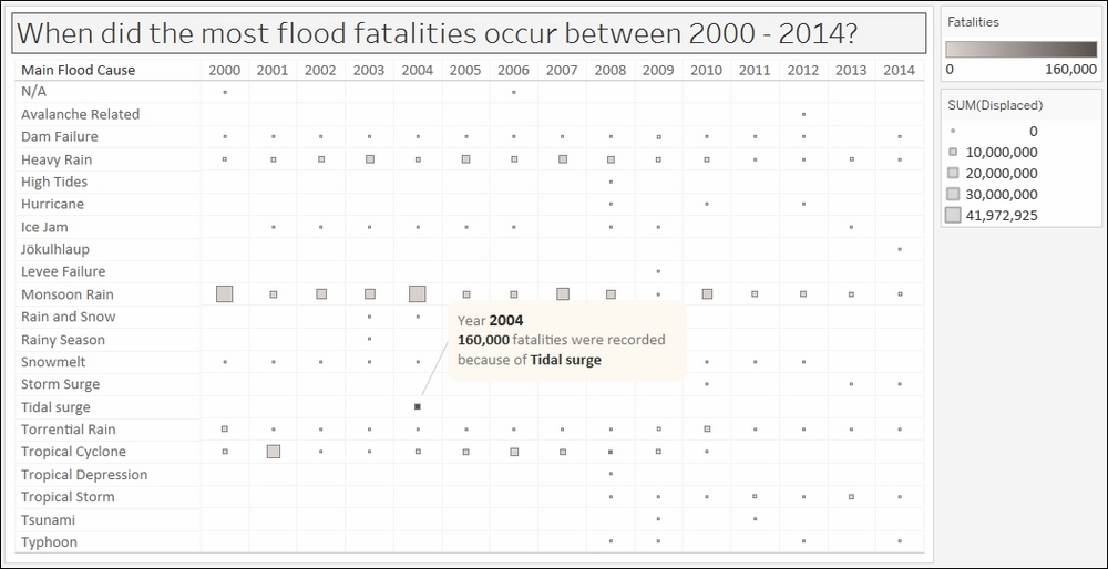
In this recipe, we will create a heat map that can easily show which flood caused the most fatalities, and in which year it occurred.

Getting ready

To follow this recipe, open B05527_01 – STARTER.twbx. Use the worksheet called Heat Map, and connect to the MasterTable (FlooddataMasterListrev) data source.

How to do it...

The following are the steps to create the heat map:

  1. From Dimensions, drag Began to Rows. Tableau will automatically choose the YEAR level for this date field.

  2. Right-click on the Null column heading produced by the YEAR(Began) pill in Rows, and select Exclude.

  3. From Dimensions, drag Main Flood Cause to Columns.

  4. From Measures, drag Dead to Color in the Marks card.

  5. Click on the top-right drop-down arrow of the color legend and choose Edit title….

  6. Edit the title of the color legend to display Fatalities.

  7. Click on the drop-down arrow beside the color legend and choose Edit colors….

  8. Choose the Gray Warm 10.0 palette and click on Assign Palette. Click on OK when done.

  9. Adjust the width and height of the columns. You can do this by moving your mouse pointer to the column or row edge of a film until you see a double-headed arrow. The left-right double-headed arrow allows you to adjust the width, and the up-down double-headed arrow allows you to adjust the height.

  10. Add the grid borders. You can do this by selecting the Format menu item, and selecting Borders…. The format sidebar will replace the original data sidebar. In this Format borders side bar, under the Sheet tab Default section, add borders to the Cell, Pane, and Header.

  11. Right-click on the column with the darkest color—the column that represents the year 2004 and the main cause of Tidal Surge. Select Annotate and then Mark. Add the following annotation:

How it works...

Heat maps allow us to easily see values that stand out based on the color density. In our recipe, we created a grid of colors based on the number of fatalities caused by floods. Where the color is darkest is when the number of fatalities was the highest.

To create a heat map in Tableau, we simply need to identify the dimensions we want and place them into our Rows and/or Columns. We also need to place a measure onto the Color in the Marks card, and this determines the density of the color for that intersection or column.

There's more...

By default, measures, when dropped onto Color in the Marks card, will produce a gradient of colors. While pretty, sometimes the color differences are not so discernible. To make the colors more easily identifiable, we can elect to step the colors.

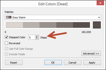
Stepping the color means there will be a finite number of colors used, instead of a gradient of colors that has all the color progression from the palette. The challenge with gradient is it is not easy to see how different one light blue is from another light blue, for example.

Another common variation for heat maps is adding another measure to Size in the Marks card. When you do this, the heat map will now have a series of different sized squares, instead of having a uniform size grid. For example, the following chart is what we will get if we place the measure Displaced onto Size.

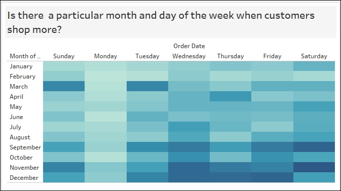
What other use cases can benefit from a heat map? Heat maps can be used to spot trends in different verticals—to spot when students register, promotions are redeemed, profit increases, traffic is light/heavy and so on. The following screenshot can help identify shopper behavior—whether there is any particular month and day combination that seems to be most popular to shoppers.

See also

  • Please refer to the Creating a text table (crosstab) recipe in this chapter

  • Please refer to the Creating a highlight table recipe in this chapter

Previous PageNext Page
You have been reading a chapter from
Tableau 10 Business Intelligence Cookbook
Published in: Nov 2016Publisher: PacktISBN-13: 9781786465634
Register for a free Packt account to unlock a world of extra content!
A free Packt account unlocks extra newsletters, articles, discounted offers, and much more. Start advancing your knowledge today.
undefined
Unlock this book and the full library FREE for 7 days
Get unlimited access to 7000+ expert-authored eBooks and videos courses covering every tech area you can think of
Renews at $15.99/month. Cancel anytime

Authors (2)

author image
Donabel Santos

Donabel Santos is a self-confessed data geek. She loves working with data, writing queries, and developing reports on her SQL Server databases, and exploring and visualizing data with Tableau. She is the principal and senior business intelligence architect at QueryWorks Solutions, a Tableau Learning and Alliance partner in Vancouver, BC, Canada, providing consulting and training services. She has spent years in consulting and has developed a variety of solutions for clients in different verticals—finance, manufacturing, healthcare, legal, higher education, and local government. Donabel is a multi-year Microsoft Data Platform MVP (previously known as SQL Server MVP) and has extensive experience in the SQL server in different areas, such as development, administration, data warehouse, reporting (SSRS), tuning, troubleshooting, XML, CLR, and integration with ERPs and CRMs using PowerShell, C#, SSIS, and Power BI. One of Donabel's passions is teaching and sharing her love for data. She is a Tableau Certified Professional and a Tableau accredited trainer, delivering Tableau public and on-site client training. She is also the lead instructor for a number of courses at British Columbia Institute of Technology (BCIT), including Applied Database Administration and Design (ADAD) and Applied Data Analytics (ADA) programs. She teaches SQL server administration, development, integration (SSIS), data warehouse foundations, and visual analytics with Tableau. Donabel has also authored three other books with Packt Publishing: SQL Server 2012 with PowerShell V3 Cookbook, PowerShell for SQL Server Essentials, and SQL Server 2014 with PowerShell V5 Cookbook. She also contributed a chapter to Manning Publications' PowerShell Deep Dives.
Read more about Donabel Santos

author image
Paul Banoub

Contacted on: 18/12/2015 for Mastering Tableau 10 [video]
Read more about Paul Banoub