


Bar charts represent numeric values as bars, split across clear categories. Bar charts are very effective charts for comparing magnitudes, and spotting highs and lows in the data.
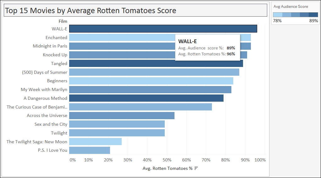
In this recipe, we will create a bar chart that shows the top 15 movies in 2007-2011 by Average Rotten Tomatoes Score.
To follow this recipe, open B05527_01 – STARTER.twbx file. Use the worksheet called Bar, and connect to the HollywoodMostProfitableStories data source.
The following are the steps to create the top 15 movies bar chart:
From Dimensions, drag Film to Rows.
From Measures, drag Rotten Tomatoes % to Columns.
Change the aggregation of Rotten Tomatoes % from Sum to Average. You can do this by clicking on the drop-down icon in the Rotten Tomatoes % pill, or by right-clicking it:

Hover your mouse pointer over the Avg. Rotten Tomatoes % axis and click on the sort icon that appears. This will sort the bars in descending order:

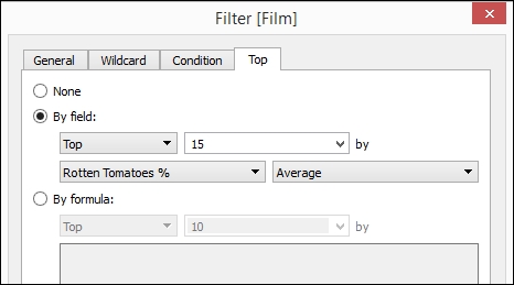
From Dimensions, drag Film to the Filters shelf. This will open a menu for filters:

Select the Top tab. Choose By field: and specify Top,
15, Rotten Tomatoes %, and Average as shown next. Click OK when done:
Adjust the width and height of the film titles. You can do this by moving your mouse pointer to the column or row edge of a film until you see a double-headed arrow. The left-right double-headed arrow allows you to adjust the width, and the up-down double-headed arrow allows you to adjust the height.
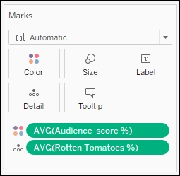
From Measures, drag Audience Score % to the Color in the Marks card. Change the Aggregation from Sum to Average:

Click on the drop-down arrow beside the color legend and choose Edit title…. Change the title to
Avg Audience Score. You can get to this option by clicking on the drop-down arrow on the color legend's top-right corner.
Click on the drop-down arrow beside the color legend again. This time choose Edit colors….
Choose the Blue 10.0 palette. Select the Stepped Color, and specify
5steps:
Click on Tooltip in the Marks cards, and add the following tooltip:
Note
Note that only fields you have used in the sheet can be added in the tooltip via the Insert dropdown. You can also add some predefined values such as Data Source Name, Sheet Name, or Page Count.

Bar charts are probably one of the most common, if not the most common, type of chart that is used to visualize data. Bar charts are best used when you are comparing numeric data that is clearly split between different items or categories. These charts are an easy favorite among the chart types because it allows us to easily look at the edges, and see approximately how much longer one bar is than another, even if the difference is very slight. Bars are also often sorted to make it easy to spot top or bottom items.
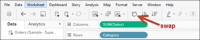
Bar charts can be presented either vertically or horizontally. The decision sometimes depends on the number of items being represented. If you have many items, labels can become less readable with vertical bar charts. In Tableau, there is an easy way to switch between vertical and horizontal bar charts. There is a swap icon in the Tableau toolbar that swaps the pills from Rows to Columns and vice versa.
In this recipe, we simply dragged the Film dimension to Columns and the Avg. Rotten Tomatoes % measure to Rows, and Tableau already knew what to do. When you check out your Marks card, you will see that the selection is still set to Automatic, but the actual icon beside it is bars:
To help the reader understand the bar chart better, we can also sort the bars in either ascending or descending fashion. A quick way to sort items in Tableau is by hovering over a column header or an axis, until you see a sort icon appear. In an axis, the first click on the icon sorts the marks in descending fashion. The second click sorts ascending, and the third click sorts it back to data source order. With a column header, which is produced by discrete fields, the fields will be sorted alphabetically in ascending order on the first click, descending on the second click, and then back to data source order on the third click.
Note
Discrete and continuous fields are discussed in more detail in Appendix C, Working with Tableau 10. This book comes with a supplementary chapter – Appendix C, Working with Tableau 10, which aims to help the novice navigate their way and get up to speed with Tableau. This supplementary chapter can be downloaded from the following link:
https://www.packtpub.com/sites/default/files/downloads/AppendixCWorkingwithTableau10.pdf
In our recipe, we also picked the top 15 highest rated films from our data source. We are setting the expectation that as the reader sees the movies from top to bottom, the ratings also are lower. Tableau makes it easy to pick the top n items on some measure. You can simply right-click on the dimension you want to filter, and select Filter… to open the filter window for more options. Tableau provides a tab called Top, which allows you to keep only the top or bottom n items, based on a measure you specify.
One enhancement we can do with bar charts that Tableau allows us to do very easily is to overlay another measure. In this recipe, we used color to show the Avg Audience Score %. You will notice that although the length of the bars are in descending fashion, the color density doesn't follow the same pattern. This indicates that the audience may not necessarily agree with the Rotten Tomatoes % ratings.
Bar charts can also be created using Tableau's Show Me tool, which by default appears in the top-right corner of your Tableau design area. You simply need to select the fields from your side bar that you wish to visualize, and the possible charts from this combination are enabled in the Show Me tool. The Show Me tool is introduced and discussed in more detail in Appendix C, Working with Tableau 10.