


Creating a word cloud
A word cloud, also called a tag cloud, is typically a collection of keywords or text data visualized using size and color. Often, the goal of a word cloud is to represent the relative importance or prevalence of the keywords. Word clouds are not meant to allow the audience to clearly and accurately compare the underlying values of each keyword.
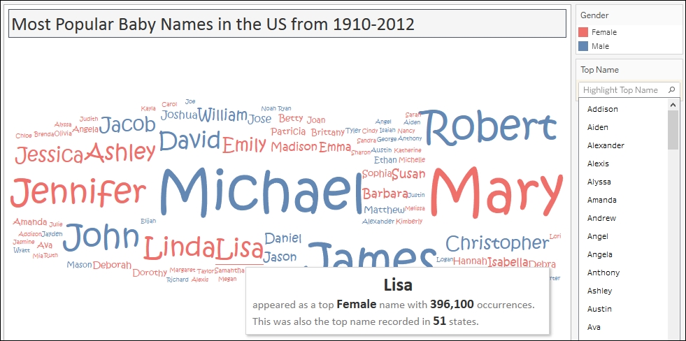
In this recipe, we will create a viz that shows the most popular baby names from 1910-2012. Note that viz is a slang word for visualization.
Getting ready
To follow this recipe, open
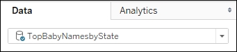
B05527_01 – STARTER.twbx. Use the worksheet called Word Cloud, and connect to the TopBabyNamesByState data source.
How to do it...
The following are the steps to create a word cloud:
Change the mark type to Text in the Marks card.
From Measures, drag Occurences to Size in the Marks card.
From Dimensions, drag Gender to Color in the Marks card.
From Dimensions, drag Top Name to Text in the Marks card.
From Dimensions, right-click and drag State to Text in the Marks card.
Select CNTD(State) .
Click on Tooltip in the Marks card to format the tooltip with the following information:

Click on the drop-down arrow beside the color legend and choose Edit colors….
Choose the Superfishel Stone palette and click on Assign Palette. Click on OK when done.
Right-click on the Top Name pill in the Marks card, and select Show highlighter. This will show the data highlighter control, a new feature in Tableau 10, which allows you to search and highlight all points on hover.
Change the font style of the names to a font style of your choice. To do this, click on Label in the Marks card, and select the ellipsis button under Label Appearance to modify the style of the text.
How it works...
A word cloud can be created in Tableau if you have a field that contains the keywords or values you want displayed in the word cloud, as well as a measure that determines the size of that keyword.
In this recipe, we change the mark to Text, and display the Top Name in Text.
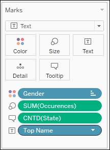
In addition, we vary the Size of the names based on the number of occurrences it has in our data source. We also color the names differently based on Gender which is recorded from our data source.
In our tooltip, we also display in how many states this name was recorded as a Top Name. Since we don't use State anywhere in the visualization, but want to use it in our tooltip, we can make this data field available either by dragging it to Tooltip or Detail.
When you right-click and drag a data field onto Rows, Columns, or any of the other shelves, a window with different options for values comes up. When you right-click and drag State, you are going to be prompted with exactly what about State you want to display.
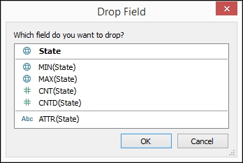
In our recipe, we chose CNTD(State), which is the numeric value for the unique number of states related to the Top Name.
There's more...
You have probably seen some word clouds in some of the websites or blog sites you visit. Although it is hard to measure just by looking at the word cloud how many more times a keyword occurs compared to another keyword, this may be an effective chart depending on the context, intent, and audience. Arguably, bar charts would be more effective if you want to clearly state the difference in magnitude. However, in some cases, the intent is to simply illustrate and highlight which keywords are often used or mentioned. Sometimes, the relative comparison may be sufficient.
See also
Please refer to the Creating a bubble chart recipe in this chapter


