Making the look and feel of your slides consistent
The human eye has the superpower of seeing even the smallest of details and that can derail our concentration. This means if your titles seem to be jumping around from one slide to the next, your audience will notice it. There is the same problem if you have been using different font sizes for titles or content across your presentation, or if you have used various alignment styles throughout your presentation.
What does consistency look like? Here is a list of elements that will help you achieve it:
- Using a maximum of two font styles for titles and content
- Placing titles and content placeholders in the same position for identical layouts
- Using a specific color scheme that is applied consistently throughout your presentation
- Formatting titles and content elements with the same font size and font type and the same alignment
- Keeping enough whitespace or blank areas on your slides helps the audience to understand your content
I am also sharing a screenshot of a short presentation I did a few years ago to show you an example of how slides can be made consistent (see Figure 2.9). As you can see, titles are placed in the same position on all similar slide layouts, using the same font style and size. A thin rectangle is used at the bottom of each slide to recall my corporate colors without using my logo on all the slides.
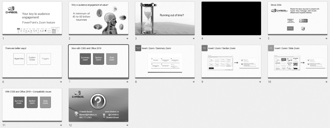
Figure 2.9 – Example of how slides can have a consistent look
Making your slides consistent also means creating layouts that can be reused for similar types of content. You can plan to have slides with a short list of bullet points, some with one image and text, others with full-slide images with a banner over them, and so on. The possibilities are endless if you give your creativity a chance. Of course, you might be starting to think you will never have enough time to create consistent slides if you must create each slide one by one. No worries, that is why Chapter 3, Leveraging PowerPoint’s Slide Master for Design, is next. You will get familiar with what I call the best design automation feature in PowerPoint.