

Learning how to structure the layout and managing themes
So far, we have discussed the basic structure of a Dash app and gone through a brief overview of its main elements: the imports, app instantiation, app layout, callbacks (which we will cover in the next chapter), and running the app. We created a bare-bones app, and then we learned how to add a few HTML elements to it. We are now ready to take our app to the next level—from a layout perspective. We will keep working with the app.layout attribute and control it in a more powerful and flexible way using the Dash Bootstrap Components package.
Bootstrap is basically a set of tools that abstract away many details for handling the layout of web pages. Here are some of the most important benefits of using it:
- Themes: As we will see in a moment, changing the app's theme is as simple as providing an additional argument while instantiating the app. Dash Bootstrap Components ships with a set of themes that you can select from and/or edit.
- Grid system: Bootstrap provides a powerful grid system, so we can think about our pages more from a user perspective (rows and columns) and not have to focus on the screen attributes (pixels and percentages), although we still have access to those low-level details whenever we need to.
- Responsiveness: Having a large number of possible screen sizes makes it almost impossible to properly design page layouts. This is handled for us, and we can also fine-tune the behavior of page elements to control how their sizes change as the screen size changes.
- Prebuilt components: A set of prebuilt components is also provided, which we will be using. Alerts, buttons, drop-down menus, and tabs are some of the components that Bootstrap provides.
- Encoded colors: We also get a set of colors for easy communication with users, in case we have a warning, an error, simple information, and so on.
Let's explore these features one by one.
Themes
First, let's see how easy it is to change the theme of an app. In the same app.py file, add the following import and the new argument to the app creation call:
import dash_bootstrap_components as dbc
…
app = dash.Dash(__name__, external_stylesheets=[dbc.themes.BOOTSTRAP])
…
Running the app again, you should see that the theme has changed. As shown in Figure 1.6, you can also see other sample themes, and I also added their names and how to set them at the bottom of each page:
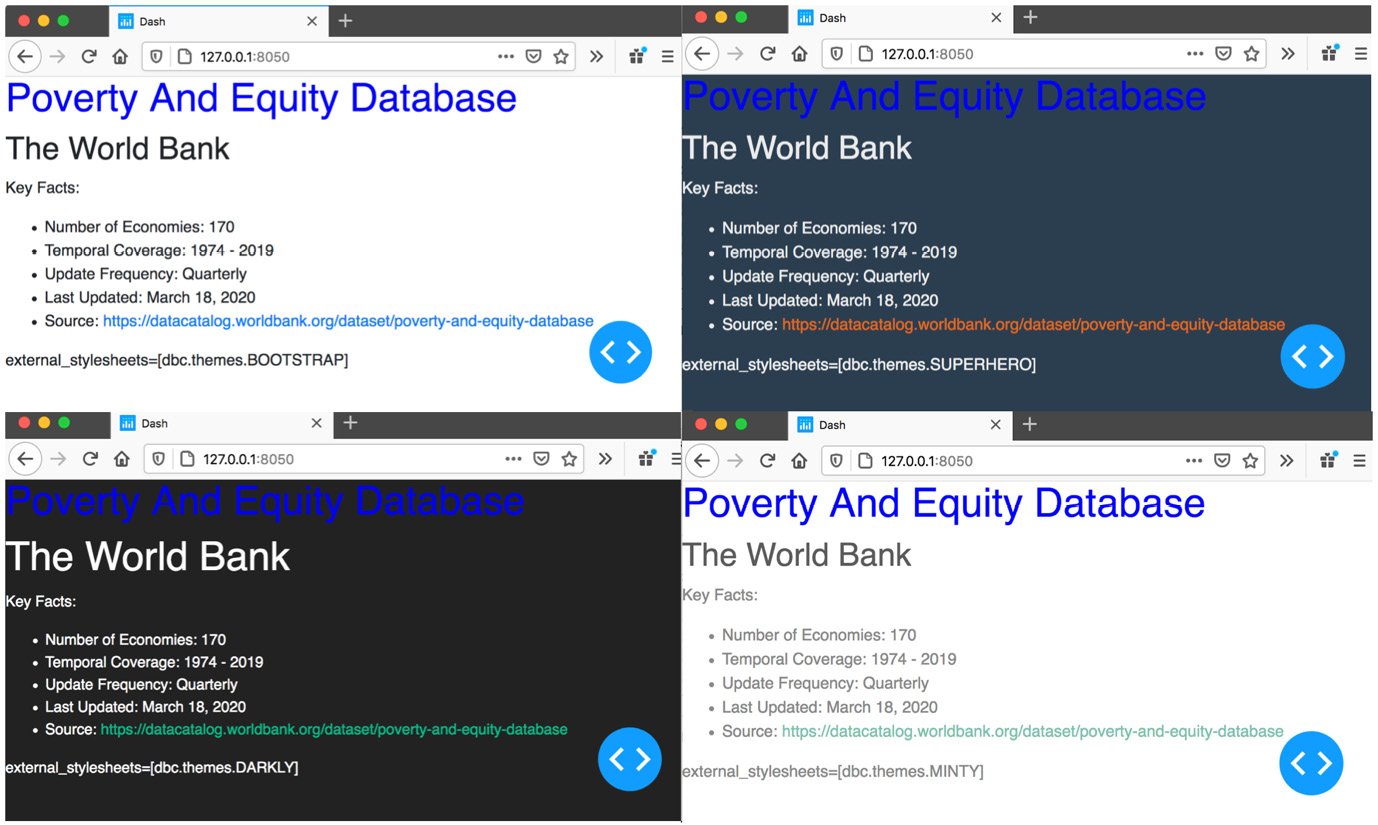
Figure 1.6 – Theme samples and how to set them
You can see how easy it is to completely change the look and feel of the app, simply by changing one argument. Note also that the color and font size of the <h1> element were overridden in the style argument. We specifically set the color to "blue" and the size to "40px". Usually, this is not advisable; for example, in the two dark themes in the figure it is very difficult to read the blue text. So, be careful when you make such changes.
Grid system and responsiveness
Another powerful benefit that we get from Bootstrap is its grid system. When adding Dash HTML Components, we saw that we can do so by appending items to the children parameter of the main html.Div element. In this case, every added item occupies the full width of the screen and takes as much screen height as it needs to display its contents. The order of the elements in the list determines their order of display on the screen as well.
Displaying elements side by side in columns
While it's possible to do this by editing the style parameter of any HTML element, it is a bit tedious and can be brittle. You have to worry about too many details, and it might break in unexpected ways. With Bootstrap, you simply define a column, and that in turn behaves as an independent screen, displaying its elements on top of one another, with each element occupying the full width of this mini screen. Columns' widths can also be specified in powerful and flexible ways. The grid system divides the screen into 12 columns, and the width of a column can be specified by using a number from 1 to 12 inclusive. Figure 1.7 shows how the columns can be defined, and how they would change for screens of different size:
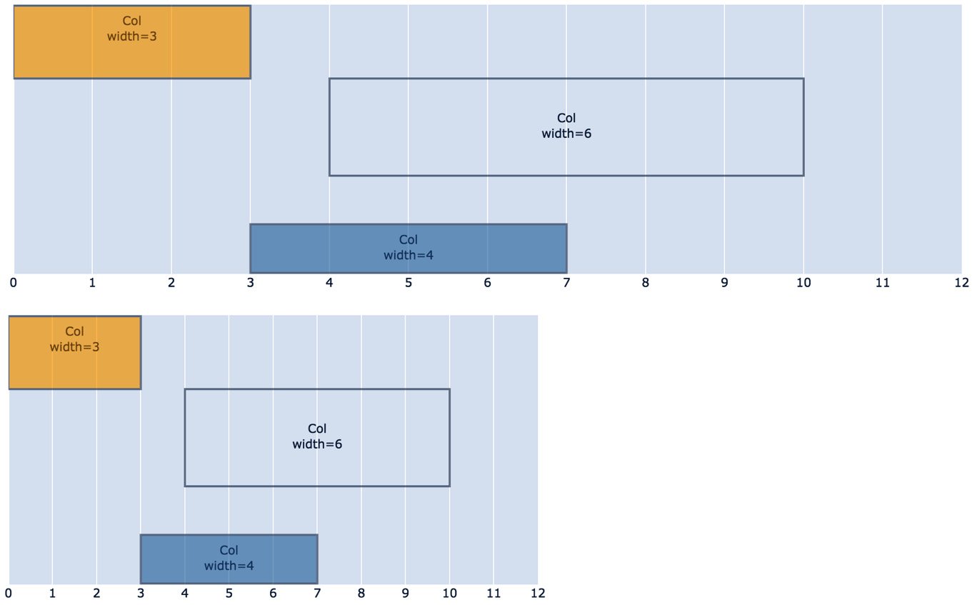
Figure 1.7 – The same column layout on two screen sizes
As you can see, the two screens are identical, and the resizing happens automatically, while maintaining the proportions.
In many cases, this might not be exactly what you want. When the screen width becomes smaller, it might make more sense to expand the columns to be more easily readable by the users. For this, we have the option of specifying the width of columns for each of five possible screen widths: xs (extra-small), sm (small), md (medium), lg (large), and xl (extra-large). These are also the names of the parameters that you can set:
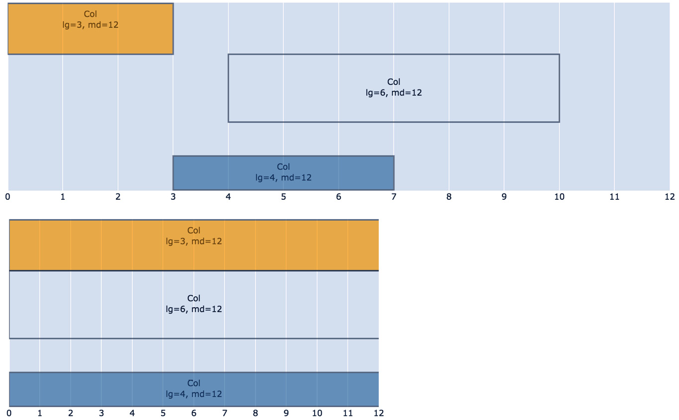
Figure 1.8 – Granular control of column width based on screen size
Figure 1.8 shows how this is achieved by setting two arguments for the column. The way to set these values is simple, as indicated in the figure. The full code would be something like this:
import dash_boostrap_components as dbc
dbc.Col(children=[child1, child2, …], lg=6, md=12)
The lg=6, md=12 arguments simply mean that we want this column to have a width of six when the screen is large (lg), which means 6 ÷ 12, or half the screen's width. On screens of medium size (md), set the column width to 12, which means the full width of the screen (12 ÷ 12).
You might be wondering how we can have the columns in the middle of the page, and not starting from the left, as is the case in Figures 1.7 and 1.8. The width and the different size parameters can also take a dictionary, one of the keys of which can be offset, and this is how you set its horizontal location on the screen:
dbc.Col(children=[child1, child2, …], lg={'size': 6, 'offset': 4}, md=12)
As you can see, lg became a dictionary where we indicated that we want that column to skip the first four columns from the left, and be displayed after that, in the specified size.
Finally, if you want to place multiple columns next to each other, you simply have to place them in a row (with Row), and they will be placed next to each other:
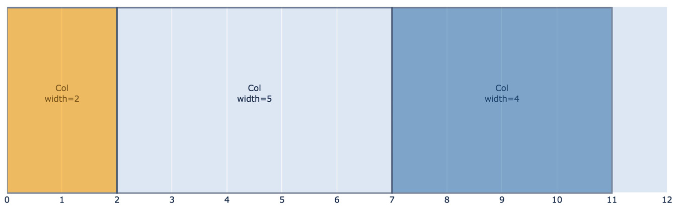
Figure 1.9 – Columns side by side in a row
In order to produce the layout in Figure 1.9, we can simply place the three columns in a list and pass it as the children parameter to a row element:
dbc.Row([
    dbc.Col('Column 1', width=2),
    dbc.Col('Column 2', width=5),
    dbc.Col('Column 3', width=4),
])
Prebuilt components
While we won't cover them all, we will be using several of those components, and they are generally straightforward to create. Please check the documentation for ideas and details of each component: https://dash-bootstrap-components.opensource.faculty.ai/. We will shortly modify the app to include some prebuilt components.
Encoded colors
Although you can set any color you want for text, background colors, and many other elements using its hexadecimal representation, Bootstrap provides a set of named colors based on the type of information you are trying to convey. This can be set as the color parameter in several components, and it would have a visual meaning to users. For example, setting color="danger" would cause the component to appear in red, and color="warning" as yellow. The available color names are primary, secondary, success, warning, danger, info, light, and dark.
Adding Dash Bootstrap components to our app
We will now add two new related components to the app: Tabs and Tab. As you might have guessed, Tabs is simply a container of Tab components. The result we are aiming for is adding a little more information to the page, and organizing it under new tabs, as you can see in Figure 1.10:
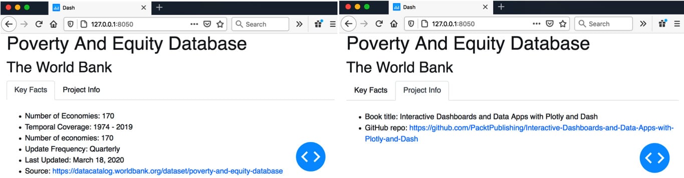
Figure 1.10 – Adding tabs to the app
Tip
One of the most important skills to develop while learning Dash is code refactoring. While the latest version of the app is still very simple, it is a very good idea to make sure you know how to manually refactor the code from the previous version to the new one. The more components you have in your app, the more attention you will need to give to the refactoring details. I suggest you always do this manually and do not simply copy and paste the latest version of the app.
In order to create the tabs, and get the new content in the form you see in Figure 1.10, you will need to make the following changes:
html.H2('The World Bank'),
dbc.Tabs([
    dbc.Tab([
        html.Ul([
            # same code to define the unordered list
        ]),
    ], label='Key Facts'),
    dbc.Tab([
        html.Ul([
            html.Br(),
            html.Li('Book title: Interactive Dashboards and Data Apps with Plotly and Dash'),
            html.Li(['GitHub repo: ',
                     html.A('https://github.com/PacktPublishing/Interactive-Dashboards-and-Data-Apps-with-Plotly-and-Dash',
                            href='https://github.com/PacktPublishing/Interactive-Dashboards-and-Data-Apps-with-Plotly-and-Dash')])
        ])
    ], label='Project Info')
As you can see, we have added one Tabs element, within which we added two Tab elements. In the first one, we simply used the same code that went into defining our ordered list. In the second, we added a similar unordered list with new content. OK, you can copy this part if you want! You can also see how to specify the labels of the tabs, by setting a value for the label parameter.
Now you can run your updated app again, and make sure that the new content went to the right place, and that the tabs work as expected.
We are now ready to add some interactivity to our app.