Reader small image

You're reading from  Learning Tableau 2022 - Fifth Edition

Product typeBook
Published inAug 2022
PublisherPackt
ISBN-139781801072328
Edition5th Edition
Tools
Right arrow
Author (1)
Joshua N. Milligan
Joshua N. Milligan
author image
Joshua N. Milligan

Joshua N. Milligan is a Hall of Fame Tableau Zen Master and 2017 Iron Viz Global finalist. His passion is training, mentoring, and helping people gain insights and make decisions based on their data through data visualization using Tableau and data cleaning and structuring using Tableau Prep. He is a principal consultant at Teknion Data Solutions, where he has served clients in numerous industries since 2004.
Read more about Joshua N. Milligan

Right arrow

Telling a Data Story with Dashboards

In data discovery and analysis, you will likely create numerous data visualizations. Each of these visualizations gives you a snapshot of a story within the data. Each insight into the data answers a question or two. At times, the discovery and analysis phase is enough for you to make a key decision and the cycle is complete. In other cases, you will need to bring the snapshots together to communicate a complete and compelling story to your intended audience.

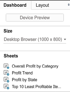
Tableau allows you to bring together related data visualizations into a single dashboard. This dashboard could be a static view of various aspects of the data or a fully interactive environment, allowing users to dynamically filter, drill down, and interact with the data visualizations.

In this chapter, we’ll take a look at most of these concepts within the context of several in-depth examples, where we’ll walk through the dashboard design process, step by step. As before...

Introduction to dashboards

Before diving into some practical examples, let’s take some time to understand what a dashboard is and why you might create one.

From a Tableau perspective, a dashboard is an arrangement of individual visualizations, along with other components, such as legends, filters, parameters, text, containers, images, extensions, buttons, and web objects, that are arranged on a single canvas. Ideally, the visualizations and components should work together to tell a complete and compelling data story. Dashboards are usually (but not always) interactive.

Dashboard objectives

The primary objective of a dashboard is to communicate data to a certain audience with an intended result. Often, we’ll talk about telling the data story. That is, there is a narrative (or multiple narratives) contained within the data that can be communicated to others.

While you can tell a data story with a single visualization or even a series of complex dashboards...

Designing dashboards in Tableau

No matter your objective or approach, the practical task of designing a dashboard in Tableau will look similar each time. In this section, we will go through some fundamental concepts.

Using objects

Dashboards are made up of objects that are arranged on a canvas.

You’ll see a list of objects that can be added to a dashboard in the left-hand pane of a dashboard:

Figure 8.1: Objects available to add to a dashboard

The pane includes these objects:

  • Horizontal: A layout container within which other objects will be arranged in a single row (horizontally).
  • Vertical: A layout container within which other objects will be arranged in a single column (vertically).
  • Text: An object that allows you to include richly formatted text in your dashboard.
  • Image: An image (for example, .gif, .png, or .jpeg) that can be positioned and sized on your dashboard. Optionally, you may set a URL for navigation when a...

A dashboard to understand profitability

Having covered some conceptual topics as well as practical matters related to dashboard design, we’ll dive into an example.

Let’s say you’ve been tasked with helping management find which items are the least profitable. Management feels that most of the least profitable items should be eliminated from their inventory. However, since you’ve done your analysis, you’ve discovered that certain items, while not profitable overall, have made a profit at times in various locations. Your primary objective is to give management the ability to quickly see an analysis of the least profitable items to identify whether an item has always been unprofitable, answering the question, “Is the least profitable item always unprofitable?” This example will combine aspects of a guided analytics dashboard and an exploratory tool.

Building the views

Use the Superstore Sales dataset and follow these steps...

Designing for different displays and devices

When designing a dashboard, some of the first questions you’ll often ask yourself are: How will my audience view this dashboard? What kind of device will they use? With the wide adoption of mobile devices, this latter question becomes very important because what looks great on a large flat-screen monitor doesn’t always look great on a tablet or phone.

The top of the Dashboard tab on the left sidebar reveals a button to preview the dashboard on various devices, as well as a drop-down for Size options:

Figure 8.15: The Device Preview option allows you to design and preview your dashboard for other devices

Clicking the Device Preview button not only allows you to see how your dashboard will look with various device types (and even specific models) but also allows you to add a layout for each device type, which you can customize:

Figure 8.16: Customizable options for devices

You can not only see how...

Interactivity with actions

In Tableau, an action is a user-initiated event that triggers a response from Tableau. You’ve seen a few examples of actions being used in dashboards already. We’ll now consider some details of how actions work in Tableau.

Tableau supports six kinds of actions:

  • Filter actions: The user’s action causes one or more filters to be applied to one or more views.
  • Highlight actions: The user’s action causes specific marks and headers to be highlighted in one or more views.
  • URL actions: The user’s action causes a specific URL to be opened (either in a browser, in a new tab, or in an embedded web object).
  • Go to Sheet: The user’s action causes navigation to a selected sheet or dashboard.
  • Parameter actions: The user’s action changes the value of a parameter. This allows the user to visually interact with parameters in new and exciting ways!
  • Set actions: The user’s action...

A regional scorecard dashboard

Now, we’ll consider another example dashboard that demonstrates slightly different objectives. Let’s say everyone in the organization has agreed upon a KPI of profit ratio. Furthermore, there is consensus that the cut-off point between an acceptable and poor profit ratio is 15%, but management would like to have the option of adjusting the value dynamically to see whether other targets might be better.

Consider the following dashboard:

Figure 8.30: A simple profit KPI dashboard

This dashboard allows your audience to very quickly evaluate the performance of each region over the last six months. Executive management could very quickly pull this dashboard up on their mobile devices and take appropriate action as needed.

The dashboard provides interactivity with the KPI target parameter. Additional drill-down capability into other dashboards or views could be provided if desired. If this view were published on Tableau Server...

Stories

The stories feature allows you to tell a story using interactive snapshots of dashboards and views. The snapshots become points in a story. This allows you to construct a guided narrative or even an entire presentation.

Let’s consider an example in which story points might be useful. The executive managers are pleased with the Regional Scorecard dashboard you developed previously. Now, they want you to make a presentation to the board and highlight some specific issues for the South region. With minimal effort, you can take your simple scorecard, add a few additional views, and tell an entire story:

  1. First, we’ll build a couple of additional views. Create a simple geographic view named ProfitRatio KPI by State. Make this a filled map with the KPI – Profit Ratio field, defining Color.
  2. Add Profit Ratio to the Detail part of the Marks card so that it is available for later use:

Figure 8.34: Profit Ratio KPI by State uses...

Summary

When you are ready to share your discovery and analysis, you will likely use dashboards to relate the story to your audience. The way in which you tell the story will depend on your objectives, as well as your audience and the mode of delivery. Using a combination of views, objects, parameters, filters, and legends, you can create an incredible framework for telling a data story. Tableau allows you to specifically design layouts for different devices to ensure that your audience has the best experience possible. By introducing actions and interactivity, you can invite your audience to participate in the story. Story points will allow you to bring together many snapshots of dashboards and views to craft and present entire narratives.

In the next chapter, we’ll turn our attention to some deeper analysis involving trends, distributions, forecasting, and clustering.

Join our community on Discord

Join our community’s Discord space for discussions with...

lock icon
The rest of the chapter is locked
You have been reading a chapter from
Learning Tableau 2022 - Fifth Edition
Published in: Aug 2022Publisher: PacktISBN-13: 9781801072328
Register for a free Packt account to unlock a world of extra content!
A free Packt account unlocks extra newsletters, articles, discounted offers, and much more. Start advancing your knowledge today.
undefined
Unlock this book and the full library FREE for 7 days
Get unlimited access to 7000+ expert-authored eBooks and videos courses covering every tech area you can think of
Renews at $15.99/month. Cancel anytime

Author (1)

author image
Joshua N. Milligan

Joshua N. Milligan is a Hall of Fame Tableau Zen Master and 2017 Iron Viz Global finalist. His passion is training, mentoring, and helping people gain insights and make decisions based on their data through data visualization using Tableau and data cleaning and structuring using Tableau Prep. He is a principal consultant at Teknion Data Solutions, where he has served clients in numerous industries since 2004.
Read more about Joshua N. Milligan