Reader small image

You're reading from  Learning Responsive Data Visualization

Product typeBook
Published inMar 2016
Reading LevelIntermediate
Publisher
ISBN-139781785883781
Edition1st Edition
Languages
Tools
Right arrow
Authors (2):
Erik Hanchett
Erik Hanchett
author image
Erik Hanchett

Erik Hanchett is a software developer, blogger, and perpetual student who has been writing code for over 10 years. He currently resides in Reno Nevada, with his wife and two kids. He blogs about software development at ProgramWithErik.com. I would like to thank my wife Susan for helping me stay motivated. My friend F.B. Woods for all his help on the English language and Dr. Bret Simmons for teaching me the value of a personal brand. I would also like to thank all my friends and family that encouraged me along the way.
Read more about Erik Hanchett

Christoph Körner
Christoph Körner
author image
Christoph Körner

Christoph Körner previously worked as a cloud solution architect for Microsoft, specializing in Azure-based big data and machine learning solutions, where he was responsible for designing end-to-end machine learning and data science platforms. He currently works for a large cloud provider on highly scalable distributed in-memory database services. Christoph has authored four books: Deep Learning in the Browser for Bleeding Edge Press, as well as Mastering Azure Machine Learning (first edition), Learning Responsive Data Visualization, and Data Visualization with D3 and AngularJS for Packt Publishing.
Read more about Christoph Körner

View More author details
Right arrow

Creating Scales and Axis


D3 is often mistaken for a charting library, which is not really correct. D3 provides loads of built-in functions to easily create interactive charts; however, it is not a charting library. One of these typical built-in charting helpers are the closely related Scales and axis generators. You will learn about them in this section.

At the end of this section, we want to be able to draw a simple axis as the one in the following figure. Therefore, we need to scale our dataset to a specific pixel range (using Scales) and create all the SVG elements for the axis (using axis generators):
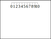
Axis in D3

Mapping data values to a Pixel Range with scales

The concept of scales is very important when we deal with graphics and visualization. It is a common task to scale values from a certain domain to a certain range of pixels. We need them to create tick values on axes, and we need them to scale our data points to the area of the chart.

The following figure explains the problem a little...

lock icon
The rest of the page is locked
Previous PageNext Page
You have been reading a chapter from
Learning Responsive Data Visualization
Published in: Mar 2016Publisher: ISBN-13: 9781785883781

Authors (2)

author image
Erik Hanchett

Erik Hanchett is a software developer, blogger, and perpetual student who has been writing code for over 10 years. He currently resides in Reno Nevada, with his wife and two kids. He blogs about software development at ProgramWithErik.com. I would like to thank my wife Susan for helping me stay motivated. My friend F.B. Woods for all his help on the English language and Dr. Bret Simmons for teaching me the value of a personal brand. I would also like to thank all my friends and family that encouraged me along the way.
Read more about Erik Hanchett

author image
Christoph Körner

Christoph Körner previously worked as a cloud solution architect for Microsoft, specializing in Azure-based big data and machine learning solutions, where he was responsible for designing end-to-end machine learning and data science platforms. He currently works for a large cloud provider on highly scalable distributed in-memory database services. Christoph has authored four books: Deep Learning in the Browser for Bleeding Edge Press, as well as Mastering Azure Machine Learning (first edition), Learning Responsive Data Visualization, and Data Visualization with D3 and AngularJS for Packt Publishing.
Read more about Christoph Körner