Reader small image

You're reading from  Learning Responsive Data Visualization

Product typeBook
Published inMar 2016
Reading LevelIntermediate
Publisher
ISBN-139781785883781
Edition1st Edition
Languages
Tools
Right arrow
Authors (2):
Erik Hanchett
Erik Hanchett
author image
Erik Hanchett

Erik Hanchett is a software developer, blogger, and perpetual student who has been writing code for over 10 years. He currently resides in Reno Nevada, with his wife and two kids. He blogs about software development at ProgramWithErik.com. I would like to thank my wife Susan for helping me stay motivated. My friend F.B. Woods for all his help on the English language and Dr. Bret Simmons for teaching me the value of a personal brand. I would also like to thank all my friends and family that encouraged me along the way.
Read more about Erik Hanchett

Christoph Körner
Christoph Körner
author image
Christoph Körner

Christoph Körner previously worked as a cloud solution architect for Microsoft, specializing in Azure-based big data and machine learning solutions, where he was responsible for designing end-to-end machine learning and data science platforms. He currently works for a large cloud provider on highly scalable distributed in-memory database services. Christoph has authored four books: Deep Learning in the Browser for Bleeding Edge Press, as well as Mastering Azure Machine Learning (first edition), Learning Responsive Data Visualization, and Data Visualization with D3 and AngularJS for Packt Publishing.
Read more about Christoph Körner

View More author details
Right arrow

Chapter 7. Creating Maps and Cartographic Visualizations Using GeoJSON

In the previous chapter, you learned about transitions and animations; now, think about animating features on geographic visualization because we will take a look at cartographic visualization and GeoJSON. In this chapter, you will learn the following:

  • Understanding the different challenges of cartographic visualizations

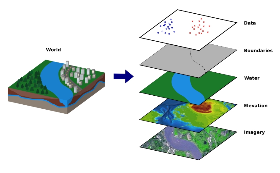
  • Understanding the geometric coordinate system

  • Learning about the GeoJSON format

  • Understanding the problems of GeoJSON and the advantages of TopoJSON

  • Learning about 3D to 2D projections

  • Getting familiar with helpful tools for cartographic visualizations

  • Creating color scales

  • Drawing GeoJSON features

  • Loading multiple resources at once

  • Drawing geographic grids

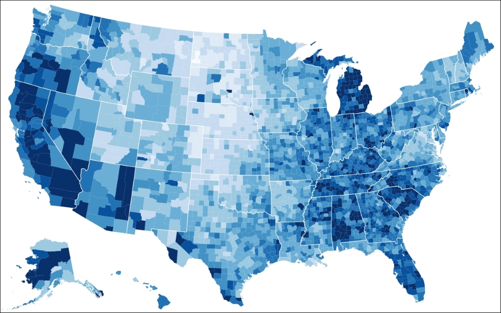
  • Implementing different types of geographic visualizations

In the first section, we will look into the ecosystem of cartographic visualizations and understand different challenges and problems that occur when dealing with such visualizations. First, we will look...

Overview of cartographic visualizations


The goal is to display cartographic data on an interactive and responsive visualization using D3.js similar to the following example:

The Choropleth map of USA (source: http://bl.ocks.org/mbostock/4060606)

However, this is not a straightforward task such as drawing a simple bar chart. There are many things that need to be considered when building a cartographic visualization, and this section will introduce you to these different steps and techniques. Let's get started straightaway and look at all the different components from a bar chart and how they can be compared to a cartographic visualization. This will give us enough knowledge on how to tackle the problem.

A geographic coordinate system

When we draw a bar chart, we usually start by drawing a coordinate system—a Cartesian coordinate system to be precise—usually represented as axes. This coordinate system defines how we can find the desired coordinates to draw a bar; it shows us the x and y directions...

Data representation for topology and geographic features


Geographical data is usually stored in databases and programs called Geographic Information Systems (GIS). These are usually tools to design, store, manipulate, analyze, and display the cartographic data. The following figure shows how the different aspects of the world can be abstracted as layers and managed in such a system:

A typical GIS abstraction

Most of these systems provide an interface to access or download these layers separately—that is, cartographic data, statistical data, or other geographic data—in a specified GIS format. There exists a variety of different GIS pixel- and vector-based formats; however, we will look into two JSON-based vector formats: GeoJSON and TopoJSON.

If you are looking for geographic data sets, I recommend you to visit http://www.data.gov/, http://geocommons.com/ as well as the extensive list on Robin Wilson's page at http://freegisdata.rtwilson.com/.

GeoJSON – a format for geographic features

JSON is...

Maps and projections


As we already saw in the first section of this chapter, there are multiple possible ways of mapping a 3D world into a 2D plane; whereas in all of these methods, some information is lost.

Let's make a little brain experiment. Think about what you would have to do to map the surface of a sphere into the plane. First, you would have to pick a hole somewhere into the surface. Then, you could stretch the surface as long it fits into the plane. However, we introduce a topology violation now at the exact point where we picked the hole. We can easily see that if you move outside of the left side of the map, you should theoretically enter on the right side again; but in our 2D representation, we lost this property, and the two sides are no longer connected. The second problem is that we also introduced a distortion when stretching the surface into the plane. Now, the top and bottom regions in the map seem to be bigger; we could not preserve the equality of the areas. If you look...

Helpful tools for creating maps in D3


Drawing maps requires a combination of knowledge and good understanding of GIS, GeoJSON, Projections, and so on as well as techniques and skills for creating the maps. In this section, we will look at a few selected tools that facilitate the generation of interactive maps with D3.

Color scales

As we discussed in the first section, the colors and color scales that the author chooses can have a huge impact for the reader to perceive the visualization. Therefore, I want to show how we can efficiently create color scales in D3.

Scales can map a certain domain of values to a range of different values using interpolation. We usually use this to create scales for axes. Axes, however, map a domain of values onto a pixel range. In our case, we want to use these scales on colors to map a value domain to a color range. We can achieve this using these color interpolation functions:

  • d3.interpolateRgb: RGB and HEX values, such as #00FF00

  • d3.interpolateHsl: HSL values...

Types of geographic visualization


According to the values and quantities that we want to display, we can choose from various visualizations that can best represent the data. Usually, we choose between line charts, bar charts, area charts (normal or stacked), pie charts, scatter plots, and so on.

It is easy to understand that the same is true for cartographic visualizations. Besides choosing the type of projection that can represent our data properly, we can also choose between the different types of visualization. This section gives an overview of the most common types of cartographic visualization.

Okay, I have talked enough about the theory—let's draw some maps!

Symbol maps

Our first map will be a simple symbol map as the one in the following figure. We want to display all earthquakes from the US recorded during the last 30 days; the dataset is taken from http://earthquake.usgs.gov/:

A simple Symbol map

As we can see in the preceding figure, we want to display differently sized and colored points...

Summary


In this chapter, you learned all the necessities to draw cartographic visualizations with D3. You learned about the geographic coordinate system, the graticules, and color scales.

GeoJSON is an important format to encode geometric features; it can store different types of geometries and values. However, it also stores a lot of redundant information; that's where TopoJSON comes handy.

Finally, we start drawing different cartographic visualizations, such as symbol maps and Choropleth maps.

In the next chapter, you will learn about testing the responsive visualizations.

lock icon
The rest of the chapter is locked
You have been reading a chapter from
Learning Responsive Data Visualization
Published in: Mar 2016Publisher: ISBN-13: 9781785883781
Register for a free Packt account to unlock a world of extra content!
A free Packt account unlocks extra newsletters, articles, discounted offers, and much more. Start advancing your knowledge today.
undefined
Unlock this book and the full library FREE for 7 days
Get unlimited access to 7000+ expert-authored eBooks and videos courses covering every tech area you can think of
Renews at $15.99/month. Cancel anytime

Authors (2)

author image
Erik Hanchett

Erik Hanchett is a software developer, blogger, and perpetual student who has been writing code for over 10 years. He currently resides in Reno Nevada, with his wife and two kids. He blogs about software development at ProgramWithErik.com. I would like to thank my wife Susan for helping me stay motivated. My friend F.B. Woods for all his help on the English language and Dr. Bret Simmons for teaching me the value of a personal brand. I would also like to thank all my friends and family that encouraged me along the way.
Read more about Erik Hanchett

author image
Christoph Körner

Christoph Körner previously worked as a cloud solution architect for Microsoft, specializing in Azure-based big data and machine learning solutions, where he was responsible for designing end-to-end machine learning and data science platforms. He currently works for a large cloud provider on highly scalable distributed in-memory database services. Christoph has authored four books: Deep Learning in the Browser for Bleeding Edge Press, as well as Mastering Azure Machine Learning (first edition), Learning Responsive Data Visualization, and Data Visualization with D3 and AngularJS for Packt Publishing.
Read more about Christoph Körner