


Also known in the statistics world as a "box and whisker plot" or simply as a boxplot, the statistical whisker plot is a series of symbols, each one showing the mean value of a set of measurements, the extent of the central part of the measurements' or population's distribution, and the extent of the remainder of the distribution excluding the "outliers" (the outliers themselves are sometimes shown as dots, but we won't use that style here). This type of plot is also sometimes used for financial price data rather than the finance plot that was the subject of the Handling financial data recipe in this chapter. We will avoid the specialized language of statistics and further discussion of the uses of these plots, but the statisticians among our readers know why they're here. The following figure shows the depiction of a statistical whisker plot using gnuplot:
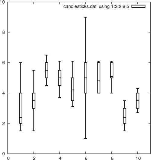
In the previous plot, typically, the boxes show the range of the central part of the data distribution; the short horizontal line within the boxes shows the value of the mean; and the vertical lines extending above and below the boxes show the range of the bulk of the distribution excluding the outliers.
We've borrowed the demo file candlesticks.dat that comes with the gnuplot distribution; make sure it's in your current directory. If you want to use your own data instead, each line of the file must be in the following format:
x whisker_min box_min mean box_high whisker_high
Feed the following script to gnuplot to get the whisker plot:
set xrange [0:11]
set yrange [0:10]
set boxwidth 0.2
plot 'candlesticks.dat' using 1:3:2:6:5 with candlesticks lt -1 lw 2 whiskerbars,\
'' using 1:4:4:4:4 with candlesticks lt -1 lw 2 notitleThe first two lines set the x and y ranges of the axes; they are set to give a little room around the data. The next line sets the boxwidth—the width of the rectangle showing the extent of the central part of the distribution (the default is very skinny). Next comes the plot command, split here over two lines. The order of the fields expected by the candlestick style is x box_min whisker_min whisker_high box_high, which is not in the same order as our datafile, so we need to use the using command to put the columns in the right order for plotting. The first plot command also specifies the line type lt to be -1 for solid black and a line width is set to 2; whiskerbars means put the little caps on the end of the whiskers. The second plot command—starting on the last line—plots from the same datafile, but employs a trick to use the 4th column—containing the mean value—repeatedly, effectively collapsing the box ends and whiskers down to the mean, all just to plot the little horizontal line in the middle of the boxes. This may seem like a convoluted method, but it ensures that the lines indicating the mean values are in the right places and have exactly the correct width to lie within the boxes.