
The graphs we created in the previous chapter served the purpose of illustrating the various 2D plot styles, but they were all missing a few things. For a graph to be useful in the real world, it must be endowed with a title and various labels that explain what it is about and how to interpret its assorted plot elements.
In this chapter, we revisit the 2D graph, creating one with a few curves, two different y-axes, and shaded areas, and in each recipe, we add an additional informative decoration to the plot. The graph remains the same, but in each recipe it will acquire more detailed annotation. This chapter is all about how to make these annotations, not about the plotting itself.
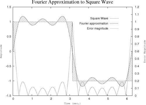
In this recipe, we add labels to our axes to explain what is being plotted and the significance of the tics and numerical scales. We also add an overall title that will appear at the top of the graph.
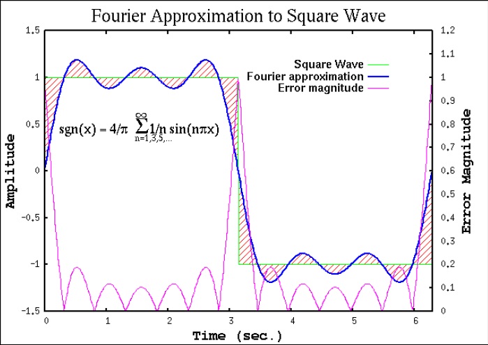
Make sure the supplied datafile ch2.dat is in your current directory. It is the result of adding the first three terms in the Fourier series approximation to the square wave. It is not important to understand what that means to follow the gnuplot recipes; we are using this file because it leads to a good graph for the purpose of illustrating annotations and labeling.
Following is the script that produces the previous annotated graph:
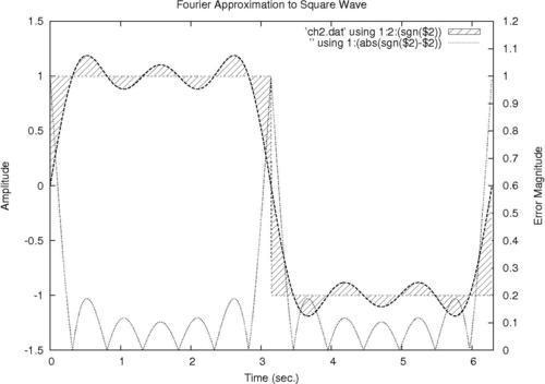
set yrange [-1.5:1.5]
set xrange [0:6.3]
set ytics nomirror
set y2tics 0,.1
set y2range [0:1.2]
set style fill pattern 5
set xlabel "Time (sec.)"
set ylabel "Amplitude"
set y2label "Error Magnitude"
set title "Fourier Approximation to Square Wave"
plot 'ch2.dat' using 1:2:(sgn($2)) with filledcurves,\'' using 1:2 with lines...
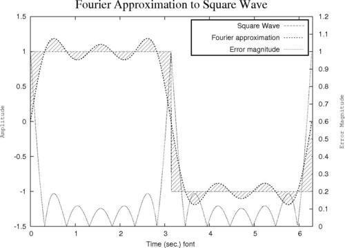
The default font size for labels and titles in gnuplot looks a little small with most terminals. For example, the labels can be hard to read from the back rows of an auditorium during a presentation. We now show how to adjust the font size, and how to select the font for labels and titles.
Most terminals accept a font and size specification in the set terminal command. To find out about the terminal you are using, just type help set term terminal, substituting the name of the terminal. For example, if you are using the PostScript terminal, typing help set term postscript provides a wealth of information on all the options accepted by the PostScript terminal, including the syntax for the font and size specifications. The following commands show how to produce the plot with all labels set in Courier at 18 pt:
set term postscript landscape "Courier, 18"
set output 'squarewave.ps'
set yrange [-1.5:1.5]
set xrange [0:6.3]
set ytics nomirror
set y2tics 0,.1
set...
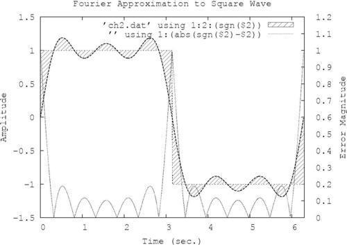
The legend refers to the block of information printed on the graph (or occasionally outside it) that explains which curve or symbol is associated with which quantity. It is called a key in gnuplot. A legend or some device that conveys the equivalent information is essential when the graph displays more than one curve.
You've probably noticed that all of our example graphs already contain a key; this is done by gnuplot by default. This recipe will show you how to take complete control of your graph's legend.
Following is a gnuplot script showing the extra commands that produce the legend in the previous plot:
set term postscript landscape
set yrange [-1.5:1.5]
set xrange [0:6.3]
set ytics nomirror
set y2tics 0,.1
set y2range [0:1.2]
set style fill pattern 5
set key at graph .9, .9 spacing 3 font "Helvetica, 14"
set xlabel "Time (sec.) font "Courier, 12"
set ylabel "Amplitude" font "Courier, 12"
set y2label "Error Magnitude" font "Courier, 12"
set title "Fourier Approximation...This recipe is a simple modification of the previous one, but gets its own section because the legend in the box is such a popular style (for better or worse).
Replace the highlighted set key command in the previous recipe with the following two commands:
set key spacing 3 font "Helvetica, 14"
set key box lt -1 lw 2
The new command is in the second line. set key box tells gnuplot to draw a box around the legend; this is followed by two specifications for the type of line from which the box will be drawn. In the previous command, we have used abbreviations: lt stands for linetype, and a linetype of -1 yields a solid black line in the PostScript terminal. lw stands for linewidth; lw 2 is one step up from the default lw 1, and makes the box more prominent.
Complex graphs can often benefit from information in addition to what can be provided in a title, in the axis labels, and a legend. Sometimes we need to explain the meaning of a particular feature on the graph. This can be done with labels and arrows.
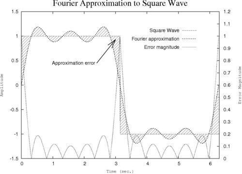
Following is the complete script that you can feed to gnuplot to create the graph:
set term postscript landscape
set out 'fourier.ps'
set yrange [-1.5:1.5]
set xrange [0:6.3]
set ytics nomirror
set y2tics 0,.1
set y2range [0:1.2]
set style fill pattern 5
set key at graph .9, .9 spacing 3 font "Helvetica, 14"
set xlabel "Time (sec.)" font "Courier, 12"
set ylabel "Amplitude" font "Courier, 12"
set y2label "Error Magnitude" font "Courier, 12"
set title "Fourier Approximation to Square Wave" font "Times-Roman, 24"
set label "Approximation error" right at 2.4, 0.45 offset -.5, 0
set arrow 1 from first 2.4, 0.45 to 3, 0.93 lt 1 lw 2 front size .3, 15
plot 'ch2.dat' using 1:2:(sgn($2)) with filledcurves notitle...
A new feature in gnuplot 4.4 allows you to use the Unicode character set in your graph's title and labels. This is a vast improvement over more cumbersome methods of entering special characters, but it does not work on all terminals. For example, PostScript does not support Unicode directly, but some implementations of the pdf and png terminals, and others, will work. The following example was created using the pngcairo version of the png terminal. Which versions you have available will depend on the details of your operating system and gnuplot installation. A more general method for creating complex labels is given in the next recipe.
You will need some method of inputting Unicode characters. There are myriad ways of doing this, depending on your operating system, terminal program, text editor, and so on, and the details are beyond the scope of this book. In order to create the title for this example, incorporating the name of a famous Viking scientist...
Certain terminals support enhanced text, which means that they accept a markup language specific to gnuplot that can be used to include characters from various fonts, set subscripts, superscripts, overprint characters, and generally manipulate text with sufficient flexibility to create simple equations to serve as annotations for your graphs. This recipe shows how to make such an equation, but you will see that the markup is cumbersome, and attaining the desired result requires some amount of trial and error. Frankly, a better way to create all but the simplest mathematical text is to use the LaTeX techniques covered in a later chapter, which also leads to a much more attractive output.
However, the enhanced text mode can be useful for quickly placing some mathematical text on your plot, in situations where you are not too picky about the typographical quality of the result.