


A more interesting type of histogram plot shows the distribution of some quantity with a second distribution stacked on top. This provides a quick way to visually compare two distributions. The values of the second distribution are measured not from the axis, but from the top of the box showing the first distribution. The following figure shows a stacking histogram:
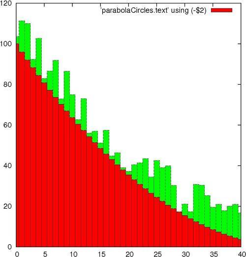
You might have noticed that the information printed in the legend on the upper-right corner is not very descriptive. This is the default; in the next chapter, you will learn how to change it to whatever you want.
The script that produced the stacked histogram is as follows:
set style fill solid 1.0 border lt -1
set style data histograms
set style histogram rowstacked
plot [0:40] 'parabolaCircles.text' using (-$2),\'' using (20*$3) notitle
The first line requests histogram bars filled with a solid color, and with a black border. Without this, the bars are plotted unfilled, which makes the plot more difficult to interpret.
The next two lines specify that data from files should be plotted using histograms; the rowstacked style means that data from each row in the file will be plotted together in one vertical stack.
In the last line, we have chosen to illustrate how to do simple calculations on data columns; the expression is enclosed in parentheses, the column number is preceded with a dollar sign, and the familiar Fortran or C type syntax works just the way you would expect. So we have flipped our parabola back "right side up" with a negative sign, and increased the magnitude of our random numbers by multiplying by 20. (This file was used to plot circles with random diameters in the Plotting circles recipe in this chapter. The random numbers were scaled to give appropriately sized circles, but are too small to give a good illustration of the stacked histogram here. Rather than generating new data, some simple arithmetic allows us to reuse the file.)


