Chapter 4. Getting Started with Layouts and Material Design
We have already seen the Android Studio UI designer, as well as a little bit more of Kotlin in action. In this hands-on chapter, we will build three more layouts – still quite simple, yet a step up from what we have done so far.
Before we get to the hands-on part, we will have a quick introduction to the concept of Material Design.
We will look at another type of layout, called LinearLayout, and walk through it, using it to create a usable UI. We will take things a step further using ConstraintLayout, both to understand constraints and to design more complex and precise UI designs. Finally, we will meet the TableLayout to lay data out in an easily readable table.
We will also write some Kotlin code to switch between our different layouts within one app/project. This is the first major app that links together multiple topics into one neat parcel. The app is called Exploring Layouts.
In this chapter, we will cover the following topics...
You might have heard of material design, but what exactly is it? The objective of material design is, quite simply, to achieve beautiful user interfaces. It is also, however, about making these user interfaces consistent across Android devices. Material design is not a new idea. It is taken straight from the design principles used in pen-and-paper design, like having visually pleasing embellishments such as shadows and depth.
Material design uses the concept of layers of materials that you can think of in the same way you would think of layers in a photo-editing app. Consistency is achieved with a set of principles, rules, and guidelines. It must be stressed that material design is entirely optional, but it also must be stressed that material design works, and, if you are not following it, there is a good chance your design will be disliked by the user. The user, after all, has become used to a certain type of UI, and that UI was most likely created using material design...
Exploring Android UI design
We will see with Android UI design that so much of what we learn is context-sensitive. The way that a given widget's x attribute will influence its appearance might depend on a widget's y attribute, or even on an attribute on another widget. It isn't easy to learn this verbatim. It is best to expect to gradually achieve better and faster results with practice.
For example, if you play with the designer by dragging and dropping widgets onto the design, the XML code that is generated will vary considerably depending upon which layout type you are using. We will see this as we proceed through this chapter.
This is because different layout types use different means to decide the position of their children. For example, the LinearLayout, which we will explore next, works very differently to ConstraintLayout, which was added by default to our project in Chapter 1, Getting Started with Android and Kotlin.
This information might initially seem like a problem, or even a...
We have already seen ConstraintLayout, but there are more. Layouts are the building blocks that group together the other UI elements/widgets. Layouts can, and often do, contain other layouts themselves.
Let's look at some commonly used layouts in Android, because knowing the different layouts and their pros and cons will make us more aware of what can be achieved, and therefore will expand our horizons of what is possible.
We have already seen that, once we have designed a layout, we can put it into action using the setContentView function in our Kotlin code.
Let's build three designs with different layout types and then put setContentView to work and switch between them.
Creating the Exploring Layouts project
One of the toughest things in Android is not just finding out how to do something, but finding out how to do something amongst other things. That is why, throughout this book, as well as showing you how to do some neat stuff, we will link lots of topics together into apps that span multiple topics and often chapters. The Exploring Layouts project is the first app of this type. We will learn how to build multiple types of layout while linking them all together in one handy app:
Create a new project in Android Studio. If you already have a project open, select File | New Project. When prompted, choose Open in same window, as we do not need to refer to our previous project.
Note
If you are on the start screen of Android Studio, you can create a new project simply by clicking the Start a new Android Studio project option.
Select the Empty Activity project template, as we will build most of the UI from scratch. Click the Next button.
Enter Exploring Layouts for...
Building a menu with LinearLayout
LinearLayout is probably the simplest layout that Android offers. As the name suggests, all the UI items within it are laid out linearly. You have just two choices – vertical and horizontal. By adding the following line of code (or editing via the Attribute window), you can configure a LinearLayout to lay things out vertically:
You can then (as you could probably have guessed) change "vertical" to "horizontal" to lay things out horizontally.
Before we can do anything with LinearLayout, we need to add one to a layout file. And, as we are building three layouts in this project, we also need a new layout file.
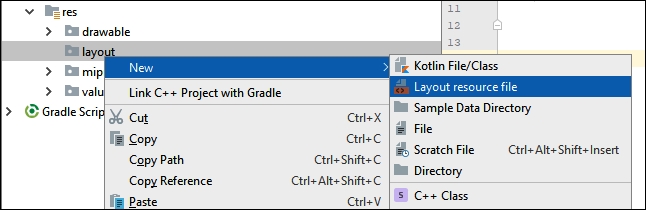
Adding a LinearLayout to the project
In the project window, expand the res folder. Now right-click the layout folder and select New. Notice that there is an option for Layout resource file, as shown in the following screenshot:
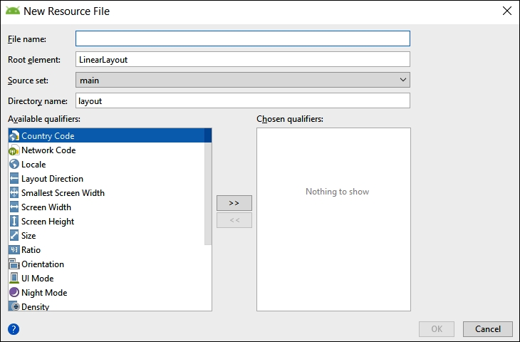
Select Layout resource file and you will see the New Resource File dialog window:
In the File name...
Wiring up the UI with the Kotlin code (part 1)
To achieve an interactive app, we will do the following three things:
We will call setContentView from the onCreate function to show the progress of our UI when we run the app.
We will write two more functions of our own and each one will call setContentView on a different layout (that we have yet to design).
Then, later in this chapter, when we design two more UI layouts, we will be able to load them at the click of a button.
As we will be building a ConstraintLayout and a TableLayout, we will call our new functions, loadConstraintLayout and loadTableLayout, respectively.
Let's do that now, and then we'll see how we can add some buttons that call these functions alongside some neatly formatted text.
Inside the onCreate function, add the following highlighted code:
The code uses the setContentView function to load...
Adding layouts within layouts
The solution to laying out some elements with a different orientation to others is to nest layouts within layouts. Here is how to do it.
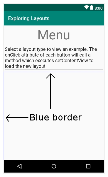
From the Layouts category of the palette, drag a LinearLayout (Horizontal) onto the design, placing it just below the Multiline Text. Notice that there is a blue border occupying all the space below the Multiline Text:
This indicates that our new LinearLayout (Horizontal) is filling the space. Keep this blue border area in mind, as it is where we will put the next item on our UI.
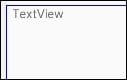
Now, go back to the Text category of the palette and drag a TextView onto the new LinearLayout we just added. Notice how the TextView sits snuggly in the top left-hand corner of the new LinearLayout:
At first, this seems no different to what happened with the previous vertical LinearLayout that was part of our UI from the start. But watch what happens when we add our next piece of the UI.
Note
The term used to refer to adding layouts within layouts is...
Making the layout look pretty
In this section, we will explore some more attributes that control the finer details of our UI. You have probably noticed how the UI looks a bit squashed in some places, and wonky and unsymmetrical in others. As we progress through the book, we will continually add to our repertoire to improve our layouts, but these short steps will introduce and take care of some of the basics:
Select the Multiline Text, and then expand the Padding attribute. Set the all option to 15sp. This has made a neat area of space around the outside of the text.
To make a nice space below the Multiline text, find and expand the Layout_Margin attribute and set bottom to 100sp.
On both TextView widgets that are aligned/related to the buttons, set the textSize attribute to 20sp, the layout_gravity to center_vertical, the layout_width to match_parent, and the layout_weight to .7.
On both buttons, set the weight to .3. Notice how both buttons now take up exactly .3 of the width and the text ...
Wiring up the UI with the Kotlin code (part 2)
Select the button next to the Load ConstraintLayout text. Find the onClick attribute and set it to loadConstraintLayout.
Select the button next to the Load TableLayout text. Find the onClick attribute and set it to loadTableLayout.
Now, the buttons will call the functions, but the code inside the loadTableLayout function is commented out to avoid errors. Feel free to run the app and see that you can switch to the ConstraintLayout by clicking the loadConstraintLayout button. But all it has is a Hello World message.
We can now move on to building this ConstraintLayout.
Building a precise UI with ConstraintLayout
Open the ConstraintLayout that was auto-generated when we created the project. It is probably already in a tab at the top of the editor. If not, it will be in the res/layout folder. Its name is activity_main.xml.
Inspect the XML in the Text tab and note that it is empty, apart from a TextView that says Hello World. Switch back to the Design tab, left-click the TextView to select it, and tap the Delete key to get rid of it.
Now we can build ourselves a simple, yet intricate, UI. ConstraintLayout is very useful when you want to position parts of your UI very precisely and/or relative to the other parts.
To get started, look in the Widgets category of the palette and find the CalenderView. Drag and drop the CalenderView near the top and horizontally central. As you drag the CalenderView around, notice that it jumps/snaps to certain locations.
Also notice the subtle visual cues that show when the view is aligned. I have highlighted...
Laying out data with TableLayout
In the project window, expand the res folder. Now, right-click the layout folder and select New. Notice that there is an option for Layout resource file.
Select Layout resource file, and you will see the New Resource File dialog window.
In the File name field, enter my_table_layout. This is the same name we used in the call to setContentView within the loadTableLayout function.
Notice that it has already selected LinearLayout as the Root element option. Delete LinearLayout and type TableLayout in its place.
Click the OK button and Android Studio will generate a new TableLayout in an XML file called my_table_layout and place it in the layout folder ready for us to build our new table-based UI. Android Studio will also open the UI designer (if it isn't already) with the palette on the left and the attributes window on the right.
You can now uncomment the loadTableLayout function:
You can...
We have covered many topics in just a few dozen pages. We have not only built three different types of layout, including LinearLayout with nested layouts, ConstraintLayout with manually configured constraints, and TableLayout (albeit with fake data), but we have also wired all the layouts together with clickable buttons and text that trigger our Kotlin code to switch between all these different layouts.
In the next chapter, we will stick with the topic of layouts. We will review the many attributes we have seen, and we will build our most aesthetically pleasing layout so far by incorporating multiple CardView layouts, complete with depth and shadow, into a smooth-scrolling ScrollView layout.


