Chapter 13. Bringing Android Widgets to Life
Now that we have a good overview of both the layout and coding of an Android app, as well as our newly acquired insight into object-oriented programming (OOP) and how we can manipulate the UI from our Kotlin code, we are ready to experiment with more widgets from the Android Studio palette.
At times, OOP is a tricky thing, and this chapter introduces some topics that can be awkward for beginners. However, by gradually learning these new concepts and practicing them repeatedly, they will, over time, become our friend.
In this chapter, we will diversify a lot by going back to the Android Studio palette and looking at half a dozen widgets that we have either not seen at all or have not used fully yet.
Once we have done so, we will put them all into a layout and practice manipulating them with our Kotlin code.
In this chapter, we will cover the following topics:
Declaring and initializing the objects from the layout
We know that when we call setContentView in the onCreate function, Android inflates all the widgets and layouts, and turns them into real instances on the Heap.
We know that to use a widget from the Heap, we must have an object of the correct type by using its unique id property. Sometimes, we must specifically obtain a widget from a layout. For example, to get a reference to a TextView class with an id property of txtTitle and assign it to a new object called myTextView, we can do the following:
The left-hand side of the declaration of the myTextView instance should look familiar to all the instances of other classes that we declared throughout the previous three chapters. What is new here is that we are relying on the return value of a function to supply the instance. The findViewById function does indeed return an instance that...
Creating UI widgets from pure Kotlin without XML
We can also create widgets from Kotlin objects that are not a reference to an object in our layout. We can declare, instantiate, and set a widget's attributes, all in code, as follows:
The preceding code creates a new Button instance. The only caveat is that the Button instance must be part of a layout before it can be seen by the user. So, we can either get a reference to a layout element from our XML layout in the same way that we previously did using the findViewById function, or we can create a new one in code.
If we assume that we have a LinearLayout in our XML with an id property equal to linearLayout1, we can incorporate our Button instance from the preceding line of code in it, as follows:
We can even create an entire layout in pure Kotlin code by...
Exploring the palette – part 1
Let's take a whirlwind tour of some of the previously unexplored and unused items from the palette, and then we can drag a number of them onto a layout and see what useful functions they might have. We can then implement a project to put them all to use.
We have already explored Button and TextView in the previous chapter. Now let's take a closer look at some more widgets alongside them.
The EditText widget does as its name suggests. If we make an EditText widget available to our users, then they will indeed be able to edit the text in it. We saw this in an earlier chapter, but we didn't achieve anything with it. What we didn't see was how to capture the information from within it, or where we could type this text-capturing code.
The next block of code assumes that we have declared an object of type EditText and have used it to get a reference to an EditText widget in our XML layout. We might write something similar to the following code for...
When a RadioButton widget is part of RadioGroup, the visual appearance of them is coordinated for us. All we need to do is react when any given RadioButton widget is pressed. Of course, as with any other button, we need to know when they have been clicked on.
A RadioButton widget behaves differently to a regular Button widget and simply listening for clicks in onClick (after implementing OnClickListener) will not work because the RadioButton class is not designed that way.
What we need to do is use another Kotlin feature. We need an instance of a special interface, for the sole purpose of listening for clicks on RadioGroup. The next block of code assumes that we have a reference to a RadioGroup instance called radioGroup; here is the code to examine:
The preceding code, specifically setOnChekedChangeListener from its opening curly brace ({) to the closing curly brace (}), is what is known...
Exploring the palette – part 2, and more lambdas
Now that we have seen how lambdas and anonymous classes and interfaces work, specifically with RadioGroup and RadioButton, we can now continue exploring the palette and look at working with some more UI widgets.
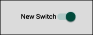
The Switch widget is just like a Button widget except that it has two fixed states that can be read and responded to.
An obvious use for the Switch widget is to show and hide something. Remember that in our Kotlin Meet UI app in Chapter 12, Connecting Our Kotlin to the UI and Nullability we used a Button to show and hide a TextView widget?
Each time we hid or showed the TextView widget, we changed the text property on the Button to make it evident what would happen if it was clicked on again. What might have been more intuitive for the user, and more straightforward for us as programmers, would have been to use a Switch widget, as illustrated in the following screenshot:
The following code assumes that we already have...
The widget exploration app
We have just discussed six widgets – EditText, ImageView, RadioButton (and RadioGroup), Switch, CheckBox, and TextClock. Let's make a working app and do something practical with each of them. We will also use a Button widget and a TextView widget again as well.
In this layout, we will use LinearLayout as the layout type that holds everything, and within LinearLayout, we will use multiple RelativeLayout instances.
RelativeLayout has been superseded by ConstraintLayout, but they are still commonly used and are worth playing around with. You will see as you build layouts within RelativeLayout that the UI elements behave very much the same as ConstraintLayout, but that the underlying XML is different. It is not necessary to learn this XML in detail, rather, using RelativeLayout will allow us to show the interesting way that Android Studio enables you to convert these layouts to ConstraintLayout.
Remember that you can refer to the completed code in the download bundle...
Coding the widget exploration app
The first part of the Kotlin code that we need to change is to make sure that our new layout is displayed. We can do so by changing the call to the setContentView function in the onCreate function to look like this:
There are many import statements that are needed for this app, so let's add them all up front to save us from having to keep mentioning them as we proceed. Add the following import statements:
The preceding code also includes the …exploration_layout.* code (as highlighted in the preceding code) to automatically enable us to use the id attributes that we have just configured as the instance names in our Kotlin code. This saves us from using the findViewByID...
Running the Widget Exploration app
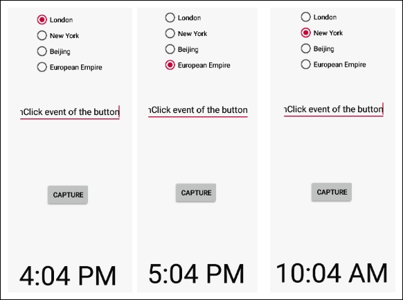
Try checking the radio buttons to see the time zone change on the clock. In the following image, I have photoshopped a few cropped screenshots to show that the time changes when a new time zone is selected:
Enter different values into the EditText widget, and then click the button to see it grab the text and display it on itself, as demonstrated in the screenshot at the start of this tutorial.
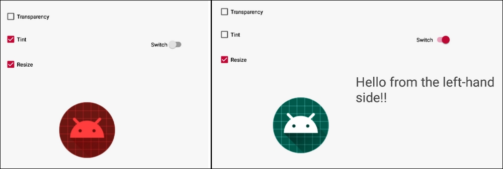
Change what the image in the app looks like with different combinations of checked and unchecked checkboxes and hide and show the TextView widget by using the Switch widget above it. The following screenshot displays two combinations of the checkboxes and the switch widget photoshopped together for demonstration purposes:
Note
Transparency doesn't show very clearly in a print book, so I didn't check that box. Be sure to try this out on an emulator or real device.
Converting layouts to ConstraintLayout
Finally, as promised, this is how we can convert the layout to the faster-running ConstraintLayout:
Switch back to the Design tab
Right-click on the parent layout – in this case, LinearLayout – and select Convert LinearLayout to ConstraintLayout, as shown in the following screenshot:
Now you can convert any old RelativeLayout layouts to the newer and faster ConstraintLayout widget, as well as build your own RelativeLayout.
We have learned a lot in this chapter. As well as exploring a plethora of widgets, we learned how to implement widgets in Kotlin code without any XML, we used our first anonymous classes using short, snappy code in the form of a lambda to handle clicks on a selection of widgets, and we put all our new widget prowess into a working app.
Now let's move on to look at another way that we can significantly enhance our UI.
In the next chapter, we will see a completely new UI element that we can't just drag and drop from the palette, but we will still have plenty of help from the Android API. We will learn about dialog windows. We will also make a start on our most significant app to date called Note to self. It is a memo, to-do, and personal note app.


