Reader small image

You're reading from  Learning Highcharts 4

Product typeBook
Published inJan 2015
Reading LevelIntermediate
PublisherPackt
ISBN-139781783287451
Edition1st Edition
Languages
Right arrow
Author (1)
Joe Kuan
Joe Kuan
author image
Joe Kuan

Joe Kuan was born in Hong Kong and continued his education in the UK from secondary school to university. He studied computer science at the University of Southampton for his BSc and PhD. After finishing his education, he worked with different technologies and industries in the UK. Currently, he is working for iTrinegy—a company specializing in network emulation, profiling, and performance monitoring. He enjoys working on a variety of projects and applying different programming languages. Part of his role is to develop frontend data and present complex network data in stylish and interactive charts. He has adopted Highcharts in his company products since the early version 2. Since then, he has been contributing blogs (joekuan.wordpress.com) and software (joekuan.org) on Highcharts, Highstocks, and Highmaps. In December 2012, he published his first book, Learning Highcharts, Packt Publishing, which is a comprehensive book on Highcharts covering tutorials, examples, tricks, and tips.
Read more about Joe Kuan

Right arrow

Sketching an area chart


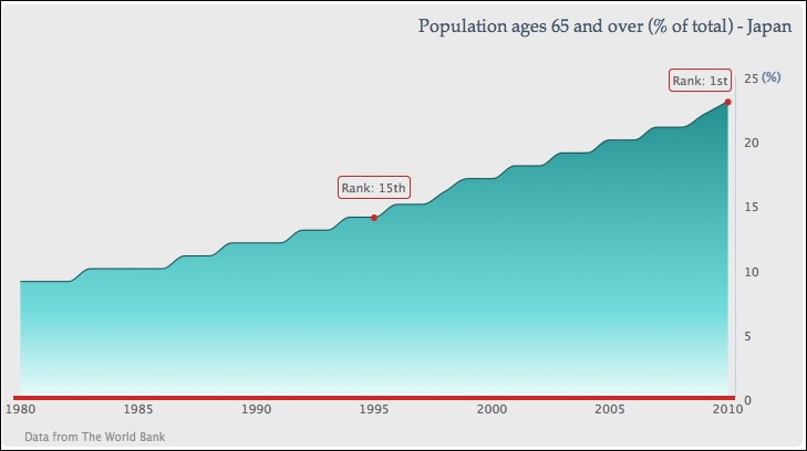
In this section, we are going to use our very first example and turn it into a more stylish graph (based on the design of a wind energy poster by Kristin Clute): an area spline chart. An area spline chart is generated using the combined properties of area and spline charts. The main data line is plotted as a spline curve and the region underneath the line is filled in a similar color with a gradient and opaque style:

First, we want to make the graph easier for viewers to look up the values for the current trend, so we move the y-axis values to the right side of the chart, where they will be closest to the most recent year:

            yAxis: {  ....
                opposite: true
            }

The next thing is to remove the interval lines and have a thin axis line along the y axis:

          yAxis: { ....
              gridLineWidth: 0,
              lineWidth: 1,
          }

Then, we simplify the y-axis title with a percentage sign and align to the top of the axis:

 ...
lock icon
The rest of the page is locked
Previous PageNext Page
You have been reading a chapter from
Learning Highcharts 4
Published in: Jan 2015Publisher: PacktISBN-13: 9781783287451

Author (1)

author image
Joe Kuan

Joe Kuan was born in Hong Kong and continued his education in the UK from secondary school to university. He studied computer science at the University of Southampton for his BSc and PhD. After finishing his education, he worked with different technologies and industries in the UK. Currently, he is working for iTrinegy—a company specializing in network emulation, profiling, and performance monitoring. He enjoys working on a variety of projects and applying different programming languages. Part of his role is to develop frontend data and present complex network data in stylish and interactive charts. He has adopted Highcharts in his company products since the early version 2. Since then, he has been contributing blogs (joekuan.wordpress.com) and software (joekuan.org) on Highcharts, Highstocks, and Highmaps. In December 2012, he published his first book, Learning Highcharts, Packt Publishing, which is a comprehensive book on Highcharts covering tutorials, examples, tricks, and tips.
Read more about Joe Kuan