Reader small image

You're reading from  Learning Highcharts 4

Product typeBook
Published inJan 2015
Reading LevelIntermediate
PublisherPackt
ISBN-139781783287451
Edition1st Edition
Languages
Right arrow
Author (1)
Joe Kuan
Joe Kuan
author image
Joe Kuan

Joe Kuan was born in Hong Kong and continued his education in the UK from secondary school to university. He studied computer science at the University of Southampton for his BSc and PhD. After finishing his education, he worked with different technologies and industries in the UK. Currently, he is working for iTrinegy—a company specializing in network emulation, profiling, and performance monitoring. He enjoys working on a variety of projects and applying different programming languages. Part of his role is to develop frontend data and present complex network data in stylish and interactive charts. He has adopted Highcharts in his company products since the early version 2. Since then, he has been contributing blogs (joekuan.wordpress.com) and software (joekuan.org) on Highcharts, Highstocks, and Highmaps. In December 2012, he published his first book, Learning Highcharts, Packt Publishing, which is a comprehensive book on Highcharts covering tutorials, examples, tricks, and tips.
Read more about Joe Kuan

Right arrow

Chapter 9. 3D Charts

3D charts have been the most long awaited and the most desired feature in Highcharts. A feature that has been in the subject of heated debate within the users' community. There are users who agree, and those that disagree with the use of 3D charts. The pro camp argue for the use of 3D charts, for example in sales and marketing reports or infographics posters. The con party argue that 3D charts are misleading in terms of accuracy in data visualization and comparison, so the development resources should be focused elsewhere. As for Highcharts, it takes the pro-choice direction.

This chapter focuses on the basics of 3D configuration and shows a gallery of charts presented in 3D, as well as several specific options in each supported series. In this chapter, we will learn:

  • What a 3D chart in Highcharts is and isn't

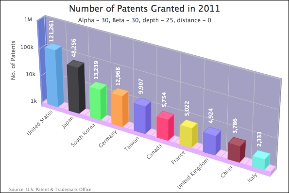
  • Experimenting with 3D chart orientation: alpha, beta, depth, and viewDistance

  • Configuring the 3D chart background

  • Plotting the column, pie, donut, and scatter series...

What a Highcharts 3D chart is and isn't


At the time of writing, the 3D chart feature is to display the 2D charts in a real 3D presentation, that is, we can rotate and tilt the charts in different dimensions and adjust the view distance. The 3D feature is currently only available for the column, pie, and scatter series.

What 3D charts cannot do is to construct a real three dimensional, x, y, and z axes chart, except for the scatter plot; we will even see some shortcomings in the scatter plot later. As this is the first major release of 3D charts, this limitation may be short lived.

Experimenting with 3D chart orientation


To enable the 3D feature, we first need to include the extension as follows:

<script 
 src="http://code.highcharts.com/highcharts-3d.js"></script>

In Highcharts, there are two levels of 3D options: chart and series. The chart level options are located in chart.options3d, which mainly deals with the orientation and the frame around the plotting area, whereas the 3D options for the series remain in the usual plotOptions area, such as plotOptions.column.depth.

Currently, Highcharts supports 2 axles of rotation: horizontal and vertical, which are the alpha and beta options in chart.options3d respectively. The values for these options are in degrees. The following diagram illustrates with arrows the direction of chart rotation as the degree value increases and decreases:

Alpha and beta orientations

In the previous diagram, we showed the direction of orientation. Let's experiment with a column chart. We are going to use a chart from Chapter 4, Bar...

Configuring the 3D chart background


Instead of having a white background with dark labels, let's replace the side, bottom, and back frames around the plot area with different settings. In Highcharts, we can specify the color and thickness of these frames, as follows:

                   options3d: {
                       ....,
                       frame: {
                            back: {
                                color: '#A3A3C2',
                                size: 4
                            },
                            bottom: {
                                color: '#DBB8FF',
                                size: 10
                            },
                            side: {
                                color: '#8099E6',
                                size: 2
                            }
                       }
                   }

Meanwhile, we also change the data label color to white which contrasts nicely with the new background color:

Note that if we...

Plotting the column, pie, donut, and scatter series in 3D charts


In this section, we will plot a gallery of column, pie, donut, and scatter series which are currently supported for 3D presentation. We will also examine the 3D options specific to each series. Some of the examples used here are taken from previous chapters.

3D columns in stacked and multiple series

Let's start with a multi-series stacked column chart embedded with the options3d setting:

                options3d: {
                    alpha: 10,
                    beta: 30,
                    enabled: true
                }

Here is what a multi-series grouped and stacked 3D columns chart looks like:

Column depth and Z-padding

Notice from the preceding chart, the sides of the UK/Germany stacked columns are covered by the S. Korea/Japan columns. Suppose that we want to show part of the sides of the UK/Germany columns. In order to do that, we can reduce the thickness of the S. Korea/Japan columns with the plotOptions.column.depth...

Summary


In this chapter, we learned how to create 3D column, scatter, and pie charts, and how to manipulate the orientation and configurations specific to each series. We tested these options by producing a gallery of 3D charts. On top of that, we explored a number of user interactions for 3D charts in Highcharts.

In the next chapter, we will explore the Highcharts APIs, which are responsible for making a dynamic chart, such as using Ajax queries to update the chart content, accessing components in Highcharts objects, and exporting charts to SVG.

lock icon
The rest of the chapter is locked
You have been reading a chapter from
Learning Highcharts 4
Published in: Jan 2015Publisher: PacktISBN-13: 9781783287451
Register for a free Packt account to unlock a world of extra content!
A free Packt account unlocks extra newsletters, articles, discounted offers, and much more. Start advancing your knowledge today.
undefined
Unlock this book and the full library FREE for 7 days
Get unlimited access to 7000+ expert-authored eBooks and videos courses covering every tech area you can think of
Renews at $15.99/month. Cancel anytime

Author (1)

author image
Joe Kuan

Joe Kuan was born in Hong Kong and continued his education in the UK from secondary school to university. He studied computer science at the University of Southampton for his BSc and PhD. After finishing his education, he worked with different technologies and industries in the UK. Currently, he is working for iTrinegy—a company specializing in network emulation, profiling, and performance monitoring. He enjoys working on a variety of projects and applying different programming languages. Part of his role is to develop frontend data and present complex network data in stylish and interactive charts. He has adopted Highcharts in his company products since the early version 2. Since then, he has been contributing blogs (joekuan.wordpress.com) and software (joekuan.org) on Highcharts, Highstocks, and Highmaps. In December 2012, he published his first book, Learning Highcharts, Packt Publishing, which is a comprehensive book on Highcharts covering tutorials, examples, tricks, and tips.
Read more about Joe Kuan