
Although Flot provides everything you need for visualization, it doesn't include the typical statistical calculations you might want to perform on your raw data. Here, we will learn how to use the jStat library to process your raw data so that it can be visualized with Flot.
jStat includes a large range of advanced statistical calculations. You can view its documentation online at http://jstat.github.io/index.html.
You can download jStat from its GitHub repository at https://github.com/jstat/jstat. We will be using some of the calculations in its vector and linearalgebra modules:
...
  <script src="jquery.js"></script>
  <script src="jquery.flot.js"></script>
  <script src="jstat/core.js"></script>
  <script src="jstat/linearalgebra.js"></script>
  <script src="jstat/vector.js"></script>
...
We use jStat's functions to analyze our data in various ways as follows:
...
    var yvalues = [3, 5, 2, 3, 6, 9, 3, 8, 7, 1];
    var n = yvalues.length;

    var mean = jStat.mean(yvalues);
    var median = jStat.median(yvalues);
    var mode = jStat.mode(yvalues);
    var stdev = jStat.stdev(yvalues);

    var xvalues = jStat(0, n - 1, n);
    var data = jStat([xvalues[0], yvalues]).transpose();
    var corrcoeff = jStat.corrcoeff(yvalues, xvalues[0]);

    var display = function (label, value) {
      $('#sample').
        before(label + ': ' + value.toFixed(3) + '<br />');
    };
    display('Standard deviation', stdev);
    display('Correlation coefficient', corrcoeff);

    var line = function (y) {
      return [ [0, y], [n - 1, y] ];
    };

    $.plot(
      $('#sample'),
      [
        { data: data, points: {show: true}, color: 'black' },
        { label: 'mean', data: line(mean) },
        { label: 'median', data: line(median) },
        { label: 'mode', data: line(mode) }
      ],
      { legend: { position: 'nw' } }
    );
  </script>
...
The data is displayed along with multiple types of analysis information:
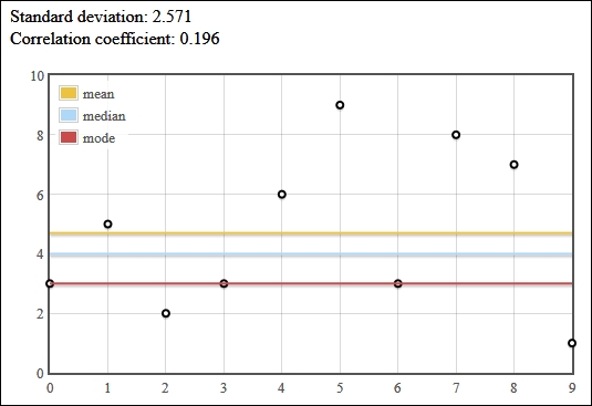
jStat, like most statistical and mathematical software, operates on vectors and matrices. So, we represent our data, yvalues, as a vector in the form of an array of y values. We then use jStat to calculate the mean, median, mode, and standard deviation (stdev) of those y values.
The main jStat function can be used to produce a sequence of values. We use this to create xvalues, an array that contains a sequence from 0 to 9 ([0, 1, 2, ..., 9]). The jStat function can also be used to create a matrix. We do this with our xvalues and yvalues vectors and use the transpose function to create a matrix which happens to be in the same structure that Flot can plot, that is transpose takes a matrix like the following matrix:
[ [0, 1, 2], [7, 8, 9] ]
It produces a matrix like the following matrix:
[ [0, 7], [1, 8], [2, 9] ]
Next, we use jStat's corrcoeff function to calculate the correlation coefficient between our data and xvalues.
Finally, we display all of this information. We display the standard deviation and correlation as text, and we use Flot to plot the data points as well as three horizontal lines that represent the mean, median, and mode.
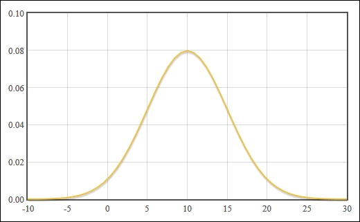
jStat also comes with a large variety of probability distribution calculations, which are typical tools in statistical analysis. These include the normal (Gaussian) distribution, Beta distribution, Chi-squared distribution, Poisson distribution, and much more.
You can calculate the data points for a normal distribution curve in only a few lines. Simply input your mean and standard deviation values into the normal function and use the pdf function to retrieve the y values:
...
var numPoints = 50;

var mean = 10;
var stdev = 5;
var span = stdev * 4;

var xvalues = jStat(mean - span, mean + span, numPoints + 1);
var normalDistribution = xvalues.normal(mean, stdev).pdf();

var normalPlot = jStat([
  xvalues[0],
  normalDistribution[0]
]).transpose();

$.plot( $('.chart'), [ normalPlot ] );
...
Flot draws the distribution curve centered at our mean value: