Flot is powerful and highly configurable, but it's also easy to get started with since Flot uses sensible defaults for most of its options. This recipe will teach you how to create the simplest types of charts.
You can download Flot from http://www.flotcharts.org/. Refer to the What you need for this book section for more information about Flot and jQuery versions and supported browsers.
Flot requires a few lines of HTML and CSS boilerplate to begin with. Our HTML must include a div element that will contain the chart. The div element must have a width and height defined; we do that with some CSS as follows:
<!doctype html>
<html>
<head>
  <meta charset="utf-8" />
  <title>Flot - Basic Charts</title>
  <style>
    .chart {
      width: 500px;
      height: 300px;
    }
  </style>
</head>
<body>
  <div class="chart" id="sampleChart"></div>
</body>
</html>
Tip
Downloading the example code
You can download the example code files for all Packt books you have purchased from your account at http://www.packtpub.com. If you purchased this book elsewhere, you can visit http://www.packtpub.com/support and register to have the files e-mailed directly to you.
Since Flot is a jQuery plugin, we must, of course, include jQuery before we include Flot itself as follows:
...
<body>
  <div class="chart" id="sampleChart"></div>
  <script src="jquery.js"></script>
  <script src="jquery.flot.js"></script>
</body>
</html>
Once we have the boilerplate code in place, we can start creating charts. We'll start with simple line charts, point charts, bar charts, and area charts.
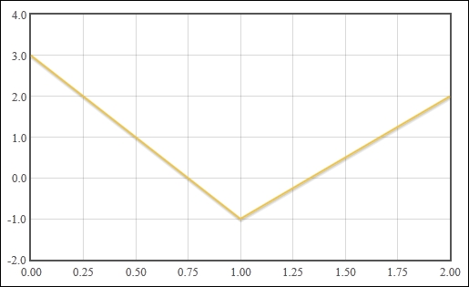
We can create the simplest line chart with just a few lines of JavaScript code:
...
<body>
  <div class="chart" id="sampleChart"></div>
  <script src="jquery.js"></script>
  <script src="jquery.flot.js"></script>
  <script>
    $('#sampleChart').plot(
      [ [[0, 3], [1, -1], [2, 2]] ],
      { series: { lines: {show: true} } }
    );
  </script>
</body>
</html>
This creates a chart with a line ranging from 0 to 2 on the X axis and -1 to 3 on the Y axis. Flot draws the grid and tick labels for us automatically:
Creating bar charts and point charts is just as easy. Simply change the chart option from lines to points in order to create a point chart as follows:
...
  <script>
    $('#sampleChart').plot(
      [ [[0, 3], [1, -1], [2, 2]] ],
      { series: { points: {show: true} } }
    );
  </script>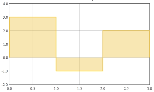
...Change the option to bars in order to create a bar chart, as shown in the following code:
...
  <script>
    $('#sampleChart').plot(
      [ [[0, 3], [1, -1], [2, 2]] ],
      { series: { bars: {show: true} } }
    );
  </script>
...
Once again, Flot draws a bar chart with the range of values, grid and tick labels, as expected. A colored bar is drawn for each data point:
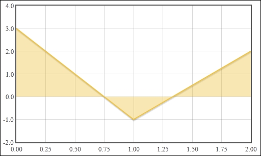
An area chart is just a line chart with the fill option specified, as shown in the following code:
...
  <script>
    $('#sampleChart').plot(
      [ [[0, 3], [1, -1], [2, 2]] ],
      { series: { lines: {show: true, fill: true} } }
    );
  </script>
...
Flot fills in the region between the data point and a horizontal line at the origin:
We first started by defining a div element in our HTML as a placeholder for our chart. Flot uses this element as a container. You can see this in action by using Firebug or your browser's equivalent development tool to inspect the contents of the element after Flot has drawn the chart. Flot creates multiple canvas elements as well as some other div elements in order to construct the chart that we specify.
Since the chart is often part of a larger set of HTML content, Flot does not assume anything about the size of the chart. Instead, we must specify our intended size by setting the CSS properties of the container element.
Lastly, we invoke Flot by calling the plot function via the jQuery object, passing in our container element, our chart data, and our chart options:
$(<placeholder>).plot(<data>, <options>);
The chart data is represented as a set of nested arrays. The first level is an array of series, which is a group of data. The second level is a data set, which is a set of data points. The last level is a data point; an x and y coordinate as shown in the following code:
[ [ [0, 1], [1, 2] ] ]
Data: [ series1, series2 ]
Series: [ datapoint1, datapoint2 ]
Datapoint: [ x1, y1 ]
We use the options object to specify which type of chart should be used to display our data. The object has a series property whose value determines the options applied to all series. We set the show property of the lines, points, or bars objects to enable that particular chart type.
Flot's sensible default options give you a good starting point without too much effort. However, there are many more configurations and options available to us. You can learn about all the options (including the grid and legend configuration options, which we don't cover in this book) at https://github.com/flot/flot/blob/0.8.1/API.md.
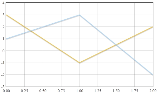
The preceding examples use only one series in the data. We can add more series to our data options and Flot will display them accordingly. The options specified in the series object are applied to all series:
...
  <script>
    $('#sampleChart').plot(
      [
        [[0, 3], [1, -1], [2, 2]],
        [[0, 1], [1, 3], [2, -2]]
      ],
      { series: { lines: {show: true} } }
    );
  </script>
...
Flot draws a single chart with the series overlapping each other in same order as the data array:
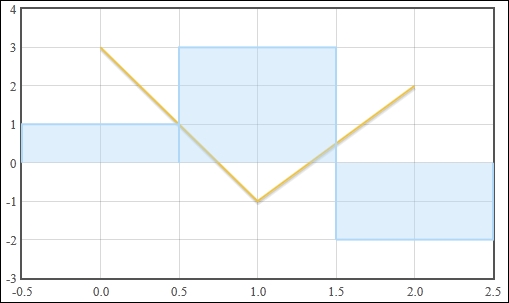
Flot allows us to specify different options for each series by using a different data options format. Instead of directly specifying a data set for each series, we specify a series object. The series object contains a data set and can contain options that apply to that series alone. In this case, we show one data set using the lines chart type and the other using the bars chart type. The bars in the bar chart are aligned to the center of the data point via the align option, as shown in the following code:
...
  <script>
    $('#sampleChart').plot(
     [
       {
         data: [[0, 3], [1, -1], [2, 2]],
         lines: {show: true}
       },
       {
         data: [[0, 1], [1, 3], [2, -2]],
         bars: {show: true, align: 'center'}
       }
     ]
    );
  </script>
...
Once again, Flot will draw a single chart with the bar chart series overlapping the line series: