
Now that we've learned how to create various types of charts, we can start applying Flot to our real-world data. Statistical data is often accompanied by error margins and visualized on charts using error bars. Flot's errorbars plugin is built specifically for that scenario.
We start with the same boilerplate code that we used to create basic charts and we include the errorbars plugin.
The error bars are displayed with a combination of extra data values, the errorbars and yerr settings, and other settings which help produce a properly formatted chart:
...
  <script src="jquery.flot.errorbars.js"></script>
  <script>
    var data = [
      [1, 2, 0.5],
      [2, 5, 0.2],
      [3, 1, 0.4]
    ];

    var plot = $.plot(
      $('.chart'),
      [ data ],
      {
        series: {
          lines: { show: true },
          points: {
            show: true,
            errorbars: 'y',
            yerr: {
              show: true,
              color: 'red',
              upperCap: '-',
              lowerCap: '-'
            }
          }
        },
        xaxis: { min: 0, max: 4 },
      }
    );
  </script>
...
Error bars are drawn in red with short horizontal lines as end caps, as specified:
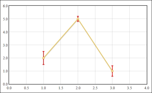
The errorbars plugin expects us to provide extra data values that specify the margin of error for each data point. The margin of error is in the same unit as the y value of the data point. In the preceding example, we've specified the values 0.5, 0.2, and 0.4 respectively.
We enable the errorbars plugin by setting the errorbars setting to y. This tells the plugin to use the extra data value as an error bar on the Y axis. The yerr settings object allows us to specify how the error bars should be displayed. We set the color, upperCap, and lowerCap settings so that the error bars are more easily visible.
We also enable the show settings on the lines and points setting objects so that both lines and points are drawn on the graph. Finally, we explicitly set the min and max settings on the xaxis settings object so that our data points are easier to see on the chart.
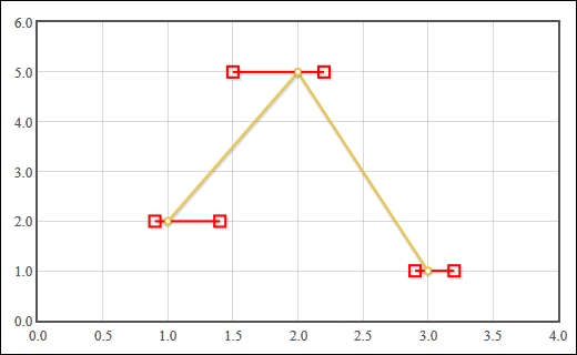
The errorbars plugin has the ability to display error bars on the X axis as well. It also gives you the ability to display asymmetric errors and custom end-cap styles.
Here, we use a combination of the asymmetric setting and custom functions for the upperCap and lowerCap settings to display a square end cap. The squareCap function receives a canvas context object (the DOM CanvasRenderingContext2D type) which we use to draw a square at the given X and Y coordinates:
...
    data = [
      [1, 2, 0.1, 0.4],
      [2, 5, 0.5, 0.2],
      [3, 1, 0.1, 0.2]
    ];

    var squareCap = function (ctx, x, y, radius) {
      ctx.beginPath();
      var r2 = radius / 2;
      ctx.rect(x - r2, y - r2, radius, radius);
      ctx.stroke();
    };

    var plot = $.plot(
      $('.chart'),
      [ data ],
      {
        series: {
          lines: { show: true },
          points: {
            show: true,
            errorbars: 'x',
            xerr: {
              show: true,
              asymmetric: true,
              color: 'red',
              upperCap: squareCap,
              lowerCap: squareCap,
              radius: 10
            }
          }
        },
        xaxis: { min: 0, max: 4 },
      }
    );
...
Asymettric error bars expect two error values in the data points. The error bars are drawn independently to the left and right of the data points. Our square caps are rendered as empty red boxes on the ends of the bars: