Reader small image

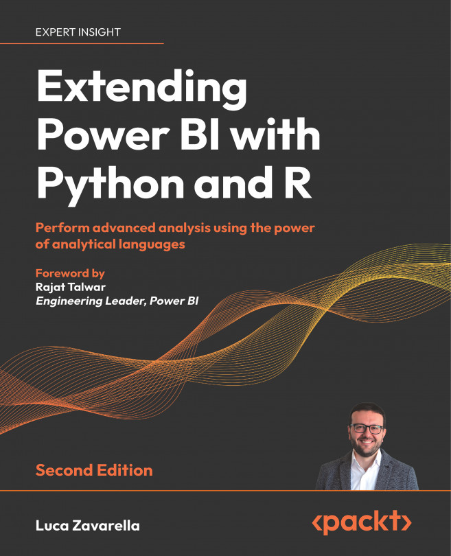
You're reading from  Extending Power BI with Python and R - Second Edition

Product typeBook
Published inMar 2024
Reading LevelIntermediate
PublisherPackt
ISBN-139781837639533
Edition2nd Edition
Languages
Right arrow
Author (1)
Luca Zavarella
Luca Zavarella
author image
Luca Zavarella

Luca Zavarella has a rich background as an Azure Data Scientist Associate and Microsoft MVP, with a Computer Engineering degree from the University of L'Aquila. His decade-plus experience spans the Microsoft Data Platform, starting as a T-SQL developer on SQL Server 2000 and 2005, then mastering the full suite of Microsoft Business Intelligence tools (SSIS, SSAS, SSRS), and advancing into data warehousing. Recently, his focus has shifted to advanced analytics, data science, and AI, contributing to the community as a speaker and blogger, especially on Medium. Currently, he leads the Data & AI division at iCubed, and he also holds an honors degree in classical piano from the "Alfredo Casella" Conservatory in L'Aquila.
Read more about Luca Zavarella

Right arrow

Using the Grammar of Graphics in Python with plotnine

Coined from the Grammar of Graphics as implemented in R, ggplot2 has become the tool of choice for many data visualization professionals. Its popularity stems from its consistent underlying graphics grammar, making the syntax reasonable to learn and master. Once you understand the basics, it’s possible to create different visualizations using the same syntax structure.

One feature of ggplot2 that makes life easier for developers is its layering approach. This feature allows the user to add or remove elements at will. Users can plot simple graphs as well as create complex custom visualizations thanks to the higher level of control provided by this approach.

This is not to say that it is impossible to create graphs as complex as those created with ggplot2 in Python. Simply, the tools provided by Matplotlib in Python are a bit more complicated to use and have a more intricate syntax to achieve the same things in ggplot2...
Technical requirements

This chapter requires you to have a working internet connection and Power BI Desktop already installed on your machine (version: 2.123.742.0, 64-bit, November 2023). You must have properly configured the R and Python engines and IDEs as outlined in Chapter 2, Configuring R with Power BI, and Chapter 3, Configuring Python with Power BI. Knowledge of the topics covered in Chapter 5, Importing Unhandled Data Objects, is recommended.

What is plotnine?

In the dynamic field of data visualization in Python, plotnine is emerging as a compelling library in the Python ecosystem. It is based on Leland Wilkinson’s Grammar of Graphics, a comprehensive framework for creating complex and meaningful graphics from data. The Grammar of Graphics empowers users to visually describe what they want to present, rather than the procedural details of plotting, which plotnine skillfully translates into beautiful visual representations. The library mirrors the functionality of R’s ggplot2, providing a Pythonic approach to sophisticated data visualization.

plotnine features an intuitive and powerful syntax, making it a favorite for exploratory data analysis where speed and efficiency in data visualization are critical. The library provides a consistent and flexible framework for constructing plots, a benefit of the Grammar of Graphics approach, which eases the learning curve and broadens its application to diverse data...

Analyzing Titanic data with plotnine

We will now demonstrate the simplicity of using plotnine for recurring tasks such as exploratory analysis.

First, you need to install the plotnine package. Here are the steps to do that:

  1. Open Anaconda Prompt.
  2. Switch to your pbi_powerqery_env environment by entering this command: conda activate pbi_powerqery_env.
  3. There are two ways to install plotnine: either install the package with the default options with a simple pip install plotnine==0.12.4 or install some extra features with pip install plotnine[all]==0.12.4 (the extra packages installed are scikit-learn and scikit-misc for loess and Gaussian smoothing). The default installation is sufficient for the code you will find in this chapter.

Then, you can import the necessary libraries and functions and load the Titanic data into the df variable with the following code:

import pandas as pd
from plotnine import (
    options, theme_tufte, ggplot, aes, geom_bar...

Using plotnine in Power BI

The plots returned by plotnine have a data type specific to the package used. Assuming you have assigned a plotnine plot to the variable p, this is what you get:

A screenshot of a computer code  Description automatically generated

Figure 20.6: Data type of a plotnine plot

As you probably remember, by default, the graphs handled in Python script are of the Matplotlib plot type. Also, If you consult Microsoft’s documentation on the Python packages installed in the Python engine of the Power BI service as of the time of writing (https://bit.ly/powerbi-python-limits), the plotnine package is not among them. So, how can you take advantage of the full potential of plotnine if the package does not seem to be installed on the service? You have three options. Let’s see what they are.

Working with plotnine and getting an image

One of the most immediate options is to use the string of the binary representation of the plot image generated by plotnine, as briefly mentioned in the Univariate exploration...

Summary

This chapter provided an in-depth exploration of data visualization techniques using the plotnine package in Python. It began with an introduction to ggplot2, a popular data visualization tool in R, and its Python equivalent, plotnine, which is based on the Grammar of Graphics concept.

The core concepts of plotnine were discussed in detail, providing a basic understanding necessary for creating and customizing visualizations.

In addition, the chapter illustrated the practical application of plotnine through an in-depth analysis of the Titanic dataset. This included comprehensive instructions on installing plotnine, importing the necessary libraries, and creating different types of visualizations such as bar charts and histograms. In addition, the chapter delved into the integration of plotnine visualizations with Power BI, providing step-by-step instructions on how to convert plotnine graphics for use in Power BI, facilitating a seamless integration process. In the...

References

For additional reading, check out the following books and articles:

Acknowledgment

I would like to thank my technical reviewer, Art Tennick, for his timely feedback that Image Pro had been removed from Microsoft AppSource, and a hint about possible alternatives.

Test your knowledge

  1. What is the difference between ggplot2 and plotnine and how are they related?
  2. How can plotnine be used in Power BI?

Learn more on Discord

To join the Discord community for this book – where you can share feedback, ask questions to the author, and learn about new releases – follow the QR code below:

https://discord.gg/MKww5g45EB

lock icon
The rest of the chapter is locked
You have been reading a chapter from
Extending Power BI with Python and R - Second Edition
Published in: Mar 2024Publisher: PacktISBN-13: 9781837639533
Register for a free Packt account to unlock a world of extra content!
A free Packt account unlocks extra newsletters, articles, discounted offers, and much more. Start advancing your knowledge today.
undefined
Unlock this book and the full library FREE for 7 days
Get unlimited access to 7000+ expert-authored eBooks and videos courses covering every tech area you can think of
Renews at $15.99/month. Cancel anytime

Author (1)

author image
Luca Zavarella

Luca Zavarella has a rich background as an Azure Data Scientist Associate and Microsoft MVP, with a Computer Engineering degree from the University of L'Aquila. His decade-plus experience spans the Microsoft Data Platform, starting as a T-SQL developer on SQL Server 2000 and 2005, then mastering the full suite of Microsoft Business Intelligence tools (SSIS, SSAS, SSRS), and advancing into data warehousing. Recently, his focus has shifted to advanced analytics, data science, and AI, contributing to the community as a speaker and blogger, especially on Medium. Currently, he leads the Data & AI division at iCubed, and he also holds an honors degree in classical piano from the "Alfredo Casella" Conservatory in L'Aquila.
Read more about Luca Zavarella