
Businesses use various reporting tools to compare results and measure performance. Often businesses want reports in graphical representations such as charts so that it will be easy to compare the results and measure the overall performance of their business. PrimeFaces provides support for creating various types of charts, such as Line, Area, Bar, Pie, Donut, Bubble, MeterGauge, and Open High Low Close (OHLC). PrimeFaces also supports rendering charts generated by JFreeCharts.
In our TechBuzz application, administrators can see the statistics of the number of posts by tags, in each year, with graphical representation using various types of charts.
In this chapter, we will cover the following commonly used charts:
Creating a Line chart
Creating an Area chart
Creating a Bar chart
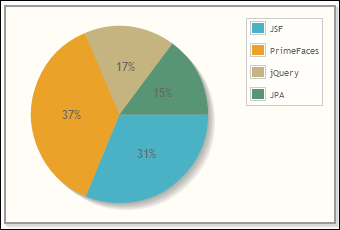
Creating a Pie chart
Creating a Donut chart
Exporting charts as images
Rendering dynamic charts using the JFreeChart API
Creating interactive charts using the ItemSelect AJAX event