


Selection components such as drop-down lists, checkboxes, and radio buttons are vey commonly used elements in web applications. But native HTML selection input components are very limited and don't provide enough features to build modern complex and rich user interfaces. To address this, PrimeFaces provides several selection input components with enhanced features and theming support.
In this chapter, we will cover the following components:
Creating the toggle button using SelectBooleanButton
Creating the On or Off options using SelectBooleanCheckbox
Introducing SelectManyCheckbox
Introducing SelectOneRadio
Introducing SelectOneButton
Introducing SelectManyButton
Creating drop-down lists using SelectOneMenu
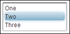
Introducing SelectOneListbox
Introducing SelectManyMenu
Creating the overlay menu using SelectCheckboxMenu
Creating the overlay menu with a default command using SplitButton
Introducing the PickList component
Introducing the MultiSelectListbox component...


