

When analyzing data, our primary goal is to efficiently and precisely deliver the findings to our audience. An easy way to present data is to display it in a table format. However, for larger datasets, it becomes challenging to visualize data in this format.
For example, the following table contains regional sales data:
|
Region |
Jul-12 |
Aug-12 |
Sep-12 |
Oct-12 |
Nov-12 |
Dec-12 |
|---|---|---|---|---|---|---|
|
Alberta |
22484.08 |
65244.19 |
15946.36 |
38593.39 |
34123.56 |
34753.98 |
|
British Columbia |
23785.05 |
51533.77 |
44508.33 |
57687.6 |
19308.37 |
43234.77 |
In table format, it is hard to see which region's sales performed best. Thus, to make the data easier to read, it may be preferable to present the data in a chart or other graphical format. The following figure is a graph of the data from the table, which makes it much easier to determine which region performed best each month in terms of sales:
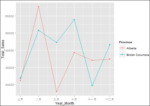
Figure 1: Sales amount by region
One of the most attractive features of R is that it already has many visualization packages...
In this recipe, we demonstrate how to use The Grammar of Graphics to construct our very first ggplot2 chart with the superstore sales dataset.
First, download the superstore_sales.csv dataset from the https://github.com/ywchiu/rcookbook/raw/master/chapter7/superstore_sales.csv GitHub link.
Next, you can use the following code to download the CSV file to your working directory:
> download.file('https://github.com/ywchiu/rcookbook/raw/master/chapter7/superstore_sales.csv', 'superstore_sales.csv')
You will also need to load the dplyr package to manipulate the superstore_sales dataset.
Please perform the following steps to create a basic chart with ggplot2:
First, install and load the
ggplot2package:> install.packages("ggplot2") > library(ggplot2)
Import
superstore_sales.csvinto an R session:> superstore <-read.csv('superstore_sales.csv', header=TRUE) > superstore$Order.Date <- as.Date(superstore$Order.Date) >...
Aesthetics mapping describes how data variables are mapped to the visual property of a plot. In this recipe, we discuss how to modify aesthetics mapping on geometric objects.
Ensure you have installed and loaded ggplot2 into your R session. Also, you need to complete the previous steps by storing sample_sum in your R environment.
Please perform the following steps to add aesthetics to the plot:
First, create a scatterplot by mapping
Year_Monthto the x axis,Total_Salesto the y axis, andProvinceto color:> g <- ggplot(data=sample_sum, mapping=aes(x=Year_Month, y=Total_Sales, colour=Province)) + ggtitle('With geom_point') > g + geom_point()
Set the aesthetics mapping on the geometric object:
> g2 <- ggplot(data=sample_sum) + geom_point(mapping=aes(x=Year_Month, y=Total_Sales, colour=Province)) + ggtitle('With Aesthetics Mapping')
> g2

Figure 4: Scatterplots using
geom_pointand aesthetics mappingAdjust the point size...
Geometric objects are elements that we mark on the plot. One can use the geometric object in ggplot2 to create either a line, bar, or box chart. Moreover, one can integrate these simple geometric objects and aesthetic mapping to create a more professional plot. In this recipe, we introduce how to use geometric objects to create various charts.
Ensure you have completed the previous steps by storing sample_sum in your R environment.
Perform the following steps to create a geometric object in ggplot2:
First, create a scatterplot with the
geom_pointfunction:> g <- ggplot(data=sample_sum, mapping=aes(x=Year_Month, y=Total_Sales, col=Province )) + ggtitle('Scatter Plot') > g + geom_point()
Use the
geom_linefunction to plot a line chart:> g+ geom_line(linetype="dashed")
Figure 9: Scatterplot and dashed line chart
Use the
geom_barfunction to make a stack bar chart:> g+geom_bar(stat = "identity", aes(fill=Province) , position...
Besides mapping particular variables to either the x or y axis, one can first perform statistical transformations on variables, and then remap the transformed variable to a specific position. In this recipe, we introduce how to perform variable transformations with ggplot2.
Ensure you have completed the previous steps by storing sum_price_by_province, and sample_sum in your R environment.
Perform the following steps to perform statistical transformation in ggplot2:
First, create a dataset named
sample_sum2by filtering sales data fromAlbertaandBritish Columbia:> sample_sum2 <- sum_price_by_province %>% filter(Province %in% c('Alberta', 'British Columbia' ) )Create a line plot with a regression line, using the
geom_pointandgeom_smoothfunctions:> g <- ggplot(data=sample_sum2, mapping=aes(x=Year_Month, y=Total_Sales, col=Province )) > g + geom_point(size=5) + geom_smooth() + ggtitle('Adding Smoother')

Figure 14: Adding...
Besides setting aesthetic mapping for each plot or geometric object, one can use scale to control how variables are mapped to the visual property. In this recipe, we introduce how to adjust the scale of aesthetics in ggplot2.
Perform the following steps to adjust the scale of aesthetic magnitude in ggplot2:
First, make a scatterplot by setting
size=Total_Sales,colour=Province,y=Province, and conditional onYear_Month. Resize the point with thescale_size_continuousfunction:> g <- ggplot(data=sample_sum, mapping=aes(x=Year_Month, y=Province, size=Total_Sales, colour = Province )) > g + geom_point(aes(size=Total_Sales)) + scale_size_continuous(range=c(1,10)) + ggtitle('Resize The Point')
Repaint the point in gradient color with the
scale_color_gradientfunction:> g + geom_point(aes(colour=Total_Sales)) + scale_color_gradient()+ ggtitle('Repaint...
When performing data exploration, it is essential to compare data across different groups. Faceting is a technique that enables the user to create graphs for subsets of data. In this recipe, we demonstrate how to use the facet function to create a chart for multiple subsets of data.
Please perform the following steps to create a chart for multiple subsets of data:
First, use the
facet_wrapfunction to create multiple subplots by using theProvincevariable as the condition:> g <- ggplot(data=sample_sum, mapping=aes(x=Year_Month, y=Total_Sales, colour = Province )) > g+geom_point(size = 5) + facet_wrap(~Province) + ggtitle('Create Multiple Subplots by Province')

Figure 19: Create multiple subplots by province
On the other hand, we can change the layout of the plot in a vertical direction if we set the number of columns to
1:> g+geom_point() + facet_wrap...
Besides deciding the visual property of a geometric object with aesthetic mapping, one can adjust the background color, grid lines, and other non-data properties with the theme. We introduce how to change the theme in this recipe.
Ensure you have completed the previous steps by storing sample_sum in your R environment.
Please perform the following steps to adjust the theme in ggplot2:
We can use different
themefunctions to adjust the theme of the plot:> g <- ggplot(data=sample_sum, mapping=aes(x=Year_Month, y=Total_Sales, colour = Province )) > g+geom_point(size=5) + theme_bw()+ ggtitle('theme_bw Example') > g+geom_point(size=5) + theme_dark()+ ggtitle('theme_dark Example')

Figure 23: Scatterplot with different themes
We can set the theme freely with the
themefunction:> g +geom_point(size=5) + + theme( + axis.text = element_text(size = 12), + legend.background = element_rect(fill = "white"), + panel.grid.major = element_line...
To create an overview of a dataset, we may need to combine individual plots into one. In this recipe, we introduce how to combine individual subplots into one plot.
Ensure you have installed and loaded ggplot2 into your R session. Also, you need to complete the previous steps by storing sample_sum in your R environment.
Please perform the following steps to combine plots in ggplot2:
First, we need to load the
gridlibrary into an R session:> library(grid)We can now create a new page:
> grid.newpage()Moving on, we can create two
ggplot2plots:> g <- ggplot(data=sample_sum, mapping=aes(x=Year_Month, y=Total_Sales, colour = Province )) > plot1 <- g + geom_point(size=5) + ggtitle('Scatter Plot') > plot2 <- g + geom_line(size=3) + ggtitle('Line Chart')
Next, we can push the visible area with a layout of two columns in one row, using the
pushViewportfunction:> pushViewport(viewport(layout = grid.layout(1, 2)))Last, we...
One can use a map to visualize the geographical relationship of spatial data. Here, we introduce how to create a map from a shapefile with ggplot2. Moreover, we introduce how to use ggmap to download map data from an online mapping service.
Ensure you have installed and loaded ggplot2 into your R session. Please download all files from the following GitHub link folder:
Perform the following steps to create a map with ggmap:
First, load the
ggmapandmaptoolslibraries into an R session:> install.packages("ggmap") > install.packages("maptools") > library(ggmap) > library(maptools)
We can now read the
.shpfile with thereadShapeSpatialfunction:> nyc.shp <- readShapeSpatial("nycc.shp") > class(nyc.shp) [1] "SpatialPolygonsDataFrame" attr(,"package") [1] "sp"
At this point, we can plot the map with the
geom_polygonfunction:> ggplot() + geom_polygon(data = nyc.shp, aes(x...