


Surface and contour plots
Matplotlib can also plot three-dimensional data in a variety of ways. Two common choices for displaying data such as this are using surface plots or contour plots (think of contour lines on a map). In this recipe, we will see a method for plotting surfaces from three-dimensional data and how to plot contours of three-dimensional data.
Getting ready
To plot three-dimensional data, it needs to be arranged into two-dimensional arrays for the  ,
,  , and
, and  components, where both the
  and
and  components must be of the same shape as the
  component. For the sake of this demonstration, we will plot the surface corresponding to the following function:

For 3D data, we can’t just use the routines from the pyplot interface. We need to import some extra functionality from another part of Matplotlib. We’ll see how to do this next.
How to do it...
We want to plot the function  on the
  and
and  range. The first task is to create a suitable grid of
  pairs on which to evaluate this function:
- We first use
np.linspaceto generate a reasonable number of points in these ranges:X = np.linspace(-5, 5)
Y = np.linspace(-5, 5)
- Now, we need to create a grid on which to create our
 values. For this, we use the
 np.meshgridroutine:grid_x, grid_y = np.meshgrid(X, Y)
- Now, we can create
 values to plot, which hold the value of the function at each of the grid points:
z = np.exp(-((grid_x-2.)**2 + (
grid_y-3.)**2)/4) - np.exp(-(
(grid_x+3.)**2 + (grid_y+2.)**2)/3)
- To plot three-dimensional surfaces, we need to load a Matplotlib toolbox,
mplot3d, which comes with the Matplotlib package. This won’t be used explicitly in the code, but behind the scenes, it makes the three-dimensional plotting utilities available to Matplotlib:from mpl_toolkits import mplot3d
- Next, we create a new figure and a set of three-dimensional axes for the figure:
fig = plt.figure()
# declare 3d plot
ax = fig.add_subplot(projection="3d")
- Now, we can call the
plot_surfacemethod on these axes to plot the data (we set the colormap to gray for better visibility in print; see the next recipe for a more detailed discussion):ax.plot_surface(grid_x, grid_y, z, cmap="gray")
- It is extra important to add axis labels to three-dimensional plots because it might not be clear which axis is which on the displayed plot. We also set the title at this point:
ax.set_xlabel("x")ax.set_ylabel("y")ax.set_zlabel("z")ax.set_title("Graph of the function f(x, y)")
You can use the plt.show routine to display the figure in a new window (if you are using Python interactively and not in a Jupyter notebook or on an IPython console) or plt.savefig to save the figure to a file. The result of the preceding sequence is shown here:
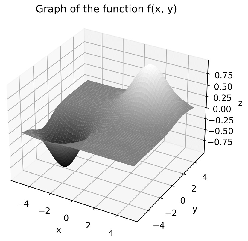
Figure 2.6 - A three-dimensional surface plot produced with Matplotlib
- Contour plots do not require the
mplot3dtoolkit, and there is acontourroutine in thepyplotinterface that produces contour plots. However, unlike the usual (two-dimensional) plotting routines, thecontourroutine requires the same arguments as theplot_surfacemethod. We use the following sequence to produce a plot:fig = plt.figure() # Force a new figure
plt.contour(grid_x, grid_y, z, cmap="gray")
plt.title("Contours of f(x, y)")plt.xlabel("x")plt.ylabel("y")
The result is shown in the following plot:
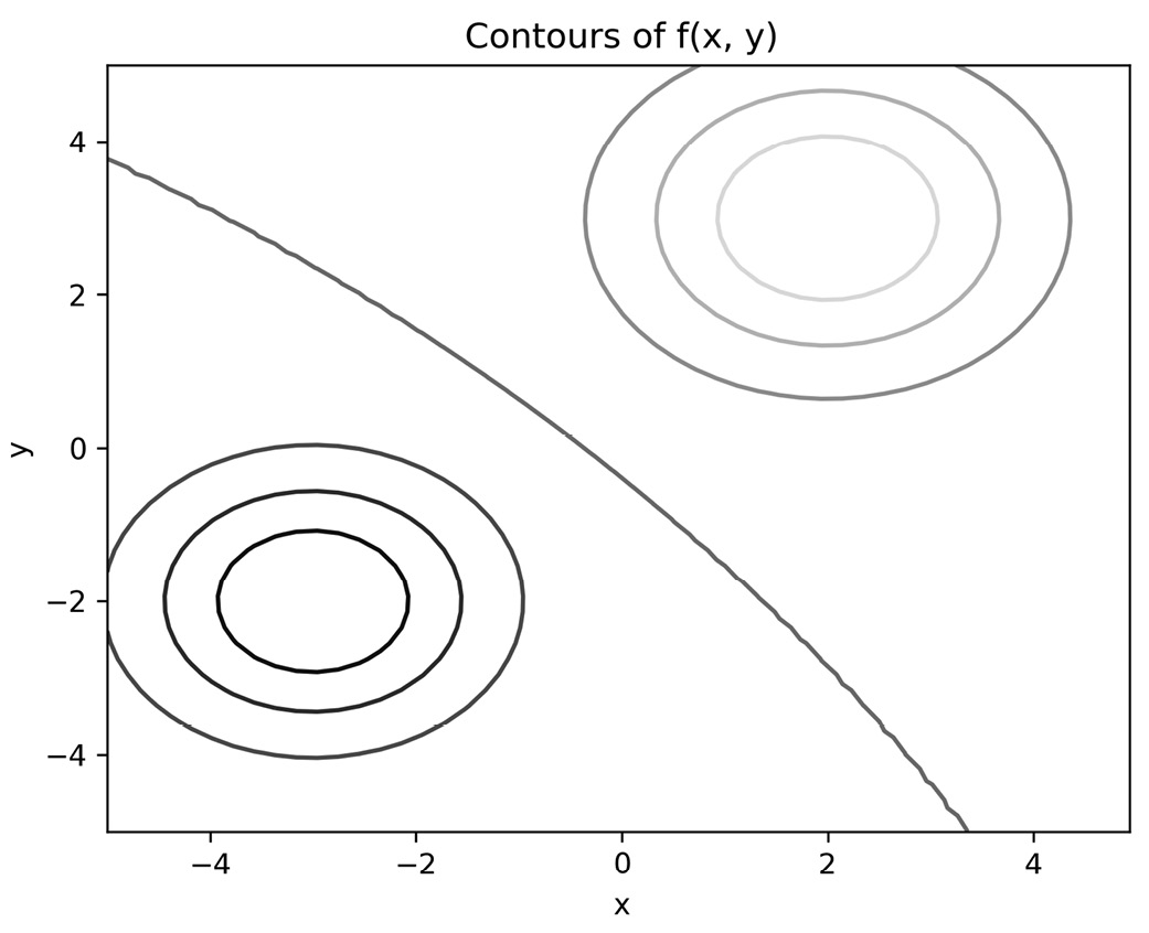
Figure 2.7 - Contour plot produced using Matplotlib with the default settings
The peak and basin of the function are shown clearly here by the rings of concentric circles. In the top right, the shading is lighter, indicating that the function is increasing, and in the bottom left, the shade is darker, indicating that the function is decreasing. The curve that separates the regions in which the function is increasing and decreasing is shown between them.
How it works...
The mplot3d toolkit provides an Axes3D object, which is a three-dimensional version of the Axes object in the core Matplotlib package. This is made available to the axes method on a Figure object when the projection="3d" keyword argument is given. A surface plot is obtained by drawing quadrilaterals in the three-dimensional projection between nearby points in the same way that a two-dimensional curve is approximated by straight lines joining adjacent points.
The plot_surface method needs the  values to be provided as a two-dimensional array that encodes the
  values on a grid of
  pairs. We created a range of
  and
and  values that we are interested in, but if we simply evaluate our function on the pairs of corresponding values from these arrays, we will get the
  values along a line and not over a grid. Instead, we use the
 meshgrid routine, which takes the two X and Y arrays and creates from them a grid consisting of all the possible combinations of values in X and Y. The output is a pair of two-dimensional arrays on which we can evaluate our function. We can then provide all three of these two-dimensional arrays to the plot_surface method.
There’s more...
The routines described in the preceding section, contour and plot_surface, only work with highly structured data where the  ,
,  , and
, and  components are arranged into grids. Unfortunately, real-life data is rarely so structured. In this case, you need to perform some kind of interpolation between known points to approximate the value on a uniform grid, which can then be plotted. A common method for performing this interpolation is by triangulating the collection of
  pairs and then using the values of the function on the vertices of each triangle to estimate the value on the grid points. Fortunately, Matplotlib has a method that does all of these steps and then plots the result, which is the
 plot_trisurf routine. We briefly explain how this can be used here:
- To illustrate the use of
plot_trisurf, we will plot a surface and contours from the following data:x = np.array([ 0.19, -0.82, 0.8 , 0.95, 0.46, 0.71,
-0.86, -0.55, 0.75,-0.98, 0.55, -0.17, -0.89,
-0.4 , 0.48, -0.09, 1., -0.03, -0.87, -0.43])
y = np.array([-0.25, -0.71, -0.88, 0.55, -0.88, 0.23,
0.18,-0.06, 0.95, 0.04, -0.59, -0.21, 0.14, 0.94,
0.51, 0.47, 0.79, 0.33, -0.85, 0.19])
z = np.array([-0.04, 0.44, -0.53, 0.4, -0.31,
0.13,-0.12, 0.03, 0.53, -0.03, -0.25, 0.03,
-0.1 ,-0.29, 0.19, -0.03, 0.58, -0.01, 0.55,
-0.06])
- This time, we will plot both the surface and contour (approximations) on the same figure as two separate subplots. For this, we supply the
projection="3d"keyword argument to the subplot that will contain the surface. We use theplot_trisurfmethod on the three-dimensional axes to plot the approximated surface, and thetricontourmethod on the two-dimensional axes to plot the approximated contours:fig = plt.figure(tight_layout=True) # force new figure
ax1 = fig.add_subplot(1, 2, 1, projection="3d") # 3d axes
ax1.plot_trisurf(x, y, z)
ax1.set_xlabel("x")ax1.set_ylabel("y")ax1.set_zlabel("z")ax1.set_title("Approximate surface") - We can now plot the contours for the triangulated surface using the following command:
ax2 = fig.add_subplot(1, 2, 2) # 2d axes
ax2.tricontour(x, y, z)
ax2.set_xlabel("x")ax2.set_ylabel("y")ax2.set_title("Approximate contours")
We include the tight_layout=True keyword argument with the figure to save a call to the plt.tight_layout routine later. The result is shown here:
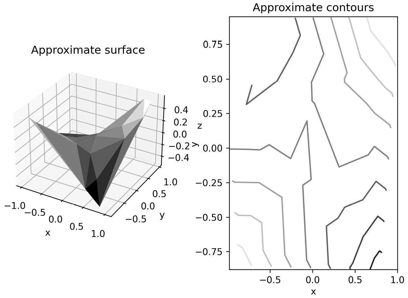
Figure 2.8 - Approximate surface and contour plots generated from unstructured data using triangulation
In addition to surface plotting routines, the Axes3D object has a plot (or plot3D) routine for simple three-dimensional plotting, which works exactly as the usual plot routine but on three-dimensional axes. This method can also be used to plot two-dimensional data on one of the axes.
See also
Matplotlib is the go-to plotting library for Python, but other options do exist. We’ll see the Bokeh library in Chapter 6. There are other libraries, such as Plotly (https://plotly.com/python/), that simplify the process of creating certain types of plots and adding more features, such as interactive plots.