


Customizing three-dimensional plots
Contour plots can hide some detail of the surface that they represent since they only show where the “height” is similar and not what the value is, even in relation to the surrounding values. On a map, this is remedied by printing the height onto certain contours. Surface plots are more revealing, but the problem of projecting three-dimensional objects into 2D to be displayed on a screen can itself obscure some details. To address these issues, we can customize the appearance of a three-dimensional plot (or contour plot) to enhance the plot and make sure the detail that we wish to highlight is clear. The easiest way to do this is by changing the colormap of the plot, as we saw in the previous recipe. (By default, Matplotlib will produce surface plots with a single color, which makes details difficult to see in printed media.) In this recipe, we look at some other ways we can customize 3D surface plots, including changing the initial angle of the display and changing the normalization applied for the colormap.
Getting ready
In this recipe, we will further customize the function we plotted in the previous recipe:

We generate points at which this should be plotted, as in the previous recipe:
t = np.linspace(-5, 5)
x, y = np.meshgrid(t, t)
z = np.exp(-((x-2.)**2 + (y-3.)**2)/4) - np.exp(
    -((x+3.)**2 + (y+2.)**2)/3)
Let’s see how to customize a three-dimensional plot of these values.
How to do it...
The following steps show how to customize the appearance of a 3D plot:
As usual, our first task is to create a new figure and axes on which we will plot. Since we’re going to customize the properties of the Axes3D object, we’ll just create a new figure first:
fig = plt.figure()
Now, we need to add a new Axes3D object to this figure and change the initial viewing angle by setting the azim and elev keyword arguments along with the projection="3d" keyword argument that we have seen before:
ax = fig.add_subplot(projection="3d", azim=-80, elev=22)
With this done, we can now plot the surface. We’re going to change the bounds of the normalization so that the maximum value and minimum value are not at the extreme ends of our colormap. We do this by changing the vmin and vmax arguments:
ax.plot_surface(x, y, z, cmap="gray", vmin=-1.2, vmax=1.2)
Finally, we can set up the axes labels and the title as usual:
ax.set_title("Customized 3D surface plot")
ax.set_xlabel("x")
ax.set_ylabel("y")
ax.set_zlabel("z")
The resulting plot is shown in Figure 2.9:
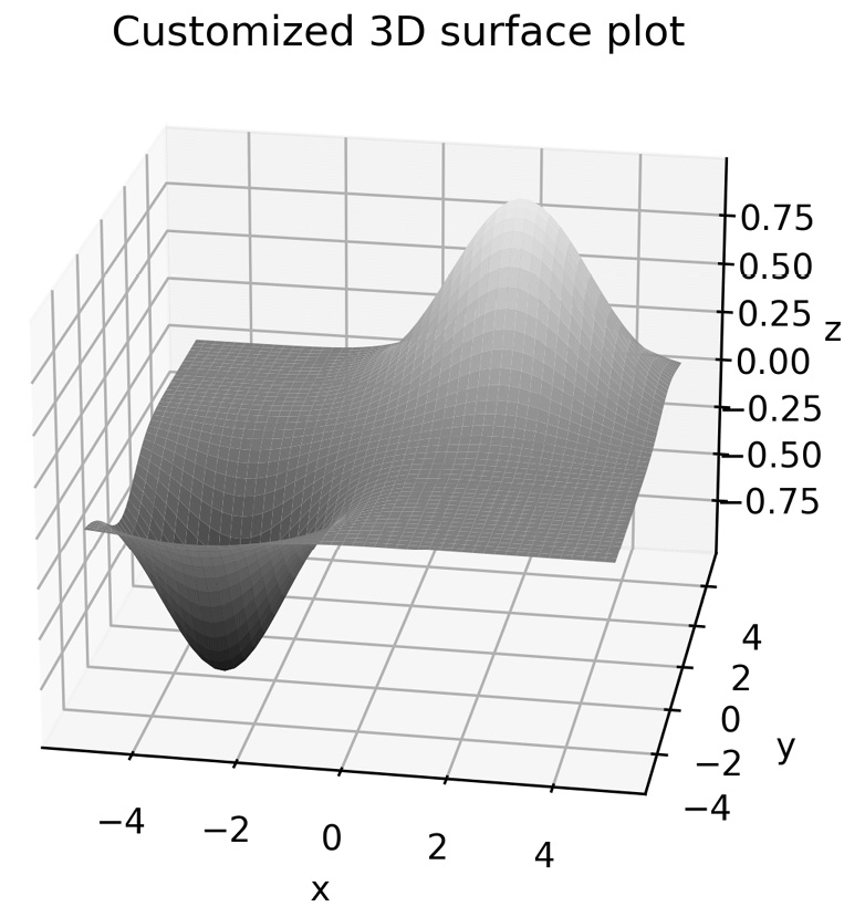
Figure 2.9 - Customized 3D surface plot with modified normalization and an initial viewing angle
Comparing Figure 2.6 with Figure 2.9, we can see that the latter generally contains darker shades compared to the former, and the viewing angle offers a better view of the basin where the function is minimized. The darker shade is due to the normalization applied to the values for the colormap, which we altered using the vmin and vmax keyword arguments.
How it works...
Color mapping works by assigning an RGB value according to a scale—the colormap. First, the values are normalized so that they lie between 0 and 1, which is typically done by a linear transformation that takes the minimum value to 0 and the maximum value to 1. The appropriate color is then applied to each face of the surface plot (or line, in another kind of plot).
In the recipe, we used the vmin and vmax keyword arguments to artificially change the value that is mapped to 0 and 1, respectively, for the purposes of fitting the colormap. In effect, we changed the ends of the color range applied to the plot.
Matplotlib comes with a number of built-in colormaps that can be applied by simply passing the name to the cmap keyword argument. A list of these colormaps is given in the documentation (https://matplotlib.org/tutorials/colors/colormaps.html) and also comes with a reversed variant, which is obtained by adding the _r suffix to the name of the chosen colormap.
The viewing angle for a 3D plot is described by two angles: the Azimuthal angle, measured within the reference plane (here, the  -
- -plane), and the elevation angle, measured as the angle from the reference plane. The default viewing angle for
 Axes3D is -60 Azimuthal and 30 elevation. In the recipe, we used the azim keyword argument of plot_surface to change the initial Azimuthal angle to -80 degrees (almost from the direction of the negative  axis) and the
 elev argument to change the initial elevation to 22 degrees.
There’s more...
The normalization step in applying a colormap is performed by an object derived from the Normalize class. Matplotlib provides a number of standard normalization routines, including LogNorm and PowerNorm. Of course, you can also create your own subclass of Normalize to perform the normalization. An alternative Normalize subclass can be added using the norm keyword of plot_surface or other plotting functions.
For more advanced uses, Matplotlib provides an interface for creating custom shading using light sources. This is done by importing the LightSource class from the matplotlib.colors package, and then using an instance of this class to shade the surface elements according to the  value. This is done using the
 shade method on the LightSource object:
from matplotlib.colors import LightSource
light_source = LightSource(0, 45)  # angles of lightsource
cmap = plt.get_cmap("binary_r")
vals = light_source.shade(z, cmap)
surf = ax.plot_surface(x, y, z, facecolors=vals)
Complete examples are shown in the Matplotlib gallery should you wish to learn more about how this.
In addition to the viewing angle, we can also change the type of projection used to represent 3D data as a 2D image. The default is a perspective projection, but we can also use an orthogonal projection by setting the proj_type keyword argument to "ortho".


