

A dashboard is a mechanism to put together multiple displays into one for use in a presentation. For example, you can take 3 graphical displays of production lines drawn from different data and display them on screen in one frame or dashboard. With Jupyter we can draw upon many mechanisms for retrieving and visualizing data which can then be put together into a single presentation.

A glyph is a symbol. In this section, we are looking to display glyphs at different points in a graph rather than the standard dot as the glyph should provide more visual information to the viewer. Often there is an attribute about a data point that can be used to turn the data point into a useful glyph, as we will see in the following examples.
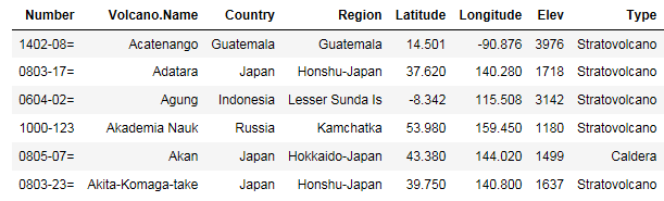
The ggplot2 package is useful for visualizing data in a variety of ways. ggplot is described as a plotting system for R. We will look at an example that displays volcano data points across the globe. I used the information from the National Center for Environmental Information at https://www.ngdc.noaa.gov/nndc. I selected volcano information post-1964.
This generated a set of data that I copied into a local CSV file:
#read in the CSV file as available as described previouslyvolcanoes = read.csv("volcanoes.csv")head(volcanoes)
If we just plot out the points on a world map we can see where the volcanoes are located. We are...
You can publish a notebook/dashboard using markdown. Markdown involves adding annotations to cells in your notebook that are interpreted by Jupyter and converted into the more standard HTML representations that you see in other published materials.
In all cases, we create the cell with the markdown type. We then enter the syntax for markdown in the cell. Once we run markdown cells the display of the cell changes to the effective markdown representation. You should also note there is no line number designation for markdown cells, as there is no code executing in markdown cells.
You can adjust font style information using italic and bold HTML notations. For example, if we have the code format of a cell as follows. You can use markdown that has markdown tags for italics (<i>) and bold (<b>):

When we run the cell we see the effective markdown as:

Shiny is a web application framework for R. It does not require the user to code HTML. There are normally two sets of code: the server and the user interface (UI). Both sets of code work on top of a Shiny server. A Shiny server can reside on one of your machines or in the cloud (via several hosting companies).
The Shiny server code set deals with accessing data, computing results, obtaining direction from the user, and interacting with other server code set to change results. The UI code set deals with layout of the presentation.
For example, if you had an application that produced a histogram of data the server set would obtain the data and produce results, display the results, and interact with the user to change the result—for example, it might change the number of buckets or range of data being displayed. The UI code set would strictly be concerned with layout.
Shiny code does not run under Jupyter. You can develop the coding using RStudio. RStudio is an integrated...
Using Node.js, developers have come up with a way to host your dashboard/notebook without Jupyter on jupyter-dashboard-server.
Installation requires installing Node.js (as the server is written in Node.js). This is a larger installation set.
Once you have Node.js installed, one of the tools installed is npm-node product manager. You can use npm to install the dashboard server with the following command:
npm install -g jupyter-dashboards-serverOnce installed you can run the server with the following command:
C:\Users\Dan>jupyter-dashboards-server --KERNEL_GATEWAY_URL=http://my.gateway.commygateway.com is a dummy. You would use your gateway server (if needed). At this point the server is running on the environment you mentioned and will output a few lines:
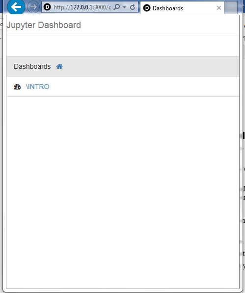
Using generated SESSION_SECRET_TOKENJupyter dashboard server listening on 127.0.0.1:3000
You can open a browser to the URL (http://127.0.0.1:3000/dashboards) and see what the server console looks like:
As for developing...
In this chapter, we visualized data graphically using glyphs to emphasize important aspects of the data. We used markdown to annotate a notebook page. We used Shiny to generate an interactive application. And we saw a way to host notebooks outside of Jupyter.
In the next chapter, we will look at statistical modeling under Jupyter.
The rest of the chapter is locked
You have been reading a chapter from
Jupyter for Data SciencePublished in: Oct 2017Publisher: PacktISBN-13: 9781785880070
Register for a free Packt account to unlock a world of extra content!
A free Packt account unlocks extra newsletters, articles, discounted offers, and much more. Start advancing your knowledge today.
undefined
Unlock this book and the full library FREE for 7 days
Get unlimited access to 7000+ expert-authored eBooks and videos courses covering every tech area you can think of
Renews at $15.99/month. Cancel anytime