


In the past, it was necessary to install the separate components of Jupyter, Python, and so on to have a working system. With Continuum Analytics, the process of installing Jupyter and adding the R engine to the solution set for Jupyter is easy and works on both Windows and Mac.
Assuming you have installed conda already, we have one command to add support for R programming to Jupyter:
conda install -c r r-essentialsTo get a flavor of the resources available to R developers, we can look at the 2016 election data. In this case, I am drawing from Wikipedia (https://en.wikipedia.org/wiki/United_States_presidential_election,_2016), specifically the table named 2016 presidential vote by demographic subgroup. We have the following coding below.
Define a helper function so we can print out values easily. The new printf function takes any arguments passed (...) and passes them along to sprintf:
printf <- function(...)print(sprintf(...))I have stored the separate demographic statistics into different TSV (tab-separated value) files, which can be read in using the following coding. For each table, we use the read.csv function and specify the field separator as a tab instead of the default comma. We then use the head function to display information about the data frame that was loaded:
age <- read.csv("Documents/B05238_05_age.tsv", sep="\t")head(age)education...
Similarly, we can look at voter registration versus actual voting (using census data from https://www.census.gov/data/tables/time-series/demo/voting-and-registration/p20-580.html).
First, we load our dataset and display head information to visually check for accurate loading:
df <- read.csv("Documents/B05238_05_registration.csv")summary(df)

So, we have some registration and voting information by state. Use R to automatically plot all the data in x and y format using the plot command:
plot(df)We are specifically looking at the relationship between registering to vote and actually voting. We can see in the following graphic that most of the data is highly correlated (as evidenced by the 45 degree angles of most of the relationships):

We can produce somewhat similar results using Python, but the graphic display is not even close.
Import all of the packages we are using for the example:
from numpy import corrcoef, sum, log, arange
from numpy.random import...
We can look at trends in college admissions acceptance rates over the last few years. For this analysis, I am using the data on https://www.ivywise.com/ivywise-knowledgebase/admission-statistics.
First, we read in our dataset and show the summary points, from head to validate:
df <- read.csv("Documents/acceptance-rates.csv")summary(df)head(df)
We see the summary data for school acceptance rates as follows:
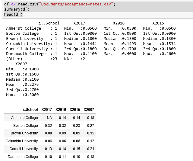
It's interesting to note that the acceptance rate varies so widely, from a low of 5 percent to a high of 41 percent in 2017.
Let us look at the data plots, again, to validate that the data points are correct:
plot(df)
From the correlation graphics shown, it does not look like we can use the data points from 2007. The graphs show a big divergence between 2007 and the other years, whereas the other three have good correlations.
So, we have 3 consecutive years of data from 25 major US universities. We can convert the data into a time series using a few steps...
R has built-in functionality for splitting up a data frame between training and testing sets, building a model based on the training set, predicting results using the model and the testing set, and then visualizing how well the model is working.
For this example, I am using airline arrival and departure times versus scheduled arrival and departure times from http://stat-computing.org/dataexpo/2009/the-data.html for 2008. The dataset is distributed as a .bz2 file that unpacks into a CSV file. I like this dataset, as the initial row count is over 7 million and it all works nicely in Jupyter.
We first read in the airplane data and display a summary. There are additional columns in the dataset that we are not using:
df <- read.csv("Documents/2008-airplane.csv")summary(df)...CRSElapsedTime AirTime ArrDelay DepDelay Min. :-141.0 Min. : 0 Min. :-519.00 Min. :-534.00 1st Qu.: 80.0 1st Qu.: 55 1st Qu.: -10.00...
In this chapter, we first set up R as one of the engines available for a notebook. Then we used some rudimentary R to analyze voter demographics for the presidential election. We looked at voter registration versus actual voting. Next, we analyzed the trend in college admissions. Finally, we looked at using a predictive model to determine whether flights would be delayed or not.
In the next chapter, we will look into wrangling data in different ways under Jupyter.