Reader small image

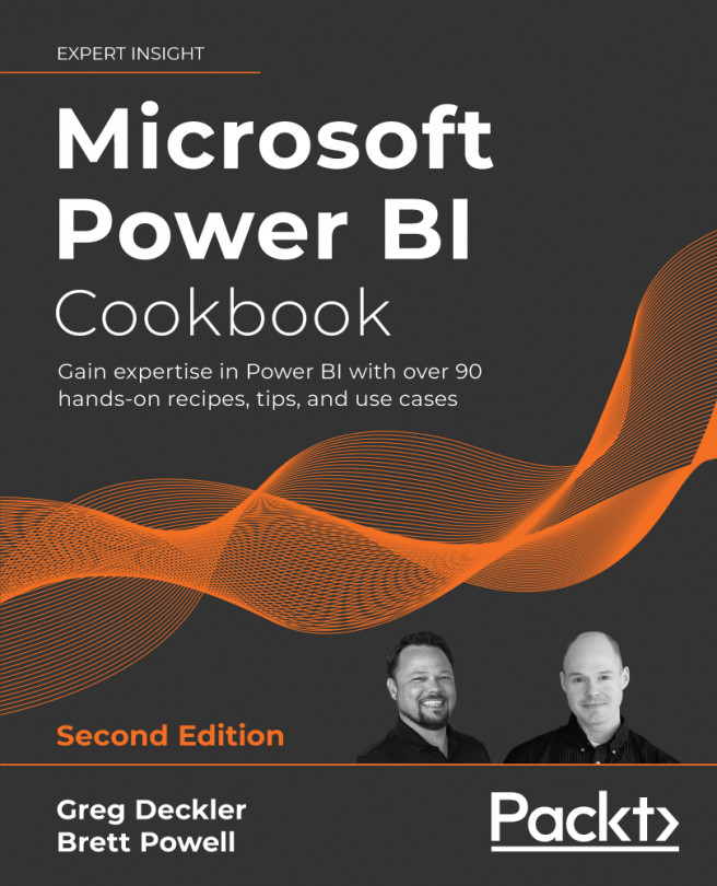
You're reading from  Microsoft Power BI Cookbook. - Second Edition

Product typeBook
Published inSep 2021
PublisherPackt
ISBN-139781801813044
Edition2nd Edition
Right arrow
Authors (2):
Gregory Deckler
Gregory Deckler
author image
Gregory Deckler

Greg Deckler is a 7-time Microsoft MVP for Data Platform and an active blogger and Power BI community member, having written over 6,000 solutions to community questions. Greg has authored many books on Power BI, including Learn Power BI 1st and 2nd Editions, DAX Cookbook, Power BI Cookbook 2nd Edition and Mastering Power BI 2nd Edition. Greg has also created several external tools for Power BI and regularly posts video content to his YouTube channels, Microsoft Hates Greg and DAX For Humans.
Read more about Gregory Deckler

Brett Powell
Brett Powell
author image
Brett Powell

Brett Powell is the owner of and business intelligence consultant at Frontline Analytics LLC, a data and analytics research and consulting firm and Microsoft Power BI partner. He has worked with Power BI technologies since they were first introduced as the PowerPivot add-in for Excel 2010 and has been a Power BI architect and lead BI consultant for organizations across the retail, manufacturing, and financial services industries. Additionally, Brett has led Boston's Power BI User Group, delivered presentations at technology events such as Power BI World Tour, and maintains the popular Insight Quest Microsoft BI blog.
Read more about Brett Powell

View More author details
Right arrow

Applying Advanced Analytics and Custom Visuals

Power BI Desktop's standard report authoring tools provide a robust foundation for the development of rich BI and analytical content. Custom visualizations developed by Microsoft and third parties further supplement these capabilities with their own unique features and can be integrated with standard visuals in Power BI reports and dashboards. Additionally, geospatial analysis features such as the ArcGIS maps visual for Power BI, custom dimension groupings, and animation and annotation options further aid in the extraction of meaning from data and also support sharing these insights with others.

Power BI Desktop also includes advanced analytics features reflecting modern data science tools and algorithms, including clustering, forecasting, and support for custom R and Python scripts and visuals. For example, an analytics pane is available to enrich visuals with additional metrics, such as a trend line, and the Quick Insights...
Technical Requirements

The following are required to complete the recipes in this chapter:

Incorporating Advanced Analytics

The standard line, scatter, column, and bar chart visualization types available in Power BI Desktop, which generally represent the majority of Power BI report content, given their advantages in visual comprehension, can be further enhanced via a dedicated analytics pane. Similar to visual-level filters, the Power BI analytics pane creates measures scoped to the specific visual, such as trend lines, constant lines, percentile lines, min, max, and average. This additional logic provides greater context to the visual and avoids the need to author complex or visual-specific DAX measures.

"This pane is our home for all of our analytics features and you'll be able to use this to augment your charts with any kind of additional analytics that you need."

- Amanda Cofsky Rivera, Power BI Program Manager

This recipe includes two examples of leveraging the analytics pane in Power BI Desktop to raise the analytical value of chart visuals...

Enriching Content with Custom Visuals and Quick Insights

Custom visuals for Power BI can be reviewed and downloaded from AppSource to provide additional features and options beyond those supported by the standard visuals of Power BI Desktop. Over 300 custom visuals are currently available in AppSource with many of these having been developed by Microsoft to address common needs, such as the bullet, histogram, and Gantt charts. Other custom visuals available in AppSource have been developed by third parties but validated for security by Microsoft, with these visuals having unique and powerful capabilities, such as flow map network visualization and the interactive visuals developed by ZoomCharts. In addition to custom visuals, Quick Insights can be used in the Power BI service and in Power BI Desktop to apply advanced analytics algorithms against datasets to extract insights, such as trends or relationships, and rapidly generate new visualizations for use in reports and dashboards...

Creating Geospatial Mapping with ArcGIS Maps

The ArcGIS mapping and spatial analytics software from ESRI, a market leader in geographic information systems (GISes), is built into Power BI Desktop to generate greater insights from the spatial component of data. Familiar report visualization field wells and the cross-filtering capabilities of Power BI can be combined with ArcGIS geospatial features and datasets, such as classification types, pins, and reference layers, to build custom, intelligent geographical visualizations into Power BI solutions.

In this recipe, a custom geographical column is created to include multiple geographical attributes (i.e., Street Address, City, and State) to support accurate geocoding by the ArcGIS service. The ArcGIS visualization in Power BI Desktop is then used to plot customer addresses into a Cluster theme map visualization with supporting Pins and Infographics.

Getting ready

To prepare for this recipe, follow these steps:

    ...

Democratizing Artificial Intelligence

Recent additions to Power BI's visualization library help democratize artificial intelligence by making machine learning intuitive and easy to use by end users. The Key influencers and Decomposition tree visualizations covered in this chapter, as well as other visuals like Smart narrative and Q&A, leverage machine learning algorithms to analyze visualization data in real time to bring artificial intelligence insights to the masses. Machine learning is the process of analyzing data based purely on mathematical algorithms in order to identify patterns, key metrics, clusters, anomalies, and key categorizations.

This recipe demonstrates how to configure and use the artificial intelligence capabilities of the Key influencers and Decomposition tree visualizations.

Getting ready

To prepare for this recipe, follow these steps:

  1. Open a Power BI Desktop file locally and access the Power Query Editor by clicking on Transform...

Building Animation and Storytelling

Business teams and analysts are commonly responsible for sharing or "walking through" business results, trends, and the findings from their analyses with other stakeholders, such as senior management. To support the message delivery process most effectively, Power BI provides built-in animation capabilities for the standard scatter chart and ArcGIS map visualization types. Additionally, core and custom visuals, such as the pulse chart, further aid the storytelling process by embedding user-defined annotations into the visual and providing full playback control over the animation.

"We're bringing storytelling into Power BI. We're making Power BI into the PowerPoint for data."

– Amir Netz, Microsoft Technical Fellow

This recipe includes examples for preparing the standard Scatter chart visualization for animation, leveraging the date animation feature of the ArcGIS Maps for Power BI visual. Details...

Embedding Statistical Analyses

Statistical analysis beyond basic aggregations is typically implemented outside of business intelligence semantic models by data scientists and data science applications. When possible, however, it is much more efficient to leverage existing data models, Power BI skills, and the features used for other Power BI reports and dashboards—such as the Analytics pane described earlier in this chapter.

In this recipe, the data points supporting a linear regression model are created from an existing Power BI data model. This model is then analyzed and described via DAX measures, with values such as slope, Y-intercept, and the Z-score for residuals. Finally, a rich report page is constructed to visualize the strength and accuracy of the regression model and to detect outliers.

Getting ready

To prepare for this recipe, follow these steps:

  1. Open a Power BI Desktop file locally and access the Power Query Editor by clicking on Transform...

Grouping and Binning

Grouping and binning in Power BI creates group columns that can then be utilized like other columns in the model to simplify report visualizations and self-service analysis, given their reduced granularity. Additionally, groups can be managed and edited in Power BI Desktop, providing a flexible option for dataset owners to respond quickly to changing requirements or preferences.

This recipe provides examples for using grouping and binning functionality within Power BI Desktop.

Getting ready

To prepare for this recipe, follow these steps:

  1. Open a Power BI Desktop file locally and access the Power Query Editor by clicking on Transform Data in the ribbon of the Home tab
  2. Create a query named AdWorksDW similar to the following:
    let
        Source = Sql.Database("localhost\MSSQLSERVERDEV", "AdventureWorksDW2019")
    in
        Source
    
  3. Disable load on the AdWorksDW query and place it into a Data Sources query...

Detecting and Analyzing Clusters

Clustering is a data mining and machine learning technique used to group (cluster) the items of one dimension based on the values of one or more measures. Given the number of distinct dimension items, such as products or customers, and the number of measures describing those items, clustering is a powerful method of exploring data to discover relationships not easily detected with standard reporting and analysis techniques. Power BI Desktop provides built-in support for the creation of clusters and allows these clusters to be managed, revised, and used in Power BI reports like other columns in the data model.

In this recipe, a customer cluster is created based on the sales amount, the count of orders, and the count of days since the last purchase. DAX measures are created to support this analysis, and a Scatter Chart visual is created to further analyze the clusters.

Getting ready

To prepare for this recipe, follow these steps:

    ...

Forecasting and Anomaly Detection

Standard Power BI report and dashboard visualizations are great tools to support descriptive and diagnostic analytics of historical or real-time data, but ultimately organizations need predictive and prescriptive analytics to help guide decisions involving future outcomes. Power BI Desktop provides a time series forecasting tool with built-in predictive modeling capabilities that enables report authors to quickly create custom forecasts, evaluate the accuracy of these forecasts, and build intuitive visualizations that blend actual or historical data with the forecast.

This recipe contains two complete forecasting examples. The first example builds a monthly forecast for the next three months utilizing an automatic date hierarchy. The second example builds a weekly forecast of the next eight weeks and evaluates the forecast's accuracy when applied to recent data. Finally, an example of using anomaly detection is provided.

Getting ready...

Using R and Python Visuals

The R and Python programming languages, including their powerful and extensible features in data processing, advanced analytics, and visualization, are deeply integrated with Power BI. R and Python scripts can be used as a data source for a Power BI dataset, as a data transformation and shaping process within M queries, and as their own visualization type within Power BI reports and dashboards. Like standard Power BI visuals, R and Python script visuals directly leverage the relationships defined in the data model and can be dynamically filtered via other visuals, such as slicers.

In this recipe, two histogram visualizations are created in Power BI Desktop with R scripts: one with R's standard distribution base graphics, and another with the popular ggplot2 visualization package. Additionally, a Python visual example is included.

Getting ready

To prepare for this recipe, follow these steps:

  1. Download and install the R engine on...

Conclusion

This chapter contained a broad mix of recipes highlighting many of the latest and most popular custom visualizations and advanced analytics features of Power BI. This included custom visuals, the ArcGIS map visual, and data storytelling via animation and annotation. Additionally, examples were provided of leveraging Power BI datasets, and the DAX, R, and Python languages to embed custom statistical analyses and visualizations.

lock icon
The rest of the chapter is locked
You have been reading a chapter from
Microsoft Power BI Cookbook. - Second Edition
Published in: Sep 2021Publisher: PacktISBN-13: 9781801813044
Register for a free Packt account to unlock a world of extra content!
A free Packt account unlocks extra newsletters, articles, discounted offers, and much more. Start advancing your knowledge today.
undefined
Unlock this book and the full library FREE for 7 days
Get unlimited access to 7000+ expert-authored eBooks and videos courses covering every tech area you can think of
Renews at €14.99/month. Cancel anytime

Authors (2)

author image
Gregory Deckler

Greg Deckler is a 7-time Microsoft MVP for Data Platform and an active blogger and Power BI community member, having written over 6,000 solutions to community questions. Greg has authored many books on Power BI, including Learn Power BI 1st and 2nd Editions, DAX Cookbook, Power BI Cookbook 2nd Edition and Mastering Power BI 2nd Edition. Greg has also created several external tools for Power BI and regularly posts video content to his YouTube channels, Microsoft Hates Greg and DAX For Humans.
Read more about Gregory Deckler

author image
Brett Powell

Brett Powell is the owner of and business intelligence consultant at Frontline Analytics LLC, a data and analytics research and consulting firm and Microsoft Power BI partner. He has worked with Power BI technologies since they were first introduced as the PowerPivot add-in for Excel 2010 and has been a Power BI architect and lead BI consultant for organizations across the retail, manufacturing, and financial services industries. Additionally, Brett has led Boston's Power BI User Group, delivered presentations at technology events such as Power BI World Tour, and maintains the popular Insight Quest Microsoft BI blog.
Read more about Brett Powell