Reader small image

You're reading from  Hands-On Android UI Development

Product typeBook
Published inNov 2017
Reading LevelExpert
PublisherPackt
ISBN-139781788475051
Edition1st Edition
Languages
Tools
Right arrow
Author (1)
Jason Morris
Jason Morris
author image
Jason Morris

Jason Morris has been developing software for as long as he can remember. He's written software for the desktop, the server, for feature phones and for smart phones. He's written in many languages, and deployed in a variety of countries. Jason loves a good programming challenge, and when he's not writing code, or spending time with his family, taking photo's or camping: he's probably thinking about programming. In 2010 / 2011 he wrote Android User Interface Development: A Beginners Guide, which helped many beginner Android developers take their first steps into the realm of User Interface design and development for mobile devices.
Read more about Jason Morris

Right arrow

Chapter 8. Designing Material Layouts

When designing and creating the layout for a screen, there are many different schools of thought about how it should be done. Modern layouts are often complex systems that change their shape dynamically as the user interacts with them. In the past, layouts tended to be quite rigid structures with only specialized areas such as windows or slit panels that could be adjusted by the user. However, a mobile application must make better use of their available space, since they're typically used on physically smaller devices. The direct interaction of a touch interface also changes how the user expects an application to behave; you need to not only react to the users gestures, but also be mindful of where their hand and fingers are likely to be on the screen as they might be obscuring some part of the screen, as they drag to scroll through your application.

The easiest way to see how a layout can change and adjust is with a jumbo collapsing toolbar. When the...

Looking at material structure


Material layouts have a selection of patterns that applications should follow for every screen they build. This sort of template is often called the scaffolding, and for mobile, it looks like this:

What is important about the scaffolding is that while it defines the basic layout of virtually every screen, it doesn't define how you should achieve this design, and even on Android, you'll find that there are several different ways of creating a screen with the preceding layout structure. Several elements are also optional: the Bottom Bar and floating action button are often left out because they aren't useful to a screen. The App Bar appears on most screens, but can be much larger and can also be folded away to provide the user with more reading space in the content area.

It's also important to understand that by default, the platform theming will put the App Bar (presented by the ActionBar class) into an Activity for you; it's also common to create your own App...

Introducing CoordinatorLayout


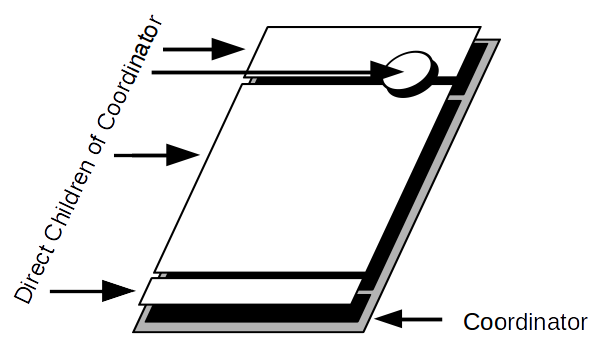
Android has a small family of layouts designed to work together to achieve the dynamic movement effects when the user scrolls. At the core of this group is the CoordinatorLayout class, which allows complex behaviors to be attached to any number of floating sibling widgets that can depend on and react to each other's position and size. To illustrate how a CoordinatorLayout actually works, take a look at this diagram:

Even though the FloatingActionButton appears to be floating above the other widgets, it's a direct child of the CoordinatorLayout. It remains in place because it is anchored to the bottom of the toolbar. If the toolbar changes its size or position, the CoordinatorLayout will move the FloatingActionButton so that it appears to be attached to the bottom of the toolbar. These movements are all done together as part of the layout process, resulting in every frame being pixel perfect and everything appearing to move and resize together.

CoordinatorLayout...

Coordinating the Overview Screen


The Overview screen you built in Chapter 7, Creating Overview Screens, is a perfect candidate for a CoordinatorLayout. To start with, the allowance overview bar can be made to collapse, and unfold as the user scrolls. This allows more space for the claim items on the screen as they are scrolling, and by expanding the overview again when they scroll upward, the user doesn't have to scroll all the way to the top to get the overview back.

This behavior won't just use the CoordinatorLayout, but will also need the help of the AppBarLayout and CollapsingToolbarLayout classes as you'll need to take control of the Material Design scaffolding to make it work. Follow these steps to move the allowance overview into the header bar and make it collapse:

  1. First, open the AndroidManifest file from the manifests folder in the project tree (use the Android perspective).
  2. Find the OverviewActivity entry and add a theme attribute that will tell the system not to provide a system...

Swiping to delete


While you have a way for your users to create claim items, the users have no way to delete the claim items that they have created. A common pattern in lists on mobile apps is to allow the user to swipe right to dismiss or delete items. RecyclerView provides some excellent and easy-to-use structures to enable this sort of behavior; however, it's always important to ensure that users don't delete items by mistake.

In the past, most user interfaces used confirmation dialogs when executing destructive actions. However, these "are you sure" dialogs are a horrible distraction for most users, because such messages violate a key principle--the application assumes that the user probably doesn't want to perform an action that they just took. In reality, the user probably did mean to delete the item, but the application interrupts them to ask whether they're sure about their choice. A much better behavior is to assume that the user does want to take the action, but then to give them...

Elevating widgets


An excellent way of highlighting one widget over the others on the screen is to make it appear over the others on the screen, not two-dimensionally, but floating above them as though in three-dimensions. This is already a clear pattern if you look at the FloatingActionButton classes; they don't just overlap other widgets, but they have a shadow and appear to float in space (hence the class name FloatingActionButton).

One of the great features in the Android widget library is that the View class defines the notion of elevation, which makes it usable by every widget in the toolkit. The elevation of a widget doesn't affect its two-dimensional position or size, but does cause it to produce a shadow that will be correctly shaded as though the widget is floating in three-dimensions. This can be used to create an amazing effect when you need to draw attention to a message, or when the user is repositioning a widget on the screen (for example, reorganizing a list of reminders)....

Building layouts using grids


When building screens, it's common to want specific widgets to appear the same size and shape as other widgets. This is often achieved using flexible grid models for the layout. By dividing the screen into a number of cells, and having each widget occupy one or more cells, you can create very complex layouts that will stretch to any screen size. However, this traditional model is completely outdated when faced with ConstraintLayout, which is capable of maintaining complex relationships between widgets without the need for a grid.


In most situations, ConstraintLayout should be more than capable of managing any complex layout you choose to design, and will be much more flexible than a grid/table layout manager. Unlike a grid-based layout engine, ConstraintLayout is much more flexible when dealing with widgets that are sized based on a font or images that can be various sizes, depending on the physical screen size and pixel-density. While GridLayout will adjust...

Stack view


Sometimes, it's useful to be able to display long lists of items with only one item visible at a time, for example, the list of attachments for a ClaimItem. In this case, you can use the side-to-side ViewPager as you've already done, but there is another option--the StackView. The StackView class presents its contents as a three-dimensional stack of cards, with the "top" card fully visible, and some of the cards "behind it," as shown:

This is often a very useful pattern, as it provides the user with plenty of screen space to view the top item, while also being able to see that there are other items that can be viewed. This makes it ideal for displaying photos or large cards of data. It's very similar to how Android displays the list of running applications when you tap on the "Recent Apps" button on a device.

The StackView is a classic Adapter view, and works using the same Adapter implementations as ListView or GridView. If done correctly, you can write code that can be used in...

Test your knowledge


  1. Elevation should be used for which of the following?
    • When the user selects an item in a list
    • To selectively highlight one item above a flat layout
    • When a user swipes to delete items
  2. CoordinatorLayout can be used to coordinate movement and size between which of these?
    • The components nested in an AppBarLayout
    • Any of its direct child widgets
    • Fragment in different activities
  3. To change elevation of a widget in a backward-compatible way, you need to do which of the mentioned?
    • Nest the widget in a CardView
    • Use the ViewCompat class
    • Use Java reflection to call setElevation
  1. The GridLayout class should be used in which of the following conditions?
    • When ConstraintLayout is not available
    • To display large tables of data
    • To lay out screens along grid lines

Summary


Taking ownership of what is normally the system's decorations for your application provides you with a huge variety of additional flexibility and power. By using the CoordinatorLayout to host the scaffolding and content of your screens, you further extend your flexibility by allowing widgets to dynamically interact with each other, even when being animated. This provides you with a way to produce pixel-perfect screens with minimal additional work.

Using layouts that cannot only dynamically change their shape, but also change their content using gestures such as swipe-to-dismiss to further enhance the direct manipulation aspects of a touchscreen user interface have been covered. At the same time, it's important to always consider the interactions of your user and when to interrupt them, especially around destructive actions. While there are still times where you might want to use a confirmation dialog, it's generally better to give users a method to undo their actions. It's often a...

lock icon
The rest of the chapter is locked
You have been reading a chapter from
Hands-On Android UI Development
Published in: Nov 2017Publisher: PacktISBN-13: 9781788475051
Register for a free Packt account to unlock a world of extra content!
A free Packt account unlocks extra newsletters, articles, discounted offers, and much more. Start advancing your knowledge today.
undefined
Unlock this book and the full library FREE for 7 days
Get unlimited access to 7000+ expert-authored eBooks and videos courses covering every tech area you can think of
Renews at £13.99/month. Cancel anytime

Author (1)

author image
Jason Morris

Jason Morris has been developing software for as long as he can remember. He's written software for the desktop, the server, for feature phones and for smart phones. He's written in many languages, and deployed in a variety of countries. Jason loves a good programming challenge, and when he's not writing code, or spending time with his family, taking photo's or camping: he's probably thinking about programming. In 2010 / 2011 he wrote Android User Interface Development: A Beginners Guide, which helped many beginner Android developers take their first steps into the realm of User Interface design and development for mobile devices.
Read more about Jason Morris