


Exploring more views and controls
In this section, we introduce some views and controls that did not clearly fit in any of the earlier created recipes. We’ll look at the ProgressView, ColorPicker, Link, and Menu views.
ProgressView is used to show the degree of completion of a task. There are two types of ProgressView: indeterminate progress views show a spinning circle till a task is completed, while determinate progress views show a bar that gets filled up to show the degree of completion of a task.
ColorPicker views allow users to select from a wide range of colors, while Menu views present a list of items that users can choose from to perform a specific action.
Getting ready
Let’s start by creating a new SwiftUI project called MoreViewsAndControls.
How to do it…
Let’s implement some views and controls in the ContentView.swift file. We will group the controls in Section instances in a List view. Section allows us to include an optional header. The steps are given here:
- Just below the
ContentViewstruct declaration, add the state variables that we’ll be using for various components:@State private var progress = 0.5 @State private var color = Color.red @State private var secondColor = Color.yellow @State private var someText = "Initial value" - Replace the body contents with a
Listview with aSectionview, twoProgressViewviews, and aButtonview:List { Section(header: Text("ProgressViews")) { ProgressView("Indeterminate progress view") ProgressView("Downloading",value: progress, total:2) Button("More") { if (progress < 2) { progress += 0.5 } } } } - Let’s add another section that implements two labels:
Section(header: Text("Labels")) { Label("Slow ", systemImage: "tortoise.fill") Label { Text ("Fast") .font(.title) } icon: { Circle() .fill(Color.orange) .frame(width: 40, height: 20, alignment: .center) .overlay(Text("F")) } } - Now, add a new section that implements a
ColorPicker:Section(header: Text("ColorPicker")) { ColorPicker(selection: $color ) { Text("Pick my background") .background(color) .padding() } ColorPicker("Picker", selection: $secondColor ) } - Next, add a
Link:Section(header: Text("Link")) { Link("Packt Publishing", destination: URL(string: "https://www.packtpub.com/")!) } - Next, add a
TextEditor:Section(header: Text("TextEditor")) { TextEditor(text: $someText) Text("current editor text:\n\(someText)") } - Then, add a
Menu:Section(header: Text("Menu")) { Menu("Actions") { Button("Set TextEditor text to 'magic'"){ someText = "magic" } Button("Turn first picker green") { color = Color.green } Menu("Actions") { Button("Set TextEditor text to 'real magic'"){ someText = "real magic" } Button("Turn first picker gray") { color = Color.gray } } } } - Finally, let’s improve the style of all the content by applying a
listStylemodifier on theList:List { ... } .listStyle(.grouped) - The resulting view app preview should look like this:
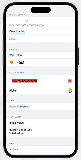
Figure 1.23: More Views and Controls app preview
How it works…
We’ve implemented multiple views in this recipe. Let’s look at each one and discuss how they work.
Indeterminate ProgressView requires no parameters:
ProgressView("Indeterminate progress view")
ProgressView()
Determinate ProgressView components, on the other hand, require a value parameter that takes a state variable and displays the level of completion:
ProgressView("Downloading",value: progress, total:2)
The total parameter in the ProgressView component is optional and defaults to 1.0 if not specified.
Label views were mentioned earlier in the Simple graphics using SF Symbols recipe. Here, we introduce a second option for implementing labels where we customize the design of the label text and icon:
Label {
                    Text ("Fast")
                        .font(.title)
                } icon: {
                    Circle()
                        .fill(Color.orange)
                        .frame(width: 40, height: 20, alignment: .center)
                        .overlay(Text("F"))
                }
Let’s move on to the ColorPicker view. Color pickers let you display a palette for users to pick colors from. We create a two-way binding using the color state variable so that we can store the color selected by the user:
                ColorPicker(selection: $color ) {
                    Text("Pick my background")
                        .background(color)
                        .padding()
                }
Link views are used to display clickable links:
Link("Packt Publishing", destination: URL(string: "https://www.packtpub.com/")!)
Finally, the Menu view provides a convenient way of presenting a user with a list of actions to choose from and can also be nested, as seen here:
                Menu("Actions") {
                    Button("Set TextEditor text to 'magic'"){
                        someText = "magic"
                    }
                    Button("Turn first picker green") {
                        color = Color.green
                    }
                    Menu("Actions") {
                        Button("Set TextEditor text to 'real magic'"){
                            someText = "real magic"
                        }
                        Button("Turn first picker gray") {
                            color = Color.gray
                        }
                    }
                }
You can add one or more buttons to a menu, each performing a specific action. Although menus can be nested, this should be done sparingly as too much nesting may decrease usability.
After learning the basics of SwiftUI, we concluded the chapter with this recipe, where we used several SwiftUI view components that we could incorporate into our apps.
Learn more on Discord
To join the Discord community for this book – where you can share feedback, ask questions to the author, and learn about new releases – follow the QR code below:
