


Data Blending
There might be times when the linking fields vary between the different worksheets. Also, if the data sources are too large, joining them with the conventional joins might be very time consuming. In that case, you can perform a data blend instead of joining the data.
In data blending, you query the data between the two data sources and then combine the result at the aggregation level defined in the worksheet of the primary data source. The primary data source will be the one from which the first dimension or measure is added in the view. Also, the results would be similar to a left join since all the records from the primary data will appear in the worksheet.
Exercise 2.08: Creating a Data Blend Using the Orders and People Tables
In this exercise, you will learn how to create a data blend for the Orders table with the People table. The following steps will help you complete this exercise:
- Load the
Sample – Superstoredataset in your Tableau instance. - Connect to the
Orderstable and go toSheet 1.
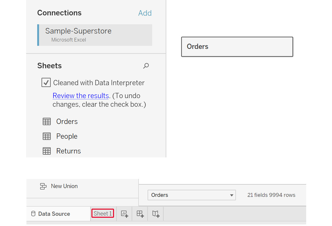
Figure 2.66: Adding the Orders table in Tableau
- In a data blend, create the linking at the worksheet level and not at the data source level. Inside the worksheet, you will be able to see the
Orderstable and its columns. Add a new data source, as follows (see the highlighted option):
Figure 2.67: Adding data option inside a worksheet
- This should lead to the same menu that you get for connecting to a data source. Click on
Microsoft Excel, navigate to the location of theSample – Superstore.xlsExcel file, and click onOpento open theConnectpane.
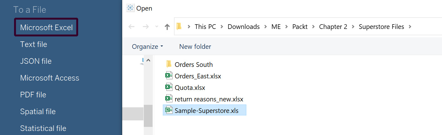
Figure 2.68: Adding another data source in Tableau
- Now, drag the
Peopletable to the canvas and go toSheet 1like before:
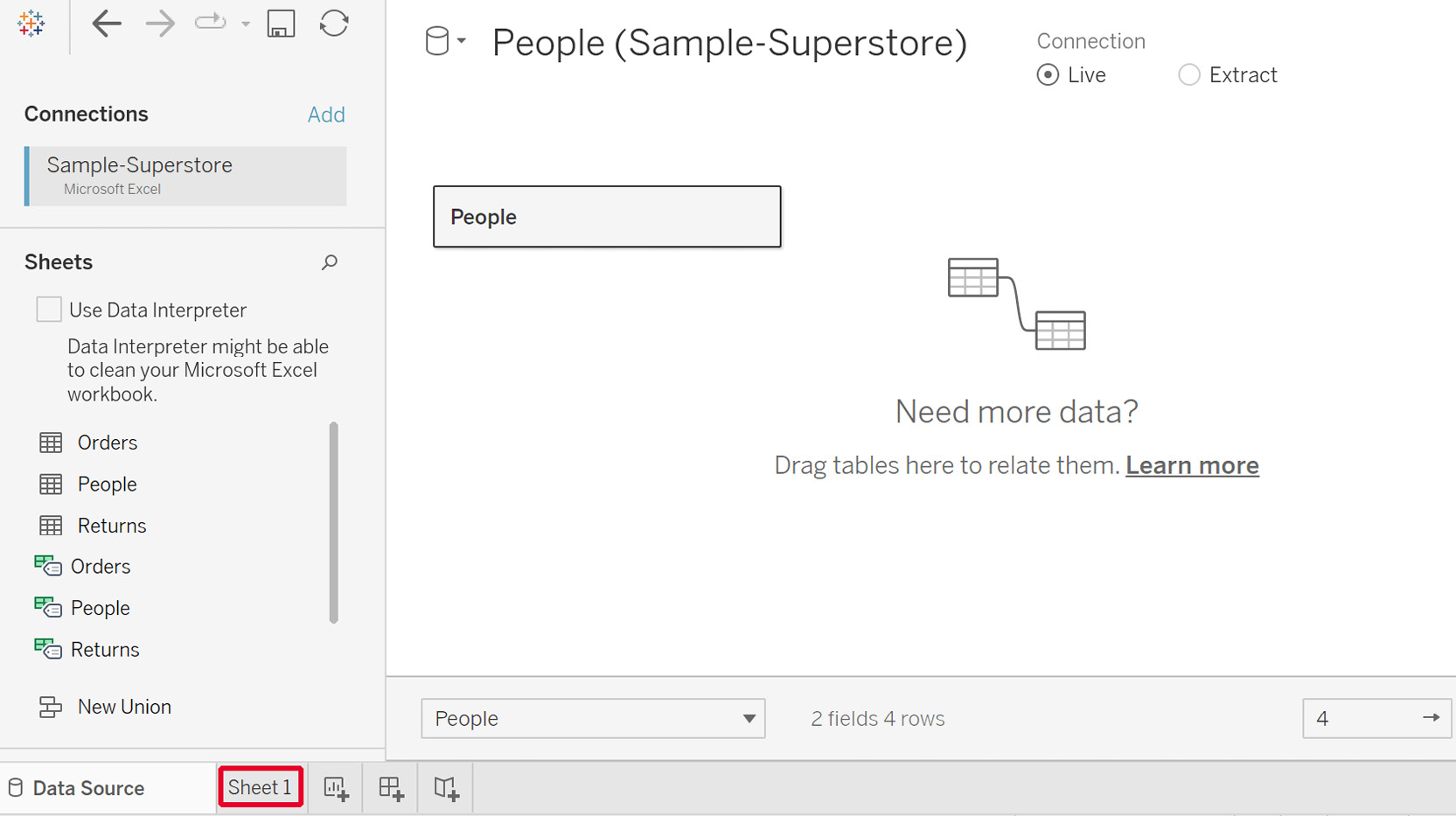
Figure 2.69: Adding the People data to Tableau
Now, you will be able to see the two data sources, as follows:

Figure 2.70: Data sources listed inside the worksheet
- Add a relationship between these data sources to use them. To do that, click on
Data|Edit Relationships…to open the popup.Note
If you are using a Tableau version later than 2020.1, this may be called
Edit Blend Relationships...to differentiate between relationships made directly in theData Sourcetab.
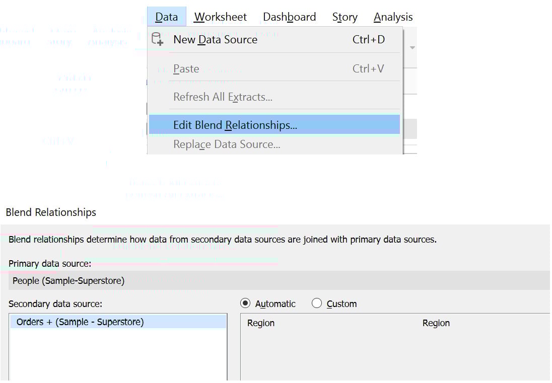
Figure 2.71: Edit data properties window
- Based on the field names, the relationship can be set to
Automaticby default. To change it, click onCustomand add the relationship. Edit the relationship toCustomer NameandPerson, as highlighted in the following figure. SelectRegionand thenEdit…before making the selections in the popup. ClickOKto add the relationship:
Figure 2.72: Selecting the matching columns between the two data sources
Thus, you have successfully blended the two data sources and can visualize your data in the next exercise.
Exercise 2.09: Visualizing Data Created from a Data Blend
In the previous exercise, you learned how to perform data blending between two data sources. In this exercise, you will create a visualization on the blended data to understand the application of a data blend – again, you will continue using the Orders table and the People table for this purpose. Note that a blend will only be active if you use the fields from these two data sources; otherwise, it will remain inactive.
Perform the following steps to complete this exercise:
- On the
Ordersdata, click and dragCustomer NametoRows.Note
Tableau versions later than 2020.1 may give a warning at this step that the field may contain more than 1000 rows. If this is the case, select
Add all membersto proceed.
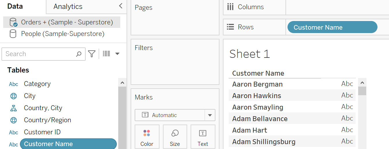
Figure 2.73: Adding the primary data source
This will now become your primary data source, indicated by the blue tick on the data source.
- Repeat the step for the
Peopledata source.
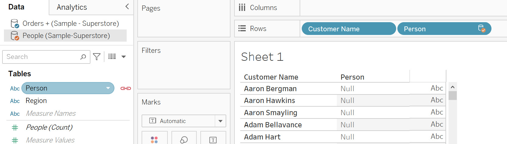
Figure 2.74: Adding the secondary data source
This will become your secondary data source, indicated by the orange tick on the data source. Also, notice the red linking icon that is used to link the two data sources.
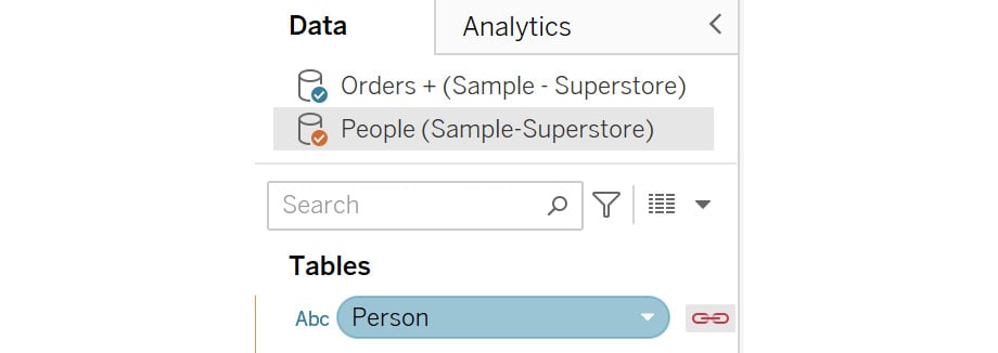
Figure 2.75: Primary and secondary data source icons
- When you filter on
Personfor the four people that you have in thePeopledata, you will see that you have linked these values between these data sources. Click on thePersoncolumn dropdown and thenFilter…, uncheck theNullvalue, and clickOKto add the filter.
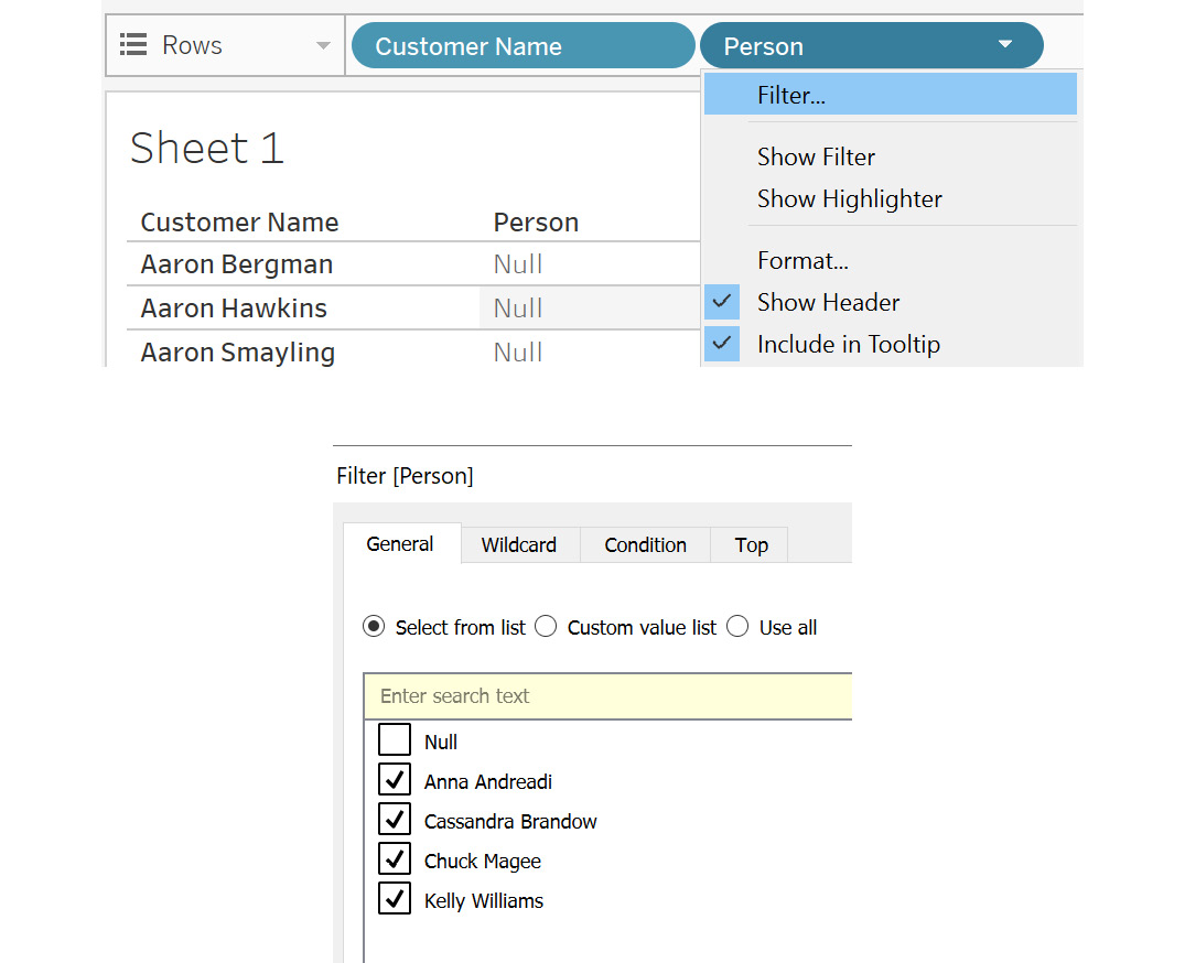
Figure 2.76: Filtering to remove unmatched values
You will get the following output, which shows the customer name matching Person:
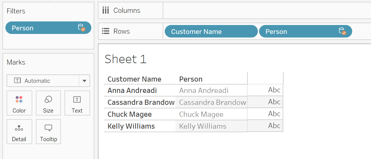
Figure 2.77: Data blend output
Using data blending, you can display data from various sources at multiple aggregation levels in different sheets. For instance, in one sheet, you can blend the data at the Year aggregation level, while in the other you can blend at the Month level.
This is possible because, in a data blend, the data sources are not joined at the input source. This provides the flexibility to have large data sources and blend only in certain sheets where required. This can help make the dashboard render faster.
Limitations of Data Blending
Data blending does not work with certain aggregation levels, such as MEDIAN and COUNTD (count distinct).
You cannot publish the blended data sources on Tableau Server directly. First, you need to publish the data sources individually on the server and then blend the published data sources in your Tableau Desktop instance. Publishing data sources means uploading your data and directly storing it on Tableau Server.
Another limitation is that the data used from the secondary data source must be at a higher aggregation level compared to the primary data source. If the aggregation level is not correct, an asterisk (*) will appear in the visualizations, indicating a one-to-many join aggregation level. You can swap the data sources to resolve this error.
This concludes the theory sections of this lesson. Next, you will put all you have learned into practice in the following activities.
Activity 2.01: Identifying the Returned Orders
As an analyst, you may encounter a situation where you would like to assess business performance by sales. It is therefore important to understand how many orders are fulfilled and how many are returned. If certain products are being returned frequently, it is a point of investigation as it can have serious consequences on the business.
Usually, order information is kept separate from returns information. Hence, to bring this information together, you need to join the two data sources.
For this activity, you will use the Orders and Returns tables from the Sample - Superstore Excel file. You are already aware of the Orders table.
The Returns table consists of the Order ID and Returned columns. Order ID is the ID that would match with the Orders table. The Returned column indicates Yes for the order ID.
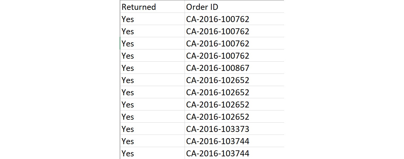
Figure 2.78: Returns sheet columns
The objective is to identify the returned orders after combining them with the main Orders table so that you may determine which orders were both fulfilled and returned.
The steps are as follows:
- Open the
Sample - Superstoredataset in your Tableau instance. - Rename the data source to
Activity 1. - Drag the
Orderstable onto the canvas. - Repeat the same steps for the
Returnstable. - You need to bring all the
OrdersandReturnstable values into the combined dataset. Can you identify the correct join based on the requirement? Remember that for an order to be returned, it should always be completed first. What can be interpreted if you change the join types to left, right, or full outer in this case? - Identify how many products were returned from the data grid. (An order can have multiple products clubbed in it.)
Final Output Expected:
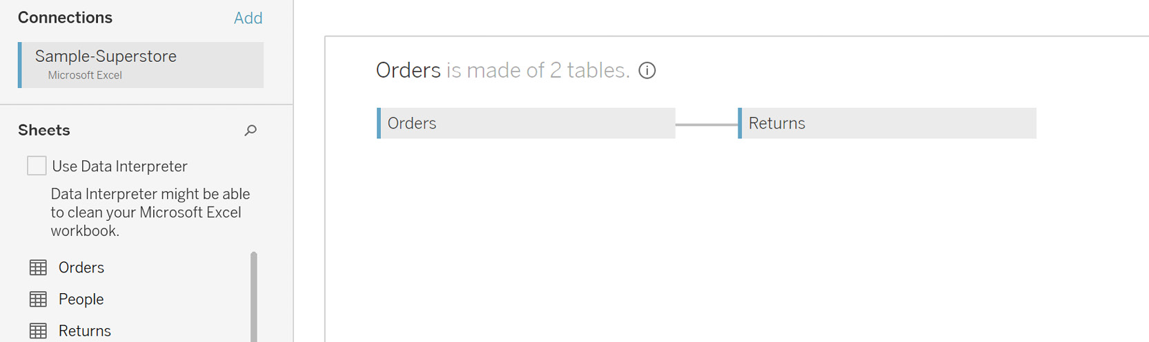
Figure 2.79: Choose the correct join
In this activity, you strengthened your knowledge of various joins and their outputs. You also learned how to interpret the results by changing the join types.
Note
The solution to this activity can be found here: https://packt.link/CTCxk.
Activity 2.02: Preparing Data for Visualization
Now that you have joined the data, the next step is to make sure that the data is ready for visualization. This involves performing data transformation activities such as cleaning the data by removing the null values. You may also be required to rename certain columns or add aliases, split the columns, and so on.
In this activity, you will perform some data transformation steps based on the left join output of the previous activity.
This activity will help you to strengthen the concepts of data transformation in Tableau. This is a very important process in any Tableau project. Hence, it becomes crucial that you are well experienced in doing these in Tableau.
The objective of this activity is to transform the data into a cleaned form for visualization. You need to first create an extract for this data source. Then you need to display the data only for the Furniture and Office Supplies categories. Is there a way to do this using the extract properties? You will also clean up the final data by changing any nulls to blanks. Let's also remove repeated terms such as Class from the Ship Mode column.
Once done, your data should be ready for visualization.
Continuing from Activity 2.01, the following steps will help you complete this activity:
- Open the
Sample - Superstoredataset in your Tableau instance. - Create a data extract for this data.
- Add a filter on the data to pull the
FurnitureandOffice Suppliescategories. Check the row count. - Transform the data by aliasing a few columns.
- Alias the null values from the columns of the
Returnstable to blanks. - Remove the word
Classfrom theShip Modecolumn.
Once completed, you should get the following output:
Final Output Expected:
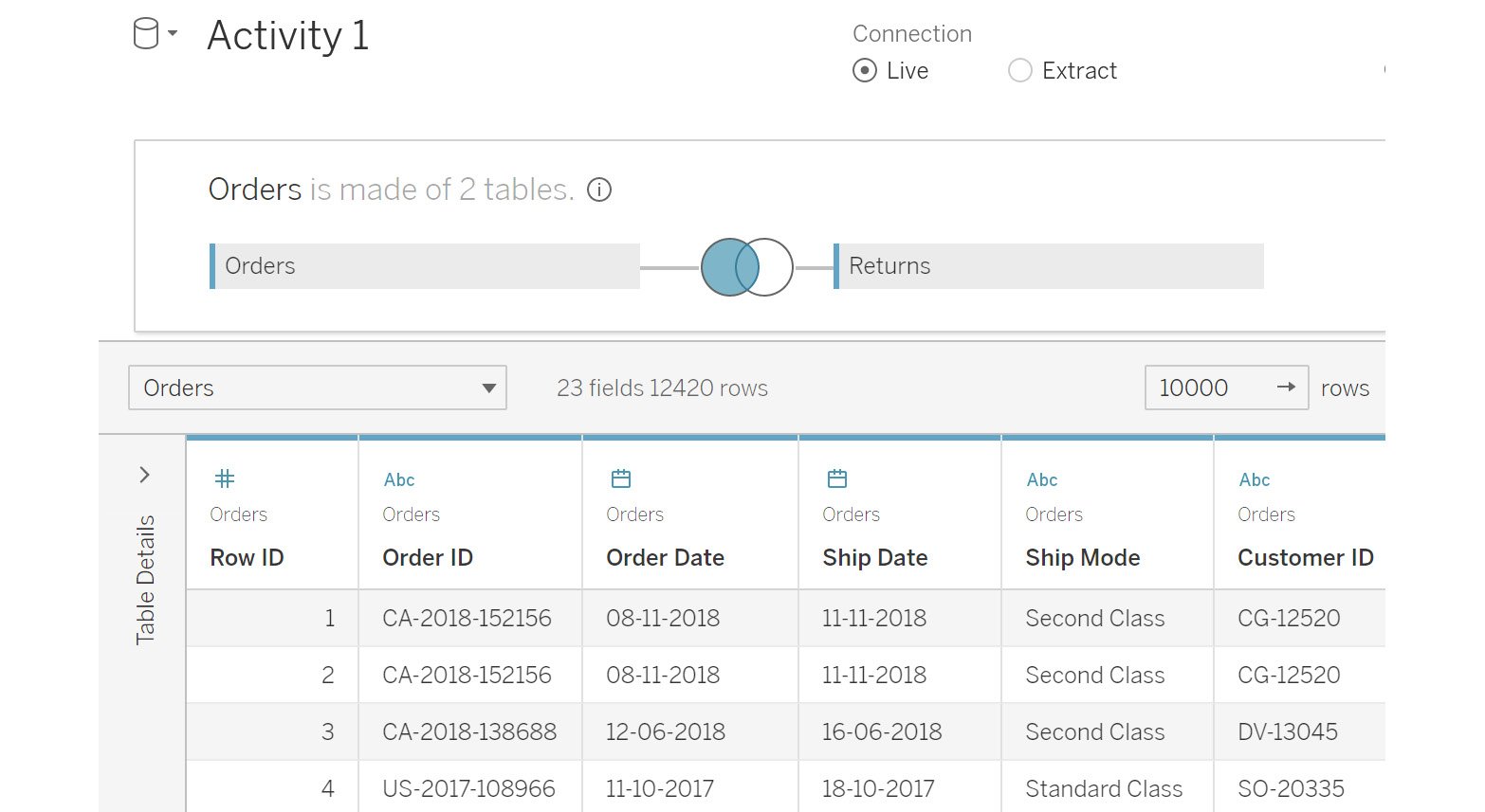
Figure 2.80: Final output for the activity
In this activity, you learned how to extract the data. You also added filters for the Category column to just pull the selected categories. Many times, you will work on projects that require the data to be segregated at the beginning, such as regional data. These filters help you to achieve exactly this. You also transformed the data using aliases, making it much cleaner by removing repeated words and nulls.
Note
The solution to this activity can be found here: https://packt.link/CTCxk.