


Data Transformation in the Data Pane
Once you finish combining the data, you may also need to make some data adjustments, such as renaming certain columns or limiting the data to use in your visualizations. These are some common examples of data transformation.
Data transformations are a key step in preparing data for effective visualization. In this section, you will learn about some commonly used ways of transforming data. In particular, you will learn about the following:
- Data Interpreter
- Renaming data sources
- Live and extract connections
- Filters
- Data grid options
- Custom SQL
The following sections will define these one by one.
Data Interpreter
Data Interpreter is an option available within Tableau that extracts only the actual rows and columns by removing titles, headers, and extra empty rows from the Excel data source.
You may sometimes add extra rows describing what kind of data the sheet contains, or some empty columns to improve the readability of the sheet. Consider the following example. Suppose you add certain comments to your Sample - Superstore file, as follows:
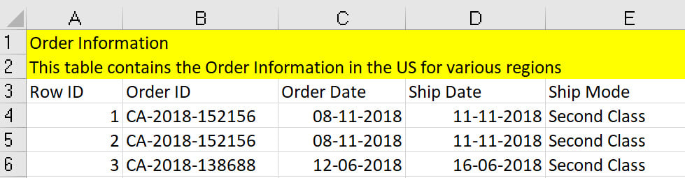
Figure 2.35: Understanding Data Interpreter
From a data visualization point of view, rows 1 to 3 are meaningless as they don't belong to the actual data and are simply headers. Tableau can automatically remove these rows by using Data Interpreter.
Data Interpreter can be enabled by selecting the Use Data Interpreter option.:
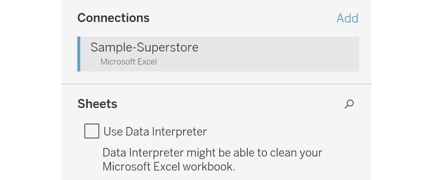
Figure 2.36: Enabling Data Interpreter
Once enabled, Data Interpreter will give you an option, Review the results. Clicking on Review the results will open up an Excel sheet of all the changes made by Data Interpreter, as can be seen in the following figure:
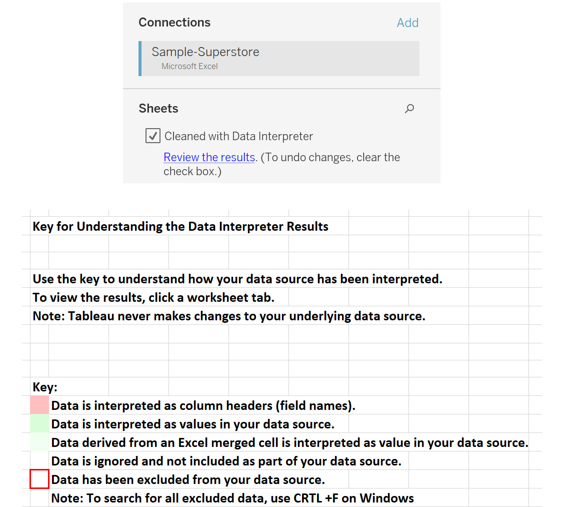
Figure 2.37: Reviewing the results of Data Interpreter
Renaming the Data Source
The data source can be renamed on the Connect screen just by clicking on it and entering the name of your choice.

Figure 2.38: Renaming a data source
When working with data sources, you want to quickly identify the tables you are working with. Renaming tables allows you to give custom names so that it becomes easier to work with them.
Live and Extract Connections
This is a very important concept for data visualization in Tableau. This option decides how the data is connected to the visualizations.
Live connections allow Tableau worksheets to be updated in real time based on any changes made in the underlying data sources. This may be a good solution when the data must be updated on a real-time basis, such as stock market data.
However, when developing the visualizations in a live connection, the database will be queried for any changes performed in the view related to the data. This may consume more time.
Tableau Data Extracts (TDEs), or extracts, are a compressed and optimized way to bring all the source data into Tableau's memory. TDEs improve the efficiency of the data query, which tends to increase the speed of executions while working with the data in the visualizations and performing user interactive activities such as filtering and sorting over the data.
When developing the visualizations in an extract connection, the database is also extracted into Tableau's local memory. Thus, any visualization development will be much faster compared to a live connection.
Exercise 2.06: Creating an Extract for Data
In the preceding exercises, you connected to the data using a live connection. Now, you will create an extract for it. The following steps should be performed to create a data extract for the Orders table:
- Load the
Sample – Superstoredataset in your Tableau instance as done in the previous exercises. - Drag the
Orderstable to the canvas. - Choose the
Extractoption, as shown in the following figure:
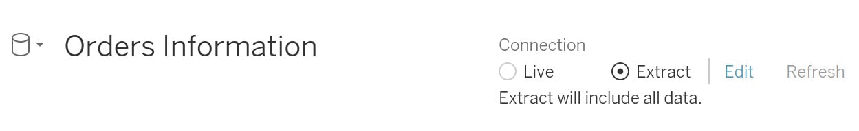
Figure 2.39: Creating an extract
- Once done, click on
Sheet 1at the bottom of the page to navigate to that sheet.
Figure 2.40: Navigating to a worksheet
- This will open a popup to save the extract locally. Select a destination of your choice to save the extract.
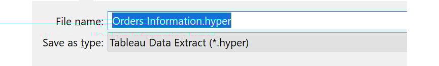
Figure 2.41: Extract creation and save
Clicking on Save will create the extract and save it at the specified location. There is also the Edit option, which can be used to edit the properties of the extract. You will study these in the next section.
- Refresh your extracts using the
EditorRefreshoption if your data changes, as shown in the following figure:

Figure 2.42: Extract Edit and Refresh options
In this exercise, you created an extract using Tableau Desktop.
Extract Properties
To access the extract properties, you can click on the Edit option next to Extract, as shown in Figure 2.42, to open the following window:
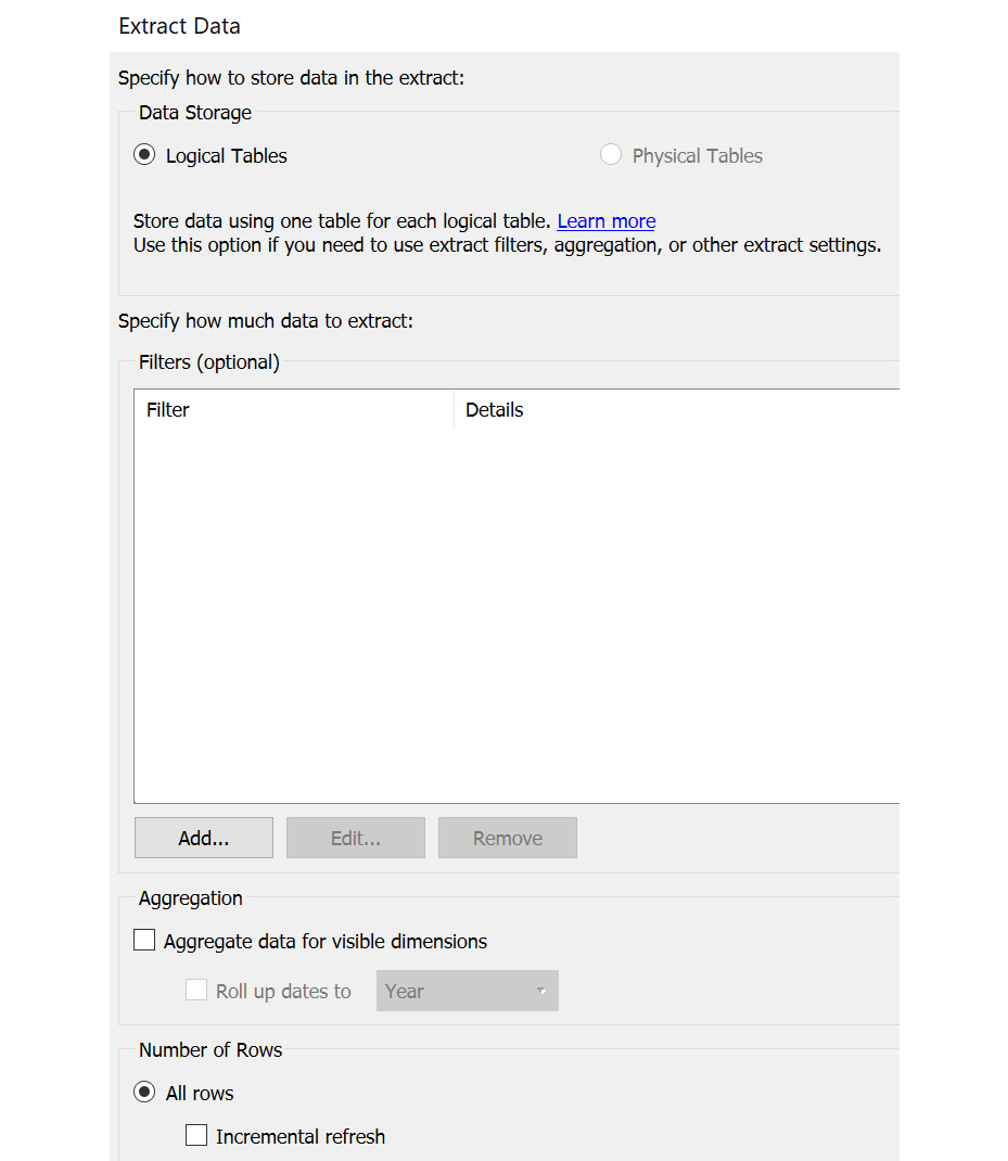
Figure 2.43: Extract edit properties
The following sections will describe this window and its fields in detail.
The Data Storage field
If you have multiple tables, the Multiple tables option will be enabled. For now, since you have a single table, the Single table option is enabled.
The Filters field
You can restrict the data in the extract using filters. For example, suppose you want only the data for the Central and East regions; you can easily do that using the Add… option. Select Region as the column to filter and select the Central and East values to add them as the filter condition.
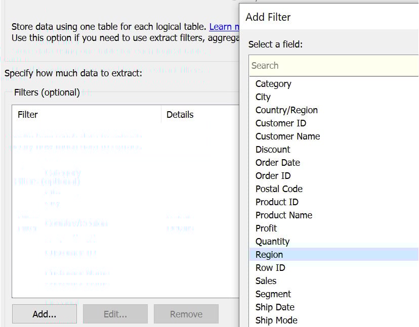
Figure 2.44: Adding a filter condition
As shown in the following figure, Central and East regions should be selected:
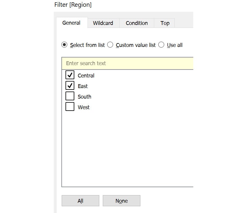
Figure 2.45: Selecting Central and East regions
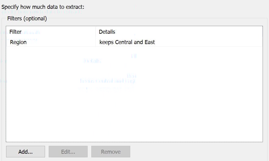
Figure 2.46: Creating extract filters using the Region column
You will learn more about these filters as you progress through this chapter.
The Aggregation Field
You can also change the granularity of the data using this option. If you have dates in the dataset on a Day level, you can roll them up or aggregate them to a higher level using a different option, such as Month or Year. You will learn more about aggregations later in the book.
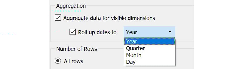
Figure 2.47: Transforming the data aggregation level
The Number of Rows Field
Using this option, you can choose the number of rows the extract should contain. All rows will include all the rows, Top will include only the specified number of rows, and Sample will contain a sample of specified rows. This is useful when you are working on a very large dataset, but for development purposes, you just need a sample of the data.
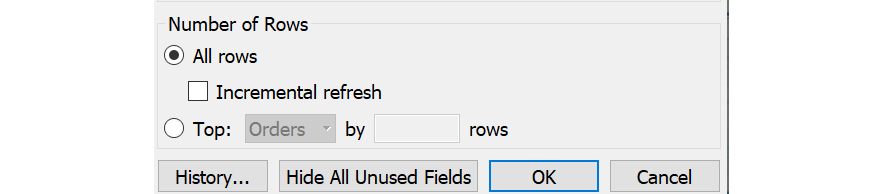
Figure 2.48: Sample selection using the number of rows
On selecting All rows, you will also get an option called Incremental refresh. Instead of refreshing the data every day, you can use this option to specify which field can be used to identify new rows so that only the specified section of the data is refreshed. This option is helpful when you have a very large dataset that updates at regular intervals wherein the old data does not change.
Consider the case of banking transactions. The bank will never modify the old data but would keep adding new data to maintain the historic data. In this case, an incremental refresh would be very helpful during extract refreshes.
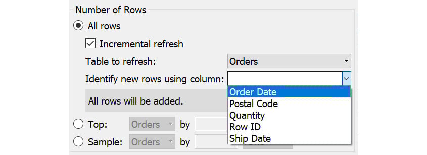
Figure 2.49: Identifying the column for performing refresh
Now that you understand what values to add in these fields, you'll review what factors to determine when choosing the type of connection.
Which Connection Is Better – Live or Extract?
Ideally, in most projects, an extract is the ideal approach, but there may be a need to showcase live data as in the example you saw before. The following points should be considered before choosing an extract or a live connection:
- Updated or delayed data: If you have a requirement for which you need the most up-to-date information whenever you view the dashboard, you would need a live connection. Otherwise, if you are comfortable with some delay in the latest data, an extract is a better choice.
- Data volume: If your data volume is very large, it is ideal to use a data extract instead of a live connection as it might take a lot of time to develop dashboards on live connections.
With these points in mind, you can choose the right type of connection for your project.
Filters
This option is similar to the Extract Filter property you learned about before. These filters are also known as data source filters because they filter data at the source. You will further study various filters later in the book.
Consider the example of a large retailer such as Amazon, where the data has a large volume. Suppose you want to analyze the data for a specific region. In this case, it is not prudent to pull the whole data in Tableau as it would make the dashboard slower, and also, you would not have any use for the data other than that for your target region.
For such a case, you can use the Data Source Filter option. This would restrict the data at the source itself and only bring in the required data based on the filtering criterion specified.
Exercise 2.07: Adding a Region Filter on the Orders Table
Consider that you want to add a Region filter on the Orders table, to bring the data for the Central and East regions only. You can do so by following these steps:
- Load the
Sample - Superstoredataset in your Tableau instance. - Drag the
Orderstable onto the canvas. - To add a filter, click on the
Filters|Addoption to open the popup:
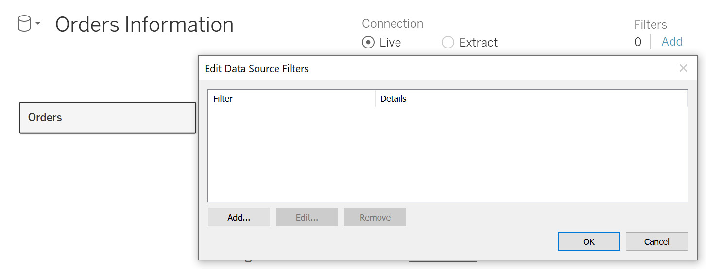
Figure 2.50: Data source filter properties
- Click on
Add…to open the columns list. SelectRegionas the column:
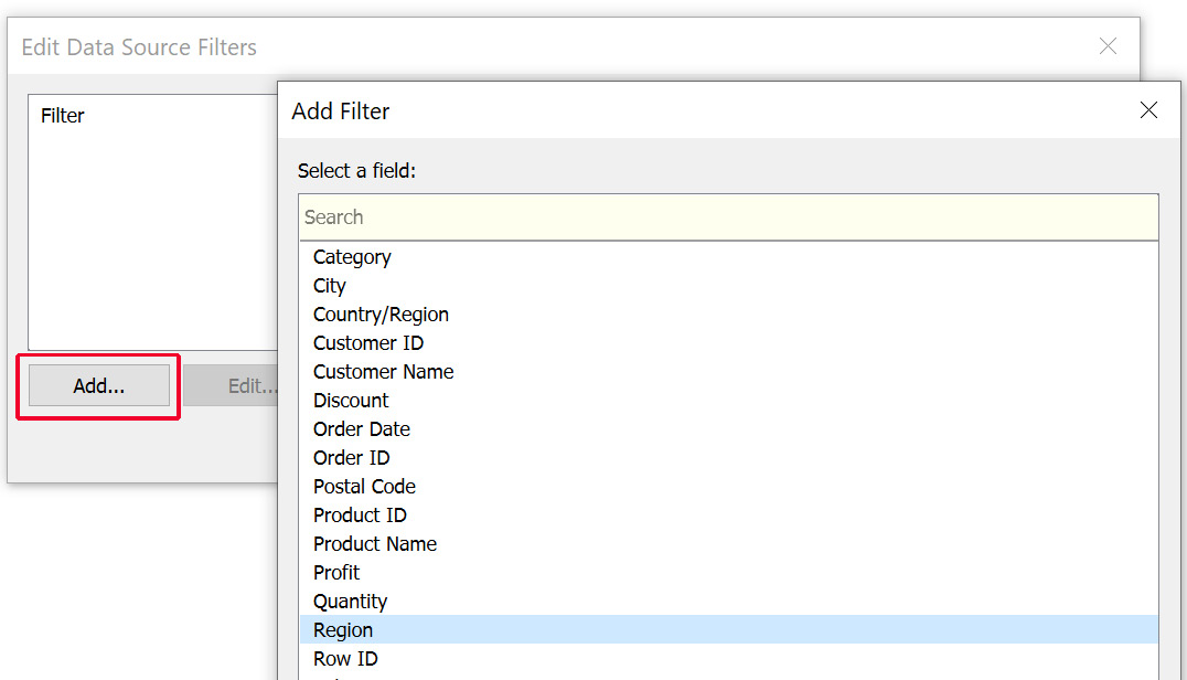
Figure 2.51: Column filter selection
- Select
CentralandEastas the regions that will be kept in the data. ClickOKto add the filter, as follows:
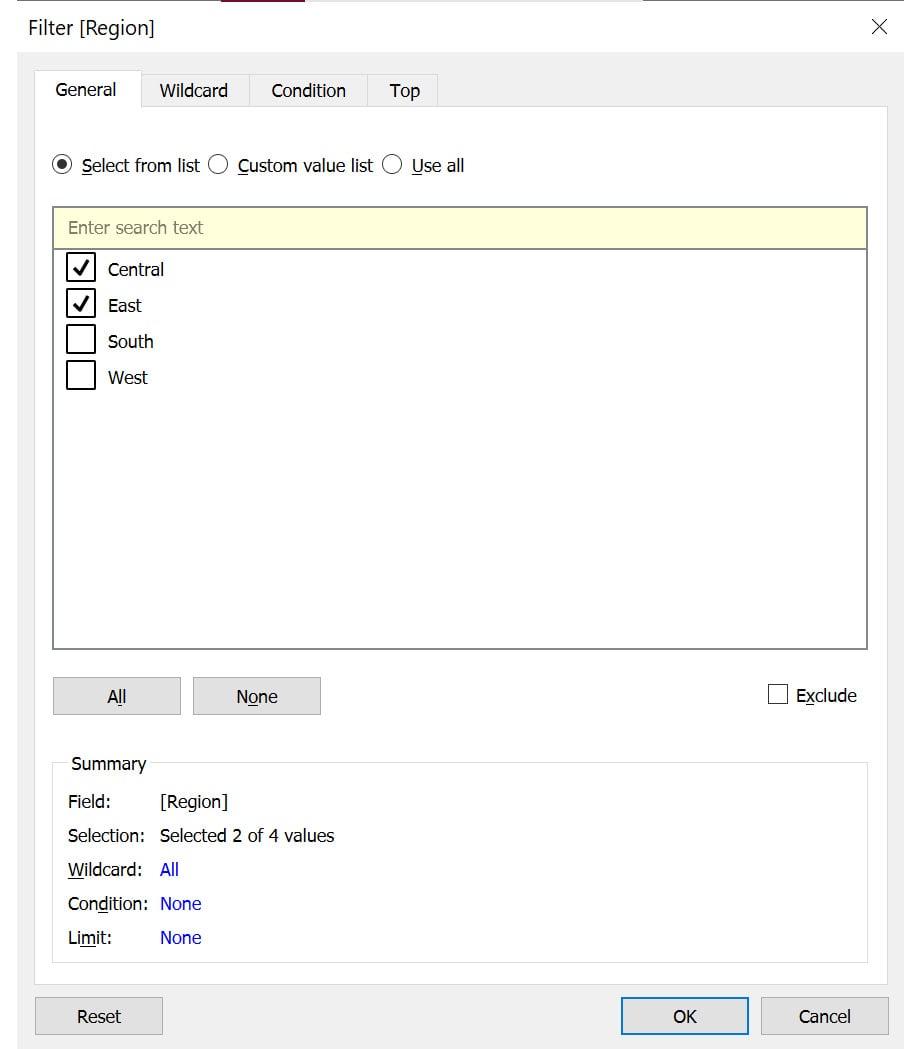
Figure 2.52: Selecting the filter values
You can similarly add more filters by clicking on the Add… option and repeating the previous steps.
- You can also edit and remove the existing filters. To do that, select the filter you want to edit or remove and then select the required option, as shown in the following figure:
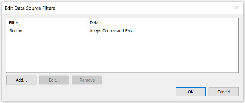
Figure 2.53: Filter preview
- Once you have added the filter, preview the data in the data grid. You will observe that you only have data for the
CentralandEastregions, as expected.
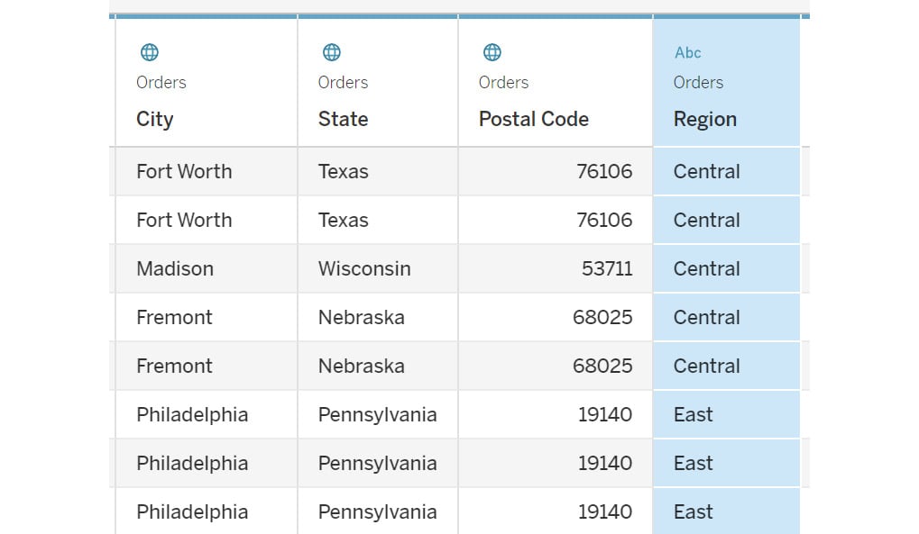
Figure 2.54: Data preview post filter application
In this exercise, you learned how to apply a filter and the various properties associated with a data source filter. In the next section, you will learn how to transform data using the data grid.
Data Grid Options
The data grid allows you to preview data. You have been using it so far just to check the number of rows the data contains, but it also contains several other options to transform data before you start with the visualization development. In this section, you will learn about these options and how to use them to better understand the data transformations.
Data preview: You can use this to preview the data. You can also select the number of rows to be displayed, by specifying the number in the box on the right, as can be seen in the following figure:

Figure 2.55: Data preview toggle
Metadata: Metadata provides information about the source, such as the table name. Toggling to the metadata view, you can see all the metadata about the data. You can view the various columns, the table they come from, and the remote field name.
If you rename a field here, the remote field name will show the original field name pulled from the data.
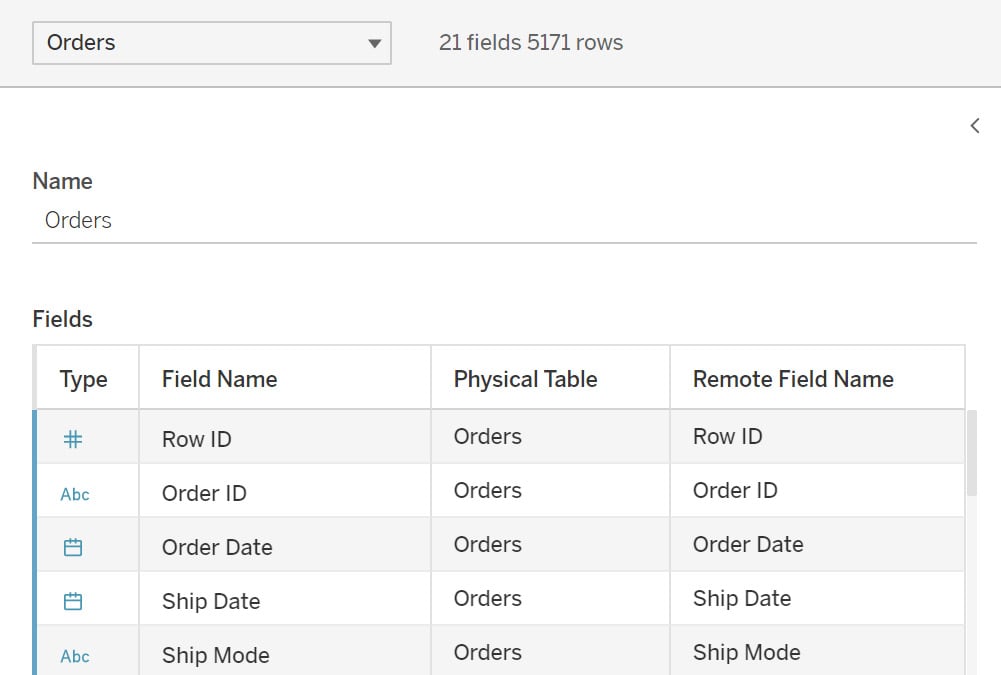
Figure 2.56: Changing to the list view representation to show input data source metadata properties
Note
In Tableau version 2021.4, the metadata is automatically available beside the preview, and you will not have to choose between these options.
The Sort fields option will sort the data as per the option you select. You can try changing these options and observe how the data preview changes.
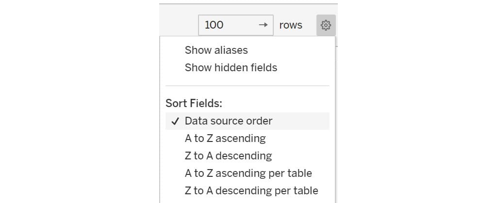
Figure 2.57: Sorting the data grid column values
Now, consider the following data transformation options.
Change data type: Using this option, you can change the data type of a column. By clicking on the Abc icon (see the following figure), you can select the required data type from the drop-down box for the column. A common example is the Customer ID field being stored as a number where you might want it to be a string:
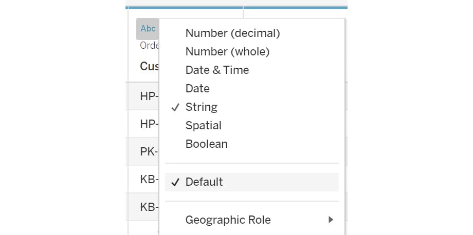
Figure 2.58: Data type change options
Data transformation: When you click on the drop-down icon, as shown in the following figure, you can see the options to transform the data, such as creating calculated fields on existing columns and creating groups. All these options are also available after you load the data. These will be covered in detail later in the book:
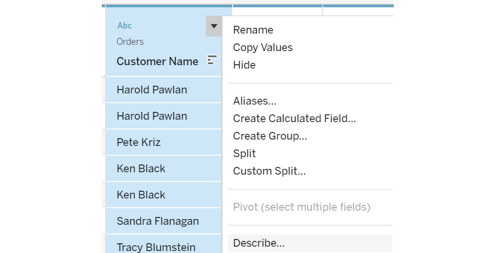
Figure 2.59: Data transformation menu options
The Rename option allows you to rename the column. You can also hide a column if it's not required in the data visualization. You can select the Show hidden fields checkbox to view any hidden columns. Hidden columns are grayed out in the view, as indicated in the following figure:
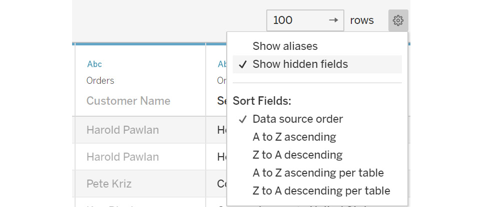
Figure 2.60: Show hidden fields
Hidden columns cannot be used in the visualization. If you want to use a column after hiding it, you need to first unhide the column to use it in the visualization. This can be done by clicking on the dropdown and selecting the Unhide option.
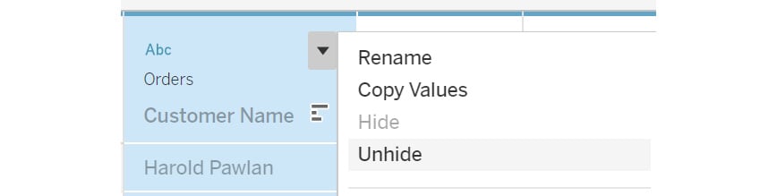
Figure 2.61: Hiding/unhiding columns from the input data source
Aliases: Aliases are a very effective way to present data in the visualization with a different name.
Observe the Ship Mode column in the data preview. You can see that the word Class is repeated for the different Ship Mode values, and it does not add any value; so you can exclude this word from all the values. This can be done using the Aliases option, which will help you to display the values as a different name. To add aliases on the column, click on the dropdown and select Aliases…, as shown in the following figure:
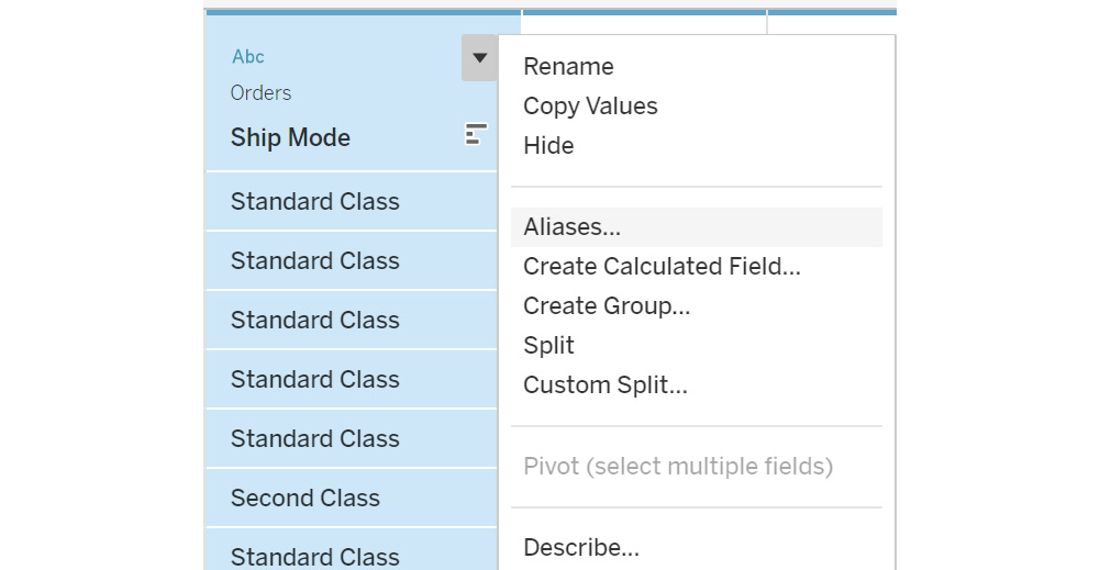
Figure 2.62: Setting a column value alias
This will open the popup to rename the values. Remove the word Class. Click on OK to add it to the data. You can also clear the aliases using the Clear Aliases option.
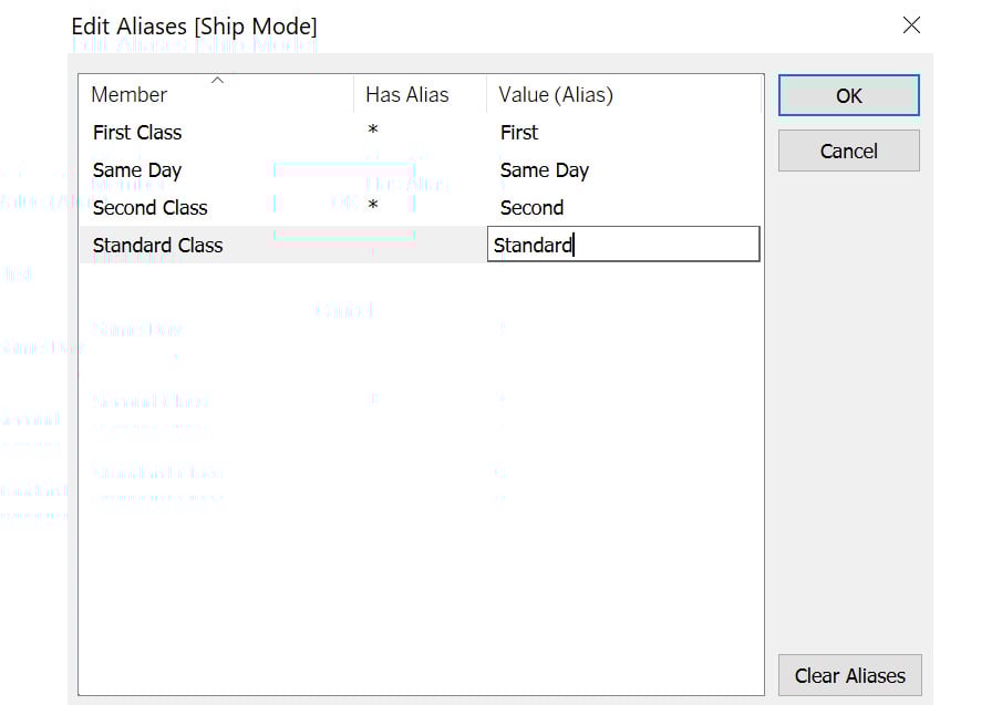
Figure 2.63: Edit Aliases properties
You can use the Show aliases toggle to switch between the original names and the aliases. Aliases are generally used to rename null records to blank or columns containing long value names.
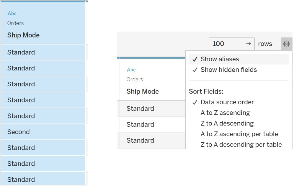
Figure 2.64: Enabling aliases in the data preview using the Show aliases option
All these options are also accessible after you load the data in the worksheet.
In this view, you learned how to perform data transformations before pulling the data in the worksheets.
In all the exercises previously, you just joined on two data sources. But it is also possible to add more than two data sources. You will just need to specify in the join connection how the tables join to each other.
This completes the various ways you can join multiple tables in Tableau. Next, you will learn about the custom SQL option.
Custom SQL
Custom SQL, as the name suggests, is used for writing custom SQL queries to pull only the selected columns based on the conditions applied instead of pulling the entire database. This option is not available with Excel and text files, so you might not see this option.
This option will appear in the Connect pane once the database is connected. When you connect a database, you will see the New Custom SQL option below all the tables listed.
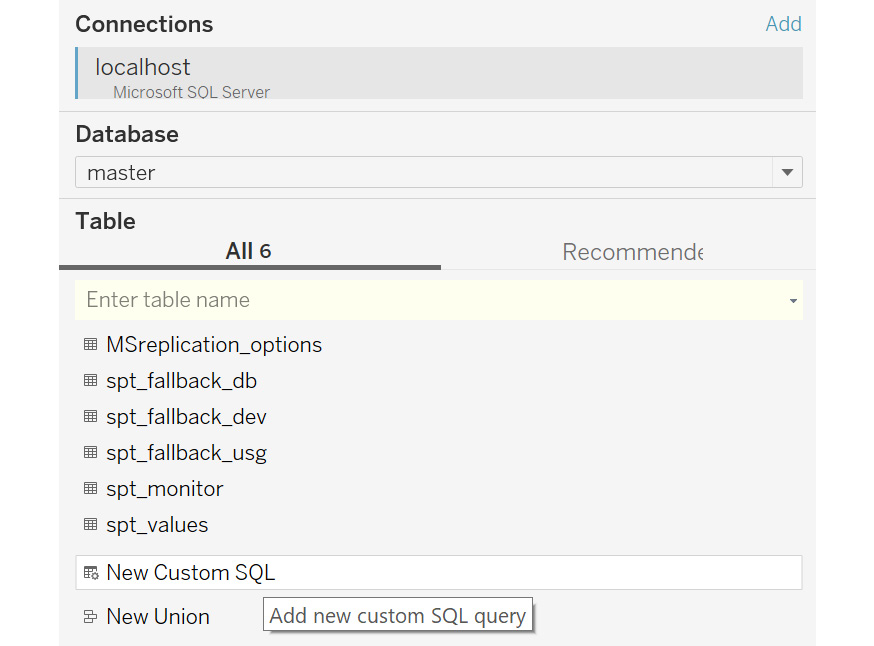
Figure 2.65: New Custom SQL option
You can drag this option onto the canvas, type in your query, and click OK. Once done, Tableau will pull the required data based on the query specified.
Custom SQL can be used to reduce the size of data by adding only the required columns in the data source, adding a union across the tables, and recasting fields to join multiple data sources together.
Until now, you have learned about the various data transformation steps that can be performed before pulling the data in the worksheet. In the next section, you will learn about data blending, which is another way of joining the data but with a difference.


