Reader small image

You're reading from  Mastering Tableau 2023 - Fourth Edition

Product typeBook
Published inAug 2023
PublisherPackt
ISBN-139781803233765
Edition4th Edition
Right arrow
Author (1)
Marleen Meier
Marleen Meier
author image
Marleen Meier

Marleen Meier is an accomplished analyst and author with a passion for statistics and data. By using traditional methodologies and approaches such as Machine Learning and AI, Marleen is dedicated to driving meaningful insights. Currently working as the APAC Data CoE Lead for ABN AMRO Clearing, Marleen is at the forefront of innovation and implementing data-driven strategies in a global financial environment. She has lived and worked in multiple countries, including Germany, the Netherlands, the USA, and Singapore, allowing her to bring a diverse and global perspective to her work. Through her writing and speaking engagements, she aims to empower individuals and organizations to unlock the full potential of their data assets.
Read more about Marleen Meier

Right arrow

Working with Maps

When I conduct Tableau classes and workshops for people who are using Tableau for the first time, I find that demonstrating mapping is always a big hit, sometimes resulting in murmurs of appreciation and surprise. People have told me on multiple occasions that Tableau’s mapping capability was the key feature that caused them to take notice of and consider Tableau’s offerings more seriously. Tableau’s out-of-the-box mapping capabilities are powerful and flexible. You may be surprised at how much you can accomplish without ever leaving the user interface. But these out-of-the-box capabilities are just the tip of the iceberg. With proper guidance (which I will attempt to provide in this chapter), you can expand beyond the native mapping functionality and explore techniques that will greatly enhance your workbooks’ functionality and aesthetics.

In this chapter, we will discuss the following topics:

  • Extending Tableau’s...

Extending Tableau’s mapping capabilities without leaving Tableau

In our everyday lives, a map can be helpful for better understanding the world around us. For instance, maps are often used on websites, television, or in printed media to present demographic information. In such instances, the mapping requirement is static since the immediate goal does not require movement. Some businesses only have static mapping requirements—for example, a retail chain might create a visualization that includes a map to better understand sales performance in a given region. In such cases, movement between locations is not a direct need.

Often, however, a map is needed to navigate from point A to point B. This kind of mapping requirement is more complicated, because it encompasses static needs (what restaurant is nearby?), but must also deliver additional information, such as routes and distances (how can I get to that restaurant?). These dynamic mapping needs assume that movement...

Creating custom polygons

Geographic areas for which Tableau natively provides polygons include worldwide airport codes, cities, countries, regions, territories, states, provinces, and some postcodes and second-level administrative districts (county-equivalents): U.S. area codes, Core-Based Statistical Areas (CBSAs), Metropolitan Statistical Areas (MSAs), congressional districts, and ZIP codes. This means, for example, that a filled map can easily be created for the countries of the world. Simply copy a list of the world’s countries (Ctrl + C) and paste that list into Tableau by pressing Ctrl + V while your mouse is located on an empty worksheet in Tableau Desktop. A new data source will be added to the top right under Data. Next, set the View type in Tableau to Filled Map and place the country list on the Detail shelf. Tableau will automatically draw polygons for each of those data points:

Figure 9.9: Native polygons

There are some geographic types for which Tableau...

Heatmaps

I want to share a feature with you that was part of an earlier Tableau release and has proven to be very useful when working with geographical data. It is the Marks type Density with which you can create heatmaps. This new feature is not limited to maps; you can also use it for any other type of chart. However, it is most efficient for dense data where patterns cannot be spotted easily.

The following steps will illustrate an example of creating a heatmap:

  1. Open the Citylimits tab in the workbook related to this chapter. If you did not complete the previous exercise, please open the Citylimits tab from the solutions workbook of this chapter.
  2. Duplicate the worksheet, and call it City Limits (2).
  3. Set the Marks card type to Density:

Figure 9.19: Texas city density

  1. Click on Color in the Marks card and select any color you like. I chose Density Gold Dark.
  2. Decrease Size in the Marks card by dragging the slider to the left...

Dual axes and layering maps

You might recall that on many different occasions throughout the previous chapters, we used dual axes. A dual axis visualization can also be achieved with maps, and, even better, since the Tableau 2020.4 release, maps can be layered. We simply add another layer with the same structure (which, in this case, is a map), and per layer, we can display different data.

We will look at two exercises, the first one being about the use of dual axes and the second one including include map layers.

Using dual axes

Let’s get started:

  1. First, we need a dataset. I simply created one in Excel myself; feel free to create your own, copy what you see in the following screenshot, or download the file from this book’s GitHub repository (https://github.com/PacktPublishing/Mastering-Tableau-2023-Fourth-Edition/blob/main/Chapter09/Freight.xlsx). Name the file freight:

Figure 9.21: Excel

  1. Connect the new dataset to Tableau...

Extending Tableau mapping with other technology

Next, we will consider how to extend Tableau’s mapping capabilities with other tools. Tableau’s developers were careful to create a mapping interface that is readily extensible. Some areas of this extensibility, such as connecting to a Web Map Service (WMS) server, are available directly from the interface; we’ll explore that next.

Using custom maps with a WMS

The easiest way to bring a custom map into Tableau is directly from Desktop. We need a properly formatted URL that points to a WMS server. Tableau Desktop can connect to any WMS server that supports the WMS 1.0.0, 1.1.0, or 1.1.1 standards.

A good place to find a list of such URLs is http://directory.spatineo.com, which provides information on a ton of different mapping services.

The following exercise was inspired by Jeffrey A. Shaffer’s article Building weather radar in Tableau in under 1 minute, which can be accessed here...

Swapping maps

We will now create a dashboard that allows the end user to choose between the various maps we just discussed. The technique used for this exercise is known as sheet swapping. However, a deeper dive into this technique is presented in Chapter 11, Designing Dashboard and Best Practices for Visualizations.

Let’s look at the necessary steps:

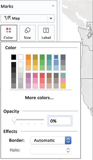
  1. Navigate to the MapSwap sheet in the workbook associated with this chapter. Double-click on State. Set the Marks card view to Map, click on Color, set Opacity to 0%, and lastly, set Border to Automatic:
A picture containing graphical user interface  Description automatically generated

Figure 9.52: Color

  1. Duplicate the MapSwap sheet twice:

Figure 9.53: Duplicate MapSwap sheet

  1. Select the MapSwap sheet and navigate to Map | Background Maps | Normal.
  2. Select the MapSwap (2) sheet and navigate to Map | Background Maps | Dark.
  3. Select the MapSwap (3) sheet and navigate to Map | Background Maps | Satellite.
  4. Create a parameter called Show...

Custom geocoding

Before we close this chapter, I wanted to share a quick tip that I saw on LinkedIn some weeks ago. The post describing the following exercise came from Klaus Schulte, a German professor and 2018 Iron Viz Champion.

He shared that he had built a grid map by using custom geocoding. Let’s try to replicate it!

Download hex map data somewhere or create it yourself. For this exercise, you can use the hex map data from my Tableau Public or GitHub: https://github.com/PacktPublishing/Mastering-Tableau-2023-Fourth-Edition/blob/main/Chapter09/hexmap.xlsx. If you want to create it yourself, please review the polygon exercise in Chapter 8, Going Beyond the Basics. You can create the file the same way we created the book polygons:

  1. Place the hexmap file in the Mapsources folder of your Tableau repository.
  2. Connect Tableau Desktop to the default Superstore data.
  3. Double-click on State/Province:

Figure 9.58: Normal map

  1. Click...

Summary

In this chapter, we explored how to extend Tableau’s mapping capabilities without leaving the interface by capturing Tableau-generated latitude and longitude data and how to look this up on Google. We created polygons and a heatmap for Texas based on a .shp file as well as a dashboard with a dual map axis and another dashboard with 4 map layers. Next, we explored various ways to extend Tableau’s mapping using other technology. We connected to a WMS server and then explored the Mapbox offering, followed by an excursion to the world of polygons.

In the next chapter, we will explore using Tableau for presentations. Specifically, we will look at how to get the best images out of Tableau, how to effectively and efficiently use Tableau with PowerPoint, and how to use Tableau directly for presentations without relying on third-party tools.

Learn more on Discord

To join the Discord community for this book – where you can share feedback, ask questions...

lock icon
The rest of the chapter is locked
You have been reading a chapter from
Mastering Tableau 2023 - Fourth Edition
Published in: Aug 2023Publisher: PacktISBN-13: 9781803233765
Register for a free Packt account to unlock a world of extra content!
A free Packt account unlocks extra newsletters, articles, discounted offers, and much more. Start advancing your knowledge today.
undefined
Unlock this book and the full library FREE for 7 days
Get unlimited access to 7000+ expert-authored eBooks and videos courses covering every tech area you can think of
Renews at $15.99/month. Cancel anytime

Author (1)

author image
Marleen Meier

Marleen Meier is an accomplished analyst and author with a passion for statistics and data. By using traditional methodologies and approaches such as Machine Learning and AI, Marleen is dedicated to driving meaningful insights. Currently working as the APAC Data CoE Lead for ABN AMRO Clearing, Marleen is at the forefront of innovation and implementing data-driven strategies in a global financial environment. She has lived and worked in multiple countries, including Germany, the Netherlands, the USA, and Singapore, allowing her to bring a diverse and global perspective to her work. Through her writing and speaking engagements, she aims to empower individuals and organizations to unlock the full potential of their data assets.
Read more about Marleen Meier