SwiftUI was launched during Apple’s Worldwide Developer Conference (WWDC) in June 2019. Since then, its popularity has kept increasing as it has been adopted widely by the Apple developer community. Apple also releases updates every year, adding new and exciting capabilities to SwiftUI.
SwiftUI is a UI framework that ditches UIKit concepts such as Auto Layout for an easier-to-use declarative programming model. SwiftUI is Apple’s preferred way to build user interfaces. It is a platform-agnostic framework that allows the fast and easy creation of applications that work across Apple platforms (iOS, iPadOS, macOS, WatchOS, and tvOS).
There is no question today about the need to learn about SwiftUI. Apple released the fifth iteration of the framework in 2023 and it is adding more features every year. Here are some other compelling reasons to be proficient in SwiftUI:
SwiftUI apps can work alongside UIKit apps: You can slowly convert your app’s user interface (UI) to SwiftUI, one screen at a time.
Industry adoption: SwiftUI has already been adopted by the industry as it was released four years ago. Just looking at job postings for iOS developers, you’ll find out that most of them require experience with SwiftUI. Learning about SwiftUI is a must for current iOS development jobs. In a few more years, SwiftUI will dominate the app development for all the Apple platforms, the same way that Swift took over from Objective-C a few years ago.
Low learning curve: SwiftUI offers a low learning curve for people who have used declarative programming before. It is also a great way to start learning declarative programming for those with little to no experience.
Live previews increase speed: SwiftUI live previews provide an instant preview of your UI without having to recompile the whole app. You can quickly prototype apps and make any changes required by your users. This greatly improves the speed of UI development.
This book is designed to be your SwiftUI reference material. Each project focuses on a single concept so that you can understand each concept thoroughly, and then combine multiple concepts to build amazing applications.
In this chapter, we will learn about views and controls, SwiftUI’s visual building blocks for app user interfaces. The following recipes will be covered:
Laying out components
Dealing with text
Using images
Adding buttons and navigating with them
Beyond buttons: using advanced pickers
Applying groups of styles using ViewModifier
Separating presentation from content with ViewBuilder
Simple graphics using San Francisco Symbols (SF symbol)
Integrating UIKit into SwiftUI—the best of both worlds
Adding SwiftUI to a legacy UIKit app
Exploring more views and controls
Technical requirements
The code in this chapter is based on Xcode 15.0 and iOS 17.0. You can download and install the latest version of Xcode from the App Store. You’ll also need to be running macOS Ventura (13.4) or newer.
Simply search for Xcode in the App Store and select and download the latest version. Launch Xcode and follow any additional installation instructions that your system may prompt you with. Once Xcode has fully launched, you’re ready to go.
SwiftUI has been evolving since the day it was announced in 2019. Every year, Apple adds new APIs and SwiftUI becomes more and more powerful. At the time of this writing, it is possible to create an iOS app exclusively using SwiftUI, without having to integrate UIKit. Since the previous edition of this book, Apple added new functionality to SwiftUI.
In WWDC 2022, Apple added new features to SwiftUI, improved some existing features, and even deprecated some of the APIs just introduced a few years ago. These are the most relevant features:
Swift Charts, which allows you to create data visualizations across all Apple platforms
New data-driven navigation with NavigationStack and NavigationSplitView
Enhancements to Form, to support multi-platform apps with a single code base:
LabeledContent view to display pairs of data, like key-value pairs or title and description, inside forms
Deeper customization of multi-line TextField instances
New MultiDatePicker control to select more than one date
New mixed-state controls for Toggle and Picker views and a new format for Stepper views.
Table, introduced in macOS 12, now available on iPadOS 16 and iOS 16, and new toolbar customization for iPadOS
PhotosPicker view, a multi-platform and privacy-preserving API for picking photos and videos
ShareLink view, which enables the presentation of the share sheet even in WatchOS
Transferable protocol, to share data between apps
ShapeStyle extensions like gradient and shadow, which can also be applied to SFSymbols
Grid, to arrange content in a two-dimensional way
Layout protocol to create full-custom layouts
In WWDC 2023, Apple added more functionality to SwiftUI. These are the most relevant features:
Interactivity and animation added to widgets
Improvement to Xcode previews with a new Preview(_:traits:body:)macro that supports UIKit and AppKit out of the box
Native SwiftUI support for MapKit
Interactivity and pie charts added to Swift Charts
Navigation, date pickers, and toolbars available in WatchOS 10
SwiftData, a successor of CoreData, used to persist data between app launches
The Observable macro, and new @State, @Environment, and @Bindable property wrappers, offering a new way of sharing data throughout the app
New powerful animations with the new spring animation, the PhaseAnimator struct, and the Keyframe Animator and CustomAnimation protocol
Inspector, a new modal presentation with the inspector(isPresented:content:)view modifier
Symbol Effects, animated symbols added to SF Symbols 5
New powerful scrolling APIs: transition effects, scroll position, paged scrolling, and inset control
Enhancements to list and tables: item selection, expanding sections programmatically, column visibility, column header visibility, hierarchical rows, and alternating row background
New dialog customizations, new gestures, and new input events
Laying out components
In this very first recipe of the book, we will start laying out components. In SwiftUI, our user interface is composed of different elements. It is very important to understand how to group components together in different layouts. SwiftUI uses three basic layout components, VStack, HStack, and ZStack. Use the VStack view to arrange components on a vertical axis, HStack to arrange components on a horizontal axis, and—you guessed it right—use the ZStack to arrange components along the vertical and horizontal axis.
In this recipe, we will also look at spacing and adjust the position used to position elements. We will also look at how Spacer and Divider can be used for layout.
Getting ready
Let’s start by creating a new SwiftUI project called TheStacks. Use the following steps:
Start Xcode (Finder | Applications | Xcode).
Click on Create a new Xcode project from the left pane.
The following screen asks us to choose an Xcode template. Select iOS, and then App. Click Next.
A screen to select the options for the project will appear. Enter the product name, TheStacks.
Make sure that Interface is set to SwiftUI, Language is set to Swift, and Storage is set to None.Click Next.
Select the folder location to store the project and choose if you want to create a Git repository or not. Then click Create.
How to do it…
Let’s implement the VStack, HStack, and ZStack within a single screen to better understand how each works and the differences between them. The steps are given here:
Select the Contentview/Contentview.swift file on the navigation pane (left side of Xcode).
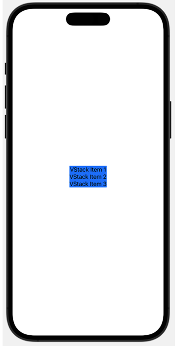
Replace the content of the body variable with a VStack and some Text views:
    var body: some View {
        VStack {
            Text("VStack Item 1")
            Text("VStack Item 2")
            Text("VStack Item 3")
        }
        .background(.blue)
    }
Press Cmd + Option + Enter if the canvas is not visible, then click on the Resume button above the canvas window to display the resulting view:
Figure 1.1: VStack with three items
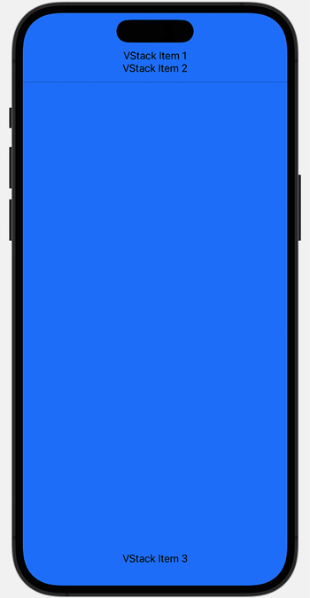
Add a Spacer and a Divider between VStack Item 2 and VStack Item 3:
Spacer()
Divider()
   .background(.black)
The content expands and covers the screen’s width and height, as follows:
The preview should look like the following screenshot (it may vary depending on the device selected for previews):
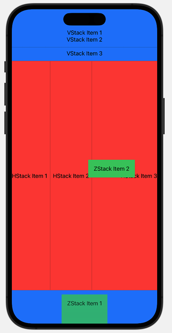
Figure 1.3: VStack, HStack, and ZStack
This concludes our recipe on using stacks. Going forward, we’ll make extensive use of VStack and HStack to position various components in our views.
How it works…
In Xcode 15, a new iOS app project with SwiftUI selected as the interface option starts with a VStack that includes an Image view and a Text view located at the center of the screen. We replaced the content provided by the template with our own VStack, with three embedded Text views. SwiftUI container views like VStack determine how to display content by using the following steps:
Figure out its internal spacing and subtract that from the size proposed by its parent view.
Divide the remaining space into equal parts.
Process the size of its least flexible view.
Divide the remaining unclaimed space by the unallocated space, and then repeat Step 2.
The stack then aligns its content and chooses its own size to exactly enclose its children.
Adding the Spacer() forces the view to use the maximum amount of vertical space. This is because the Spacer() is the most flexible view—it fills the remaining space after all other views have been displayed.
The Divider() component is used to draw a horizontal line across the width of its parent view. That is why adding a Divider() view stretched the VStack background from just around the Text views to the entire width of the VStack. By default, the divider line does not have a color. To set the divider color, we add the .background(.black) modifier. Modifiers are methods that can be applied to a view to return a new view. In other words, it applies changes to a view. Examples include .background(.black), .padding(), and .offset(…).
The HStack container is like the VStack but its contents are displayed horizontally from left to right. Adding a Spacer() in an HStack thus causes it to fill all available horizontal space, and a divider draws a vertical line between components in the HStack.
The ZStack is like HStack and VStack but overlays its content on top of existing items.
There’s more…
You can also use the .frame modifier to adjust the width and height of a component. Try deleting the Spacer() and Divider() from the HStack and then apply the following modifier to the HStack:
The most basic building block of any application is text, which we use to provide or request information from a user. Some text requires special treatment, such as password fields, which must be masked for privacy reasons.
In this recipe, we will implement different types of SwiftUI Text views. A Text view is used to display one or more lines of read-only text on the screen. A TextField view is used to display multiline editable text, and a SecureField view is used to request private information that should be masked, such as passwords.
Getting ready
Create a new SwiftUI project named FormattedText.
How to do it…
We’ll implement multiple types of text-related views and modifiers. Each step in this section applies minor changes to the view, so note the UI changes that occur after each step. Let’s get started:
Replace the initial ContentView body variable with our own VStack. The ContentView should look like the following code:
struct ContentView: View {
var body: some View {
VStack{
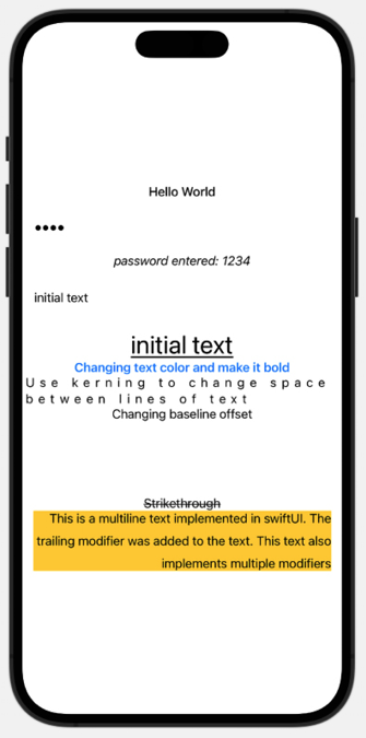
Text("Hello World")
}
}
}
Add the .fontWeight(.medium) modifier to the text and observe the text weight change in the canvas preview:
Text("Hello World")
           .fontWeight(.medium)
Add two state variables to the ContentView.swift file: password and someText. Place the values below the ContentView struct declaration. These variables will hold the content of the user’s password and Textfield inputs:
struct ContentView: View {
    @State private var password = "1234"
    @State private var someText = "initial text"
var body: some View {
...
}
Now, we will start adding more views to the VStack. Each view should be added immediately after the previous one. Add SecureField and a Text view to the VStack. The Text view displays the value entered in SecureField:
SecureField("Enter a password", text: $password)
      .padding()
Text("password entered: \(password)")
      .italic()
Add TextField and a Text view to display the value entered in TextField:
TextField("Enter some text", text: $someText)
   .padding()
Text(someText)
   .font(.largeTitle)
   .underline()
Now, let’s add some other Text views with modifiers to the list:
Text("Changing text color and make it bold")
         .foregroundStyle(.blue)
         .bold()
Text("Use kerning to change space between characters in the text")
          .kerning(7)
      Text("Changing baseline offset")
          .baselineOffset(100)
      Text("Strikethrough")
           .strikethrough()
      Text("This is a multiline text implemented in
           SwiftUI. The trailing modifier was added
           to the text. This text also implements
           multiple modifiers")
            .background(.yellow)
            .multilineTextAlignment(.trailing)
            .lineSpacing(10)
Now is the moment to test the app. We can choose to run the app in a simulator or click the Play button in the canvas preview,which allows for interactivity. Play with the app and enter some text in the SecureField and TextField. Text entered in the SecureField will be masked, while text in the TextField will be shown.
The resulting preview should look like this:
Figure 1.4: FormattedText preview
How it works…
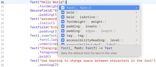
Text views have several modifiers for font, spacing, and other formatting requirements. When in doubt, position the cursor on the line of code that includes the Text view, and press the Esc key to reveal a list of all available modifiers. This is shown in the following example:
Figure 1.5: Using Xcode autocomplete to view formatting options
Unlike regular Text views, TextField and SecureField require state variables to store the value entered by the user. State variables are declared using the @State keyword. SwiftUI manages the storage of properties declared by using @State and refreshes the body each time the value of the state variable changes.
Values entered by the user are stored using the process of binding. In this recipe, we have state variables bound to the SecureField and TextField input parameters. The $ symbol is used to bind a state variable to the field. Using the $ symbol ensures that the state variable’s value is changed to correspond to the value entered by the user, as shown in the following example:
TextField("Enter some text", text: $someText)
Binding also notifies other views of state changes and causes the views to be redrawn on state change.
The wrapped value of bound state variables, which is the underlying value referenced by the state variable, is accessed without having to use the $ symbol. This is a convenience shortcut provided by Swift, as shown in the following code snippet:
Apps need to be appealing to users and need to engage them to interact with the app. To that purpose, a well-crafted and beautiful user interface with simple and intuitive interactions is very desirable.
Images play an important part in an app’s user interface as they add color and simplicity and they convey messages in a graphical way. It is fundamental to master how to use images in your apps.
In this recipe, we will learn how to add an image to a view, use an already existing UIImage, put an image in a frame, and use modifiers to present beautiful images. The images in this section were obtained from https://unsplash.com/, so special thanks to jf-brou, Kieran White, and Camilo Fierro.
Getting ready
Let’s start by creating a new SwiftUI project called UsingImages.
How to do it…
Let’s add some images to our SwiftUI project and introduce the modifiers used to style them. The steps are given here:
Replace the content of the body variable with an empty VStack.
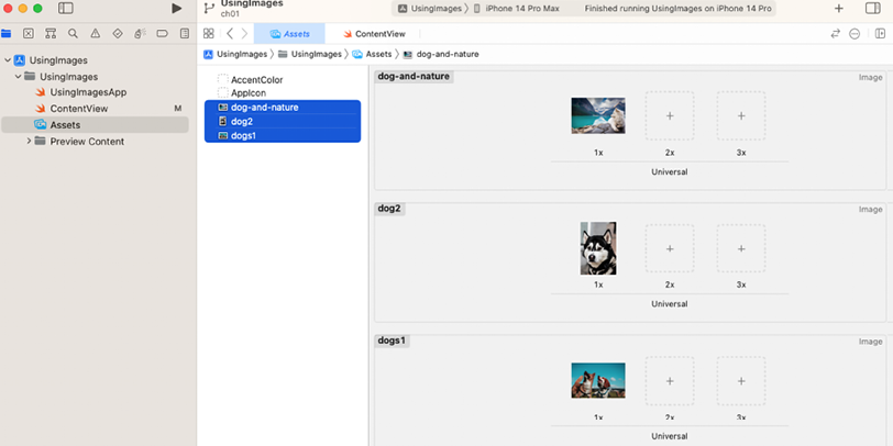
Drag and drop the downloaded images for this recipe into the project’s Assets.xcassets (or Assets) folder, as shown in the following screenshot:
Figure 1.6: Assets.xcassets folder in Xcode
Add an Image view to VStack:
Image("dogs1")
Observe the result in the canvas preview.
In iOS 17, the ImageResource and ColorResource structs were introduced, backward compatible to iOS 11 for UIKit and iOS 13 for SwiftUI. Xcode 15 automatically generates instances of ImageResource and ColorResource for images and colors in asset catalogs. For example, the three images in our asset catalog, shown in Figure 1.6, generate the following code:
This is auto-generated code, compiled along with our own code. Thanks to the new initializer for Image, which takes an ImageResource instead of Image("dogs1"), we can write Image(.dogs1). The advantage of this approach is the compile-time checking of the correct image name, which eliminates runtime errors from typos.
Add a .resizable() modifier to the image and allow SwiftUI to adjust the image such that it fits the screen space available:
Image(.dogs1)
    .resizable()
The .resizable() modifier causes the full image to fit on the screen, but the proportions are distorted. That can be fixed by adding the .aspectRatio(contentMode: .fit) modifier:
We can also use a UIImage instance to initialize an Image view. This is useful if the UIImage was generated with legacy code or programmatically. In our example, we use the UIImage convenience initializer, which takes an ImageResource instance. For example, to create a UIImage from the dogs2 image in our asset catalog, we would use: UIImage(resource: .dogs2).
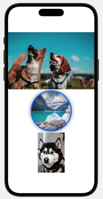
Use the UIImage and display it within the VStack. The resulting code should look like this:
The completed application should then look like this:
Figure 1.7: UsingImages preview
How it works…
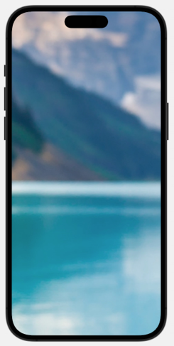
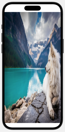
Adding the Image view to SwiftUI displays the image in its original proportions. The image might be too small or too big for the device’s display. For example, without any modifiers, the dog-and-nature image fills up the full iPhone 14 Pro Max screen:
Figure 1.8: The dog-and-nature image without the resizable modifier
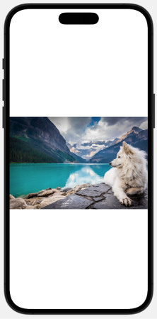
To allow an image to shrink or enlarge to fit the device screen size, add the .resizable() modifier to the image. Adding the .resizable() modifier causes the image to fit within its view, but it may be distorted due to changes in proportion:
Figure 1.9: Image with resizable modifier
To address the issue, add the .aspectRatio(contentMode: .fit) modifier to the image:
Figure 1.10: Image with AspectRatio set
To specify the width and height of an image, add the .frame(width, height) modifier to the view and set the width and height: .frame(width: 200, height: 200).
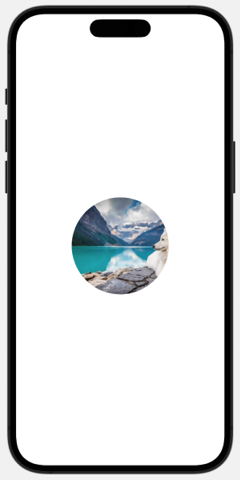
Images can be clipped to specific shapes. The .clipShape(Circle()) modifier changes the image shape to a circle:
Figure 1.11: Image with the clipShape(Circle()) modifier
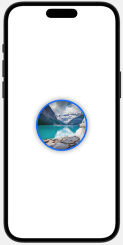
The .overlay(Circle().stroke(Color.blue, lineWidth: 6)) and.shadow(radius: 10) modifiers were used to draw a blue line around the image circle and add a shadow to the circle:
Figure 1.12: Stroke and shadow applied to image
Important Note
The order in which the modifiers are added matters. Adding the .frame() modifier before the .resizable() or .aspectRatio() modifiers may lead to different results.
Note that if you set the project deployment target to iOS 14, the ImageResource struct works without issues since Apple made the struct available for older versions of iOS. This allows us to use the new APIs in older versions of iOS in case your app needs to support them.
In this recipe, we will learn how to use the various buttons available in SwiftUI. We will use a Button view to trigger the change of a count when clicked and implement a NavigationStack to move between various SwiftUI views and an EditButton to remove items from a list. We will also briefly discuss the MenuButton and PasteButton only available in macOS.
Getting ready
Let’s start by creating a new SwiftUI project called Buttons.
How to do it…
Let’s create a home screen with buttons for each of the items we want to go over. Once clicked, we’ll use SwiftUI’s NavigationLink to show the view that implements the concept. The steps are given here:
Add a new SwiftUI view file called ButtonView to the project: File | New | File (or press the shortcut keys + N).
Select SwiftUI View from the UI templates.
In the Save As field of the pop-up menu, enter the filename ButtonView.
Repeat Step 1 and enter the filename EditButtonView.
Repeat Step 1 and enter the filename PasteButtonView.
Repeat Step 1 and enter the filename MenuButtonView.
Important Note
Avoid using the MenuButton view because this is deprecated and only available in macOS 10.14–12.0. For similar functionality, use the Menu view instead, which is available for macOS, iOS and iPadOS.
Open the ContentView.swift file and create a NavigationStack to navigate between the SwiftUI views we added to the project. The ContentView struct should look like this:
struct ContentView: View {
    var body: some View {
        NavigationStack {
            VStack(spacing: 44) {
                NavigationLink("Buttons"){
                    ButtonView()
                }
                NavigationLink("EditButtons") {
                    EditButtonView()
                }
                NavigationLink("MenuButtons") {
                    MenuButtonView()
                }
                NavigationLink("PasteButtons") {
                    PasteButtonView()
                }
                NavigationLink("Details about text") {
                    Text("Very long text that should not be displayed in a single line because it is not good design")
                    .padding()
                    .navigationTitle(Text("Detail"))
                }
            }
            .navigationTitle(Text("Main View"))
        }
    }
}
Upon completion, the ContentView preview should look like this:
Figure 1.13: ButtonsApp ContentView
Open the ButtonView.swift file in the project navigator and replace the existing struct with the following code:
struct ButtonView: View {
    @State var count = 0
    var body: some View {
        VStack {
            Text("Welcome to your second view")
            Text("Current count value: \(count)")
                .padding()
            Button {
                count += 1
            } label: {
                Text("Tap to Increment count")
                .fontWeight(.bold)
                .foregroundStyle(.white)
                .padding()
                .background(.blue)
                .clipShape(Capsule())
            }
        }.navigationBarTitle("Button View")
    }
}
#Preview {
        NavigationStack {
            ButtonView()
        }
}
Open the EditButtonView.swift file in the project navigator and replace the existing struct with the following code that implements an EditButton:
Open the PasteButtonView.swift file and implement the text regarding PasteButtons:
struct PasteButtonView: View {
    @State var text  = String()
    var body: some View {
        VStack{
            Text("PasteButton controls how you paste in macOS but is not available in iOS. For more information, check the \"See also\" section of this recipe")
                .padding()
        }
.navigationTitle("PasteButton")
    }
}
#Preview {
        NavigationStack {
            PasteButtonView()
        }
}
Go back to ContentView, run the code in the canvas preview or simulator, and play around with it to see what the results look like.
How it works…
A NavigationLink must be placed in a NavigationStack or NavigationSplitView prior to being used.
In this recipe, we use a NavigationLink with two parameters—destination and label. The destination parameter represents the view that would be displayed when the label is clicked, while the label parameter represents the text to be displayed within NavigationLink. Since our label is a simple Text view, we use the convenience initializer init(_:destination:) of NavigatioLink to keep our code more concise.
NavigationLink buttons can be used to move from one SwiftUI view to another—for example, moving from ContentView to EditButtonView. They can also be used to display text details without creating a SwiftUI view in a separate file, such as in the last NavigationLink, where a click just presents a long piece of text with more information. This is made possible because the Text struct conforms to the view protocol.
The .navigationTitle("Main View")) modifier adds a title to the ContentView screen.
The .navigationTitle() modifier is also added to EditButtonView and other views. Since these views do not contain NavigationStack structs, the titles would not be displayed when viewing the page directly from the preview, but would show up when running the code and navigating from ContentView.swift to the view provided in NavigationLink. To solve this, we use a NavigationStack in the PreviewProvider structs. To make the previews more useful, note how we have enclosed the view in a NavigationStack so we can see the title in the canvas preview window.
The EditButton view is used in conjunction with List views to make lists editable. We will go over List and Scroll views in Chapter 2, Displaying Scrollable Content with Lists and Scroll Views, but EditButtonView provides a peek into how to create an editable list.
The MenuButtonView uses the Menu struct, introduced in iOS 14, to display a floating menu of actions. Check out the Exploring more views and controls recipe at the end of this chapter for more information on Menu.
PasteButtons are only available on macOS. Refer to the See also section of this recipe for code on how the PasteButton is implemented.
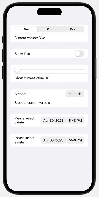
In this recipe, we will learn how to implement pickers—namely, Picker, Toggle, Slider, Stepper, and DatePicker. Pickers are typically used to prompt the user to select from a set of mutually exclusive values. Toggle views are used to switch between on/off states. Slider views are used for selecting a value from a bounded linear range of values. As with Slider views, Stepper views also provide a UI for selecting from a range of values. However, steppers use the + and : signs to allow users to increment the desired value by a certain amount. Finally, DatePicker views are used for selecting dates.
Getting ready
Create a new SwiftUI project named UsingPickers.
How to do it…
Let’s create a SwiftUI project that implements various pickers. Each picker will have a @State variable to hold the current value of the picker. The steps are given here:
In the ContentView.swift file, create @State variables that will hold the values selected by the pickers and other controls. Place the variables between the ContentView struct and the body:
    @State private var choice = 0
    @State private var showText = false
    @State private var transitModes = ["Bike", "Car", "Bus"]
    @State private var sliderVal: Float = 0
    @State private var stepVal = 0
    @State private var gameTime = Date()
Replace the body of the ContentView struct with a Form view. Then, add a Section view and a Picker view to the form:
Form {
    Section {
       Picker("Transit Modes", selection: $choice) {
          ForEach( 0 ..< transitModes.count, id: \.self) { index in
              Text("\(transitModes[index])")
               }
        }
        .pickerStyle(.segmented)
        Text("Current choice: \(transitModes[choice])")
   }
}
Under the existing Section view, add another Section view and a Toggle view:
Section{
   Toggle(isOn: $showText){
      Text("Show Text")
   }
   if showText {
      Text("The Text toggle is on")
   }
}
Add a Section view and a Slider view:
Section{
   Slider(value: $sliderVal, in: 0...10, step: 0.001)
   Text("Slider current value \(sliderVal, specifier: "%.1f")")
}
Add a Section view and a Stepper view:
Section {
   Stepper("Stepper", value: $stepVal, in: 0...5)
   Text("Stepper current value \(stepVal)")
}
Add a Section view and a DatePicker view:
Section {
   DatePicker("Please select a date", selection: $gameTime)
}
Add a Section view and a slightly modified DatePicker view that only accepts future dates:
The result should be a beautiful form, like what is shown here:
Figure 1.14: SwiftUI Form with Pickers
How it works…
Form views group controls that are used for data entry, and Section views create hierarchical view content. Section views can be embedded inside a Form view to display information grouped together. The default presentation style for a Form with embedded Section views is to include a gray padding area between each section for visual grouping, as shown in Figure 1.14.
Picker views are used for selecting from a set of mutually exclusive values. In the following example, a segmented picker is used to select a transit mode from our transitModes state variable:
Picker("Transit Modes", selection: $choice) {
   ForEach( 0 ..< transitModes.count, id:\.self) { index in
       Text("\(transitModes[index])")
   }
}
.pickerStyle(.segmented)
As shown in the preceding example, a Picker view takes two parameters, a string describing its function, and a state variable that holds the value selected. The state variable should be of the same type as the range of values to select from. In this case, the ForEach loop iterates through the transitModes array indices. The value selected would be an Int within the range of transitModes indices. The transit mode located in the selected index can then be displayed using Text("\(transitModes[index])"). It is also worth noting that we need to apply a .segmented style to the picker using the .pickerStyle() modifier, to use the visual segmented style everyone is used to in iOS.
Toggle views are controls that switch between “on” and “off” states. The state variable for holding the toggle selection should be of the Bool type. The section with the Toggle view also contains some text. The @State property of the Toggle reflects the current state of the toggle.
Creating a slider requires three arguments:
value: The @State variable to bind the user input to
in: The range of the slider
step: By how much the slider should change when the user moves it
In the sample code, our slider moves can hold values between 0 and 10, with a step of 0.001.
Steppers take three arguments too—a string for the label, value, and in. The value argument holds the @State variable that binds the user input, and the in argument holds the range of values for the stepper.
In this recipe, we also demonstrate two applications of a date picker. The first from the top shows a date picker whose first argument is the label of DatePicker, and the second argument holds the state variable that binds the user input. Use it in situations where the user is allowed to pick any date without restriction. The other date picker contains a third parameter, in. This parameter represents the date range the user can select.
Important Note
The @State variables need to be of the same type as the data to be stored. For example, the gameTime state variable is of the Date type.
Picker styles change based on its ancestor. The default appearance of a picker may be different when placed within a form or list instead of a VStack or some other container view. Styles can be overridden using the .pickerStyle() modifier.
Applying groups of styles using ViewModifier
SwiftUI comes with built-in modifiers such as background() and fontWeight(), among others. It also gives you the ability to create your own custom modifiers. You can use custom modifiers to combine multiple existing modifiers into one.
In this section, we will create a custom modifier that adds rounded corners and a background to a Text view.
Getting ready
Create a new SwiftUI project named UsingViewModifiers.
How to do it…
Let’s create a view modifier and use a single line of code to apply it to a Text view. The steps are given here:
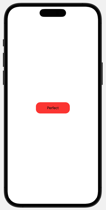
Replace the current body of the ContentView view with:
Text("Perfect")
At the end of the ContentView.swift file, create a struct that conforms to the ViewModifier protocol, accepts a parameter of type Color, and applies styles to the view’s body:
struct BackgroundStyle: ViewModifier {
    var bgColor: Color
    func body(content: Content) -> some View{
        content
        .frame(width:UIScreen.main.bounds.width * 0.3)
        .foregroundStyle(.black)
        .padding()
        .background(bgColor)
        .cornerRadius(20)
    }
}
Add a custom style to the text using the modifier() modifier:
To apply styles without using a modifier, create an extension to the View protocol. The extension should be created outside the struct or Xcode will issue an error:
This concludes the section on view modifiers. View modifiers promote clean coding and reduce repetition.
How it works…
A view modifier creates a new view by altering the original view to which it is applied. We create a new view modifier by creating a struct that conforms to the ViewModifier protocol and apply our styles in the implementation of the required body function. You can make the ViewModifier customizable by requiring input parameters/properties that would be used when applying styles.
In the example here, the bgColor property is used in our BackGroundStyle struct, which alters the background color of the content passed to the body function.
At the end of Step 2, we have a functioning ViewModifier but decide to make it easier to use by creating a View extension and adding in a function that calls our struct:
Separating presentation from content with ViewBuilder
Apple defines ViewBuilder as “a custom parameter attribute that constructs views from closures.” ViewBuilder can be used to create custom views that can be used across an application with minimal or no code duplication. In this recipe, we will create a custom SwiftUI view, BlueCircle, that applies a blue circle to the right of its content.
Getting ready
Let’s start by creating a new SwiftUI project called UsingViewBuilder.
How to do it…
We’ll create our ViewBuilder in a separate swift file and then apply it to items that we’ll create in the ContentView.swift file. The steps are given here:
With our UsingViewBuilder app opened, let’s create a new SwiftUI file by going to File | New | File.
Select SwiftUI view from the menu and click Next.
Name the file BlueCircle and click Create.
Delete the #Preview macro from the file.
Modify the existing struct with the BlueCircle ViewModifier:
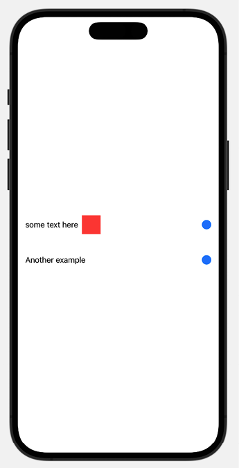
Open the ContentView.swift file and try out the BlueCircle ViewBuilder:
    var body: some View {
        VStack {
            BlueCircle {
                Text("some text here")
                Rectangle()
                .fill(Color.red)
                .frame(width: 40, height: 40)
            }
            BlueCircle {
                Text("Another example")
            }
        }
    }
The resulting preview should look like this:
Figure 1.16: ViewBuilder result preview
How it works…
We use the ViewBuilder struct to create a view template that can be used anywhere in the project without duplicating code. The ViewBuilder struct must contain a body property since it extends the View protocol.
Within the body property/view, we update the content property with the components we want to use in our custom view. In this case, we use a BlueCircle. Notice the location of the content property. This determines the location where the view passed to our ViewBuilder will be placed.
The SF Symbols 5 library provides a set of over 5,000 free consistent and highly configurable symbols. Each year, Apple adds more symbols and symbol variants to the collection.
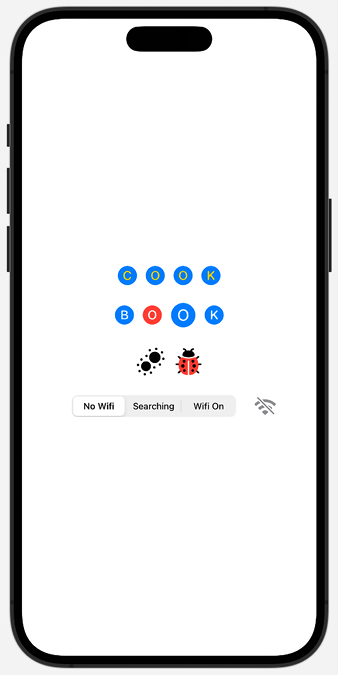
Let’s add the @State property to fix the Xcode error. Immediately below the declaration of the ContentView struct, add the wifiSelection property:
@State private var wifiSelection = 0
The resulting preview should look like this:
Figure 1.17: SF Symbols in action
How it works…
SF Symbols defines several design variants such as enclosed, fill, and slash. These different variants can be used to convey different information—for example, a slash variant on a Wi-Fi symbol lets the user know if the Wi-Fi is unavailable.
In our first HStack, we use the .symbolVariant(.fill.circle) modifier to apply the .fill and .circle variants to all the items in the HStack. This could also be accomplished using the following code:
However, the preceding code is too verbose and would require too many changes if we decided that we didn’t need either the .circle or .fill variant, or both.
We also notice something new in our first HStack —the .foregroundStyle(...) modifier. The .foregroundStyle modifier can accept one, two, or three parameters corresponding to the primary, secondary, and tertiary colors. Some symbols may have all three levels of colors, or only primary and secondary, or primary and tertiary. For symbols without all three levels, only the ones that pertain to them are applied to the symbol. For example, a tertiary color applied to an SF Symbol with only primary and secondary levels will have no effect on the symbol.
The second HStack also uses the .symbolVariant modifier with one variant. It also introduces a new modifier, .symbolRenderingMode(). Rendering modes can be used to control how color is applied to symbols. The multicolor rendering mode renders symbols as multiple layers with their inherited styles. Adding the .multicolor rendering mode is enough to present a symbol with its default layer colors. Other rendering modes include hierarchical, monochrome, and palette.
Finally, we create another HStack with a segmented picker for a Wi-Fi system image where we change the appearance based on the status of the wifiSelection state variable. The picker reads the state variable and changes the wifi symbol appearance from a slashed symbol when “No Wifi” is selected to a variable color animated symbol when “Searching” is selected to a solid blue symbol when “Wifi On” is selected. Here, we used the new Symbols framework introduced in iOS 17, and the .symbolEffect view modifier to add an animation to a symbol. When we want to add animations to a symbol, the SF Symbols Mac app allows us to configure all the animations and preview the result. We can even export the animation configuration to add it in Xcode.
Integrating UIKit into SwiftUI: the best of both worlds
SwiftUI was announced at WWDC 2019 and is only available on devices running iOS 13 and above. Many improvements and new APIs have been added to SwiftUI since its introduction, to the point that, at the time of this writing, we can create an app in SwiftUI without using any UIKit components.
However, if you’re dealing with legacy code written in UIKit, and have the need to integrate the code in your SwiftUI app, Apple provides a way to do this. UIViews and UIViewControllers can be seamlessly placed inside SwiftUI views and vice versa.
In this recipe, we’ll look at how to integrate UIKit APIs in SwiftUI. We will create a project that wraps instances of UIActivityIndicatorView to display an indicator in SwiftUI.
Getting ready
Open Xcode and create a SwiftUI project named UIKitToSwiftUI.
How to do it…
We can display UIKit views in SwiftUI by using the UIViewRepresentable protocol. Follow these steps to implement the UIActivityIndicatorView in SwiftUI:
Within the Xcode menu, click File | New | File and select Swift File. Name the view ActivityIndicator.
Replace the import Foundation statement with import SwiftUI:
import SwiftUI
Modify the code in ActivityIndicator to use the UIViewRepresentable protocol:
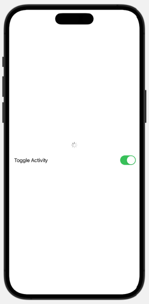
Let’s open the ContentView.swift file and replace the struct with the following code to make use of the ActivityIndicator instance that we just created. Let’s also add a Toggle control to turn the indicator on or off:
struct ContentView: View {
    @State private var animate = true
    var body: some View {
        VStack{
            ActivityIndicator(animating:  animate)
            HStack{
                Toggle(isOn: $animate){
                    Text("Toggle Activity")
                }
            }.padding()
        }
    }
}
The resulting ContentView preview should look like this:
UIKit views can be implemented in SwiftUI by using the UIViewRepresentable protocol to wrap the UIKit views. In this recipe, we make use of a UIActivityIndicatorView by first wrapping it with a UIViewRepresentable.
In our ActivityIndicator.swift file, we implement a struct that conforms to the UIViewRepresentable protocol. This requires us to implement both the makeUIView and updateUIView functions. The makeUIView function creates and prepares the view, while the updateUIView function updates the UIView when the animation changes.
Important Note
You can implement the preceding features in iOS 14+ apps by using SwiftUI’s ProgressView. The purpose of the recipe was to show how to integrate a UIKit view with SwiftUI.
See also
Check out the Exploring more views and controls recipe at the end of this chapter for more information on ProgressView.
Apple’s tutorial on how to integrate UIKit and SwiftUI:
In this recipe, we will learn how to navigate from a UIKit view to a SwiftUI view while passing a secret text to our SwiftUI view. This recipe assumes prior knowledge of UIKit and it is most useful to developers who want to integrate SwiftUI into a legacy UIKit app. If this is not your case, feel free to skip to the next recipe.
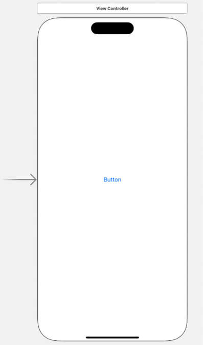
We’ll be making use of a UIKit storyboard, a visual representation of the UI in UIKit. The Main.storyboard file is to UIKit what the ContentView.swift file is to SwiftUI. They are both the default home views that are created when you start a new project.
We start off this project with a simple UIKit project that contains a button.
Getting ready
Get the following ready before starting out with this recipe:
Open the StartingPoint folder and double-click on AddSwiftUIToUIKit.xcodeproj to open the project in Xcode.
How to do it…
We will add a NavigationController to the UIKit ViewController that allows the app to switch from the UIKit to the SwiftUI view when the button is clicked:
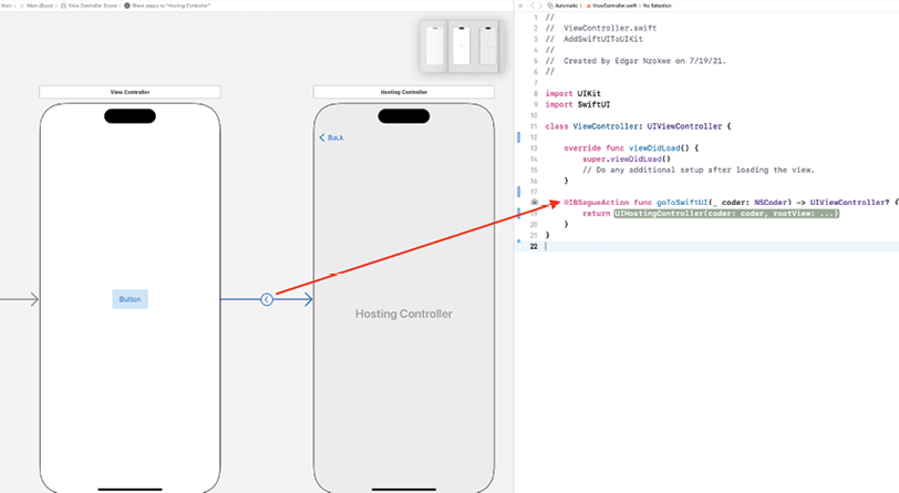
Open the Main.storyboard file in Xcode by clicking on it. The Main.storyboard looks like this:
Figure 1.19: UIKit View Controller
Click anywhere in the ViewController to select it.
In the Xcode menu, click Editor | Embed in | Navigation Controller.
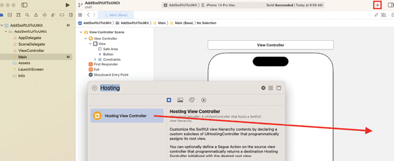
Add a new ViewController to the project:
Click the + button at the top right of the Xcode window.
In the new window, select the Objects library, type hosting in the search bar, select Hosting View Controller, and drag it out to the storyboard:
Figure 1.20: Creating a UIKit Hosting View Controller
Hold down the Ctrl key, and then click and drag from the ViewController button to the new Hosting View Controller that we added.
In the pop-up menu, for the Action Segue option, select Show.
Click the Adjust Editor Options button:
Figure 1.21: Adjust Editor Options button
Click Assistant. This splits the view into two panes, as shown here:
Figure 1.22: Xcode with the Assistant editor open
To create a segue action, hold the Ctrl key, then click and drag from the segue button (item in the middle of the blue arrow in Figure 1.22) to the space after the viewDidLoad function in the ViewController.swift file.
In the pop-up menu, enter the name goToSwiftUI and click Connect. The following code will be added to the ViewController.swift file:
Add a statement to import SwiftUI at the top of the ViewController page, below import UIKit:
import SwiftUI
Within the goToSwiftUI function, create a text that will be passed to our SwiftUI view. Also, create a rootView variable that specifies the SwiftUI view that you would like to reach. Finally, return the UIHostingController, which is a special ViewController used to display the SwiftUI view. The resulting code should look like this:
    @IBSegueAction func goToSwiftUI(_ coder: NSCoder) -> UIViewController? {
        let greetings = "Hello From UIKit"
        let rootView = Greetings(textFromUIKit: greetings)
        return UIHostingController(coder: coder, rootView: rootView)
    }
At this point, the code will not compile because we have not yet implemented a Greetings view. Let’s resolve that now.
Create a SwiftUI view to display a message:
Click File | New | File and select SwiftUI View.
Name the view Greetings.swift.
Add a View component that displays some text passed to it:
struct Greetings: View {
    var textFromUIKit: String
    var body: some View {
        Text(textFromUIKit)
    }
}
#Preview {
    Greetings(textFromUIKit: "Hello, World!")
}
Run the project in the simulator, click on the UIKit button, and watch the SwiftUI page get displayed.
How it works…
To host SwiftUI views in an existing app, you need to wrap the SwiftUI hierarchy in a ViewController or InterfaceController.
We start by performing core UIKit concepts, such as adding a Navigation View Controller to the storyboard and adding a Hosting View Controller as a placeholder for our SwiftUI view.
Lastly, we create an IBSegueAction to present our SwiftUI view upon clicking the UIKit button.
Exploring more views and controls
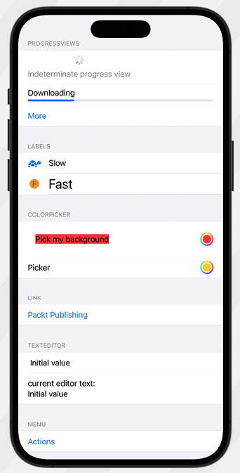
In this section, we introduce some views and controls that did not clearly fit in any of the earlier created recipes. We’ll look at the ProgressView, ColorPicker, Link, and Menu views.
ProgressView is used to show the degree of completion of a task. There are two types of ProgressView: indeterminate progress views show a spinning circle till a task is completed, while determinate progress views show a bar that gets filled up to show the degree of completion of a task.
ColorPicker views allow users to select from a wide range of colors, while Menu views present a list of items that users can choose from to perform a specific action.
Getting ready
Let’s start by creating a new SwiftUI project called MoreViewsAndControls.
How to do it…
Let’s implement some views and controls in the ContentView.swift file. We will group the controls in Sectioninstances in a Listview. Section allows us to include an optional header. The steps are given here:
Just below the ContentView struct declaration, add the state variables that we’ll be using for various components:
    @State private var progress = 0.5
    @State private var color  = Color.red
    @State private var secondColor  = Color.yellow
    @State private var someText = "Initial value"
Replace the body contents with a List view with a Section view, two ProgressView views, and a Button view:
The total parameter in the ProgressView component is optional and defaults to 1.0 if not specified.
Label views were mentioned earlier in the Simple graphics using SF Symbols recipe. Here, we introduce a second option for implementing labels where we customize the design of the label text and icon:
Let’s move on to the ColorPicker view. Color pickers let you display a palette for users to pick colors from. We create a two-way binding using the color state variable so that we can store the color selected by the user:
                ColorPicker(selection: $color ) {
                    Text("Pick my background")
                        .background(color)
                        .padding()
                }
Finally, the Menu view provides a convenient way of presenting a user with a list of actions to choose from and can also be nested, as seen here:
                Menu("Actions") {
                    Button("Set TextEditor text to 'magic'"){
                        someText = "magic"
                    }
                    Button("Turn first picker green") {
                        color = Color.green
                    }
                    Menu("Actions") {
                        Button("Set TextEditor text to 'real magic'"){
                            someText = "real magic"
                        }
                        Button("Turn first picker gray") {
                            color = Color.gray
                        }
                    }
                }
You can add one or more buttons to a menu, each performing a specific action. Although menus can be nested, this should be done sparingly as too much nesting may decrease usability.
After learning the basics of SwiftUI, we concluded the chapter with this recipe, where we used several SwiftUI view components that we could incorporate into our apps.
Learn more on Discord
To join the Discord community for this book – where you can share feedback, ask questions to the author, and learn about new releases – follow the QR code below:
Unlock advanced controls and animations with SwiftUI 5, taking your app development skills to the next level
Visualize data effortlessly using Swift Charts enhancing your app's data-driven capabilities
Develop for multiple platforms, including iOS, macOS, and watchOS, and become a versatile app developer
Purchase of the print or Kindle book includes a free PDF eBook
Description
SwiftUI is the modern way to build user interfaces for iOS, macOS, and watchOS. It provides a declarative and intuitive way to create beautiful and interactive user interfaces. The new edition of this comprehensive cookbook includes a fully updated repository for SwiftUI 5, iOS 17, Xcode 15, and Swift 5.9. With this arsenal, it teaches you everything you need to know to build beautiful and interactive user interfaces with SwiftUI 5, from the basics to advanced topics like custom modifiers, animations, and state management.
In this new edition, you will dive into the world of creating powerful data visualizations with a new chapter on Swift Charts and how to seamlessly integrate charts into your SwiftUI apps. Further, you will be able to unleash your creativity with advanced controls, including multi-column tables and two-dimensional layouts. You can explore new modifiers for text, images, and shapes that give you more control over the appearance of your views.
You will learn how to develop apps for multiple platforms, including iOS, macOS, watchOS, and more.
With expert insights, real-world examples, and a recipe-based approach, you’ll be equipped to build remarkable SwiftUI apps that stand out in today’s competitive market.
What you will learn
Create stunning, user-friendly apps for iOS 17, macOS 14, and watchOS 10 with SwiftUI 5
Use the advanced preview capabilities of Xcode 15
Use async/await to write concurrent and responsive code
Create powerful data visualizations with Swift Charts
Enhance user engagement with modern animations and transitions
Implement user authentication using Firebase and Sign in with Apple
Learn about advanced topics like custom modifiers, animations, and state management
Build multi-platform apps with SwiftUI
What do you get with eBook?
Instant access to your Digital eBook purchase
Download this book in EPUB and PDF formats
Access this title in our online reader with advanced features
DRM FREE - Read whenever, wherever and however you want
Juan C. Catalan is a software engineer with more than 18 years of professional experience. He started mobile development back in the days of iOS 3. Juan has worked as a professional iOS developer in many industries, including medical devices, financial services, real estate, document management, fleet tracking and industrial automation. He has contributed to more than 30 published apps in the App Store, some of them with millions of users. Juan gives back to the iOS development community with technical talks, mentoring developers, reviewing technical books and now as a book author. He lives in Austin, Texas, with his wife Donna, where they spend time with their kids.
Where there is an eBook version of a title available, you can buy it from the book details for that title. Add either the standalone eBook or the eBook and print book bundle to your shopping cart. Your eBook will show in your cart as a product on its own. After completing checkout and payment in the normal way, you will receive your receipt on the screen containing a link to a personalised PDF download file. This link will remain active for 30 days. You can download backup copies of the file by logging in to your account at any time.
If you already have Adobe reader installed, then clicking on the link will download and open the PDF file directly. If you don't, then save the PDF file on your machine and download the Reader to view it.
Please Note: Packt eBooks are non-returnable and non-refundable.
Packt eBook and Licensing When you buy an eBook from Packt Publishing, completing your purchase means you accept the terms of our licence agreement. Please read the full text of the agreement. In it we have tried to balance the need for the ebook to be usable for you the reader with our needs to protect the rights of us as Publishers and of our authors. In summary, the agreement says:
You may make copies of your eBook for your own use onto any machine
You may not pass copies of the eBook on to anyone else
How can I make a purchase on your website?
If you want to purchase a video course, eBook or Bundle (Print+eBook) please follow below steps:
Register on our website using your email address and the password.
Search for the title by name or ISBN using the search option.
Select the title you want to purchase.
Choose the format you wish to purchase the title in; if you order the Print Book, you get a free eBook copy of the same title.
Proceed with the checkout process (payment to be made using Credit Card, Debit Cart, or PayPal)
Where can I access support around an eBook?
If you experience a problem with using or installing Adobe Reader, the contact Adobe directly.
To view the errata for the book, see www.packtpub.com/support and view the pages for the title you have.
To view your account details or to download a new copy of the book go to www.packtpub.com/account
Our eBooks are currently available in a variety of formats such as PDF and ePubs. In the future, this may well change with trends and development in technology, but please note that our PDFs are not Adobe eBook Reader format, which has greater restrictions on security.
You will need to use Adobe Reader v9 or later in order to read Packt's PDF eBooks.
What are the benefits of eBooks?
You can get the information you need immediately
You can easily take them with you on a laptop
You can download them an unlimited number of times
You can print them out
They are copy-paste enabled
They are searchable
There is no password protection
They are lower price than print
They save resources and space
What is an eBook?
Packt eBooks are a complete electronic version of the print edition, available in PDF and ePub formats. Every piece of content down to the page numbering is the same. Because we save the costs of printing and shipping the book to you, we are able to offer eBooks at a lower cost than print editions.
When you have purchased an eBook, simply login to your account and click on the link in Your Download Area. We recommend you saving the file to your hard drive before opening it.
For optimal viewing of our eBooks, we recommend you download and install the free Adobe Reader version 9.
 Argentina
 Australia
 Austria
 Belgium
 Brazil
 Bulgaria
 Canada
 Chile
Chile
 Colombia
 Cyprus
 Czechia
 Denmark
 Ecuador
 Egypt
Egypt
 Estonia
 Finland
 France
 Germany
 Great Britain
 Greece
 Hungary
 India
India
 Indonesia
 Ireland
 Italy
Italy
 Japan
Japan
 Latvia
 Lithuania
 Luxembourg
 Malaysia
 Malta
Malta
 Mexico
 Netherlands
 New Zealand
 Norway
 Philippines
 Poland
 Portugal
 Romania
 Russia
 Singapore
 Slovakia
 Slovenia
 South Africa
 South Korea
 Spain
Spain
 Sweden
 Switzerland
 Taiwan
 Thailand
 Turkey
 Ukraine
 United States

 + N).
+ N).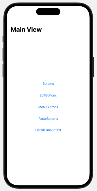


 Filter


