

Implementing Android views in Jetpack Compose
In every Android application, having a UI element is very crucial. A view in Android is a simple building block for a UI. A view ensures users can interact with your application through a tap or other motion. This recipe will look at different Compose UI elements and see how we can build them.
Getting ready
In this recipe, we will create one project that we will re-use for the entire chapter, so let’s go ahead and follow the steps in Chapter 1, Getting Started with Modern Android Development Skills, on how to create your first Android project.
Create a project and call it Compose Basics. In addition, we will mostly use the Preview section to view the UI element we create.
How to do it…
Once you have created the project, follow these steps to build several Compose UI elements:
- Inside our project, let us go ahead and create a new package and call it components. This is where we will add all the components we create.
- Create a Kotlin file and call it
UIComponents.kt; insideUIComponent, go ahead and create a composable function, call itEditTextExample(), and call theOutlinedTextField()function; this will prompt you to import the required import, which isandroidx.Compose.material.OutlinedTextField:@Composable fun EditTextExample() { OutlinedTextField() } - When you look deep into
OutlineTextField(see Figure 2.1), you will notice the function accepts several inputs, and this is very useful when you need to customize your own composable functions.
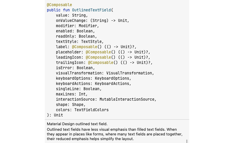
Figure 2.1 – The OutlinedTextField input
- For our example, we will not do much with the UI we create and will rather just look at how we create them.
- Now, to fully create our
OutlinedTextField()based on the types of input we see it accepts, we can give it a text and color and we can decorate it using aModifier(); that is, by giving it specific instructions such asfillMaxWidth(), which sets the max width. When we say fill, we are simply specifying it should be fully filled. We set.padding(top)to16.dp, which applies additional space along each edge of the content indp. It also has a value, which is the value to be entered in theOutlinedTextField, and anonValueChangelambda that listens to the input change. - We also give our
OutlinedTextsome border colors when focused and when not focused to reflect the different states. Hence, if you start entering input, the box will change color to blue, as specified in the code:@Composable fun EditTextExample() { OutlinedTextField( value = "", onValueChange = {}, label = { Text(stringResource(id = R.string.sample)) }, modifier = Modifier .fillMaxWidth() .padding(top = 16.dp), colors = TextFieldDefaults.outlinedTextFieldColors( focusedBorderColor = Color.Blue, unfocusedBorderColor = Color.Black ) ) } - We also have another type of
TextField, which is not outlined, and if you compare whatOutlinedTextFieldtakes in as input, you will notice they are fairly similar:@Composable fun NotOutlinedEditTextExample() { TextField( value = "", onValueChange = {}, label = { Text(stringResource(id = R.string.sample)) }, modifier = Modifier .fillMaxWidth() .padding(top = 8.dp, bottom = 16.dp), colors = TextFieldDefaults.outlinedTextFieldColors( focusedBorderColor = Color.Blue, unfocusedBorderColor = Color.Black ) ) } - You can run the application by adding the Compose functions inside the
@Previewcomposable function. In our example, we can createUIElementPreview(), which is a preview function for displaying our UI. In Figure 2.2, the top view isOutlinedTextField, whereas the second one is a normalTextField.
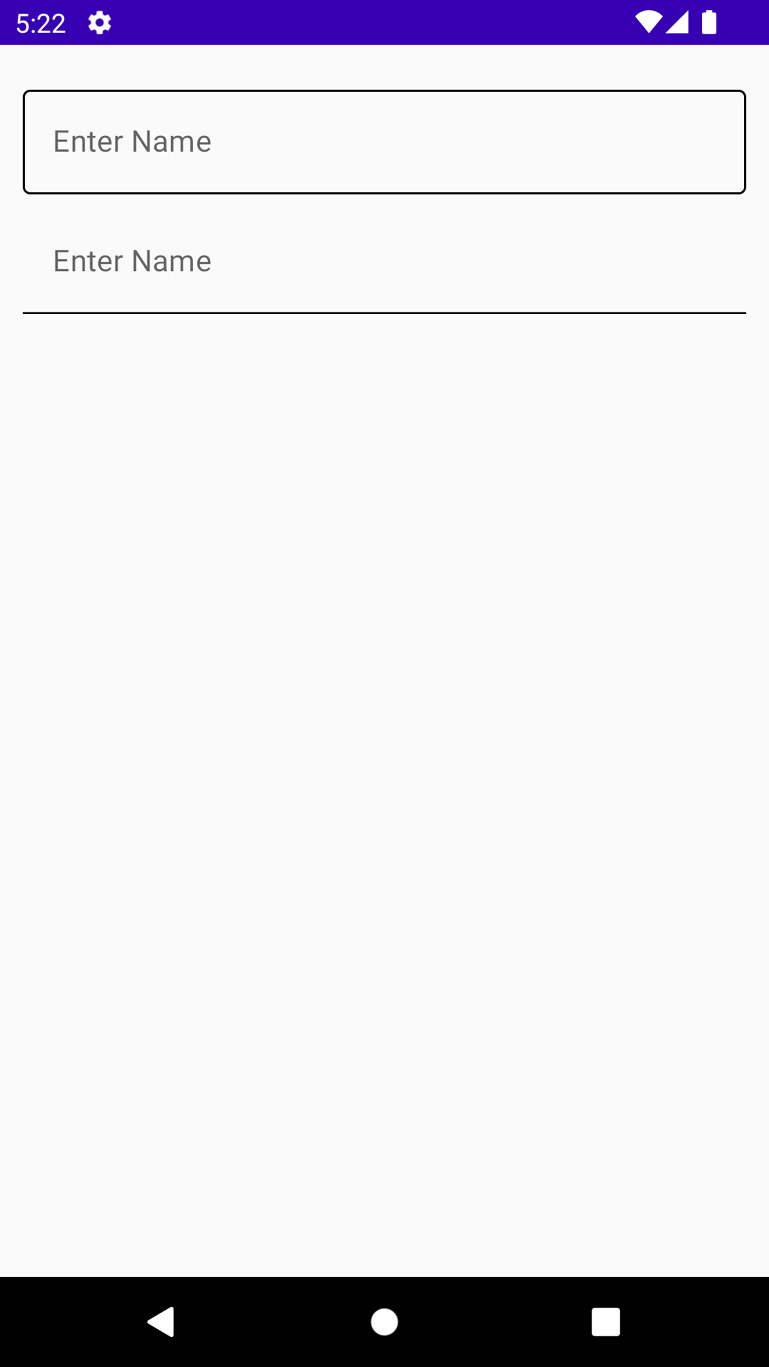
Figure 2.2 – OutlinedTextField and TextField
- Now, let’s go ahead and look at button examples. We will look at different ways to create buttons with different shapes. If you hover over the
Button()composable function, you will see what it accepts as input, as shown in Figure 2.3.
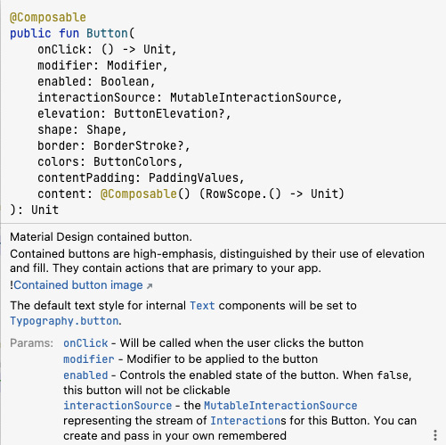
Figure 2.3 – Button input
In our second example, we will try to create a button with an icon on it. In addition, we will add text, which is crucial when creating buttons since we need to specify to users what action or what the button will be doing once it is clicked on.
- So, go ahead and create a Compose function in the same Kotlin file and call it
ButtonWithIcon(), and then import theButton()composable function. - Inside it, you will need to import an
Icon()withpainterResourceinput, a content description,Modifier, andtint. We will also needText(), which will give our button a name. For our example, we will not usetint:@Composable fun ButtonWithIcon() { Button(onClick = {}) { Icon( painterResource(id = R.drawable.ic_baseline_shopping_bag_24 ), contentDescription = stringResource( id = R.string.shop), modifier = Modifier.size(20.dp) ) Text(text = stringResource(id = R.string.buy), Modifier.padding(start = 10.dp)) } } - Let us also go ahead and create a new composable function and call it
CornerCutShapeButton(); in this example, we will try to create a button with cut corners:@Composable fun CornerCutShapeButton() { Button(onClick = {}, shape = CutCornerShape(10)) { Text(text = stringResource( id = R.string.cornerButton)) }}}} - Let us also go ahead and create a new composable function and call it
RoundCornerShapeButton(); in this example, we will try to create a button with round corners:@Composable fun RoundCornerShapeButton() { Button(onClick = {}, shape = RoundedCornerShape(10.dp)) { Text(text = stringResource( id = R.string.rounded)) } } - Let us also go ahead and create a new composable function and call it
ElevatedButtonExample(); in this example, we will try to create a button with elevation:@Composable fun ElevatedButtonExample() { Button( onClick = {}, elevation = ButtonDefaults.elevation( defaultElevation = 8.dp, pressedElevation = 10.dp, disabledElevation = 0.dp ) ) { Text(text = stringResource( id = R.string.elevated)) } } - When you run the application, you should have an image similar to Figure 2.4; the first button after
TextFieldisButtonWithIcon(), the second one isCornerCutShapeButton(), the third isRoundCornerShapeButton(), and, lastly, we haveElevatedButtonExample().
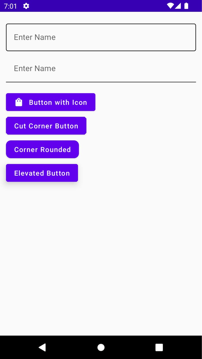
Figure 2.4 – The different button types and other UI elements
- Now, let us look at one last example since we will be using different views and styles throughout the book and will learn more in the process. Now, let us look at an image view; the
Image()composable function takes in several inputs, as shown in Figure 2.5.
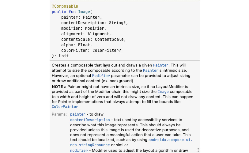
Figure 2.5 – Different ImageView input types
- In our example,
Image()will only have a painter, which is not nullable, meaning you need to provide an image for this composable function, a content description for accessibility, and a modifier:@Composable fun ImageViewExample() { Image( painterResource(id = R.drawable.android), contentDescription = stringResource( id = R.string.image), modifier = Modifier.size(200.dp) ) } - You can also try to play around with others things, such as adding
RadioButton()andCheckBox()elements and customizing them. When you run your application, you should have something similar to Figure 2.6.
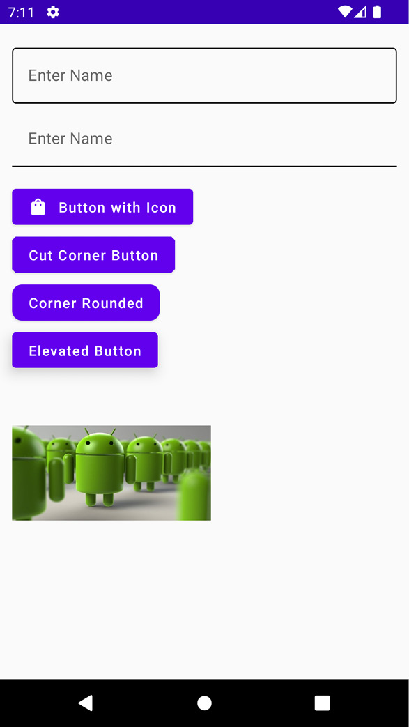
Figure 2.6 – Several UI components
How it works…
Every composable function is annotated with the @Composable annotation. This annotation tells the Compose compiler that the provided compiler is intended to convert the provided data into a UI. It is also important to note each composable function name needs to be a noun and not a verb or an adjective, and Google provides these guidelines. Any composable function you create can accept parameters that enable the app logic to describe or modify your UI.
We mention the Compose compiler, which means that a compiler is any special program that takes the code we wrote, examines it, and translates it into something the computer can understand – or machine language.
In Icon(), painterResouce specifies the icon we will be adding to the button, the content description helps with accessibility, and the modifier is used to decorate our icon.
We can preview the UI elements we build by adding the @Preview annotation and adding showBackground = true:
@Preview(showBackground = true)
@Preview is powerful, and we will look at how you can utilize it better in future chapters.