Reader small image

You're reading from  Tableau Cookbook - Recipes for Data Visualization

Product typeBook
Published inDec 2016
PublisherPackt
ISBN-139781784395513
Edition1st Edition
Tools
Right arrow
Author (1)
Shweta Sankhe-Savale
author image
Shweta Sankhe-Savale

Shweta Sankhe-Savale is the Co-founder and Head of Client Engagements at Syvylyze Analytics (pronounced as "civilize"), a boutique business analytics firm specializing in visual analytics. Shweta is a Tableau Desktop Qualified Associate and a Tableau Accredited Trainer. Being one of the leading experts on Tableau in India, Shweta has translated her experience and expertise into successfully rendering analytics and data visualization services for numerous clients across a wide range of industry verticals. She has taken up numerous training as well as consulting assignments for customers across various sectors like BFSI, FMCG, Retail, E-commerce, Consulting & Professional Services, Manufacturing, Healthcare & Pharma, ITeS etc. She even had the privilege of working with some of the renowned Government and UN agencies as well. Combining her ability to breakdown complex concepts, with her expertise on Tableau's visual analytics platforms, Shweta has successfully trained over a 1300+ participants from 85+ companies.
Read more about Shweta Sankhe-Savale
Right arrow

Chapter 3. Hungry for More Charts? Dig In!

In this chapter, we will cover the following recipes:

  • Creating an individual axes chart

  • Creating a blended axes chart

  • Creating a side by side bar chart

  • Creating a dual axes chart

  • Creating a combination chart

  • Creating a scatter plot

  • Creating a box and whisker plot

  • Creating a Gantt chart

  • Creating maps

  • Using background images

Introduction


In the previous chapter, we saw how to create basic visualizations in Tableau. In this chapter, we will focus on some of the advanced chart types in Tableau.

Creating an Individual axes chart


Just showing a single measure may not always give us a complete picture. For example, a bar chart showing region-wide sales only gives us information about how much sales each region has done. Although this is useful information for us, there isn't much insight in it to take any decisions. This would be even more useful to us if we could compare the sales of each region with targets of those regions. This way we could find out which regions are not meeting their targets and which regions are hitting or over-achieving the target.

There can be plenty of instances where we would want to compare multiple measures; and creating an individual axes chart is one of the many ways to do so.

Getting ready

For our next recipe, we will continue working in our existing workbook My first Tableau Workbook which is stored in the Workbooks folder in our My Tableau Repository. We will also continue working on the same Orders data of the Sample - Superstore.xls file.

How to do...

Creating a Blended axes chart


In the preceding individual axes chart, we saw that, because the measures were not in the same pane, it was difficult to draw inferences by just looking at the chart and without taking the axes' values into consideration.

It would be great if, in the preceding example, we could get both the Profit and Sales in the same pane and have a unified axis for both, so that it is quicker and easier to interpret the chart. This is where we use a Blended axes chart.

As the name suggests, the axis is blended to have a common unified scale to refer to.

Getting ready

We will continue working in the same workbook, and we will also work with the same example that we discussed in the previous recipe, where we compared Profit and Sales across various months for all the years. Let us see how to create a Blended axes chart.

How to do it…

  1. Let us create a new sheet by pressing Ctrl + M and rename it as Blended axes chart.

  2. Next, we will right-click and drag the Order Date field from the...

Creating a Side by Side Bar chart


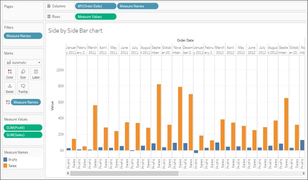
A Side by Side Bar chart is an extension of the Blended axes chart. It helps us compare values side by side. Let us follow the steps in the following recipe to quickly create a Side by Side Bar chart

Getting ready

Since this is an extension of the Blended axes, we will first duplicate the Blended axes sheet and then modify it. Let us follow the following steps and create a Side by Side Bar chart.

How to do it…

  1. Firstly, we will duplicate the Blended axes sheet and rename it to Side by Side Bar chart.

  2. Next, we will drag Measure Names from the Dimensions pane and drop it into the Columns shelf, just after the MY(Order Date) field. Refer to the following screenshot:

  3. This is a Side by Side Bar chart. However, you'll notice a horizontal scroll bar below the view. This is because; there are a lot of values that are placed horizontally. To remove the scroll, click on the dropdown in the toolbar which currently says Standard, and change it to Entire View. Refer to the...

Creating a Dual axes chart


If we are to compare measures that have the same scale and unit of measurement, then we can use the Blended axes chart. However, what if the measures don't have the same scale and unit of measurements and we still wish to compare them? For example, we may want to compare the revenue earned and the discounts offered. Revenue will be an absolute number whereas discount is going to be a percentage. The scales and the units of these measures are completely different.

In this case, we will use a Dual axes chart, where we have a secondary Y axis, which will contain the other measure that is to be compared. Let us see how we can create a Dual axes chart.

Getting ready

We will continue with the same example we have used for both Individual axes and Blended axes charts, where we are comparing Sales and Profit across different months for all the years. Let us quickly create a Dual axes chart by following the steps mentioned in the following recipe.

How to do it…

  1. We will create...

Creating a Combination chart


A Combination chart is an extension of a Dual axes chart, where instead of having the measures shown using a single mark, we can have different marks. So, for example, in the preceding Dual axes chart, we have both Sales and Profit shown as Lines. We may want to show Sales as a bar and Profit as a line. If we do that, then the chart that will be created will be called as a Combination chart. In simple words, a Combination chart is nothing but a Dual axes chart with multiple marks.

Let us see how to create a Combination chart.

Getting ready

For creating a Combination chart, we will first duplicate the Dual axes chart and then convert it into a Combination chart. The steps are as follows.

How to do it…

  1. Firstly, we will duplicate the Dual axes chart sheet and rename it to Combination chart.

  2. Once we do that, we will look at the Marks card. Refer to the following image:

  3. In the Marks card section, notice that there are three sub-sections called All, SUM(Sales) and SUM(Profit...

Creating a Scatter plot


Another way of comparing multiple measures is by creating a Scatter plot. A scatter plot is an XY axis chart with measures on both the X axis and the Y axis. It helps us find trends, concentrations and outliers by helping us focus on anomalies which are shown by the scattered points.

Getting ready

To create a Scatter plot, we will continue working in the same workbook. However, we will connect to a new data source. We will use the Access data, Sample-Coffee Chain.mdb which has been uploaded on https://1drv.ms/f/s!Av5QCoyLTBpnhj06IKTNX0S9hK48.

For our Mac users, since Tableau doesn't connect to the Access database from Mac, we will have to use the Excel version of this data which is also uploaded on the same link and is called Sample - CoffeeChain (Use instead of MS Access).xlsx.

If you haven't already downloaded these files in Chapter 1, Keep Calm and Say Hello to Tableau, you can download them now and save the files in a new folder called Tableau Cookbook data under...

Creating a Box and Whisker plot


The Box plot, or Box and Whisker plot as it is popularly known, is a convenient statistical representation of the variation in a statistical population. It is a great way of showing a number of data points as well as showing the outliers and the central tendencies of data.

This visual representation of the distribution within a dataset was first introduced by American mathematician John W. Tukey in 1969. A box plot is significantly easier to plot than say a histogram and it does not require the user to make assumptions regarding the bin sizes and number of bins; and yet it gives significant insight into the distribution of the dataset.

The box plot primarily consists of four parts:

The median provides the central tendency of our dataset. It is the value that divides our dataset into two parts, values that are either higher or lower than the median. The position of the median within the box indicates the skewness in the data as it shifts either towards the upper...

Creating a Gantt chart


A Gantt chart is a type of Bar chart which is commonly used in project management, and is one of the most popular and useful ways of showing activities such as tasks or events displayed against time. It was developed by Henry Gantt in the 1910s for tracking project schedules.

Gantt charts show the start and finish dates of various tasks/elements in a project. These elements comprise the work breakdown structure of the project. A Gantt chart can also be used for showing things in use over time, for example, the duration of a machine's use, or how long it took for people to hit a milestone and how that was distributed over time.

Getting ready

In the following recipe, we will create a Gantt chart by connecting to the Data for Box plot & Gantt chart Excel file we downloaded earlier. This Excel workbook has a sheet named Gantt Chart data, which contains sample data of various phases in a project-management process.

This is a small dataset, which has a Start date for each...

Creating Maps


Being able to compare data across geographies is critical for any business. Imagine if an organization is doing business in multiple locations; the analysis of interest would be to find out which region is giving high sales, which region is profitable, which region has the maximum customer base, and so on.

Our data may consist of geographic fields such as countries, states, cities, and so on, and when we are analyzing these fields, it makes sense to plot them on a map, primarily because it is easier to compare information across regions to find various geographic trends.

Tableau has many data-map providers and it comes with a set of Online and Offline maps that one can access to create the maps views. Further more, Tableau understands various geographic roles as well, and once it does that, it will create a small globe icon as a prefix for that field. Refer to the following image:

Tableau will also auto generate two measures: Latitude (generated) and Longitude (generated). We...

Using Background images


Tableau provides an option to display data on any given image. Typically, people use background images for displaying data on a custom map image. Even though Tableau allows us to use the default map options, background images can give us the flexibility to use our own custom images, which could be used as a special map. Background images need not necessarily be a custom map; instead it can be any image that corresponds to our data. For example, we may have data that corresponds to a floor plan of a building, or data that corresponds to a baseball game, which needs to be plotted on the baseball pitch, and so on. We can use background images to overlay that data on the actual floor plan of the building or on the baseball pitch image, to give more context.

To display the background image, we'll create an XY axis Scatter Plot. Each data point then has an X coordinate and a Y coordinate. The point to remember here is to have the right coordinates, as this is what will add...

lock icon
The rest of the chapter is locked
You have been reading a chapter from
Tableau Cookbook - Recipes for Data Visualization
Published in: Dec 2016Publisher: PacktISBN-13: 9781784395513
Register for a free Packt account to unlock a world of extra content!
A free Packt account unlocks extra newsletters, articles, discounted offers, and much more. Start advancing your knowledge today.
undefined
Unlock this book and the full library FREE for 7 days
Get unlimited access to 7000+ expert-authored eBooks and videos courses covering every tech area you can think of
Renews at $15.99/month. Cancel anytime

Author (1)

author image
Shweta Sankhe-Savale

Shweta Sankhe-Savale is the Co-founder and Head of Client Engagements at Syvylyze Analytics (pronounced as "civilize"), a boutique business analytics firm specializing in visual analytics. Shweta is a Tableau Desktop Qualified Associate and a Tableau Accredited Trainer. Being one of the leading experts on Tableau in India, Shweta has translated her experience and expertise into successfully rendering analytics and data visualization services for numerous clients across a wide range of industry verticals. She has taken up numerous training as well as consulting assignments for customers across various sectors like BFSI, FMCG, Retail, E-commerce, Consulting & Professional Services, Manufacturing, Healthcare & Pharma, ITeS etc. She even had the privilege of working with some of the renowned Government and UN agencies as well. Combining her ability to breakdown complex concepts, with her expertise on Tableau's visual analytics platforms, Shweta has successfully trained over a 1300+ participants from 85+ companies.
Read more about Shweta Sankhe-Savale