
In this chapter, we will cover some visualization tips and tricks to create a compelling dashboard in Qlik Sense:
- Creating snapshots
- Creating and adding content to a story
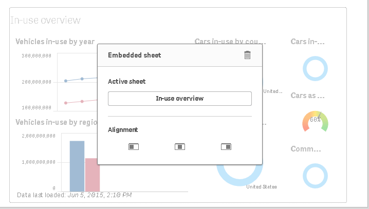
- Adding embedded sheets to the story
- Highlighting the performance measure in a bar chart
- Associating persistent colors to field values using the script
- Using the colormix1 function
- Composition
- Relationships
- Comparison
- Distribution
- Structuring visualizations
- Measuring statistical data with box plot charts
- Using a waterfall chart to analyze the cumulative effect